© ROOT-NATION.com - Use of content is permitted with a backlink.
Everything in our world has frames and borders. But it’s in our nature to destroy those borders. That spirit inspired Samsung designers when they had been working on a new flagship. Sure, the dual cameras must have been tempting them, but they didn’t budge, and in the result they broadened their mind and, in turn, ours. Let’s take a look at Samsung Galaxy S8 – a smartphone without borders.
Design and ergonomics
This time the specs weren’t the main focus – instead, the Korean specialists decided to design a real looker. It’s true that their compatriots at LG were the first to release a smartphone with a big screen and curved edges, but so what? That didn’t worry them one bit. And so we have a new flagship phone, Galaxy S8.
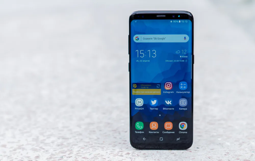
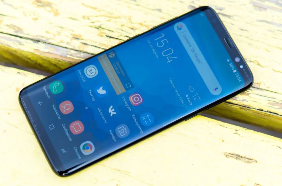
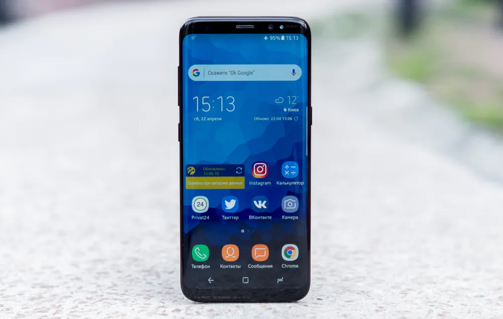
A phone without borders, as they call it, does not disappoint. Display takes up almost 85% of the faceplate and its edges are curved just like in previous Edge models. It all creates an illusion that the phone is levitating in your hands.
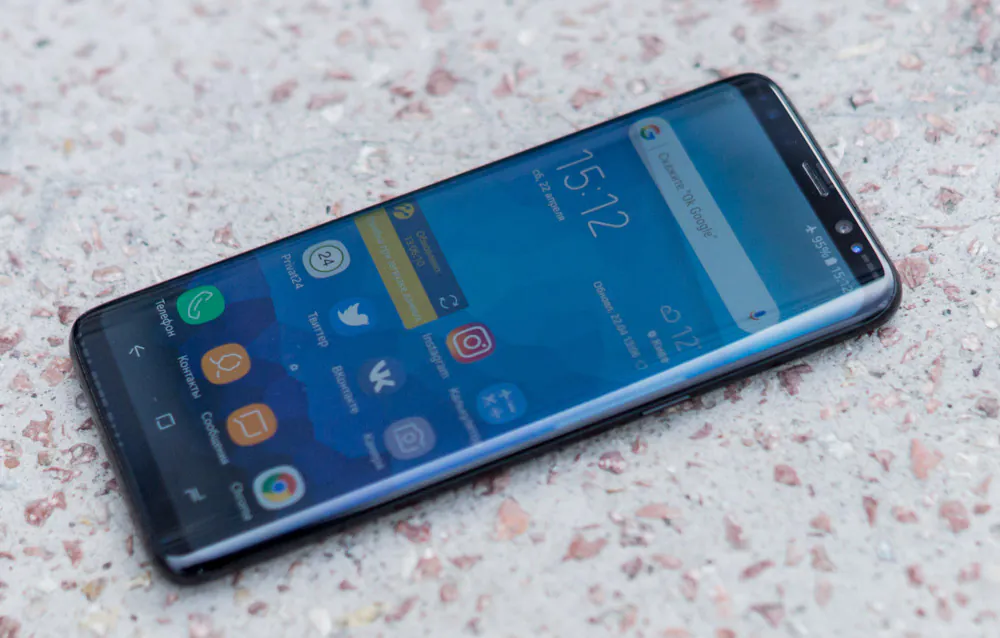
The faceplate doesn’t actually look like anything they’ve done before. In order to create “the levitating screen” Samsung had to remove three usual buttons and – gasp – the Samsung logo. But even without all those usual ingredients Samsung Galaxy S8 remains easily recognizable.
S8 has a seemingly massive display, but the phone is actually smaller than S7 Edge. They obviously learned from their mistakes: screen has a less of a curve which makes it a lot more comfortable to hold. And you can forget about accidental touches.
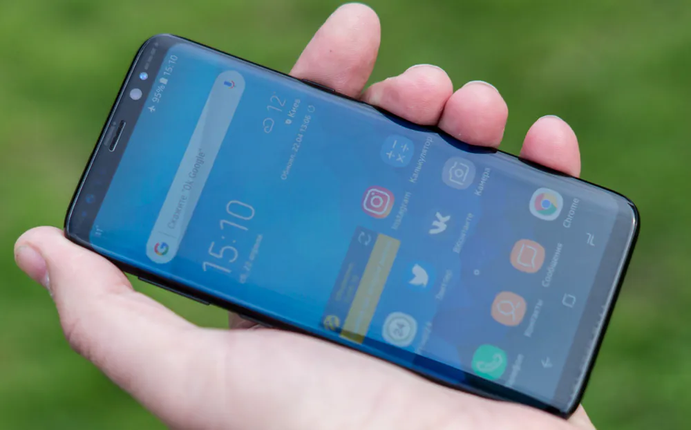
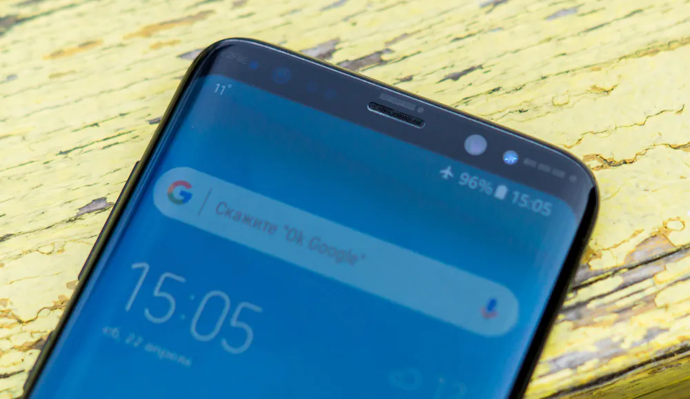
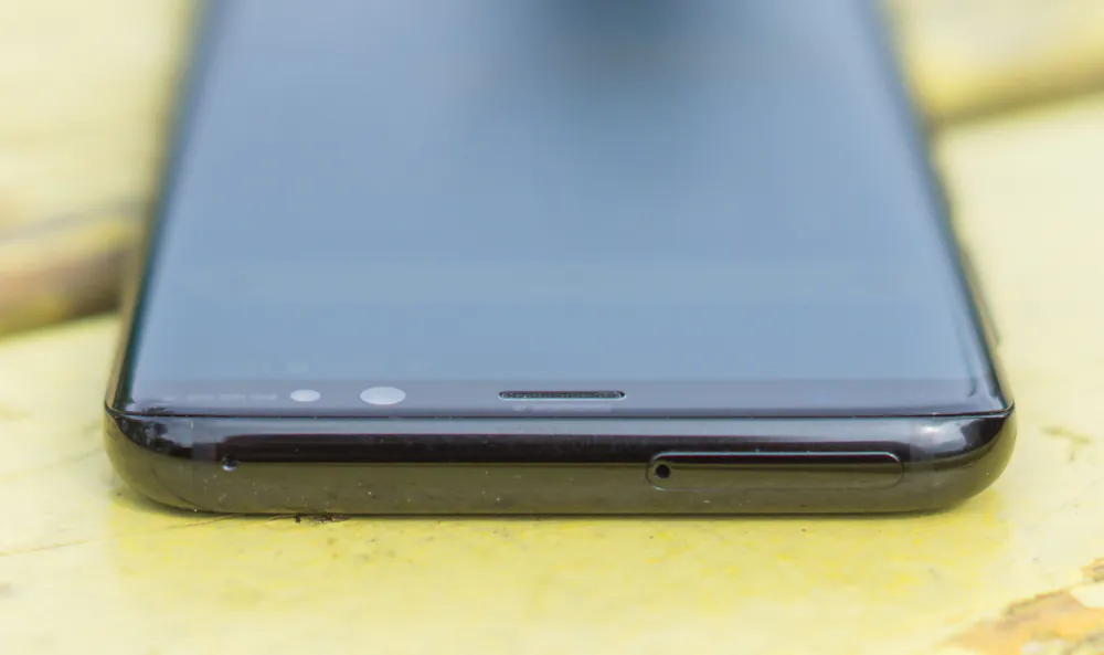
Along with the display the faceplate has a frontal camera, a speaker and lot of different sensors.
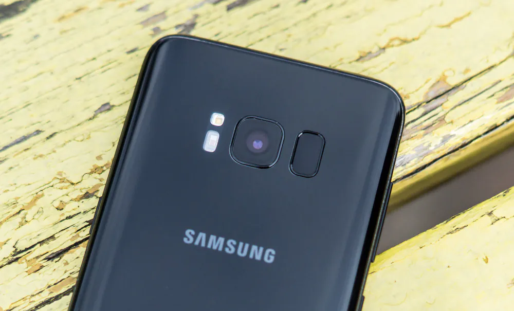
On the back there are also new additions. Along with face buttons Samsung had to remove a fingerprint scanner which was moved to the back. Now you can find it on the right of the camera, while on the left there’s flash and heartrate sensor. While it was vital for them to make the faceplate look smashing, the back is also nice to look at.
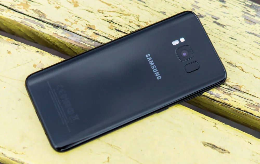
I especially enjoy the symmetry of it all. The camera and other elements are lined up neatly in one line. I am a perfectionist and just looking at it makes me happy.
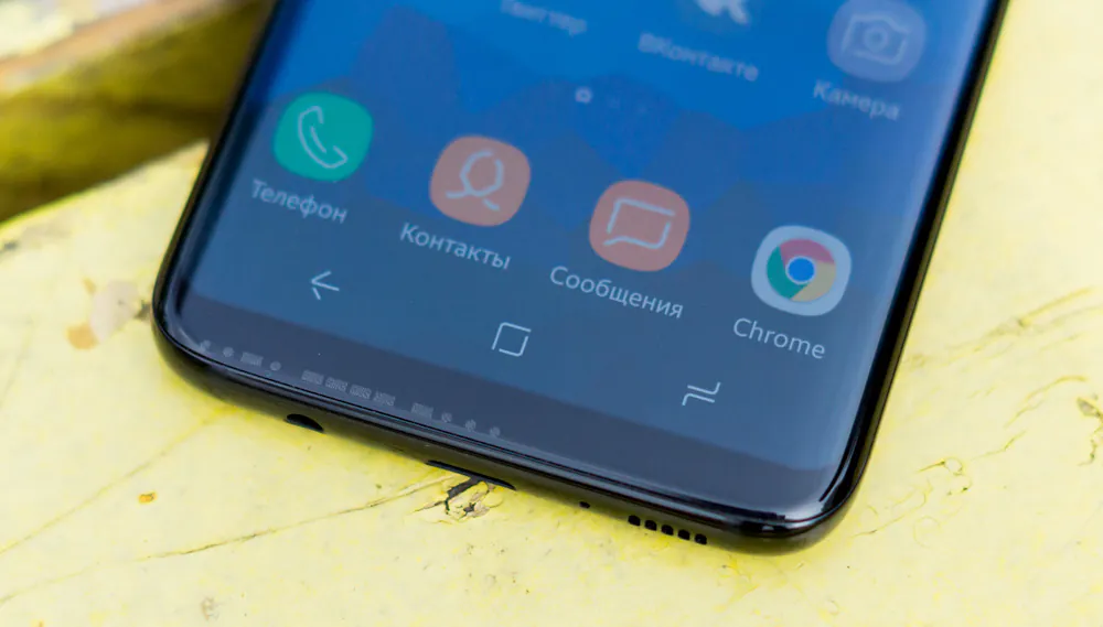
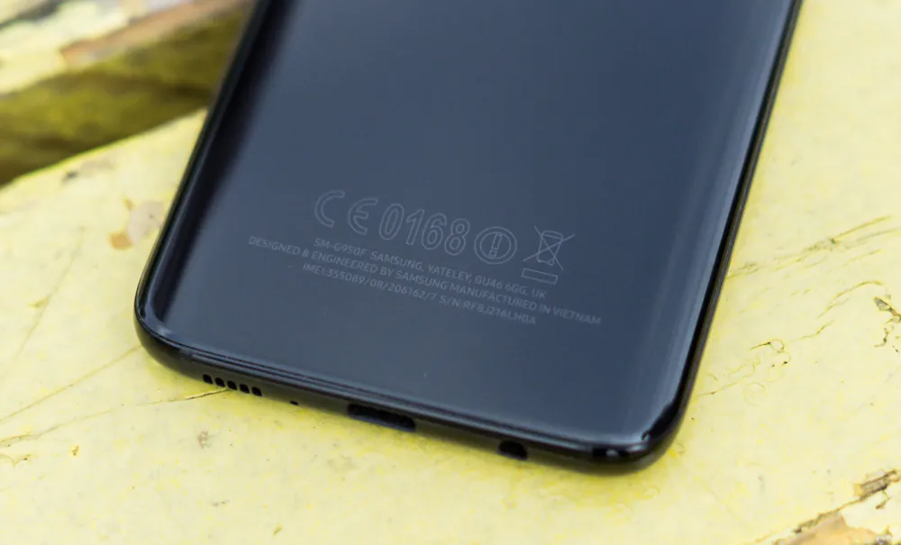
Still, there are some infuriating things as well. Just look at the low edge – it seems that the designers decided to give up on it! Audio input and a speaker are lined up symmetrically, but the USB Type C connector is somewhere below them.
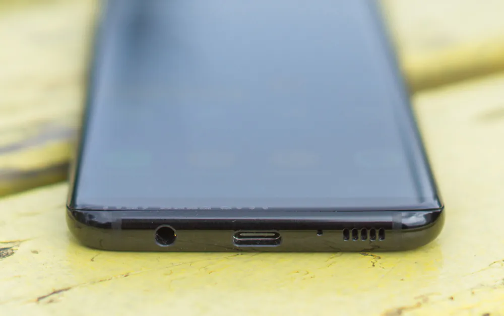
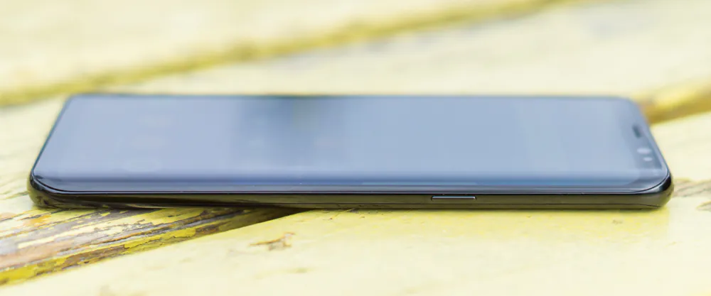
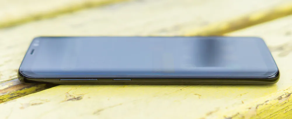
On the right we have a power button, on the upper edge there’s a slot for two NanoSim cards or for one Sim card and one memory card. On the left there’s a traditional volume button and a new addition – a nuclear missile a Bixby assistant button.
The Koreans haven’t forgotten protection either. The front and the back are protected with Corning Gorilla Glass 5 which is almost unbreakable. And if you don’t take your diamond earrings with you, you can stop worrying about scratches. Also, the phone is water- and dust-resistant. It has IP68 standard, which means you can submerge the phone in up to 1 meters of water for 30 minutes.
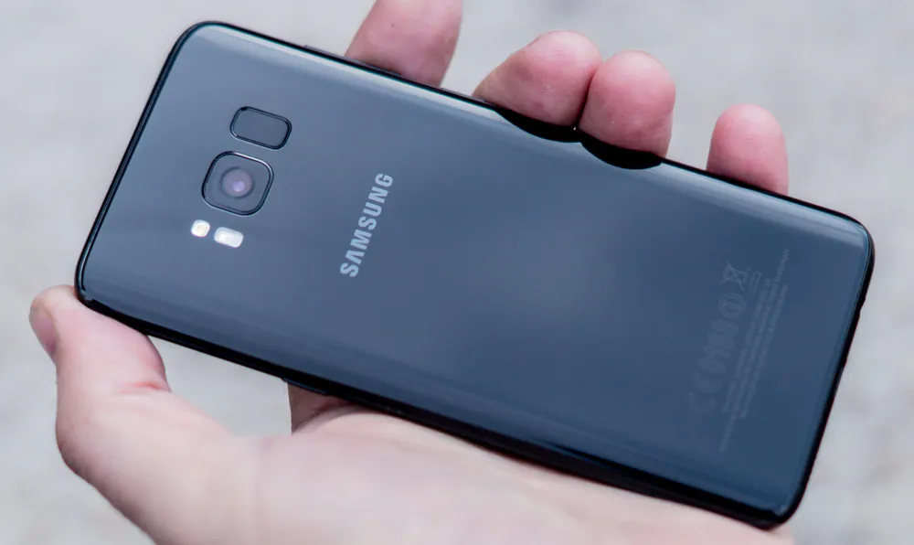
This phone consists of three parts – the edges are made of aluminum colored plastic and the rest is glass. Thanks to great engineers nothing here tells that this is not a solid build.
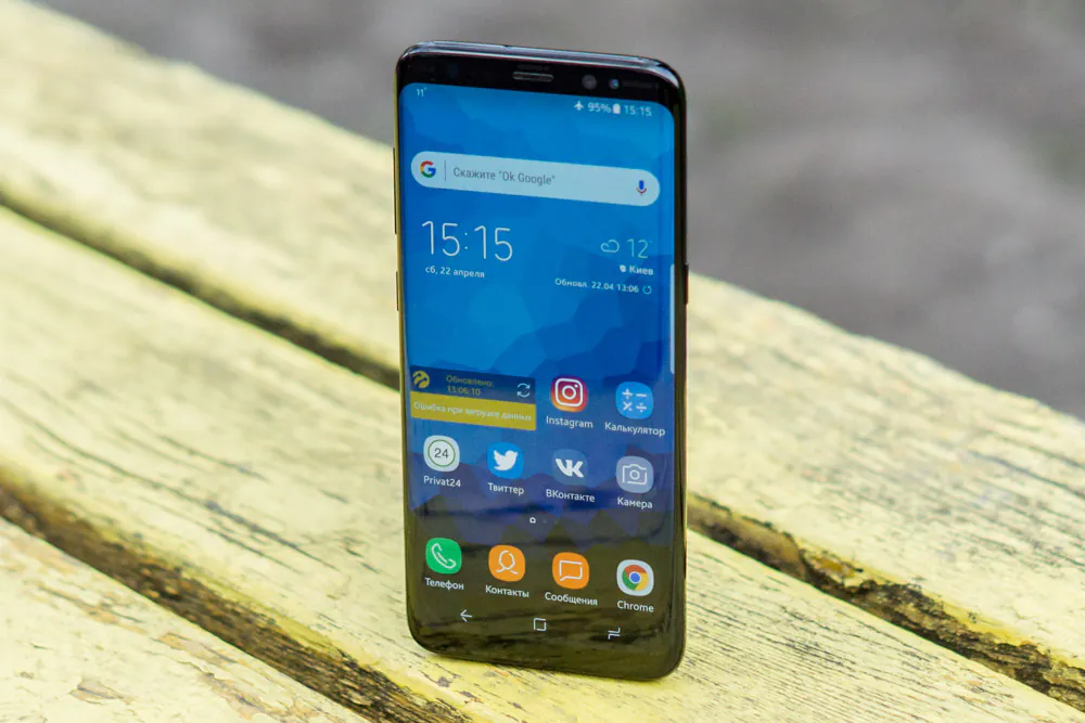
Samsung Galaxy S8 doesn’t have any hard navigation buttons. You have to get used to soft buttons instead.
In the center of the screen there’s a home button, which reacts to pressure and vibrates. A couple of days and you’ll get used to it, even when the area of navigation is not active. Back and running apps buttons can be interchanged.
Samsung Galaxy S8 display
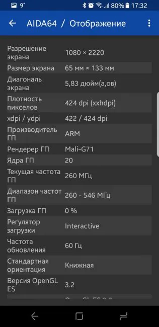
The main attraction here is the display. And what a display it is. The first shocker is that while the phone itself is smaller than 5,5 inch S7 Edge, it has a 5,8 inch display! It has irregular 2960×1440 resolution and irregular 18,5:8 ratio. The matrix, on the other hand, is traditionally great and juicy Super Amoled.
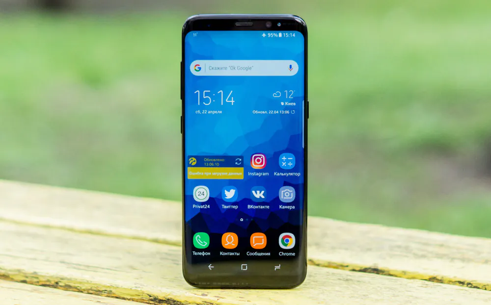
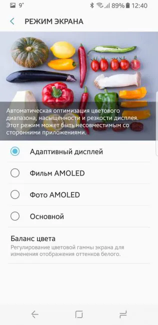
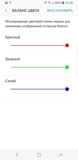
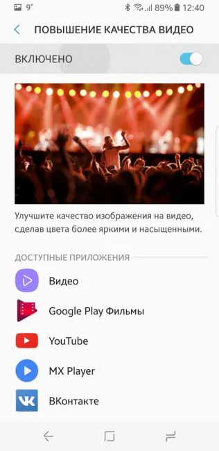
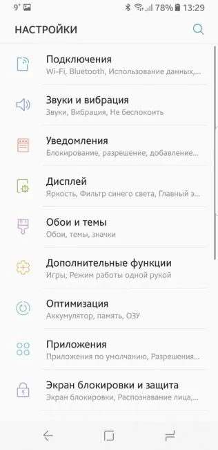
If you are somehow unimpressed with picture quality, you can choose different modes or change the balance of white.
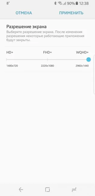
But that’s not all: you can change the resolution at any time: choose between HD+ (1480×720), FHD+ (2220×1080) or mentioned above WQHD+ (2960×1440). The first mode is for saving the battery charge, the second is what I use normally, and WQHD+ is great for VR.
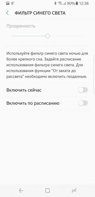
Another addition is a “blue color filter” or night mode for those who enjoy reading of watching movies before sleep.
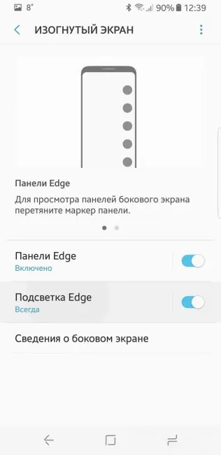
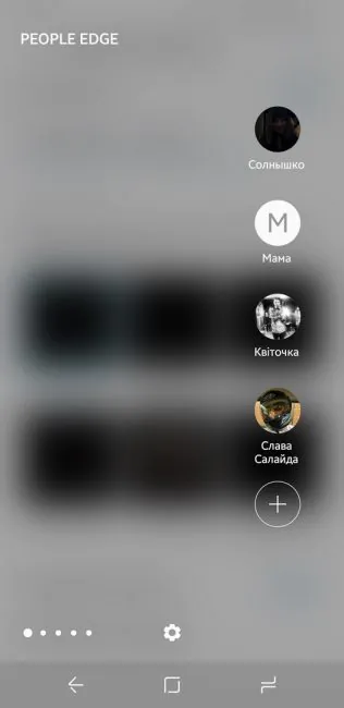
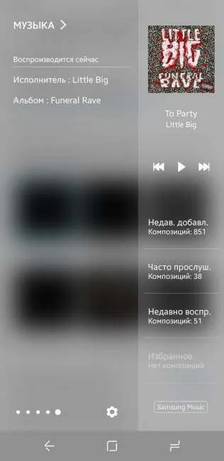
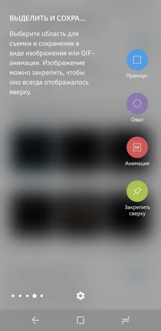
Edge apps is the third feature. The screen is not as curved as in Edge models, but it still can be customized. Weather, contacts, music player – you can use the edge to quick access anything you want. The curved panel is not a novelty, so there are a lot of third party apps for it.
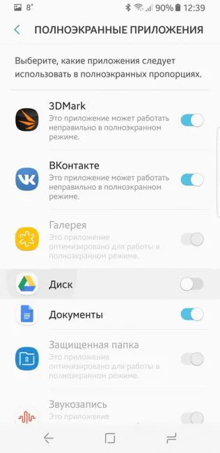
And now to the part that had me worried. How will third party apps work on this unique display? As it turns out, they work great. If an app is not yet optimized for the screen, the phone will optimize it itself.
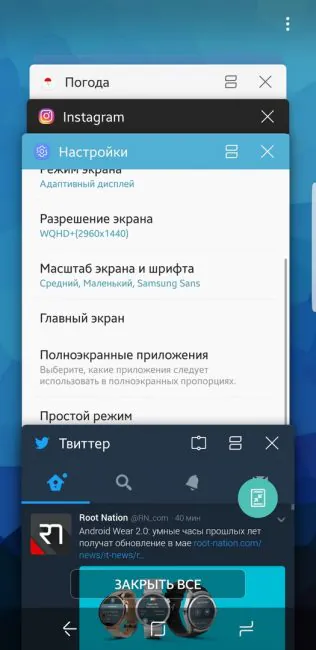
You can set which apps should work in full screen mode and which with 5,5 inch display. These settings can be also found in running apps menu.
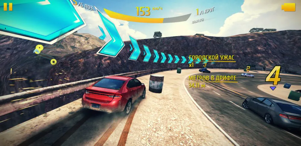
While apps work great, videos and games still leave much to be desired. Games and videos in full screen mode are cropped a bit, which is okay for videos, but bad for games, where certain parts of UI can be inaccessible.
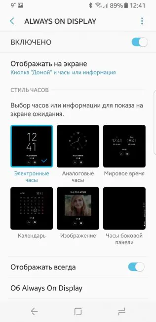
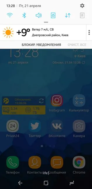
That’s not all, of course. Always on Display is still here; you can check the time and notifications. You can easily open an app which sent the notification, change music (double tap on time opens the player widget).
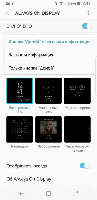
Don’t like the clock widget? You can select classic clock or a calendar, or any picture. All information can be displayed on the edge panel. Everything can be turned off – or you can leave only home button.
UI and soft
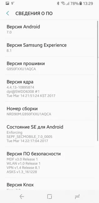
Galaxy S8 runs of Android 7.0 with Samsung Experience 8.1 shell. It’s obvious that much effort was put into the shell: it’s wonderfully optimized, works smoothly and without any glitches. It is as intuitive as a clean Android 7.
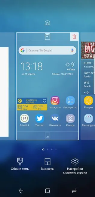
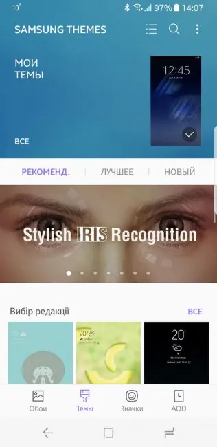
You can still customize it, of course. The easiest way is by downloading themes from Galaxy Apps.
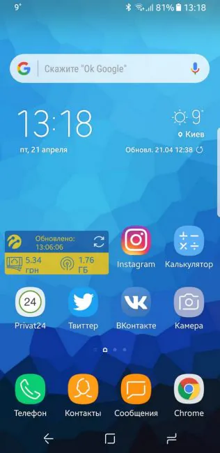
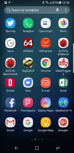
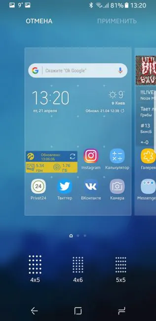
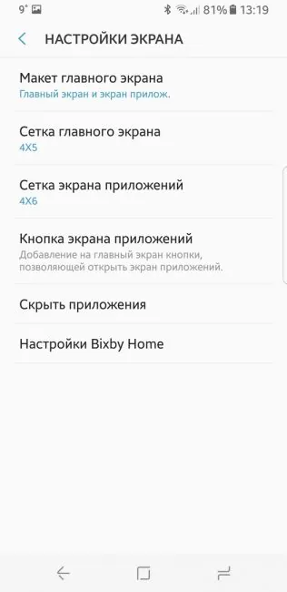
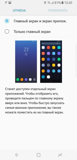
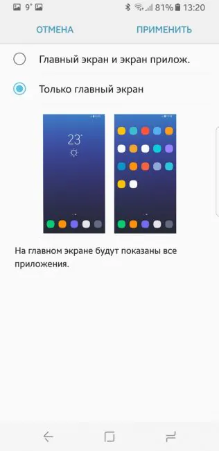
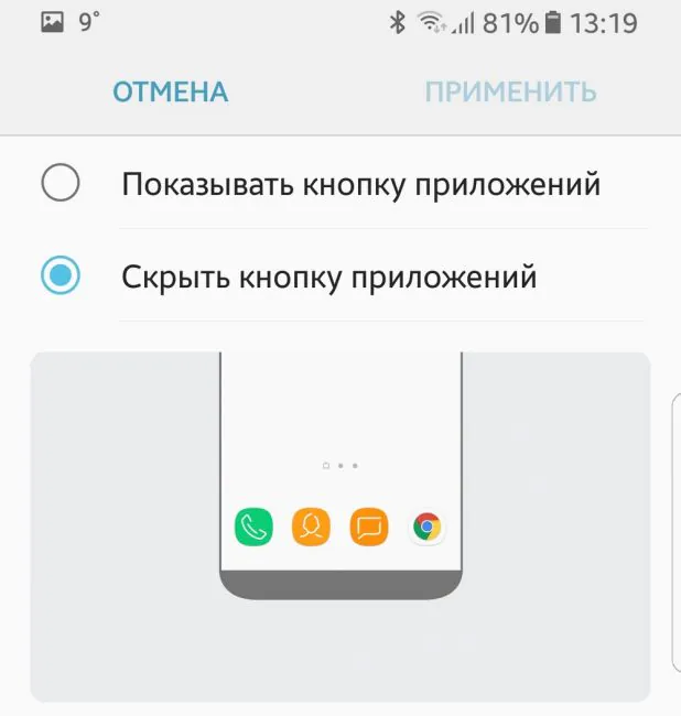
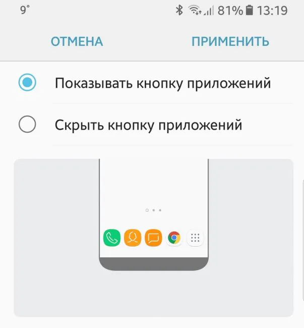
It’s possible to change the size and number of icons on the screen and in the app menu. You can remove the menu icon and use swipe to access apps. Or you can disable the menu for good so that all apps would be placed on different screens.
Icon style is also customizable – leave them as they are or make them look similar.
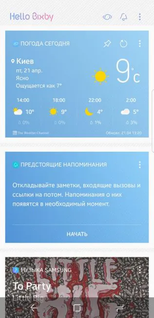
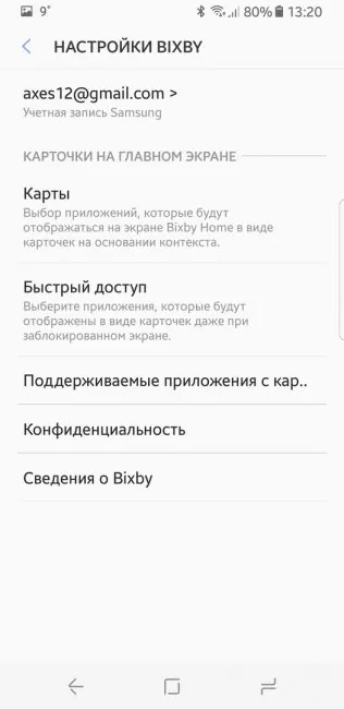
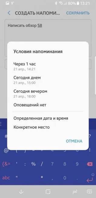
Gone is the left panel with “Briefing”, and with it another assistant by the name of S Voice. Now we have a new personal assistant called Bixby, which is a big deal – it even has its own dedicated hard button.
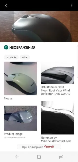
The main idea behind Bixby is to collect data on how you use the device and then use that knowledge to make your experience better. It has open API so that every developer could make use of it. Right now Bixby knows what apps I use (and how often) and what news sources I prefer, and that allows him to send me recommendations. Let’s also not forget intellectual search for products and places.
The main idea behind Bixby is to collect data on how you use the device and then use that knowledge to make your experience better. It has open API so that every developer could make use of it. Right now Bixby knows what apps I use (and how often) and what news sources I prefer, and that allows him to send me recommendations. Let’s also not forget intellectual search for products and places.
Protection
Samsung made it clear that data protection is important for them. Galaxy S8 has a lot of tools to protect your phone: along with normal fingerprint scanner there’s a face scanner and a retina scanner. And while the face scanner is pretty rudimentary (it can be fooled with a photo), a retina scan is something more serious.
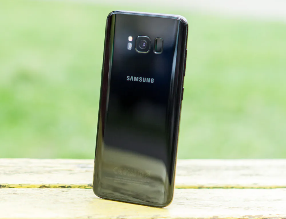
Near the camera there’s an infrared retina scanner which should work at any time of the day.
In reality it makes mistakes in bright sun and takes too long to read retina at night. Glasses can also be a problem: different angles can make your retina unreadable due to flecks of light. Don’t even bother with sunglasses.
The main scanner sits near the camera. There’s no hard “home” button in S8 and because of that the fingerprint scanner was moved to the back. I can’t say that it’s very comfortable to use because it’s too easy to mix the camera and the scanner. In the beginning you will involuntarily touch the camera from time to time and it’s advisable to check the lenses when taking a photo. The scanner itself works flawlessly.
Specs and tests
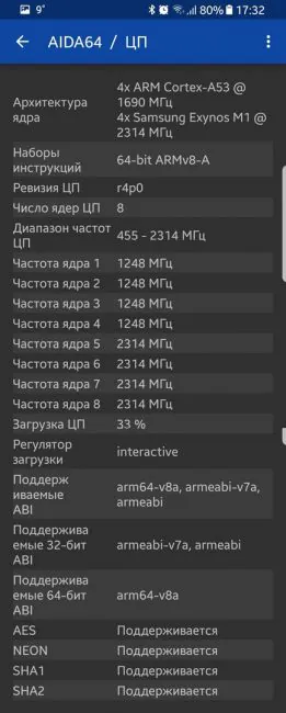
This year Samsung decided to continue the tradition of making phones with different processors. The model for ex-CIS members is equipped with Exynos processor which is even better – Samsung Exynos 8895 is the first processor which was built with 10-nanometer technological process. The result is more power and longer battery life.
Exynos 8895 (and all processors from Samsung) was made with Big.little technology. It has four energy efficient ARM Cortex A53 cores and four Samsung Exynos M1 CPU cores. Graphics is handled by Mali-G71 MP20 GPU.
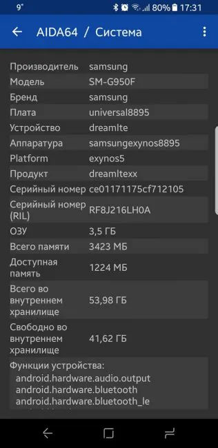
When it comes to memory, it’s all good. We have 4GB of RAM and 61 GB of internal storage. Not enough? You can expand the memory with memory cards (up to 256 GB).
No disappointments in the area of connectivity, either: dual-band Wi-Fi and AC standard, Bluetooth 5.0, NFC, GPS, ANT+, Galileo and wireless charging.
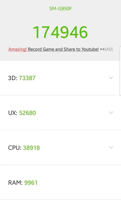
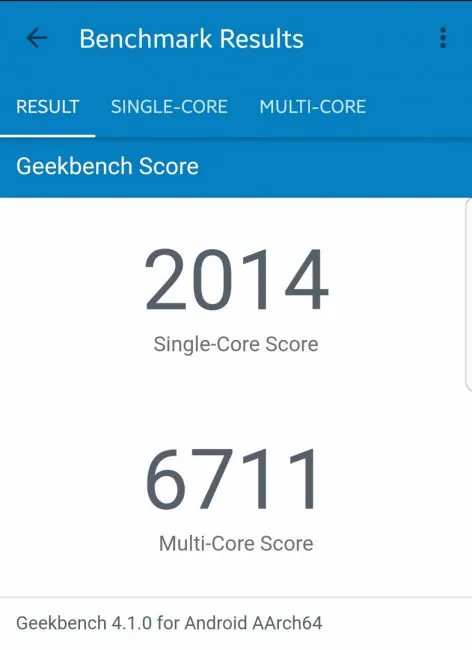
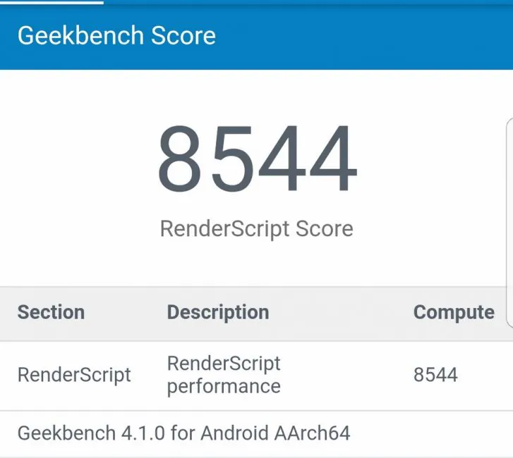
In AnTuTu S8 gets 175 000 points. In Geekbench 4 – 2000, 6700 – in CPU test. In COMPUTE test it amasses 8500 points.
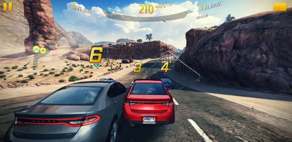
In terms of power the phone is more than capable. Want to play the most impressive game on the market? Go on. Want to watch 4K MKV file? No problem. UI and apps are not only fast – they are superfast.
Samsung Galaxy S8 cameras
While revolutionary in many ways, Samsung Galaxy S8 has nothing new to offer in terms of cameras. In fact, it’s the same camera as in Galaxy S7 Edge. The module is new, though – as well as new processing algorithms, thanks to which the camera is faster and the pictures are sharper when taken in low light.
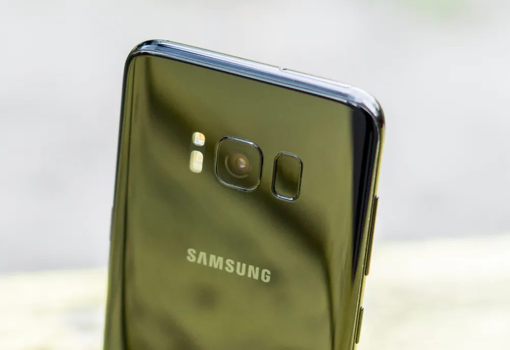
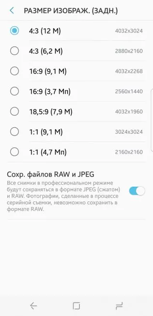
So yes, the camera is “old”, but it’s still one of the best. It has 12 MP, f/1.7 diaphragm, 1.4 μm pixel size, 6 lenses with optical and digital stabilization. Photography buffs will be able to save photos in RAW format – even when using automatic mode.
The main camera is the best in all aspects. The quality, detalization, colors – everything is great.
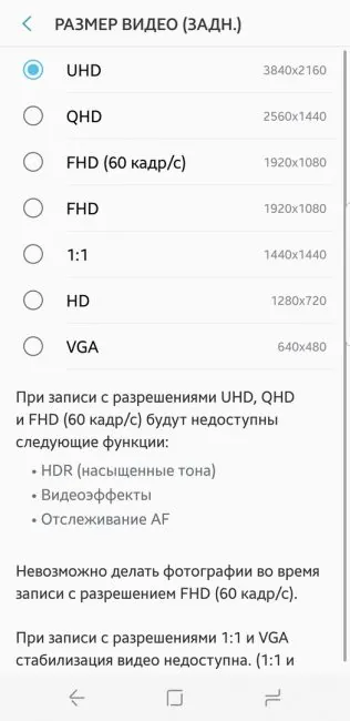
Videos and photos in full definition
Videos and photos in full definition
Frontal 8MP camera with f/1.7 diaphragm now can make HDR photos. Group selfie feature remains. Want to have a selfie in low light? There’s an option to use the screen as flash.
Samsung Galaxy S8 battery life
Battery is still the weakest link, although certain… problems of Note 7 are gone. 3000 mAh battery doesn’t sound too good for a device with a big screen.
In active use the phone won’t last from morning till evening. It has 5-6 hours of screen time, which is decent enough. Ordinary users won’t have any problems, though, and the phone will last a while day.
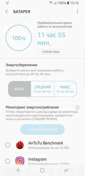
It that’s not enough, there are energy saving modes. And while the phone loses charge rapidly, it gains it even faster thanks to quick charge.
Verdict
I think that Samsung Galaxy S8 is the most innovative smartphone on the market and probably the best Android phone there is. It looks dashing with its unique unforgettable design and impresses with great specs.
Its camera is one of the best and it’s hard to imagine how others are gonna compare. The weak battery is a big flaw, though, but thankfully there’s a quick charge option.
In 2017 Samsung is back on top with a great flagship smartphone. Let’s see how others will react. Stay with us – let’s follow the news together!


