© ROOT-NATION.com - Use of content is permitted with a backlink.
Sony’s mobile division is having a bad time. Any other company might try to change something according to recent trends. Or maybe lower the price. But not Sony. They decided to end the XA series. Now it’s time for Sony Xperia 10. But is it worth the trouble?
Specifications Sony Xperia 10
- Display: 6″, IPS LCD, 2520×1080 pixels, aspect ratio 21: 9
- Chipset: Qualcomm Snapdragon 630, 8-core with a frequency of 2.2 GHz, Cortex-A53
- Graphics accelerator: Adreno 508
- RAM: 3/4 GB
- Storage: 64 GB
- Support for microSD memory cards: up to 512 GB
- Wireless networks: Wi-Fi 802.11 a/b/g/n/ac, Bluetooth 5.0 (A2DP, aptX HD, LE), GPS (A-GPS, GLONASS), NFC
- Main camera: dual, main module 13 MP, f/2.0, 27 mm, 1/3″, 1.12µm, PDAF, additional sensor depth of 5 MP, f/2.4, 22 mm, 1/4 “, 1.4µm
- Front camera: 8 megapixel f/2.0, 24 mm, 1/4″, 1.12µm
- Battery: 2870 mAh
- OS: Android 9.0 Pie
- Dimensions: 155.7×68×8.4 mm
- Weight: 162 g
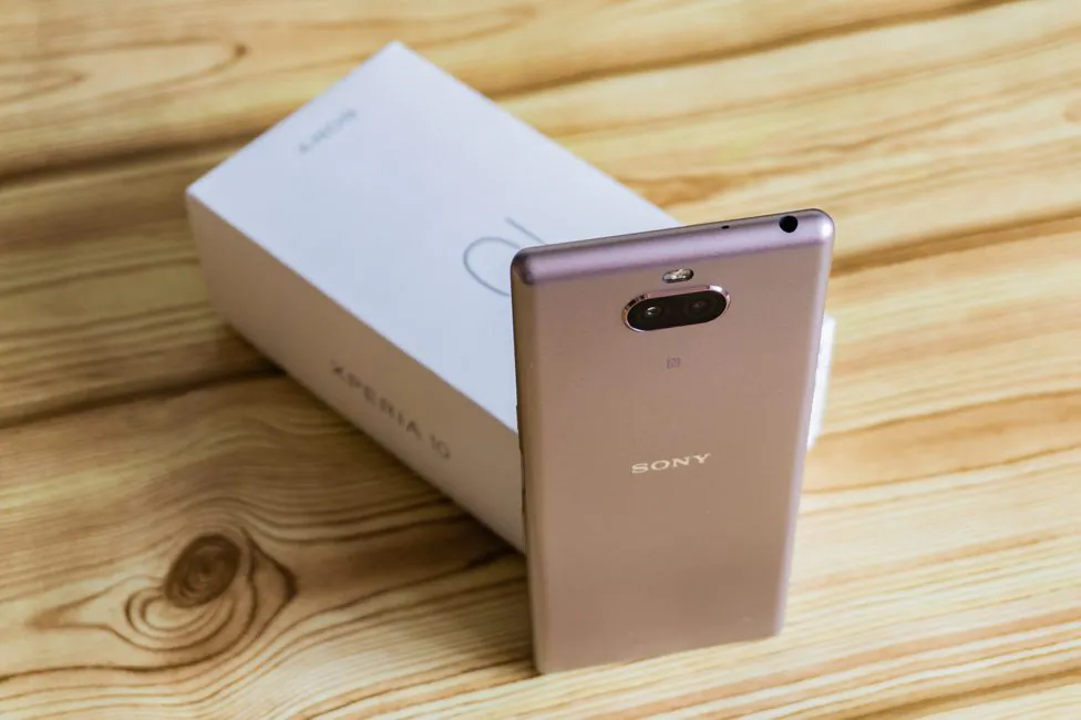
What’s in the box
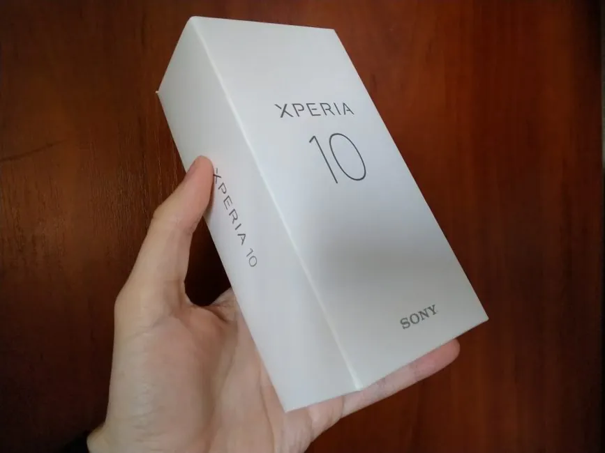
The box remains the same and its contents have not changed. Inside is a smartphone, power adapter, USB/Type-C cable and documentation. No charger for me, but I’ll use the usual 5V/1.5A.
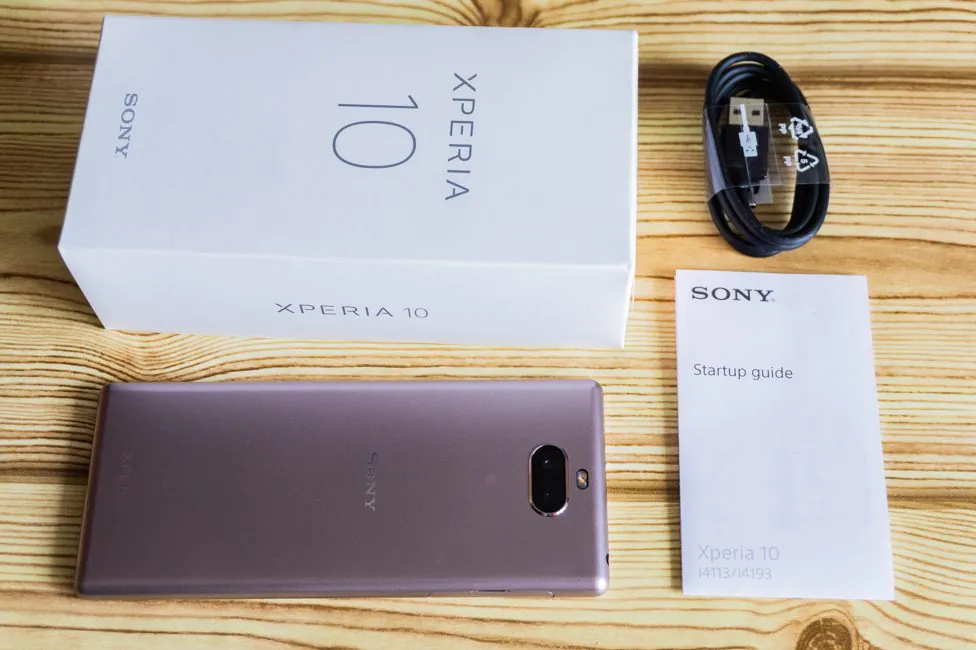
Design, materials and build quality
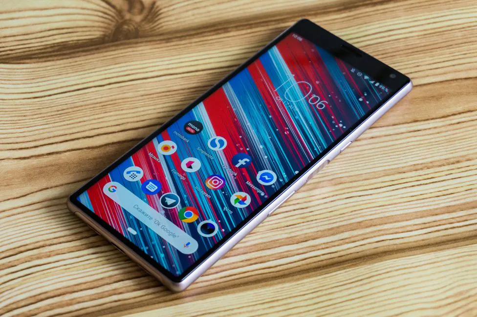
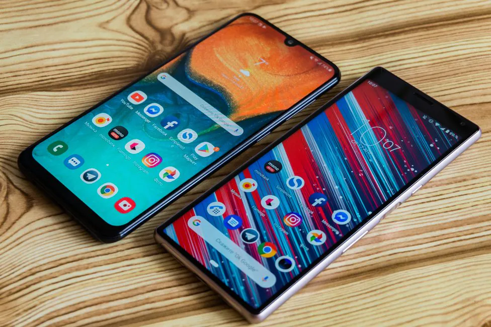
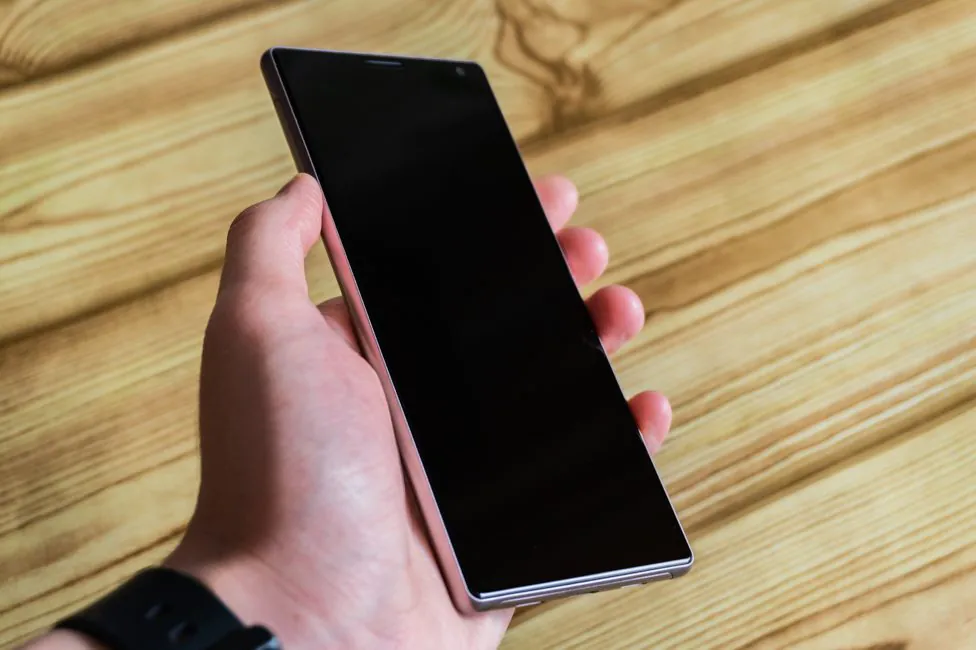
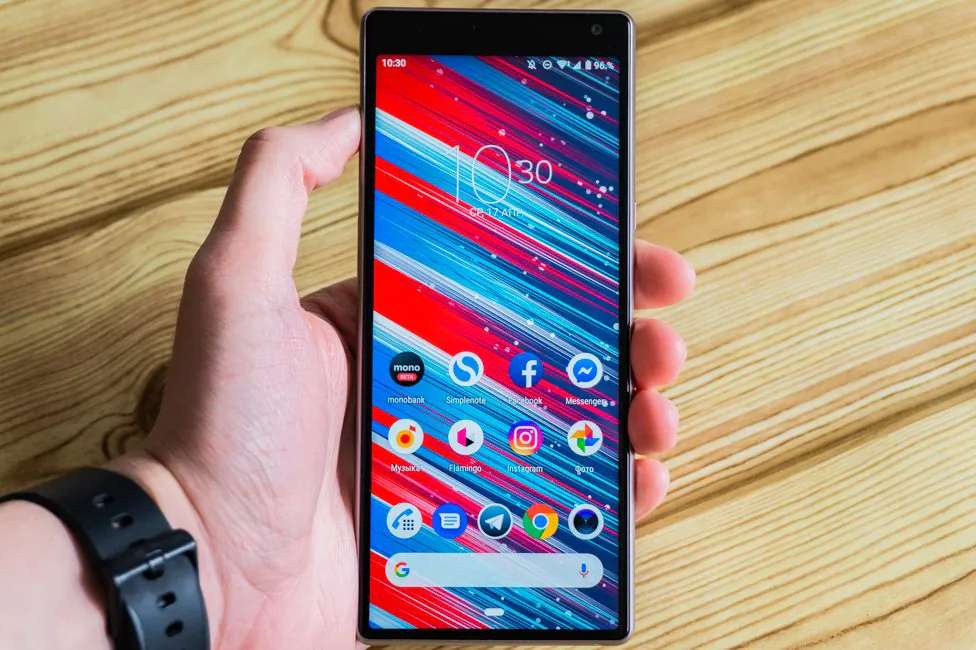
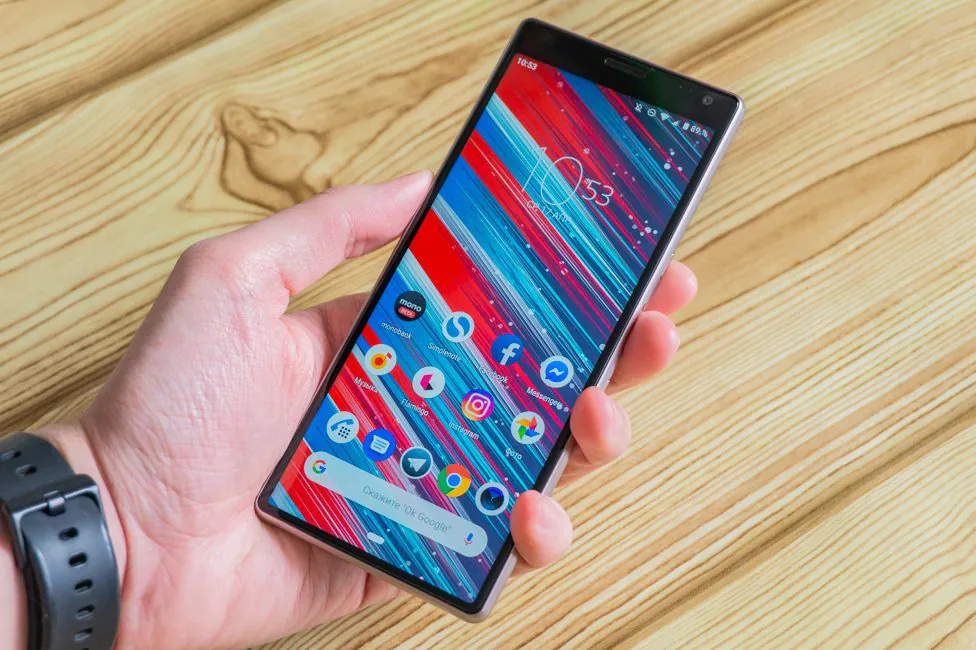
The design of the Sony Xperia 10 focuses on the front panel. The Japanese do not deviate from their own convictions and still make smartphones without notches, teardrop-shaped notches and holes in the display. Is it good or bad? I think good, because the drop-like notch is now just everywhere, but Sony devices, as always, are not like the others.
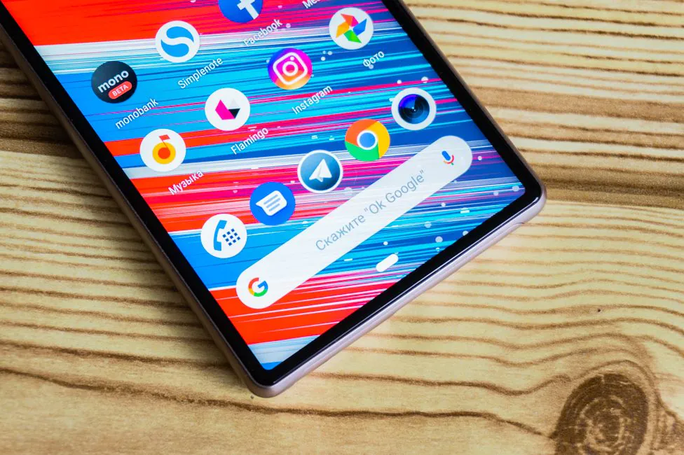
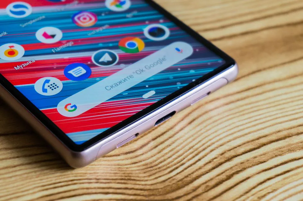
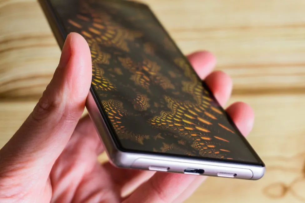
The bezels around the display in 3 out of 4 cases are small. The bottom one has “completely dissolved” and is exactly the same in thickness as the side ones. Isn’t it what we wanted all along?
Here we are. However, if you remember the XA2 series, it has always been like this. The area under the screen was smaller than it was above it, and today we are seeing how this very bottom frame went into oblivion. At this rate, someday we will be able to see how the top one will disappear too. In the meantime, we suffer living with it.
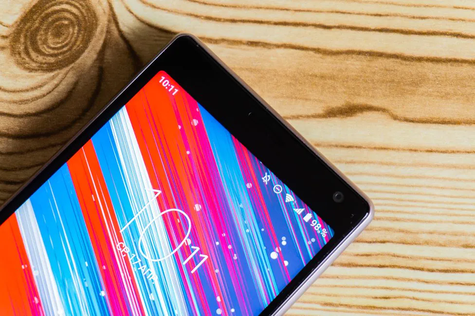
The flat sides above and below, which were in XA2 Ultra and Plus, also vanished. Now the shape of the case is the same from all sides. However, the corners are rounded off minimally, which is why it’s still feels like a usual rectangle.
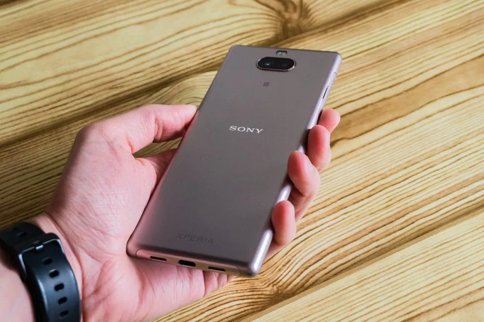
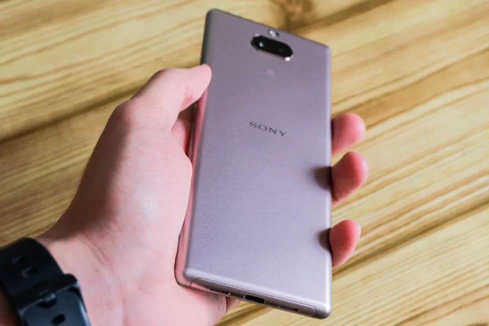
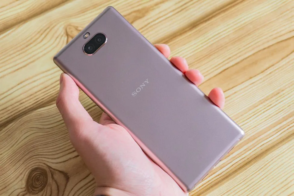
Materials were downgraded – the aluminum frame disappeared, even if it was not solid. Now there’s only an oval oblong insert is made of metal in the bottom, the rest is plastic. Not the worst quality and it does look like metal, but when you take the device in your hand, everything becomes clear.
There might be some benefits, but in all fairness it just feels worse in the hands. But Sony fans are used to this – the backs of other mid-rangers from the company are also plastic. The build quality is great, it feels like a sturdy monolith. The color of my test model is good at masking fingerprints and other undesirable evidence of active use. An oleophobic coating is applied to the front of Corning Gorilla Glass 5.
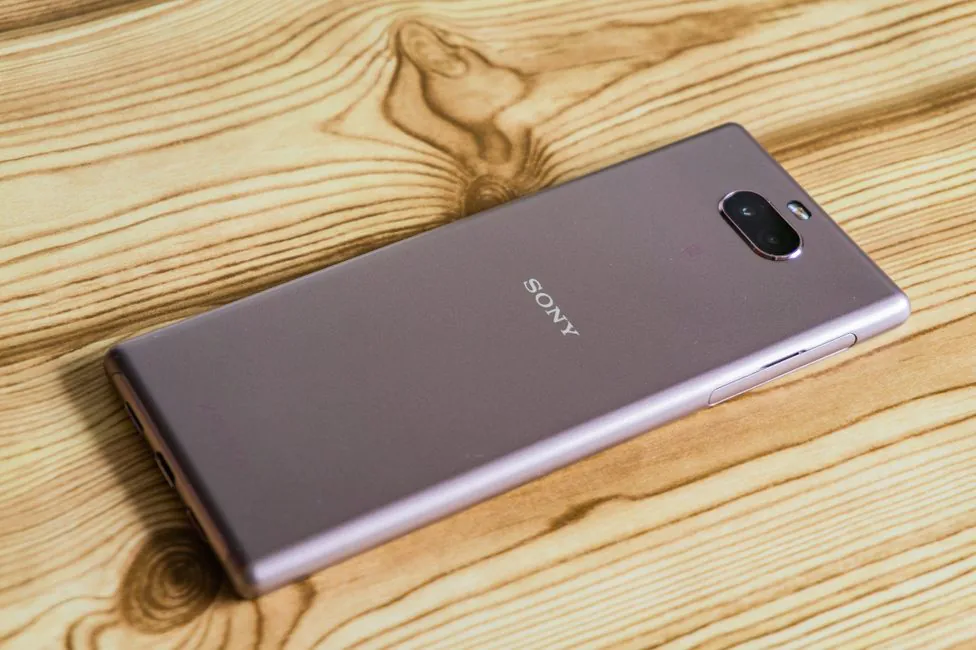
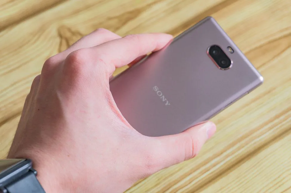
By the way, about the colors. The manufacturer has prepared four: black, navy, silver and pink. Interestingly, the older brother (Xperia 10 Plus) replaced the latter with gold. The front panel is black everywhere.
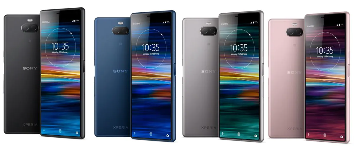
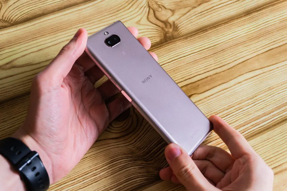
But what is even more interesting is that I have the pink one, but when it doesn’t look it. Depends on lighting: it may look gold or silver. It’s some kind of chameleon, it’s not only pink. This color is unidentifiable.
Elements’ configuration
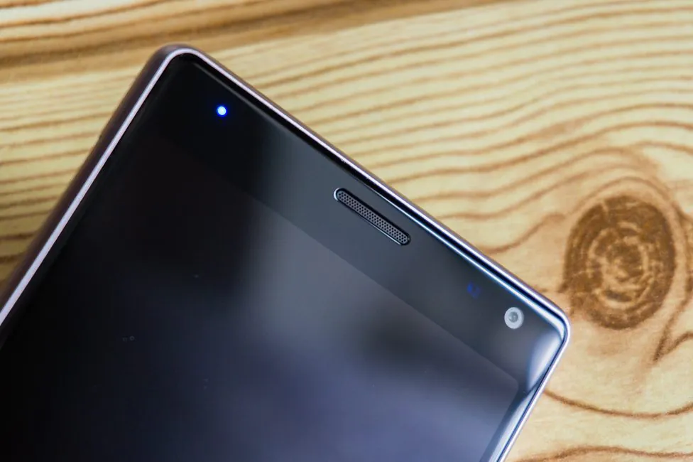
In the high area above the display, there’s a notification LED indicator, an earpiece speaker, proximity and light sensors, a front-facing camera.
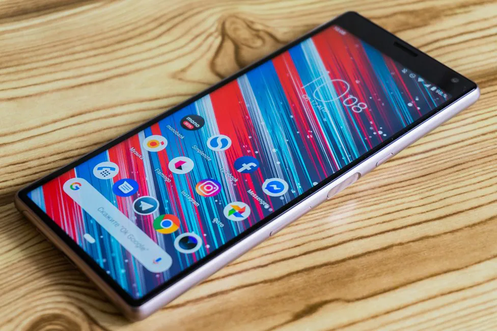
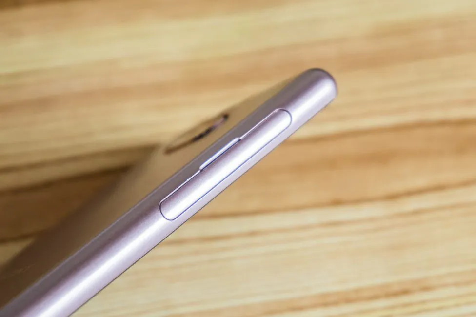
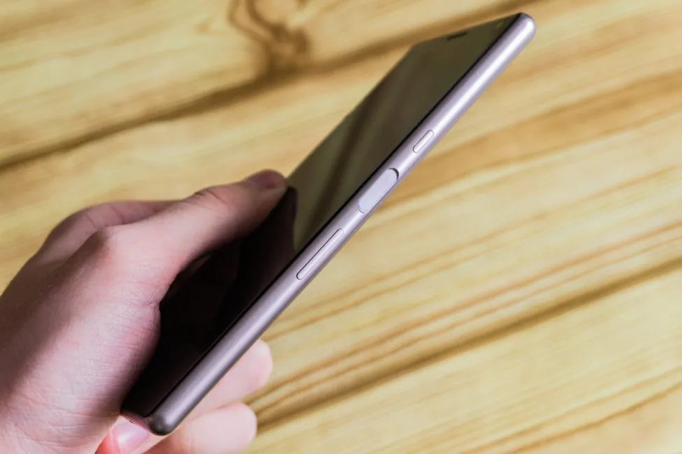
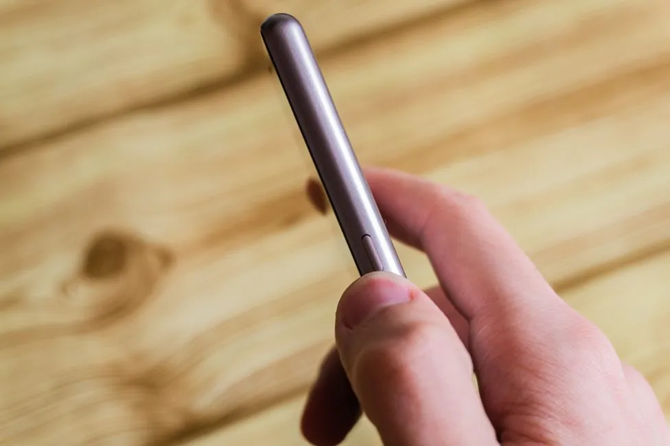
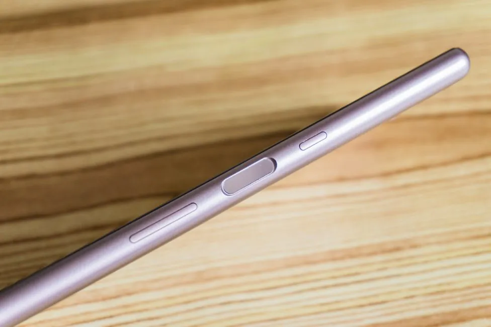
To the right there is a power button, a separate mirror area of the fingerprint scanner and a volume control button. The main feature, the shutter release or camera launch control key has disappeared.
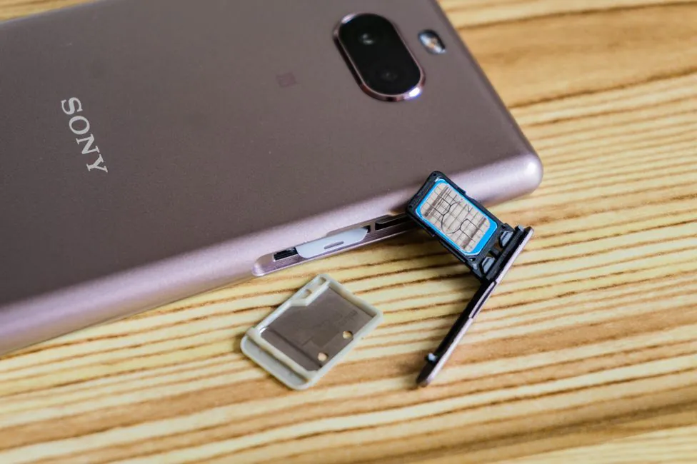
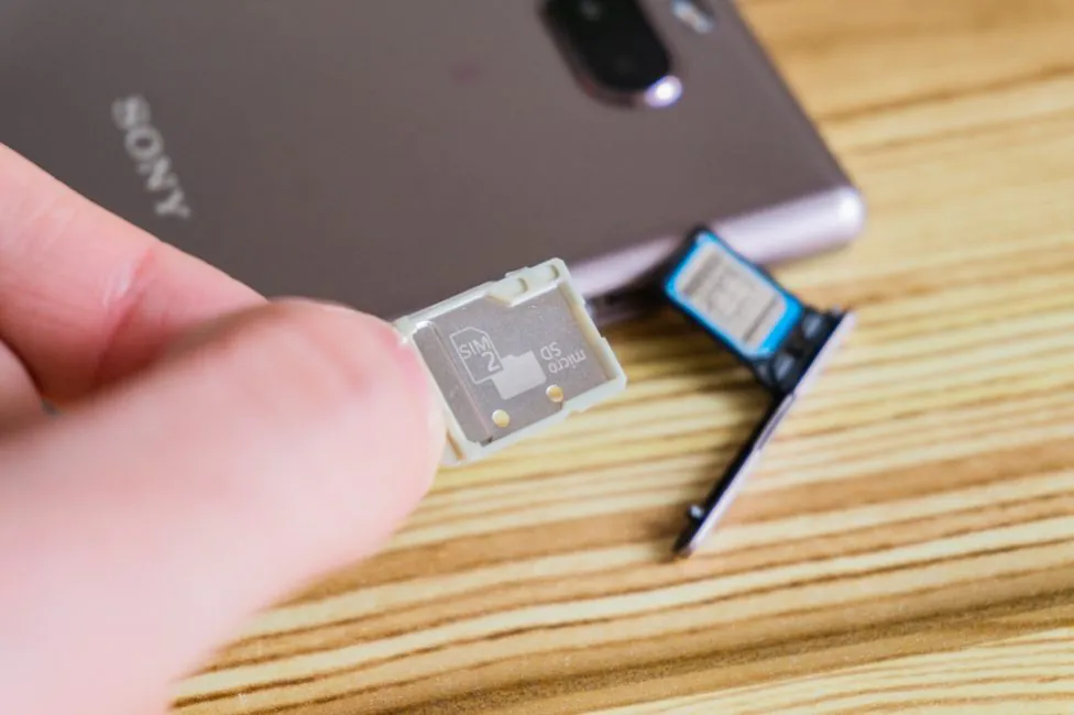
On the left side there are slots for cards. In general, the situation here is a bit strange: in the 10 Plus version took the trey from XA2 series; we’re talking about three slots. But the junior version received a tray-lid for one SIM and the second tray that’s combined: microSD/nanoSIM. Why, it is not clear.
In addition, it looks like something strange – that second tray is different in color and I could not get it with a fingernail. You either break a nail, or you don’t get the tray. It seems like you don’t need the eject key, but I had to get it. And of course, Sony’s smartphones still reboot when removing the slot…
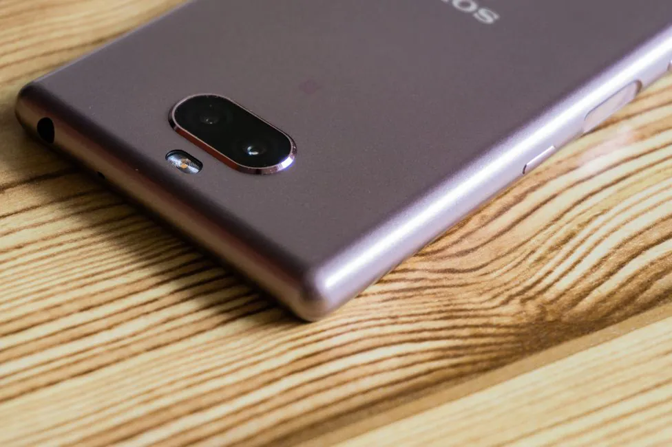
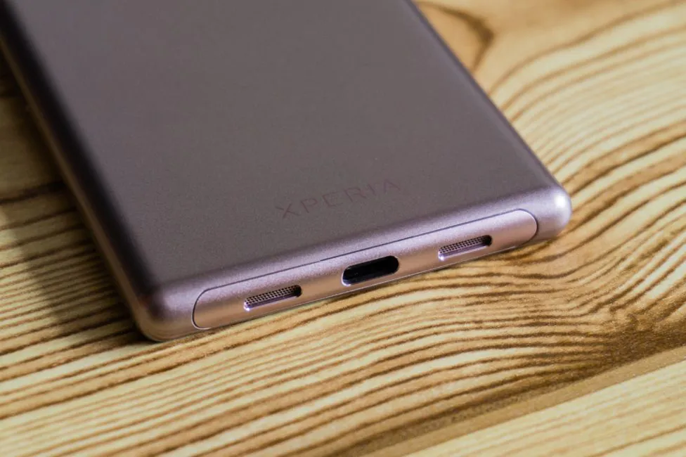
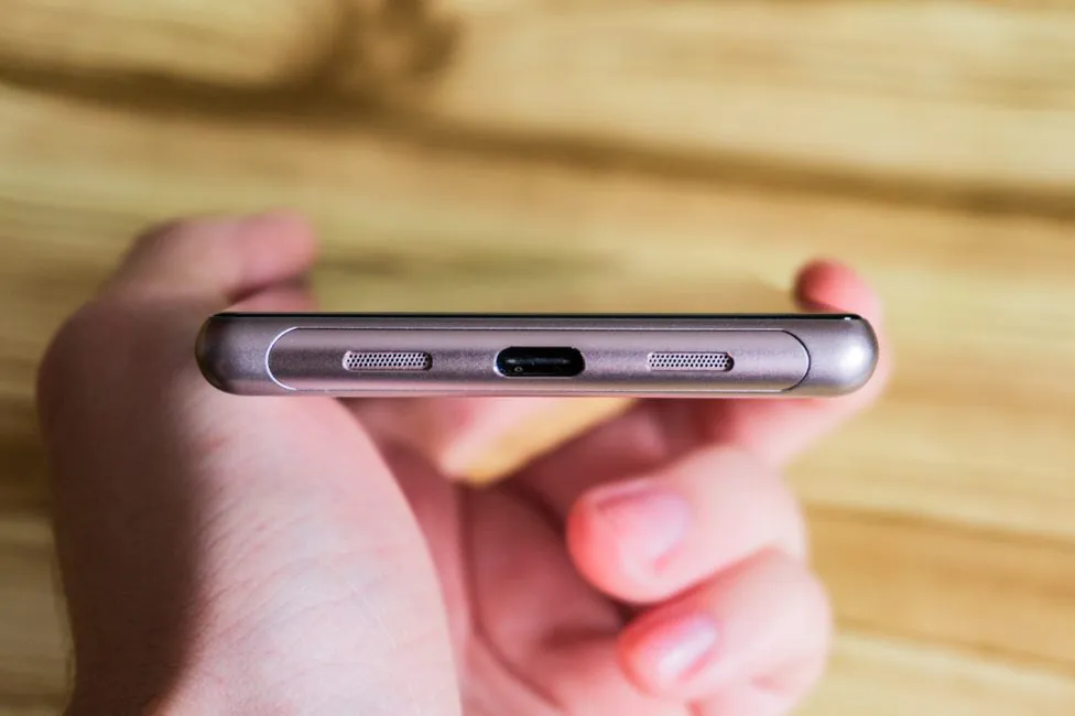
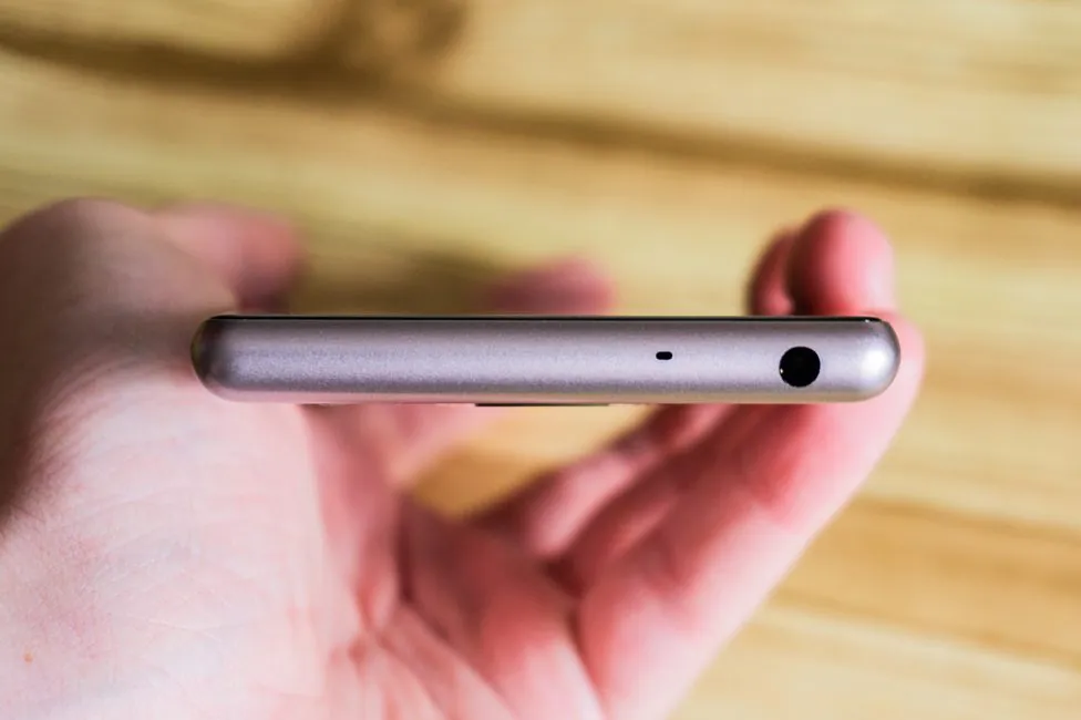
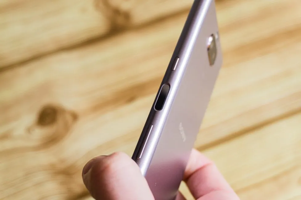
The lower end: symmetrical cutouts with a speaker and a microphone with a Type-C port in the center. On top there is a 3.5 mm audio port and a second microphone.
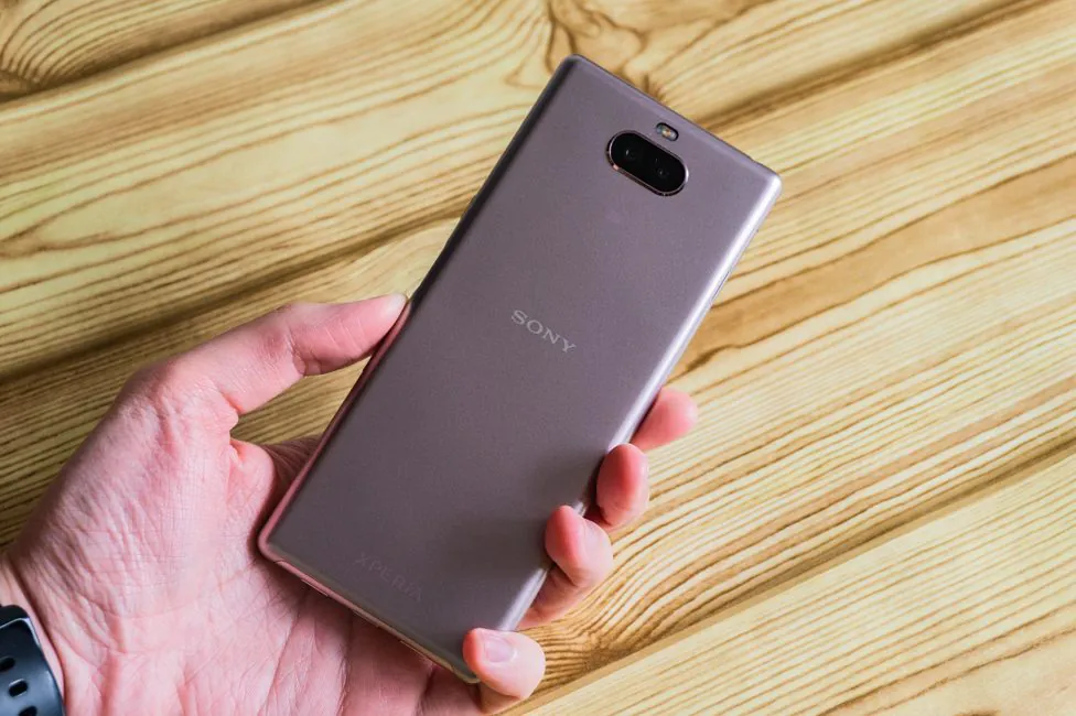
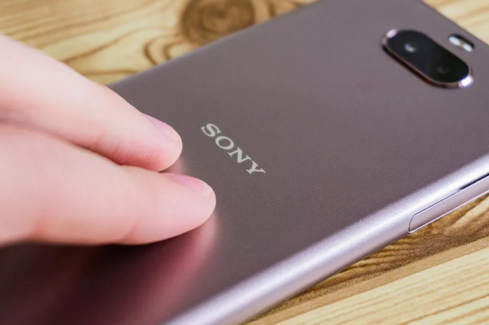
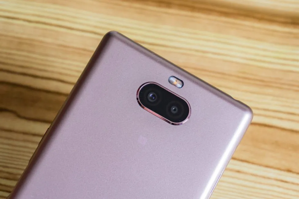
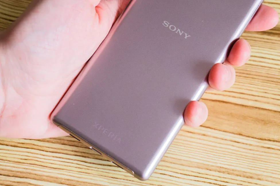
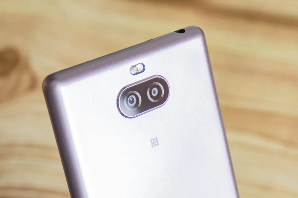
On the rear panel on top we have a flash, a slightly protruding oval block with two cameras with the frame around. Under the module is an NFC icon. In the center there’s Sony logo, below – Xperia’s.
Ergonomics
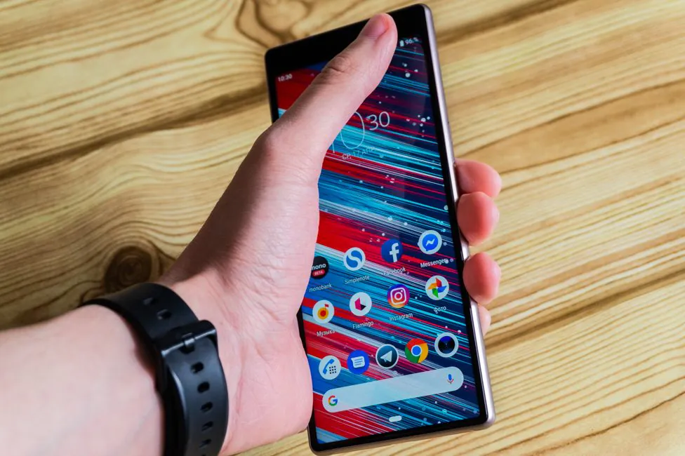
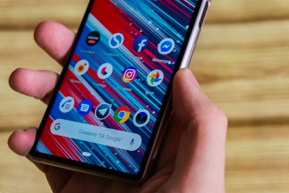
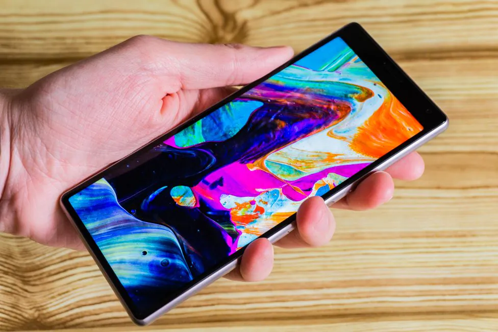
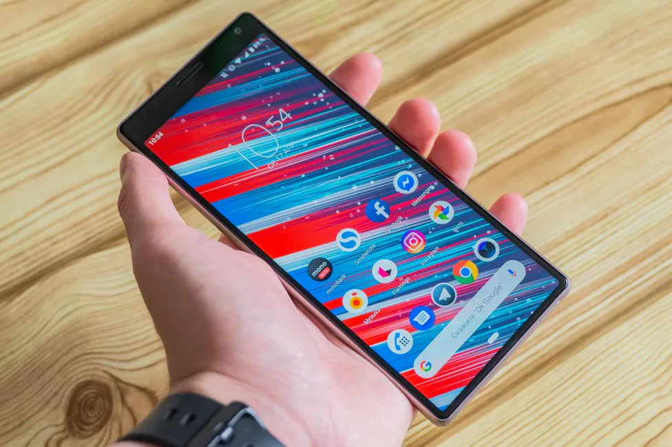
The main point that distinguishes Sony’s new products is the “movie” aspect ratio of 21:9. Consequently, the smartphone turned out to be high in size – 155.7 mm. But it is very narrow – 68 mm. Because of this, you can use Sony Xperia 10 conveniently and even comfortably reach the top corner.
But Sony is Sony, which means expect some quirks. I am talking about the control buttons. They are too recessed into the body, I mean you can find them, but it’s really unpleasant to press.
Next, their position. The power button – ok, the fingerprint scanner – okay, the volume – fiasco. Why is there a separate platform for the scanner when you can combine it with the power key? Sony was known to do this. And yes, this scanner is convenient to use. The thumb of the right hand falls on the platform as it should, and the index finger on the left too.
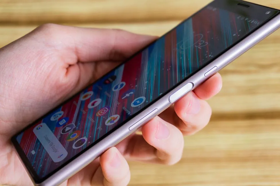
But because of this, the volume key suffers greatly. It is still possible to raise volume, but to lower the volume level you have to move your fingers down, which is a bit scary to do on the go. There was a good way of designing the phone, but Sony decided otherwise.
Sony Xperia 10 display
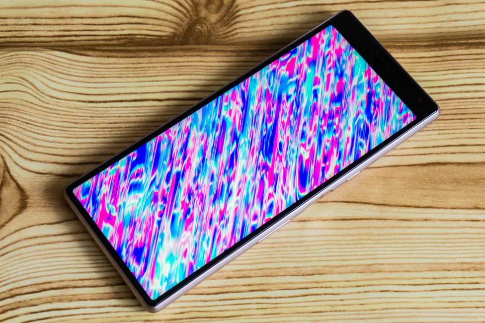
The Sony Xperia 10 has a 6″ screen, with IPS matrix. Its resolution is 2520 × 1080 pixels. As you can see, on one side it is unusually high, almost like QHD at 16:9. However, the width makes it clear that this is Full HD. Such are the realities of long displays with an aspect ratio of 21:9. But you don’t need to worry, because we have a density of about 457 ppi.
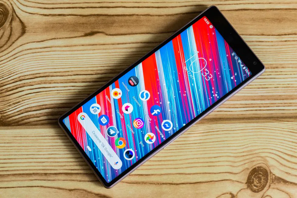
By the way, since we are talking about the aspect ratio of the screens, a few days before the announcement of Sony Xperia 1, 10 and 10 Plus we were showed a bendable Samsung Galaxy Fold, which has a small 4.6-inch screen when folded and also 21:9. And in general, if you go deeper, LG tried this format nine or ten years ago, but back then it was not a smartphone, but a mobile phone – LG BL40.
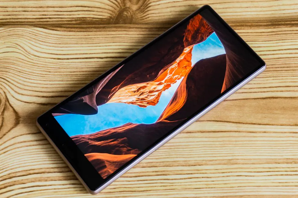
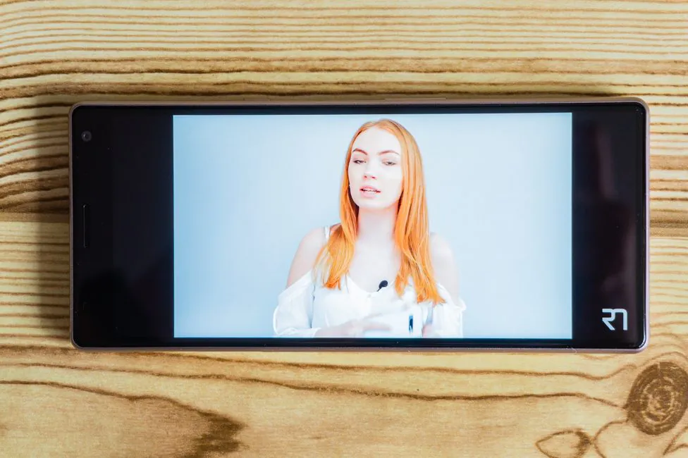
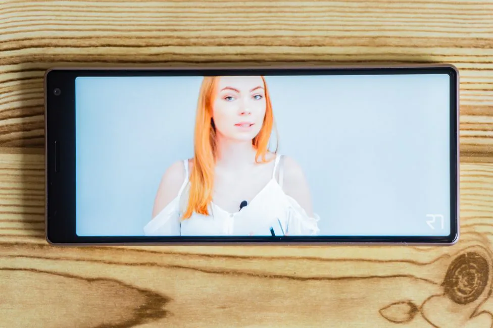
But back to the present. The quality of the IPS-matrix is not bad, but I did not see any obvious improvement compared to XA2 Plus. Why, the issues are basically the same – white color distorts at an angle like you would expect from IPS. And a slight fading of dark shades under certain angles.
The display has a decent margin of brightness, good saturated colors and normal contrast. Viewing angles are quite good.
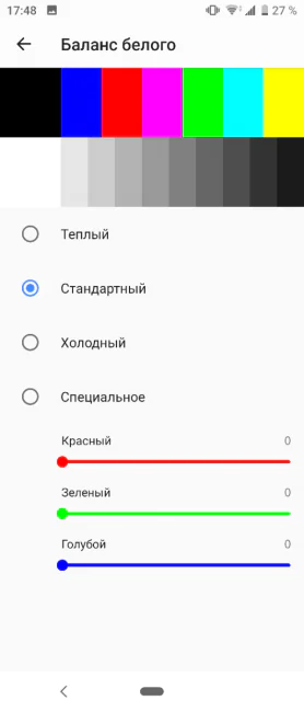
Of course, the color gamut can be customized – there are three modes in all: pale (without improving the image quality), optimal in my opinion (standard), and oversaturated (maximum brightness mode). There is also a fine adjustment of white balance and night mode. Intelligent backlight means that the screen will not turn off while the user is looking at it.
Auto-brightness works well and they have finally fixed the accelerometer that is too sensitive.
Screen 21: 9 – is it worth it?
Referring to the manufacturer’s official website, we can highlight the following theses of using the “cinema” aspect ratio:
- More comfortable simultaneous work in multiple applications
- More screen content
- Movie without the black bars
- Take a photo or video in this format
- Convenience
There is a certain sense in these theses, but how much is it necessary in the current realities? Personally, I can only agree with two points – more information is placed on a single screen in social networks and a narrow smartphone is really more convenient to hold in your hand. Films? I do not watch them on smartphones. I do not use many windows, only the picture-in-picture mode. With 21:9 I do not take pictures in the same way – in general, I recognize only 4:3. Again, I emphasize – everything is subjective. I don’t really understand the need to move to this aspect ratio when I have a 18:9 device.
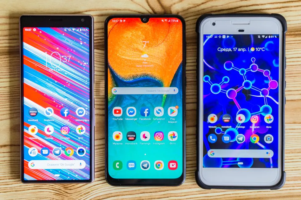
YouTube videos can be stretched to full screen with the usual zoom gesture. And here’s the thing. If the author of the video made it in 18:9 format, then you do not lose anything. But at 16:9 you can already see the cropped picture.
The films in the original cinematic ratio look good. In the regular you can find a sample trailer for a cartoon.
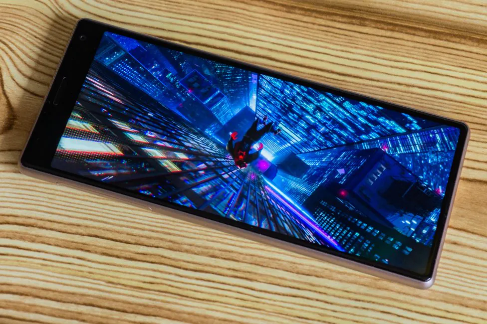
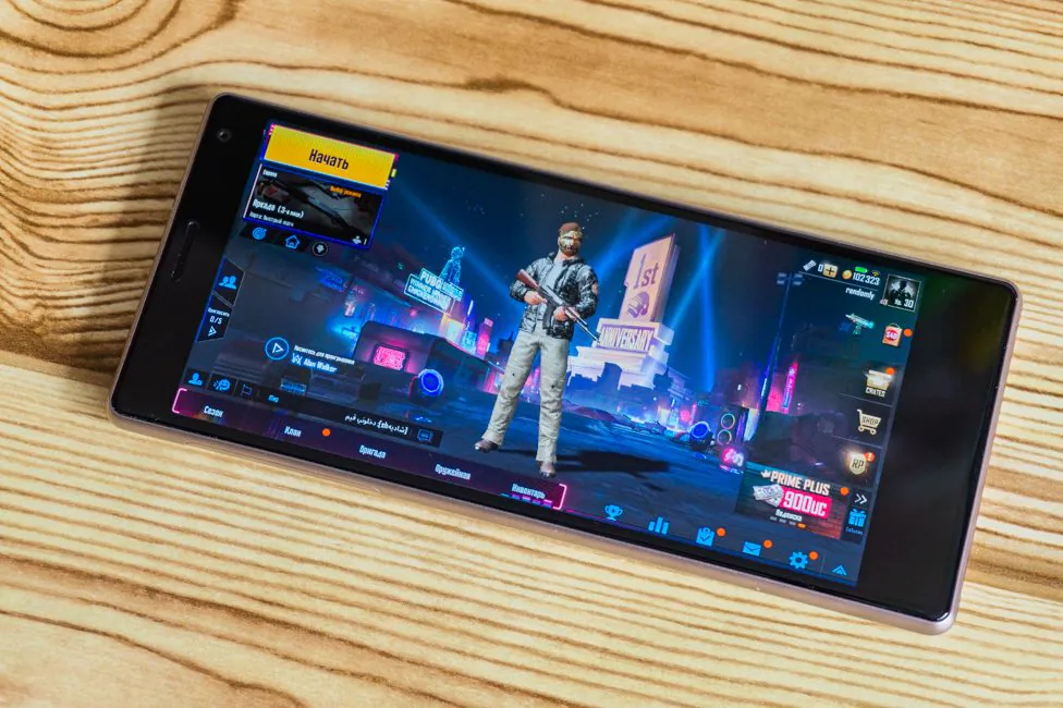
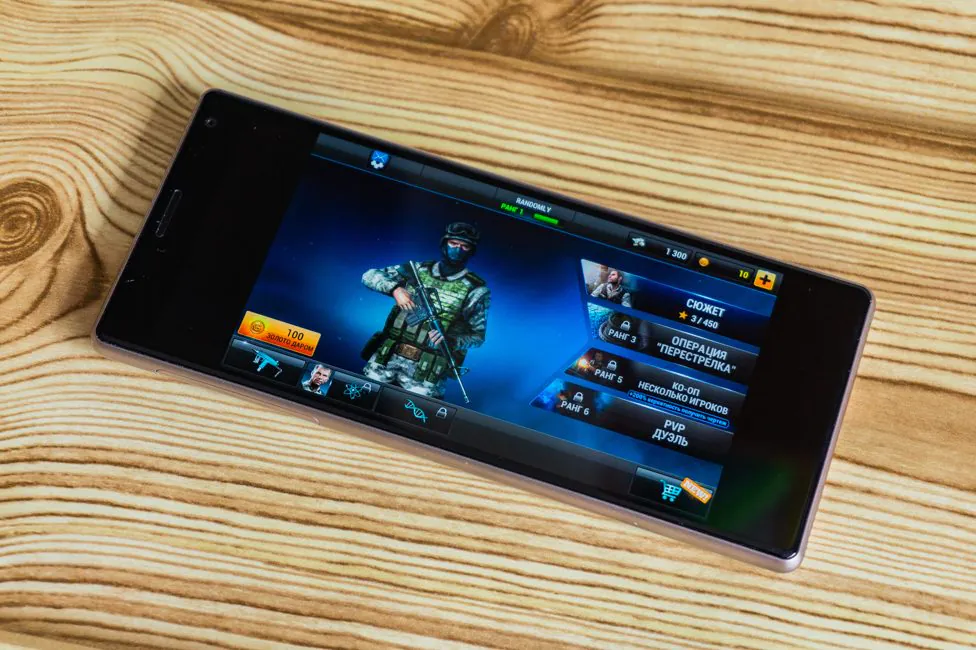
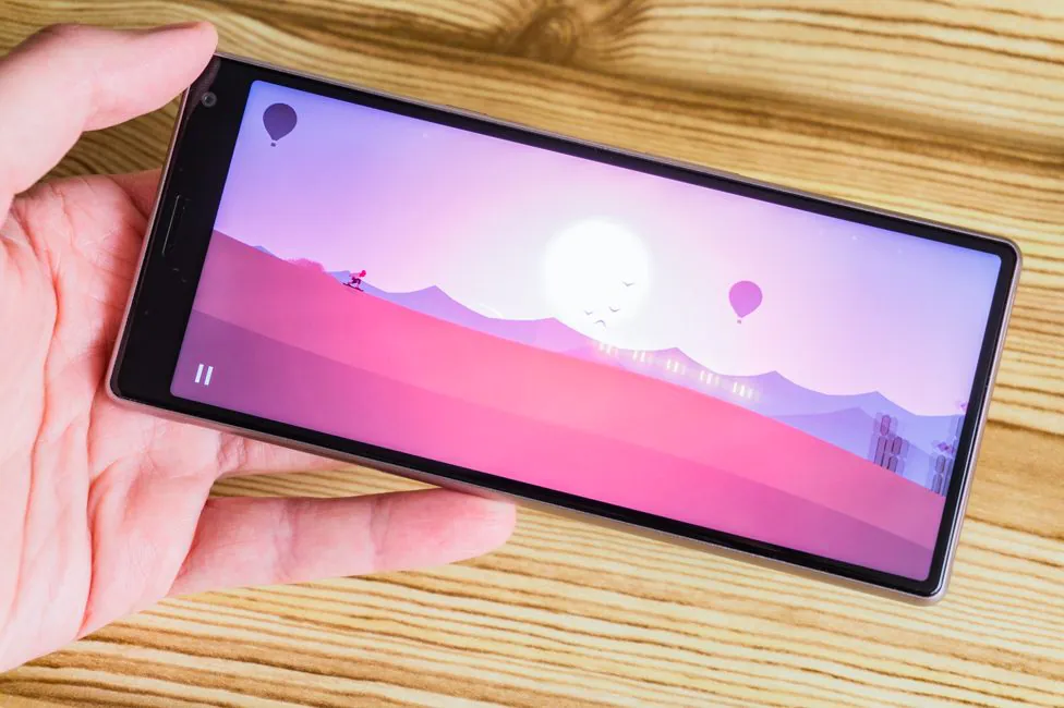
So far, the question about applications, or rather games, stands. No, of course there are many projects that are displayed in full screen. But I also seen those who “do not understand” such screens and are displayed at 18:9 or even at 16:9. This compression makes gaming really uncomfortable. Who wants to run PUBG in a small “window”? In general, 21:9 is irrational.
Sony Xperia 10 Performance
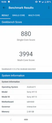
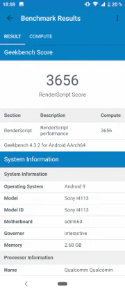
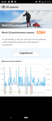
It’s time to do something about it as soon as possible. And by “it” I mean Qualcomm Snapdragon 630. The platform is almost two years old and there are already more productive mid-level chipsets. Like 636th. Or even 660th. And this, frankly, greatly upsets me. Nothing changes! Hardware deserves no explanation – it’s 14-nm, 8 Cortex-A53 cores with a maximum clock frequency of 2.2 GHz and Adreno 508 graphics.
The number of gigs of RAM depends on the region. In our case, only 3 GB. This can be forgiven for a smartphone for $200, although even there it’s possible to find 4 GB. But for $370? Sony Xperia 10 is not strong enough in terms of multitasking.
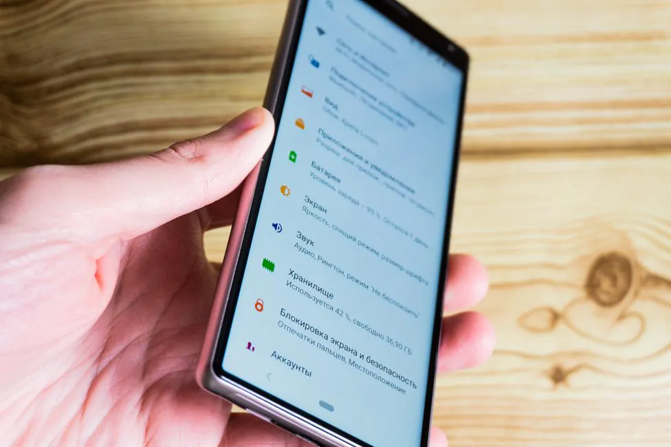
But thanks at least for the fact that the memory in the drive is now not 32, but 64 GB. In comparison with the XA2 Plus, there has been obvious progress. However, there is not a lot of free space – 46.79 GB. The rest is reserved by the system. You can install a microSD memory card, provided that you do not need a second SIM card. Why make it that way?
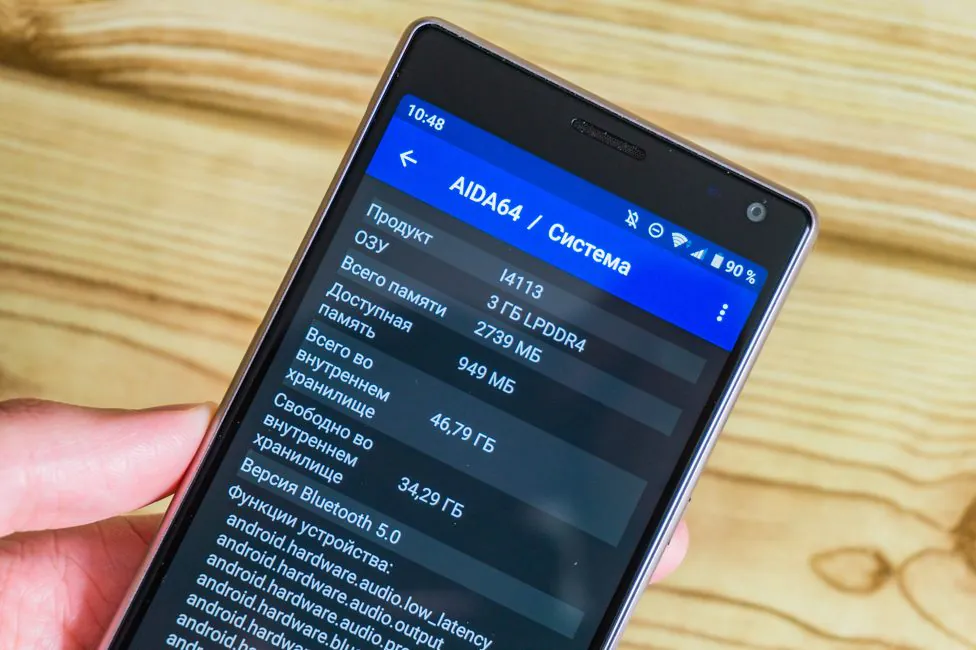
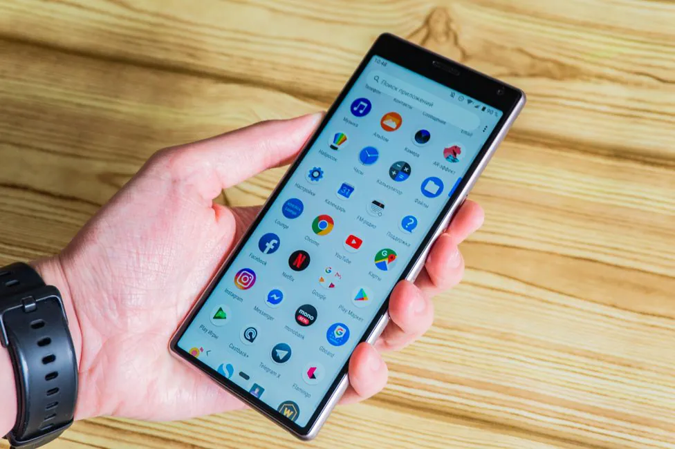
Xperia 10 doesn’t have a smooth interface. The animations sometimes slow down. However, the launch of applications is quite fast. Though I’ve seen better.
With games, the situation is similar, you can play simple time killers without problems. The heavier projects run on medium settings.
Sony Xperia 10 cameras
Sony Xperia 10 is equipped with a dual camera. As they say, better late than never. But is there any sense in it – we still have to find out today. But first, the characteristics. The main module with a resolution of 13 megapixels and an aperture of f/2.0. FR of 27 mm, sensor size 1/3″, pixel size 1.12µm. Focusing system – phase (PDAF). The second camera is a 5 MP, f/2.4, 22 mm, 1/4 “, 1.4µm depth sensor and is needed to blur the background.
The quality of the pictures is not particularly impressive. Afternoon on the street is not bad, as always. Detailing and sharpness are good, the colors are good. But in a room with a rather low level of illumination, the smartphone staggers. The device tried to fight the noise, turning small details into “watercolor” paintings. Bad conditions aren’t for Xperia 10. Same issues, once again. Macro is still absent. It is difficult to take pictures of objects close to the lens. When it’s dark, the camera gets slower.
PHOTO EXAMPLES IN FULL RESOLUTION
From the second camera, to be honest, there is little use. There is a dedicated bokeh mode in which you can adjust the degree of blur. But the separation of the object from the background is not very neat. The mode is almost useless.
You can shot video at the maximum resolution of 4K with 30 FPS in the format of 21:9 or 16:9. It is also possible to shoot Full HD and 60 fps, but only at 16:9. In general, the quality of the 4K clips is pretty good. Stabilization, however, cannot be enabled. Branded SteadyShot can only be activated with 1080p @ 30FPS.
Front camera module has a resolution of 8 megapixels, f/2.0 aperture, focal length 24 mm. It shows good detail and a fairly wide viewing angles.
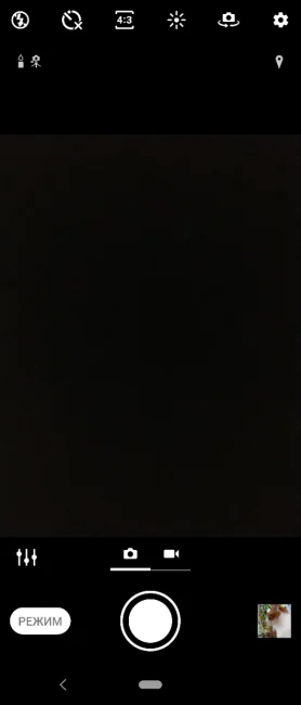
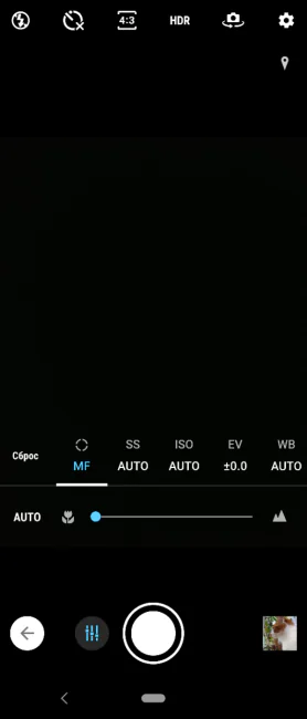
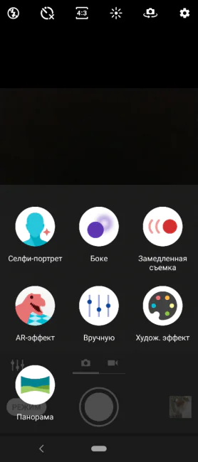
Camera application is traditional. There are panoramas, a couple of other effects, slow-motion video, bokeh and manual mode. The latter can be useful if it is important to get a wider dynamic range. Sony for unexplained reasons hid the HDR in the manual settings.
The fingerprint scanner
It is located, I remind, on the right side and for some inexplicable reason is a separate entity from the power button. On the other hand, this can be an advantage if you just need to look at the time/notification on the lock screen.
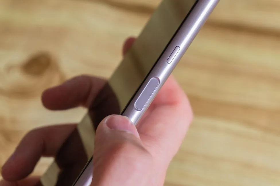
The position of the scanner, as I said, is okay. It works at an average speed, but is fairly stable. Separately, it can be noted that there is no reaction to false touches. Vibration feedback will not annoy every time you touch the scanner area by accident.
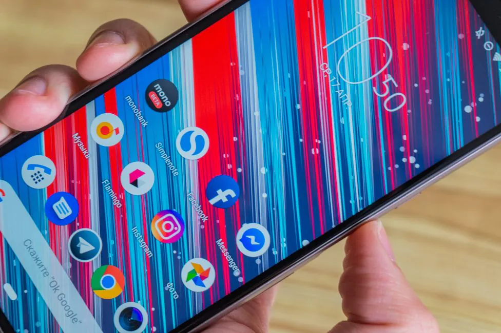
Full facial recognition is absent. Only insecure and inconvenient Google Smart Lock.
Sony Xperia 10 battery life
If you look at the battery Sony Xperia 10, it’s actually depressing. 2870 mAh in 2019 is very bad. But the situation is not terrible, but rather ordinary, as for a modern smartphone. We’re talking about a full day of work and up to 5 hours of display activity. If you use the device sparingly, you can stretch the battery a little longer. But don’t expect much.
I could not check the charging speed of the bundled unit, I was given only the cable.
Sound and communication
The earpiece speaker is okay. There’s only one multimedia speaker. Unfortunately, the earpiece speaker doesn’t cooperate with it. I mean if this is a smartphone for movies, stereo sound would be very useful. The speaker itself sounds very loud, but the quality, of course, is average.
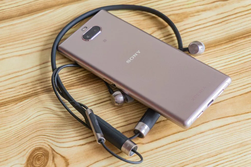
In headphones, the music sounds differently. You can twist the equalizer and experiment with different effects. Some work with wireless headphones.
Tons of wireless standards are supported. There is a dual-band Wi-Fi 802.11 a/b/g/n/ac, current Bluetooth 5.0 (A2DP, aptX HD, LE) and GPS (A-GPS, GLONASS). Traditionally for the company’s smartphones, the NFC module is also present. In principle, there are no problems here whatsoever.
Firmware and software
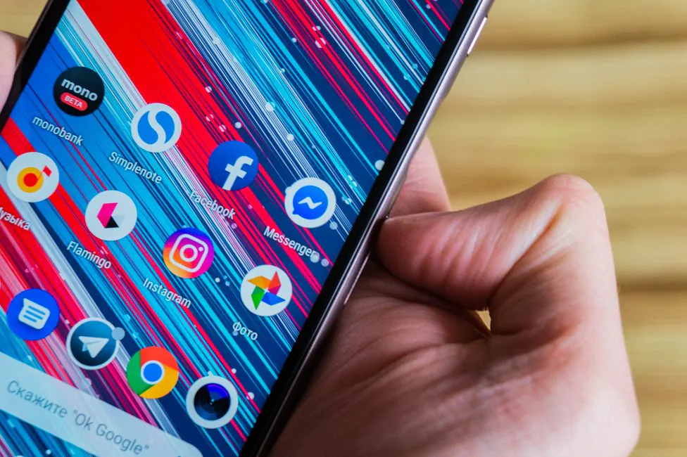
Sony almost never interferes with the software with unnecessary gimmicks and therefore the software here is close to Android in its original interpretation. In this case, 9 Pie.
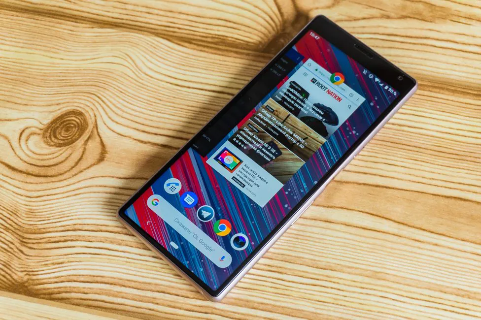
From the original system, only “Digital well-being” is missing, and even the new navigation system with a “pill” in the center and a button back to the left is there. The menu of running applications is also original, but if in a clean system the different applications are docked every time, then they are fixed in the Sony shell. Another interesting feature is that by holding the application shortcut, in the shortcuts submenu, you can see the split screen icon.
The Side sense feature has migrated from the previous Sony Xperia XZ3 flagship in Xperia 10. I talked about it in detail in its review. There is also one-handed control mode; you can pin camera or Google Assistant to double-pressing of the power button.
Verdict
Sony smartphones’ uniqueness dazzles me. On the one hand, they have a certain charm. Xperia 10 looks interesting and has a peculiar aspect ratio. It has its uses, and if you like to watch movies on the device, the phone will do just fine.
On the other hand, it’s uncompetitive in almost any other way. The display is fine, but has its issues. The hardware is not powerful enough, and both camera and the battery are mediocre.
Overall, the device is not worth its price. There are too many way more interesting phones. But only you can decide whether to buy it or not.
Subscribe to our accounts:


