© ROOT-NATION.com - Use of content is permitted with a backlink.
New reports point out that the WhatsApp new look is currently rolling out to all, and we have a thing or two to say about this new design. Over the past few months, WhatsApp has been bringing some subtle changes to its Android and iOS platforms. These changes have greatly impacted on how we interact with the app, thanks to its new controls and overall layouts.
However, up until now, these bit-by-bit updates have not reached everyone. For example, I was the first in my Android friend group to get the bottom navigation bar on my WhatsApp application. Aside from the Android app, WhatsApp for iOS is also getting a significant upgrade, bringing a truckload of design changes to the platform.

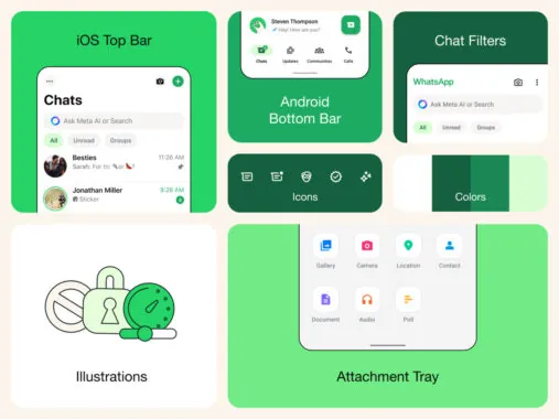
WhatsApp is now announcing that they are updating the overall appearance of the app on both major smartphone operating systems. This update will not only make the app fresh but also simple and approachable. Some of these design upgrades on the app are the new iOS top bar, Android bottom bar, Chat Filter feature, the new attachment tray, and illustrations across the app.
On Android, the navigation bar loses the green colour theme that was a predominant feature of the app. Dark mode is also now darker to reduce strain on the eyes while in use on both Android and iOS platforms. If you look closer, you’ll also notice that the shade of green on the app is much cleaner than on the previous version.
While this new WhatsApp look is coming to both Android and iOS, some design changes will not be shared. Regardless of the platform that you use, you’re in line to get this design update. So, head over to the Google Play Store or the App Store and update your app to get the WhatsApp new look on your device.


