© ROOT-NATION.com - Use of content is permitted with a backlink.
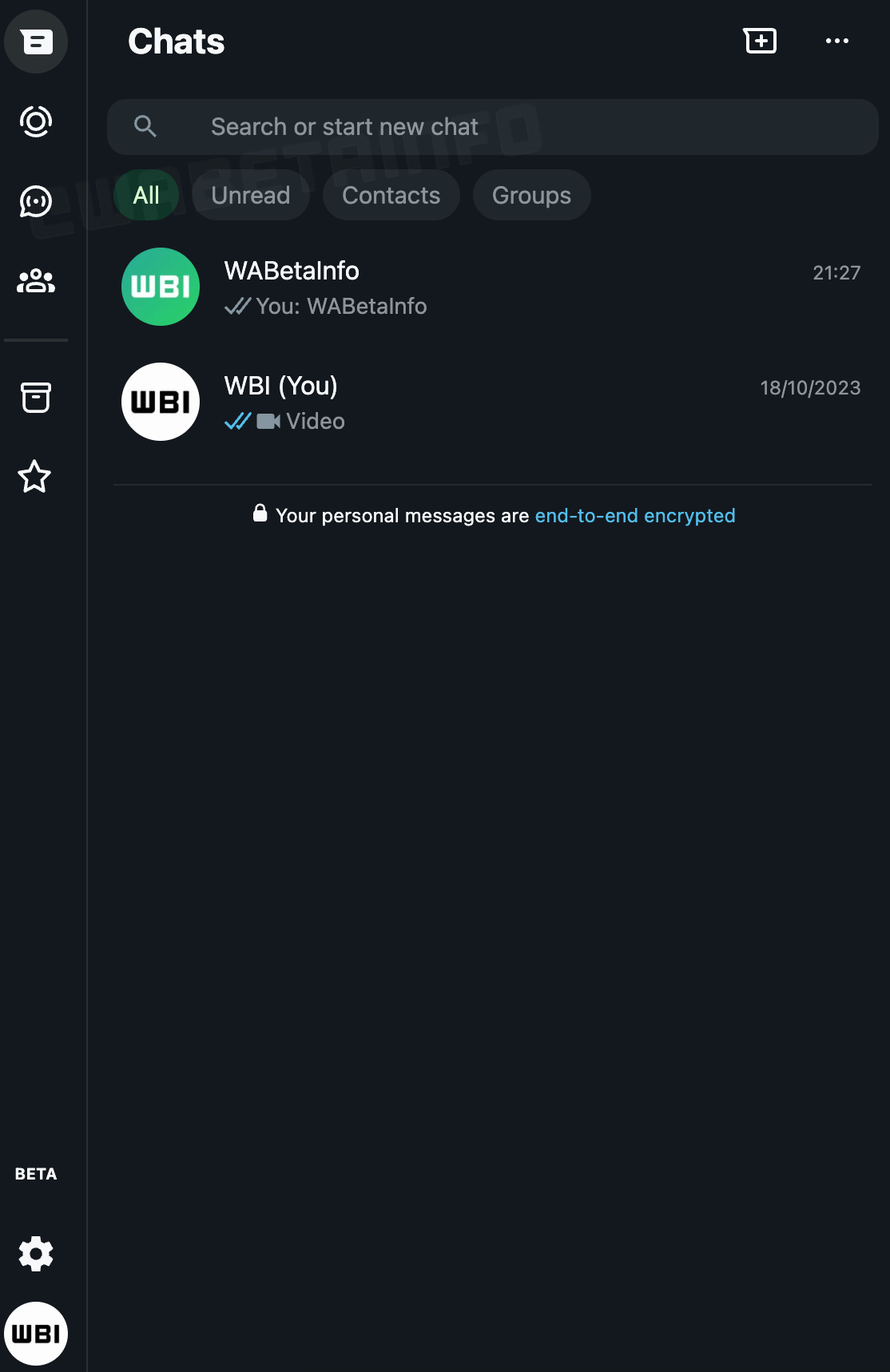
The WhatsApp Web interface that you are currently used to seeing is preparing for a makeover. This makeover will bring a new sidebar as well as a new background colour for the dark theme interface. These changes will help improve the user experience on the web platform, and users might love the changes that are coming.
At this moment, the folks at WABetaInfo can confirm that this new interface is under development and will roll out once available. Users might find the coming sidebar more accessible as they navigate between various aspects of the interface. Currently, the navigation taskbar on WhatsApp Web sits at the top of the interface and might be a bit of a reach for some users’ navigation with a mouse or trackpad.

By bringing this taskbar to the right-hand side of the interface, WhatsApp will make things a bit more accessible for users. As you can see in the picture above the coming sidebar will sit the chat, status, channel, and community buttons for navigation. Under these buttons are two more buttons for achieved and starred messages, so users can get to all their chats with ease.
Accessing the settings and user profiles on the WhatsApp Web platform will be possible from the base of the new sidebar. Despite moving most navigation buttons to the sidebar, this redesign or makeover left some buttons at the top of the interface. These buttons are the new chat and options buttons, and they now sit on the top right-hand side of the interface.
This new sidebar will enhance the look of the interface, and so will the new dark theme colour. Both the new sidebar and the new dark theme colour for the web platform are now under development and accessible to some beta testers. Once it’s ready for rollout, it’ll get to users via an OTA upgrade to the web platform.


