© ROOT-NATION.com - Use of content is permitted with a backlink.
The Moto G Pro, known in America as the Moto G Stylus, is an unusual smartphone in the budget price range (around $250). It’s based on the pure Android One, quickly receives updates, has an modern design with a notch for the front camera, and also – the most interesting! – a stylus that fits into the phone itself. Let’s see what kind of beast the Moto G Pro is.

Motorola Moto G Pro specifications and price
- Screen: S-IPS, 6.4 inches, 1080×2300 resolution (397 ppi)
- Processor: Qualcomm Snapdragon 665; 4×Kryo 260 Gold (Cortex-A73), 4×Kryo 260 Silver (Cortex-A53)
- Video chip: Adreno 610
- Memory: 4 GB RAM, 128 GB ROM, MicroSD slot (up to 512 GB, combined – you can use either a second SIM or a memory card)
- Main camera: 48 MP, f/1.7 + 16 MP f/2.2 wide-angle module, viewing angle 117° (action camera) + 2 MP f/2.2 macro lens + depth sensor
- Front camera: 16 MP f/2.0, without autofocus
- Mobile Internet: LTE, HSDPA, HSUPA, EDGE
- 4000 mAh battery, fast charging 15 W
- Dimensions and weight: 158.55×75.80×9.20 mm, 192 g
- Data transfer: NFC, Bluetooth 5.0, Wi-Fi v802.11 a/b/g/n/ac, USB Type-C v2.0, GPS, GLONASS, BeiDou, Galileo
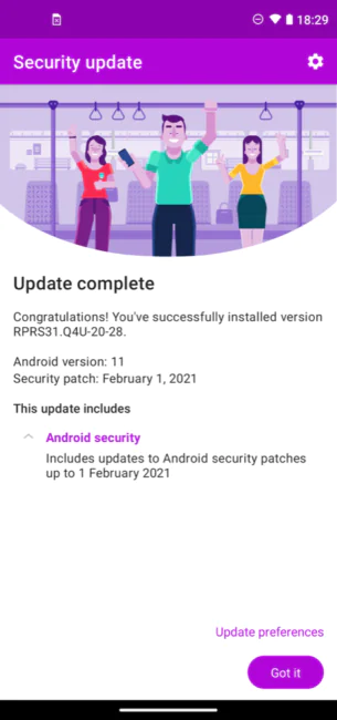
- OS: Android One based on Android 11 (originally Android 10, but an update is available).
Read also Moto G 5G Plus review – A Bargain from Motorola
What’s in the box
In the box you will find the smartphone itself, a SIM eject tool, an 18-watt charger, documentation and a silicone case. The presence of the cover is a nice gesture – you can protect the phone immediately after purchase and not spend money on an additional accessory.
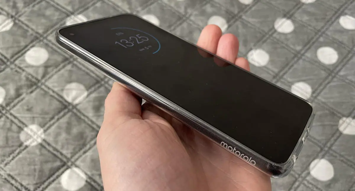
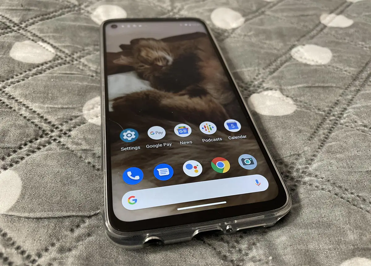
The cover is thin, it increases the grip, while not increasing the size of the smartphone, and has miniature bumpers to protect the display. The only complaint is that the camera unit has no edges, so if you put the phone on the table, the lenses can be scratched.
Moto G Pro design
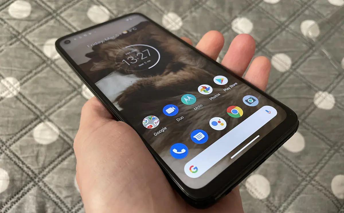
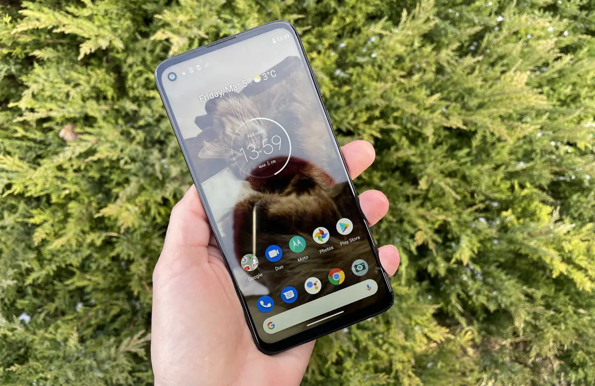
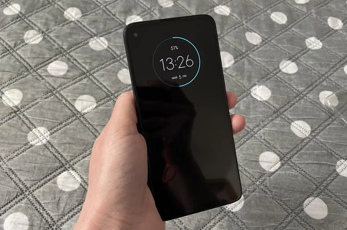
Among budget models, there are still options with drop-shaped notches, so the Moto G Pro with its graceful notch for the front camera looks modern. The bezels of the so-called bezel-less screen are relatively thick, but considering the price, it’s fine.
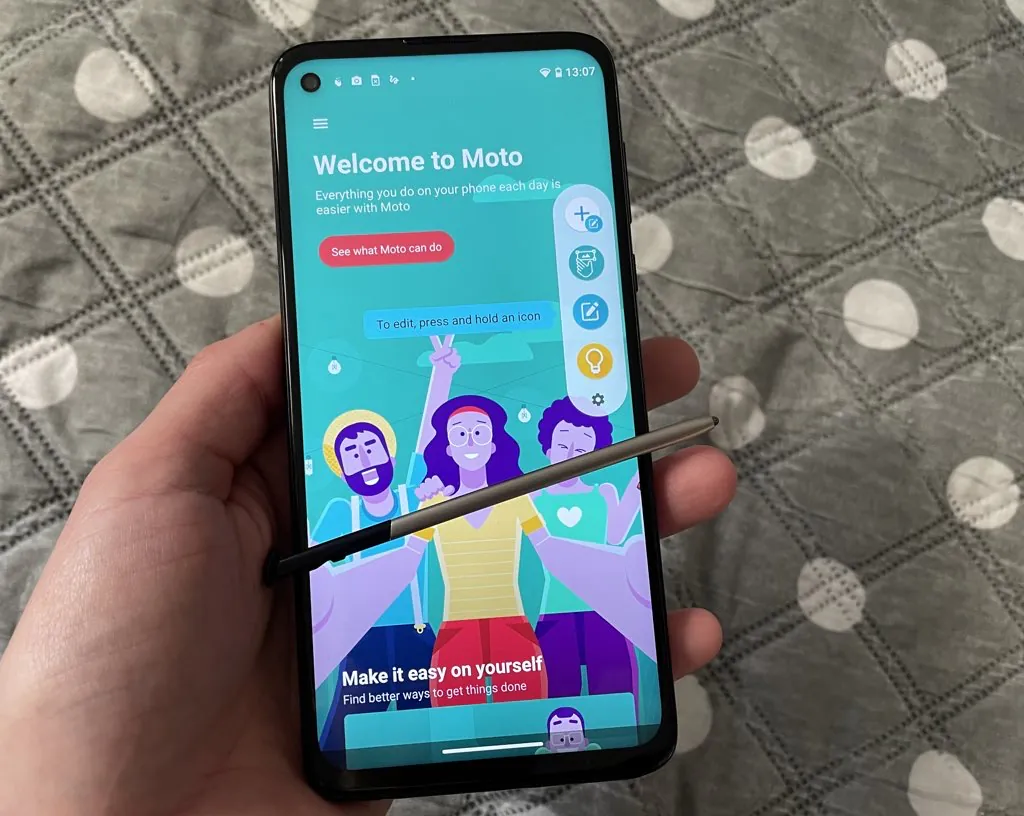
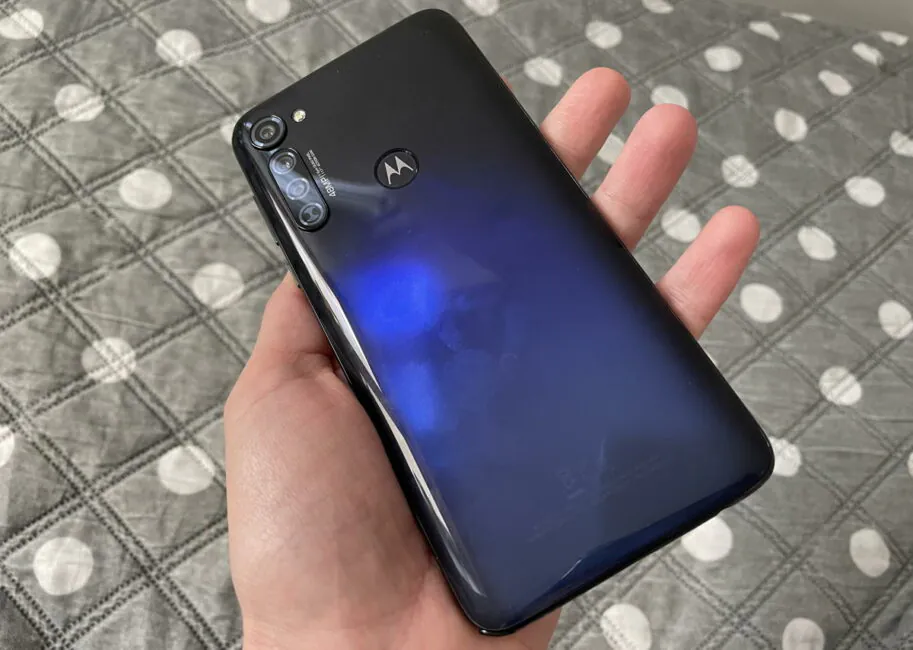
The body is entirely made of glossy plastic, in this model the manufacturer does not even try to imitate metal. It’s plastic both in appearance and in touch. But it is not as slippery as glass, the phone is secure in the hand.
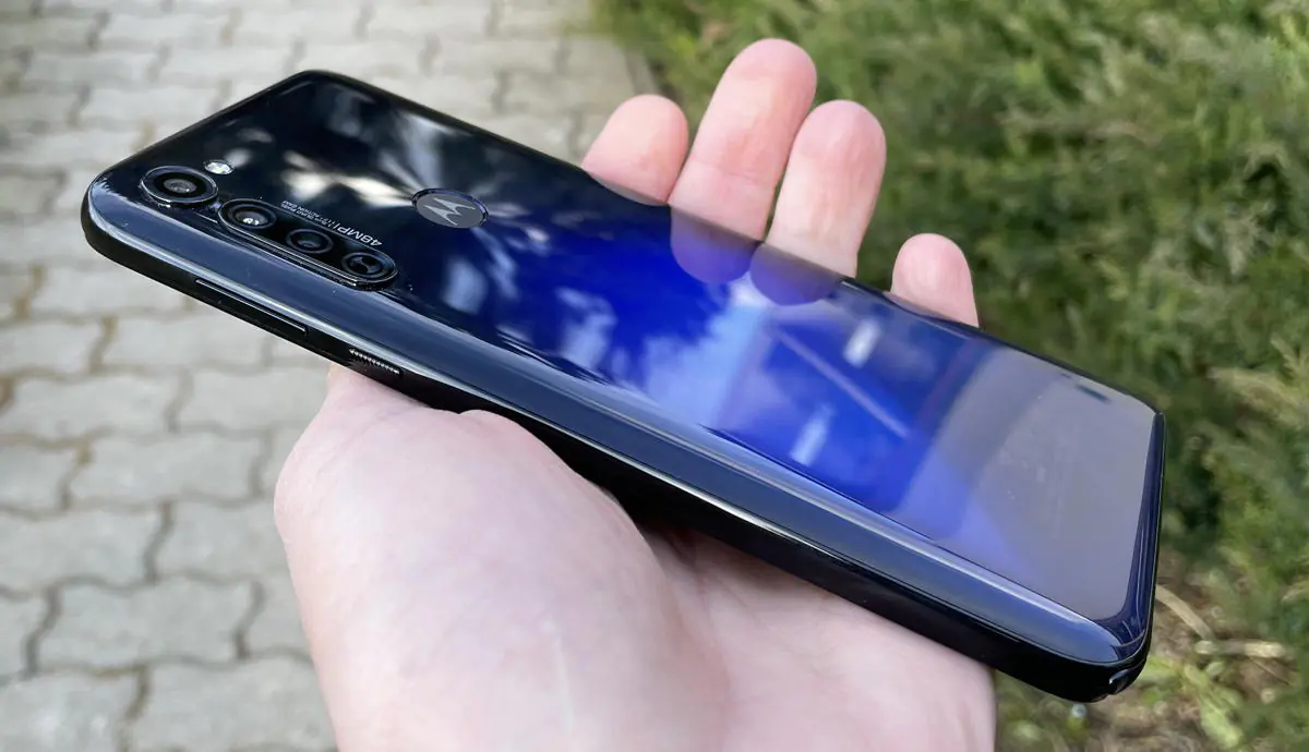
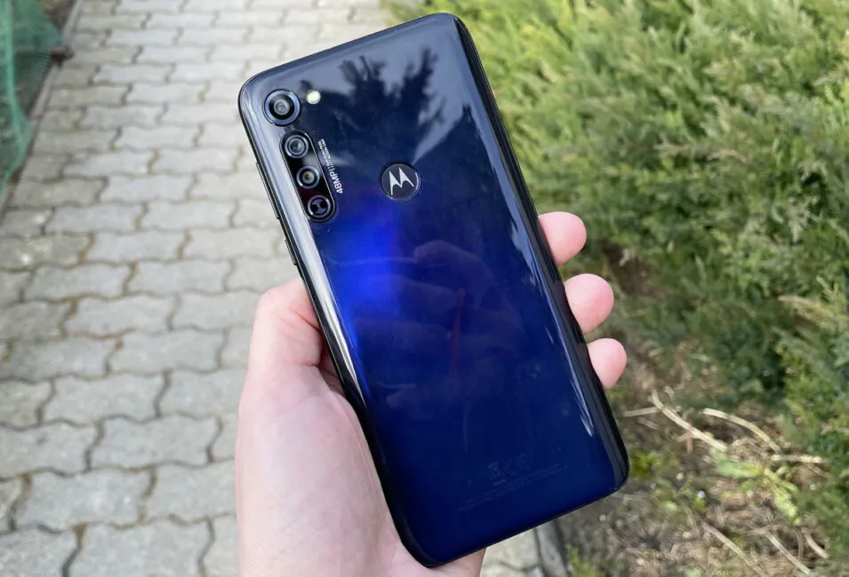
The glossy back panel collects scratches and fingerprints like crazy so it’s best to use a case.
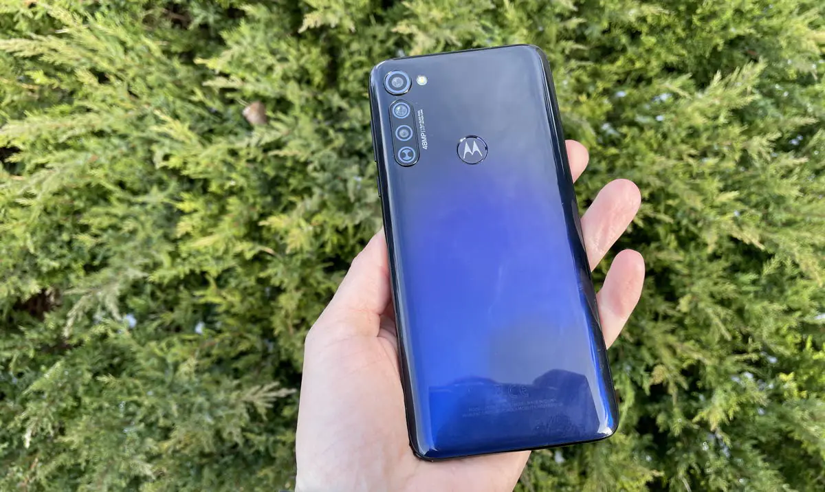
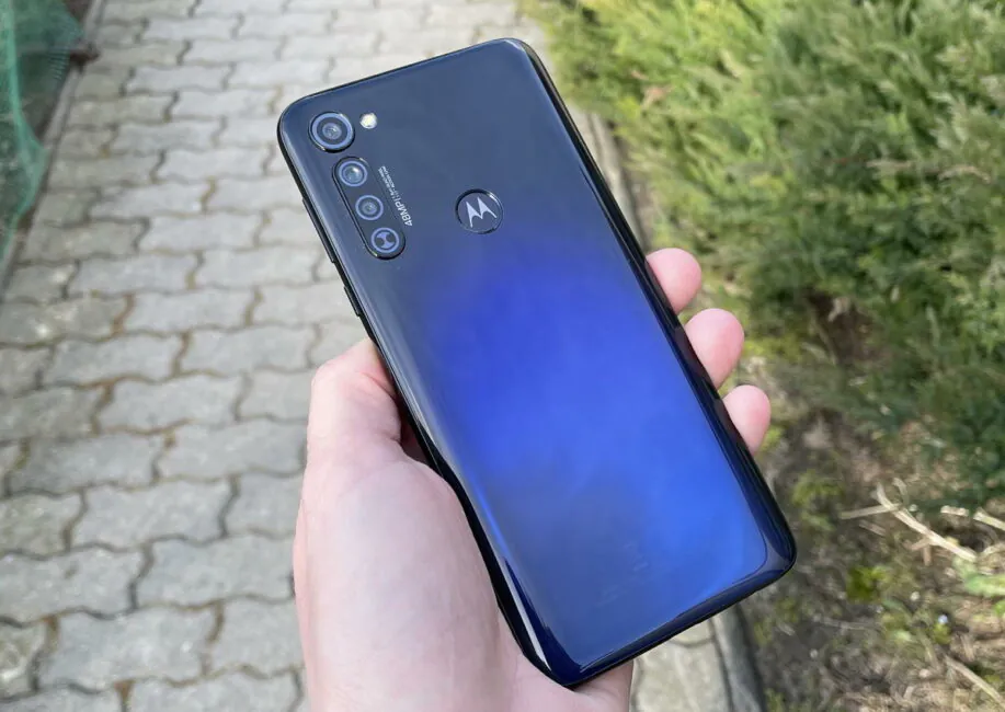
There’s one color, Mystic Indigo. The back cover has a gradient that goes from almost black to dark blue. The color is deep, pleasant, and shimmers beautifully in the light. Sure, competitors have more interesting gradients, but in the end, not everyone wants their phone to sparkle like a Christmas tree.
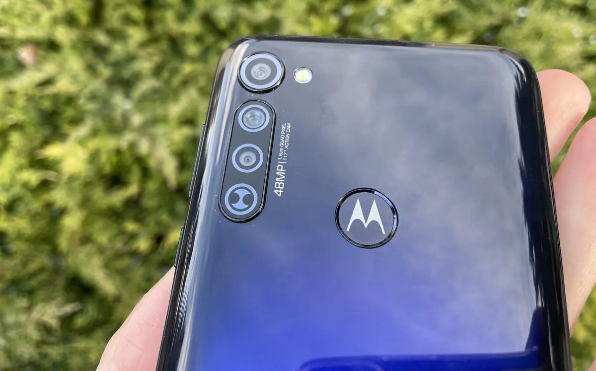
On the back there is a fingerprint sensor. Many low-cost Moto uses sensors in the side button, it’s a pity that this is not the case here. However, the placement of the sensor is comfortable, you can easily find it with your finger, especially if you use a case. Recognition does not always work clearly, but in most cases there are no problems.
The camera block looks solid for an inexpensive model, especially the topmost module, which is designed as if it is larger than it actually is.
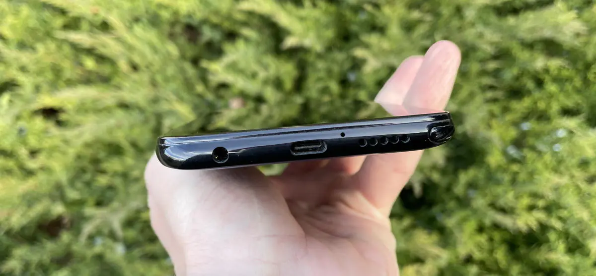
At the top there is only an additional microphone, at the bottom the main microphone, mono speaker, charging jack, 3.5 mm headphone jack, a stylus jack in the corner.
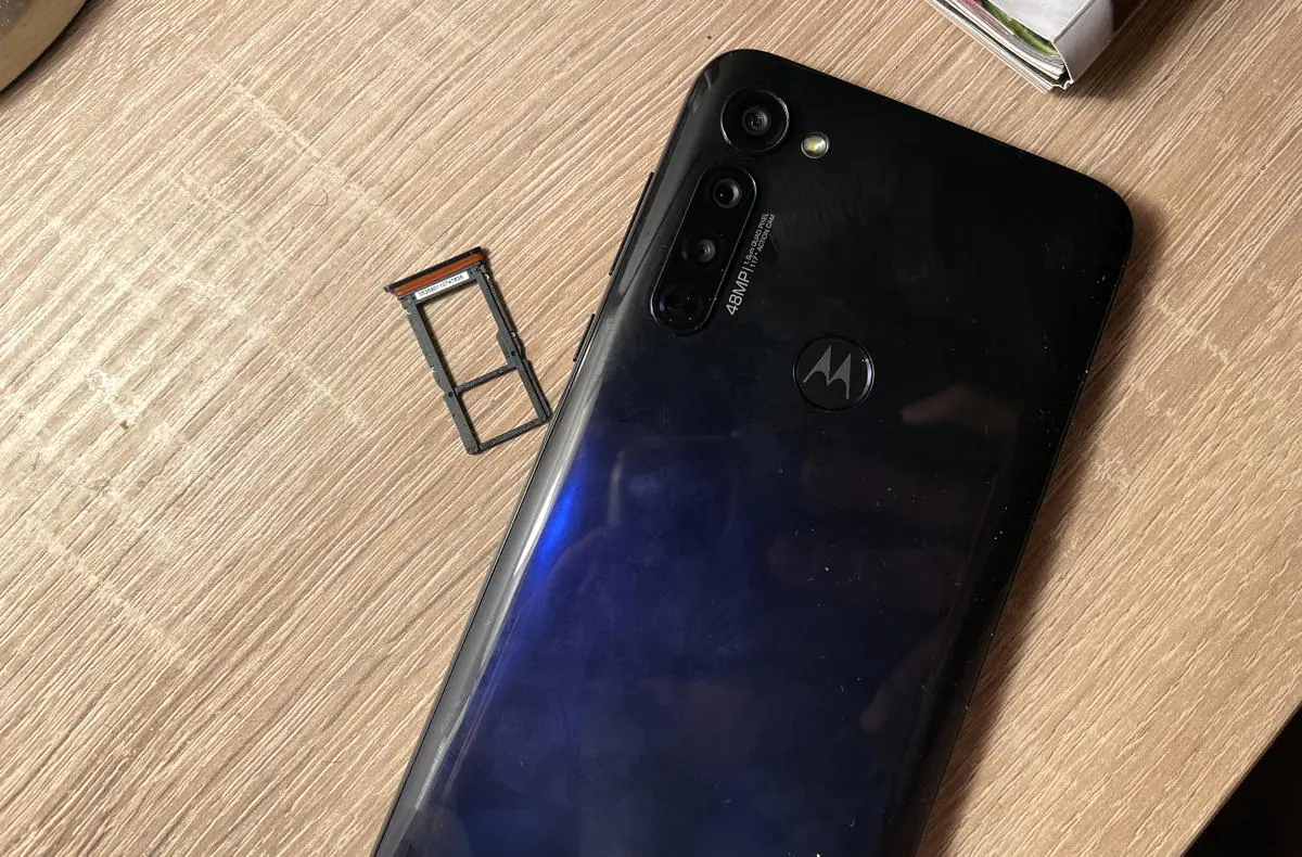
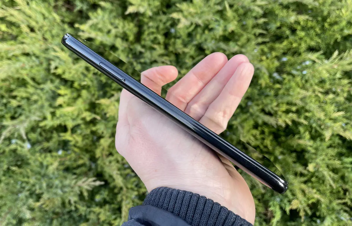
On the left side there is a tray for SIM cards and memory cards. On the right side there is a miniature power/lock button with a raised surface and a double volume rocker.
It’s worth noting that the Moto G Pro has a hydrophobic shell. The smartphone does not have an IP-level water protection, but it is not afraid of water drops or rain. For the same reason, the SIM-card tray is sealed with an elastic band.
Read also: Moto G 5G Plus review – A Bargain from Motorola
Screen
The phone has a S-IPS (Super IPS) screen. There’s nothing super about it though, especially since it was first developed back in the 90s and was the first “improvement” of the usual IPS. However, I will not scold the screen, it is adequate for a budget device. The color reproduction is not bad, and there’s excellent clarity thanks to the Full HD+ resolution (1080×2300 pixels), and sufficient viewing angles. Black depth and contrast are not the best. The maximum brightness could be higher, the screen fades in the bright sun.
The size of the screen is 6.4 inches, which means the screen is not too large and not too small. The aspect ratio is 19.2:9, the display is wide, which especially caught my eye after the Moto G 5G Plus test with a large, long and narrow screen. However, it is possible to use the Motorola Moto G Pro with one hand.
The hardware and performance of the Moto G Pro
The Snapdragon 665 chipset can be considered obsolete today. The processor is very old and while it can surpass some MediaTek models (as, for example, in Redmi Note 9), it is far from more expensive models.
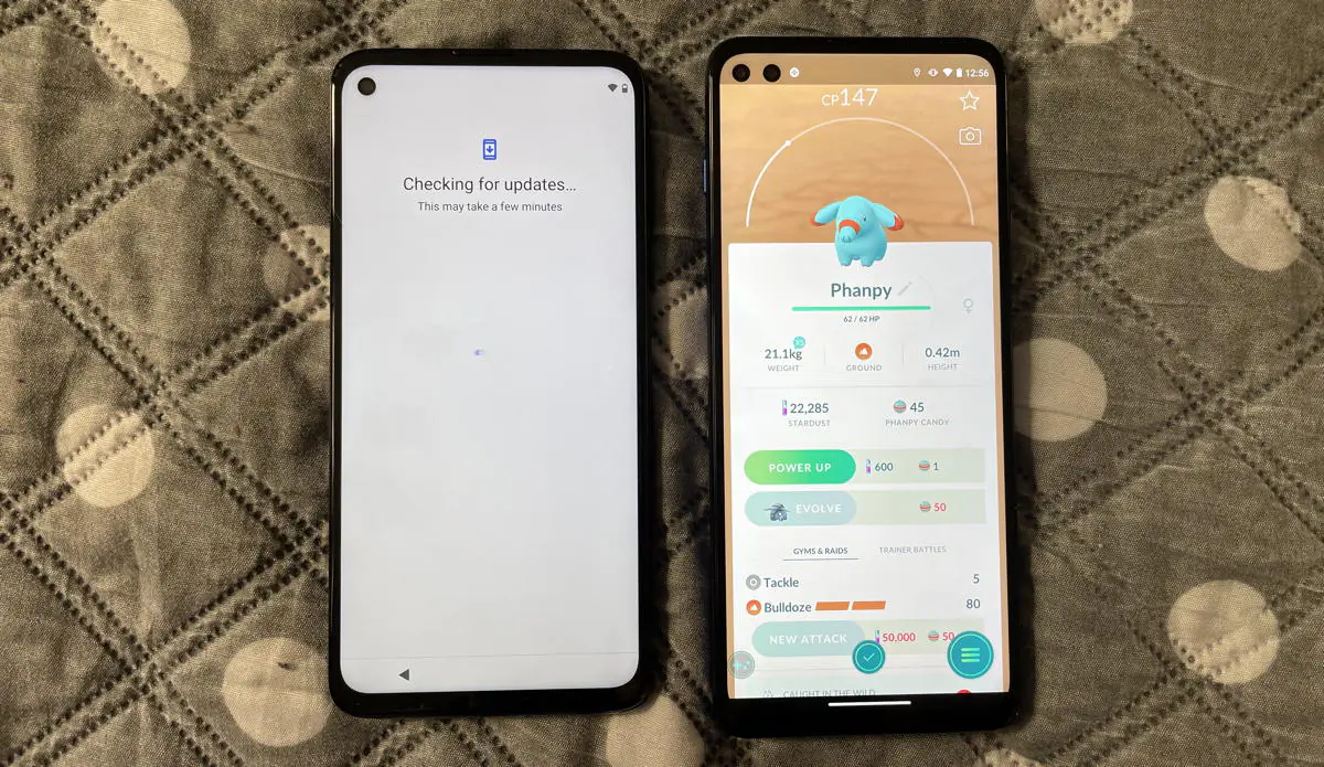
In basic tasks and web surfing, everything is fine, but there are issues when switching between apps. You can also play 3D games (Asphalt, Fortnite, PUBG), but with unstable fps, and the graphics settings will not be at maximum.
The amount of RAM (4 GB) is small by today’s standards, although still adequate for the budget price range.
There’s 128 GB of storage, which is fine, (they could have offered us 64 GB). If necessary, you can use memory cards up to 512 GB.
Cameras

I liked the cameras. At least in excellent lighting conditions they offer clarity and good color rendition; the 48 megapixel main module does an excellent job. In weak (including home) lighting, it loses clarity, but this is a budget smartphone.
You can get okay pictures even in the dark thanks to good processing.
There is also a night mode advertised on the packaging, but, in my opinion, it brightens the photo too much, and the result looks unnatural. Here’s a comparison, night mode on the right:
VIEW ALL PHOTOS AND VIDEOS FROM THE MOTO G PRO IN ORIGINAL RESOLUTION
There are many lenses. But quantity, as you know, does not always mean quality. There is a depth sensor (useful for background blur and AR applications – there is even one built-in to measure distance). There is a macro lens, but I don’t see any point in it. Yes, it shoots from a minimum distance, but 2 megapixels in 2021 is ridiculous. The fuzziness and low resolution are striking, and the shades are faded. The main lens captures the same subjects better. Here is a comparison, a photo from a telephoto camera is on the right. The difference in clarity and resolution may not be very noticeable on the thumbnails, but at full size it is very obvious.
PHOTOS FROM A TELEPHOTO LENS IN ORIGINAL RESOLUTION
There is also a wide-angle lens with a 117 degrees viewing angle. At first, I searched for toggle in the camera interface, but in the end I found out that it’s not there at all. This module is called an action camera in Moto. And it allows you to do a weird thing – shoot HORIZONTAL video while holding your phone VERTICALY.
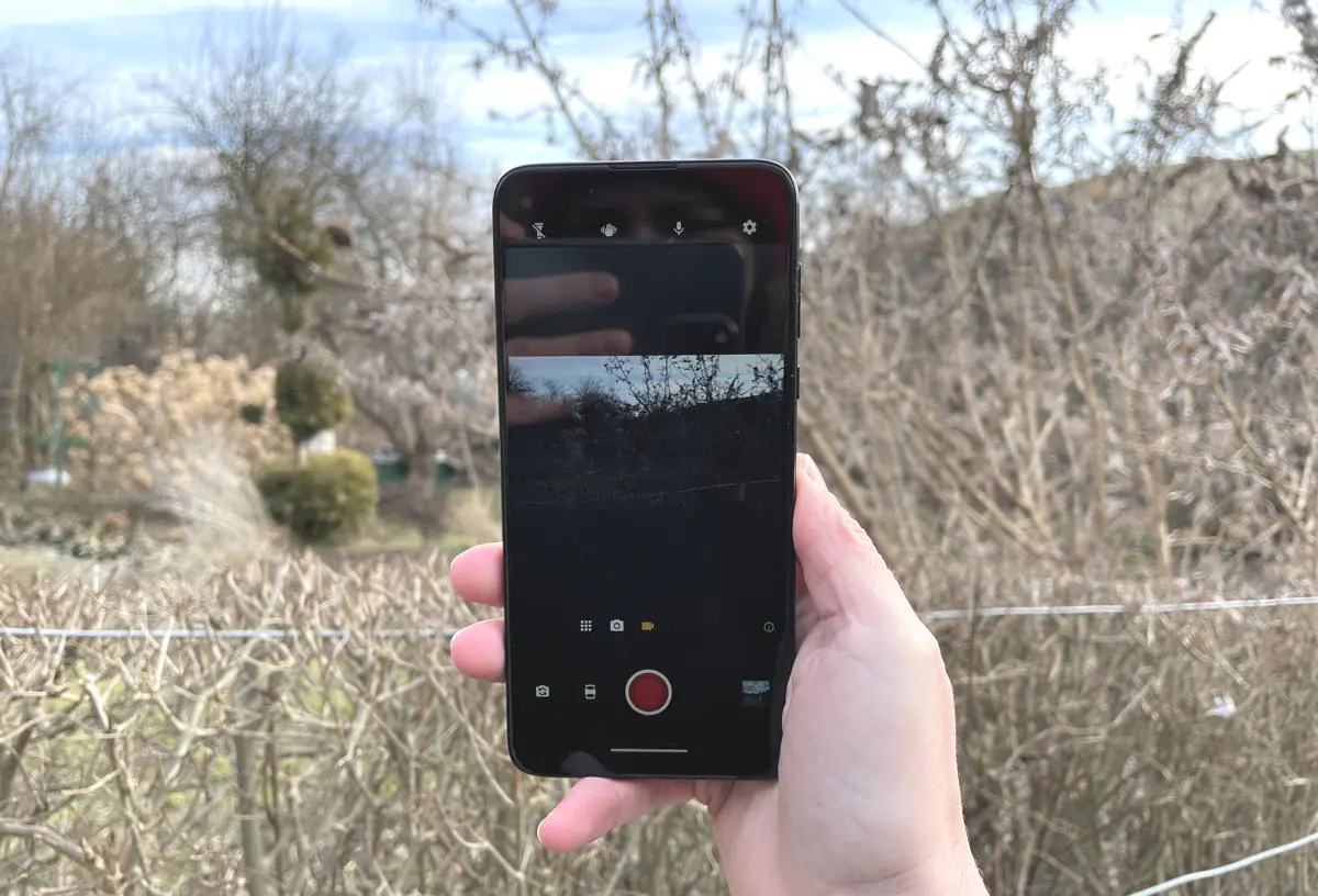
Apparently, it’s for those situations when there is no possibility to use two hands, but a good viewing angle is needed. The quality of shooting is not the best, noise, distortion at the corners, shaking, reduced resolution, it’s all there. But, perhaps, it will be useful to someone. There’s a video from the Action camera.
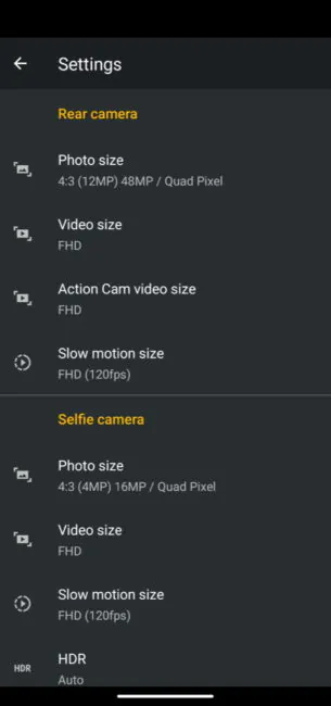
The video quality from the main module is better, although it is also not perfect, with poor color rendition. You can record in 4K Ultra HD resolution, as well as in FHD at 60 fps, there are slow motion video modes at 120 fps, time-lapse, macro. The video from Moto G 5G Plus, main module.
The front-facing camera is mediocre, there are problems with clarity and color reproduction.
The camera interface is standard for Moto. It’s clear and convenient. In video mode, there is an icon for switching to the action camera, and while taking a photo, you can zoom in up to 8x. However, the larger the zoom, the worse the quality.
Read also: OPPO A53 smartphone review: Good battery and tons of compromises
Moto G Pro software
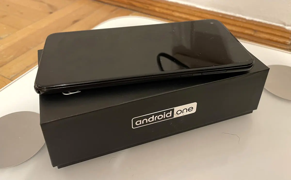
In general, Android in Moto smartphones is always “pure” and not overloaded with bloatware. However, in this particular model, the company decided to use the Android One platform.
Once upon a time, Android One was created as a version of Android for weak devices. Now its place has been taken by Android Go, and Android One is simply a program that allows devices to receive “pure” Android with guaranteed updates to the OS itself and security patches for at least two years. It’s like Pixel smartphones, but not from Google.
This is why our test G Pro has already received an update to Android 11, while other Motorola smartphones (and from other manufacturers) are still waiting. However, there are no purely visual changes, and nothing incredibly new either visually, so I, frankly, do not really understand why some people care that much about the OS version. Regular monthly security updates are useful, I admit.
Android One also features a smart approach to running apps in the background (and therefore saves battery power), as well as an effective built-in antivirus.
However, I repeat, stock Android in Motorola does not have any shells either. I simultaneously tested the G 5G Plus and G Pro models, and I did not notice any differences in the interface, except perhaps for one thing – in Android One there is a non-removable Google search box at the bottom of the desktop. Everything else is identical.
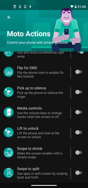
In addition, as with other Motorola smartphones, there are Moto Actions that can be configured in a separate app. We are talking about gesture control (turn on the flashlight by shaking or launch the camera app by turning the wrist), features for gamers (you can launch selected applications in a separate window during the game), and some screen settings.
Read also: Realme 7 5G review: Mid-Ranger with 5G support
Moto G Pro stylus
I don’t know why Motorola engineers wanted to release a cheap smartphone with a stylus. And, frankly, I don’t really understand who needs smartphones with styluses.
Samsung, for example, created its Galaxy Note line for business people. These are expensive smartphones at the forefront of technological progress. And business persons, in theory, take notes on a smartphone, cross out some reports or graphs, I don’t know. The stylus in Note is electronic, it can control presentations and release the camera shutter. Maybe Motorola thinks that the stylus will make the phone more attractive? In my opinion, the Galaxy Note devices aren’t attractive because of the stylus, but because this is the second generation of flagships in a year. The Galaxy S series usually comes out in the spring, and the Note in the fall, with improved processors, cameras and other features.
Who needs a budget phone with a stylus? Certainly not businessmen, they won’t be caught carrying this thing. If you have an answer to this question, please share in the comments. Personally, I don’t see the point in drawing on the phone or taking notes, do you?

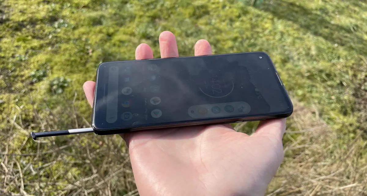
The stylus is stored in a slot inside the case. It’s made of silver metal with a black plastic part at the top. At the tip there is an elastic band that touches the screen with a slight spring. The shape is not round, but flattened, it fits better in the hand. Although, using it is not comfortable as it is very thin. A ballpoint pen is a billion times more comfortable to hold.

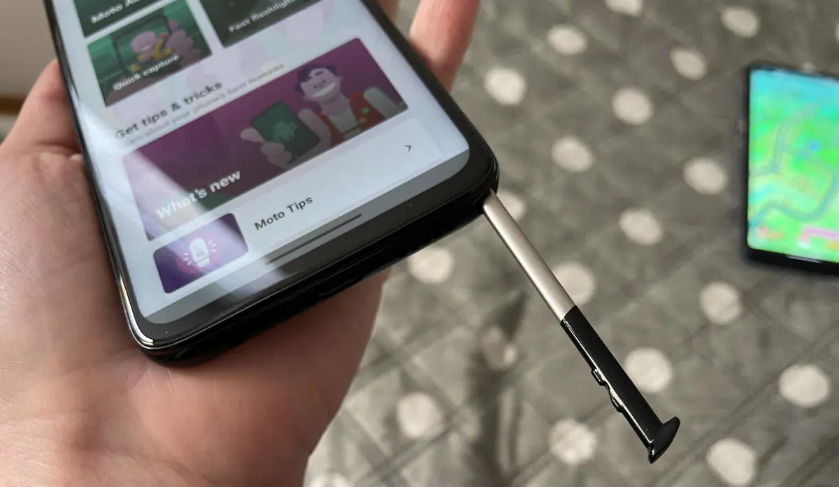
The pen is fixed firmly: it will not fall out even if you shake the phone. But it can also be removed easily. Not with a finger, but with a fingernail. If you have very short nails, it will be problematic, it’s good thing I’m a girl.
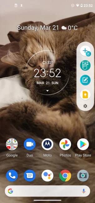
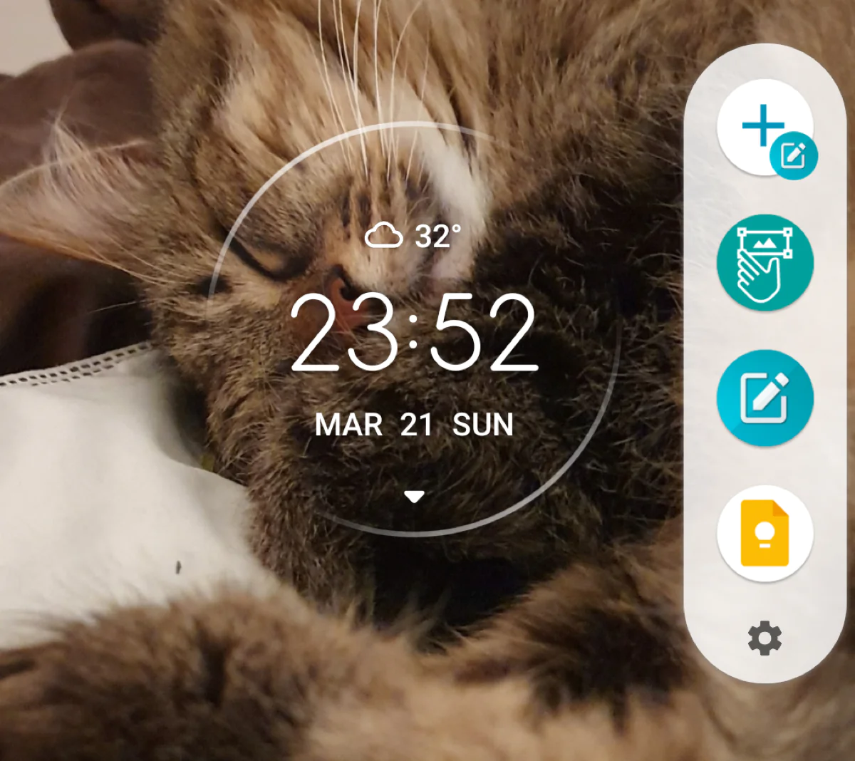
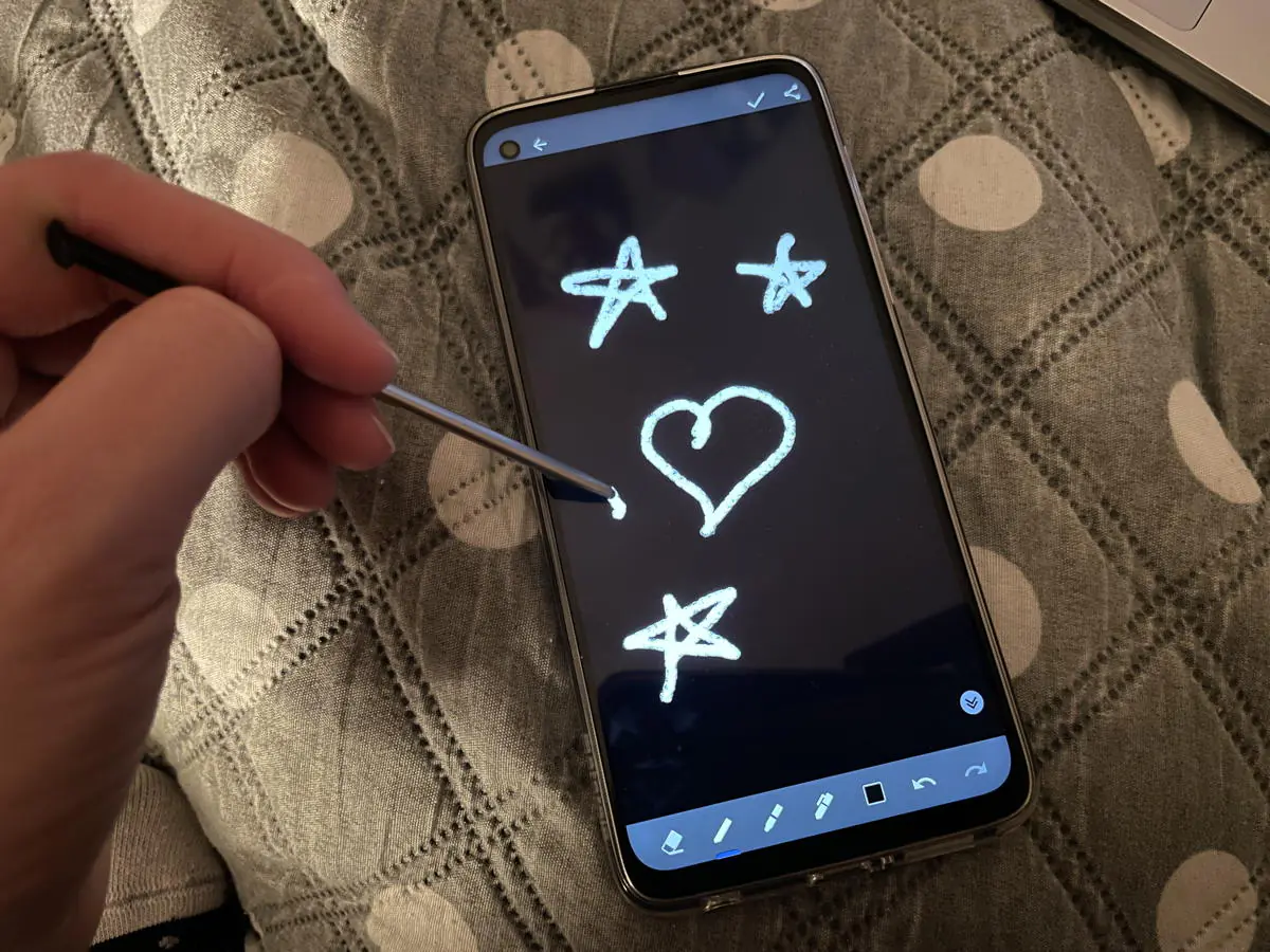
When you remove the stylus from the body, a special menu appears on the right side of the screen. Its content can be customized, including the most common apps. But by default, the menu contains just those utilities that are useful for using the stylus.
If you put the pen back into the body, the menu disappears. When you use the touch screen, go into settings, open applications – and with the stylus removed – the menu icon becomes translucent, but still visible on the screen, you can expand the menu with one touch. The icon can be moved to a more convenient place.
The stylus also has separate settings. Here you can configure how the device behaves when removing the stylus, depending on whether the phone is unlocked or locked. For example, taking out the pen, you can immediately launch the app for quick notes in order, as you might guess, to take a quick note.
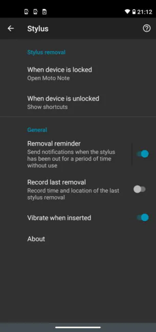
You can also turn on the notification if the stylus is not in the phone for too long, find the time and place of when you were last using it – apparently, for the forgetful. There is also an option to vibrate when the stylus is returned to the slot. In theory, it allows you to make sure that you fit it correctly, but the vibration is so weak and short that you hardly feel it.
Let’s go back to the dedicated stylus menu. The top icon is a quick handwritten note using the proprietary Moto Note app. The second takes a screenshot of the screen content and immediately allows you to mark something on it with a stylus. The third brings up the aforementioned Moto Note app for taking notes and cataloging them. The fourth is Google Keep, an app for taking notes (including handwriting), drawing (lots of tools and colors), and to-do lists. Similar to the Moto Note, but with a better, in my opinion, design and definitely broader functionality. For example, it supports photo and sound notes.
Of course, the stylus can also be used just like with a finger. Again, I don’t know who needs it. The handwriting recognition is activated in the keyboard settings. Also a dubious pleasure, since recognition is not up to par, and on modern keyboards with prompts writing is much faster anyway.
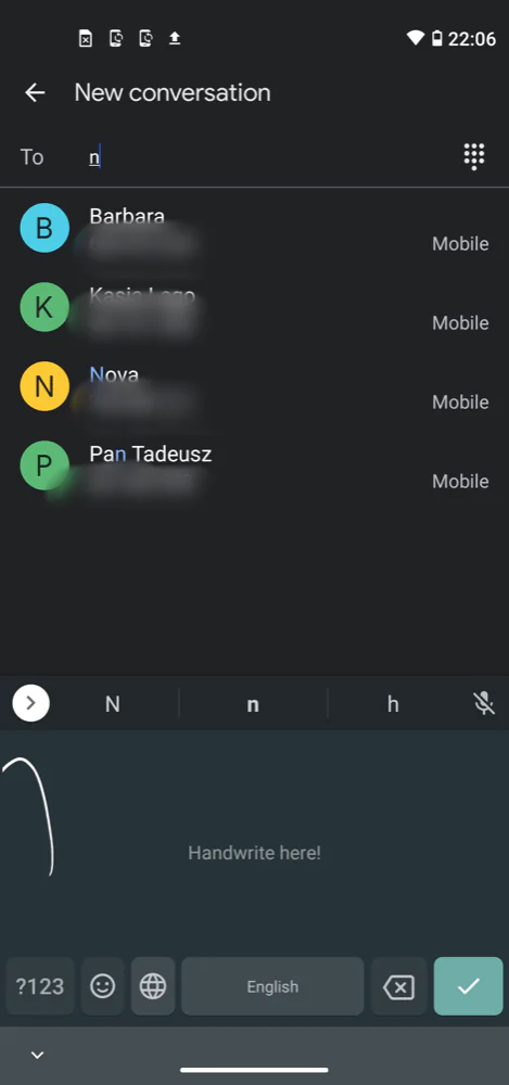
In general, I can say that the stylus is not very comfortable to hold, especially since there is an unpleasant delay. In addition, your hand may interfere with drawing or taking notes. To prevent this from happening, you have to keep your hand raised above the display all the time.
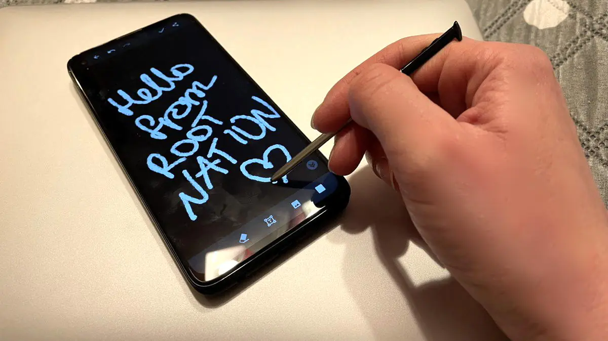
The stylus is a controversial inclusion, especially in an inexpensive device with low performance and an imperfect display (the refresh rate should have been increased). I suppose most users try get a pen and then forget about it forever.
Comms
In general, everything is standard – dual-band Wi-Fi (802.11ac), Bluetooth 5.1, NFC. It’s good that there is NFC, however, this is already the standard for most budget phones.
Moto G Pro sound
Surprisingly enough, the Motorola Moto G Pro has stereo speakers that many more expensive models lack. The sound quality is excellent, the volume is high. The sound in headphones is also great. As already noted, the 3.5 mm jack is not forgotten, so you can use the wired headphones. The system has a built-in equalizer that allows you to customize the sound to your liking. The Dolby Audio enhancer is also supported.
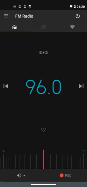
And there is also an FM radio that works even without a headset (although the reception is much better with wired headphones).
Moto G Pro battery
The device is equipped with a 4000 mAh lithium-ion battery. There are many smartphones with 5000 mAh in the Moto line, but if we consider that the Moto G Pro does not have the largest and most demanding screen and not the most powerful hardware, then 4000 mAh is quite enough for a couple of days of using the smartphone in active mode – instant messengers, Internet surfing, GPS navigation, a small number of calls, listening to music, casual games. If you play games like Pokémon Go, then with the screen always on at medium brightness, the battery will lose about 7-8% per hour. That is, about 13-15 hours of the screen is a reality. You can play a 3D game for 6-8 hours without a break.
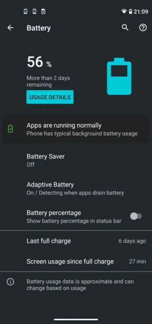
The phone upports 15-watt TurboPower fast charging. Not as good as 30-50-60-watt charging, of course. Half an hour of charging is enough for 30% of the charge, an hour for 60%. It will take a little more than two hours to charge to maximum.
Read also: Samsung Galaxy S21+ review: Standard Plus or Ultra Minus?
Verdict
The Moto G Pro would be a boring budget phone if it weren’t for the stylus. Average screen, average performance, average cameras, a billion competitors. But there are three things that set the smartphone apart from everyone else – the Android One platform (always fresh and regularly updated Android, Android 11 is already available), the presence of a stylus, and great stereo speakers. Although the second item for me is rather useless, you have every right to disagree with me. Other advantages include a good battery and an interesting Action Cam shooting mode.
Motorola asks a lot for this device. There are plenty of competitors. For example, OPPO A91 8/128GB costs a little less, offers noticeably more powerful hardware, AMOLED display and better cameras. realme 7, which Yuri Svitlik wrote about, is from the same series, except with IPS, not AMOLED screen, but the picture is still better. Poco X3 for about the same money is amazing in terms of performance. The Redmi Note 9 Pro offers a better processor, screen, great cameras and a bigger battery with faster charging, and it doesn’t cost much more. The Moto G Pro also has a competitor in its own line – the Motorola Moto G9 Plus, which I have already tested. The cost is the same or slightly higher, and the performance and display are much better. What do you think of the Moto G Pro?
Read also:
Subscribe to our accounts:



















The viable competitors you noted are all brands i don’t recognize.. the last time I tried “one of those phones”, there were strange limitations that wouldn’t allow the use of NUMEROUS apps; came to find out that brand (Xiaomi) and the like are preferred in sex trafficking because those apps don’t work! Apps like Instagram and Facebook! Idk, I don’t feel confident ever going back to those “competitors”; I’ll take a brand I recognize (that maybe has a few hardware limitations) over not being able to use my daily apps, any day.
And that’s fine! Choose what suits you and what you like. This, of course, does not mean that there are no better smartphones, but the main thing is that you like it!
You forgot to mention the Moto G Pro has a compass. This is not common for budget devices