© ROOT-NATION.com - Use of content is permitted with a backlink.
I bought the first smart watch, Huawei Watch 2, in 2018. Of course, before that I used fitness trackers, but this was the first time I used a smart watch. Back then there were fewer devices like that (and even now there is hardly an abundance): the market leader Apple Watch (only for iPhone owners), models based on WearOS, as well as smart watches from Samsung based on Tizen. Back then I had a Samsung smartphone, but Huawei Watch 2 based on WearOS was just to cheap to resist.
Long introduction about my experience with WearOS
At first it was even fun – a lot of third-party software for watches, contactless payment, a high-resolution screen, the ability to install a SIM card and always be in touch (there are no more such watches, now we only get eSIM). Essentially a mini-smartphone on the wrist. However, I quickly got tired of the Huawei Watch, as WearOS turned out to be raw and unpolished. Slow, constant lags, inconvenient interface… it’s got the whole package.
As a result, I even stopped using the device for payment in stores (which at first was delightful), because Google Pay took a long time to load and was buggy. It was easier to get the phone out of your pocket and hold it to the terminal to avoid unpleasant delays at the checkout. I would like to note that it is not about Huawei, it was WearOS’s fault.
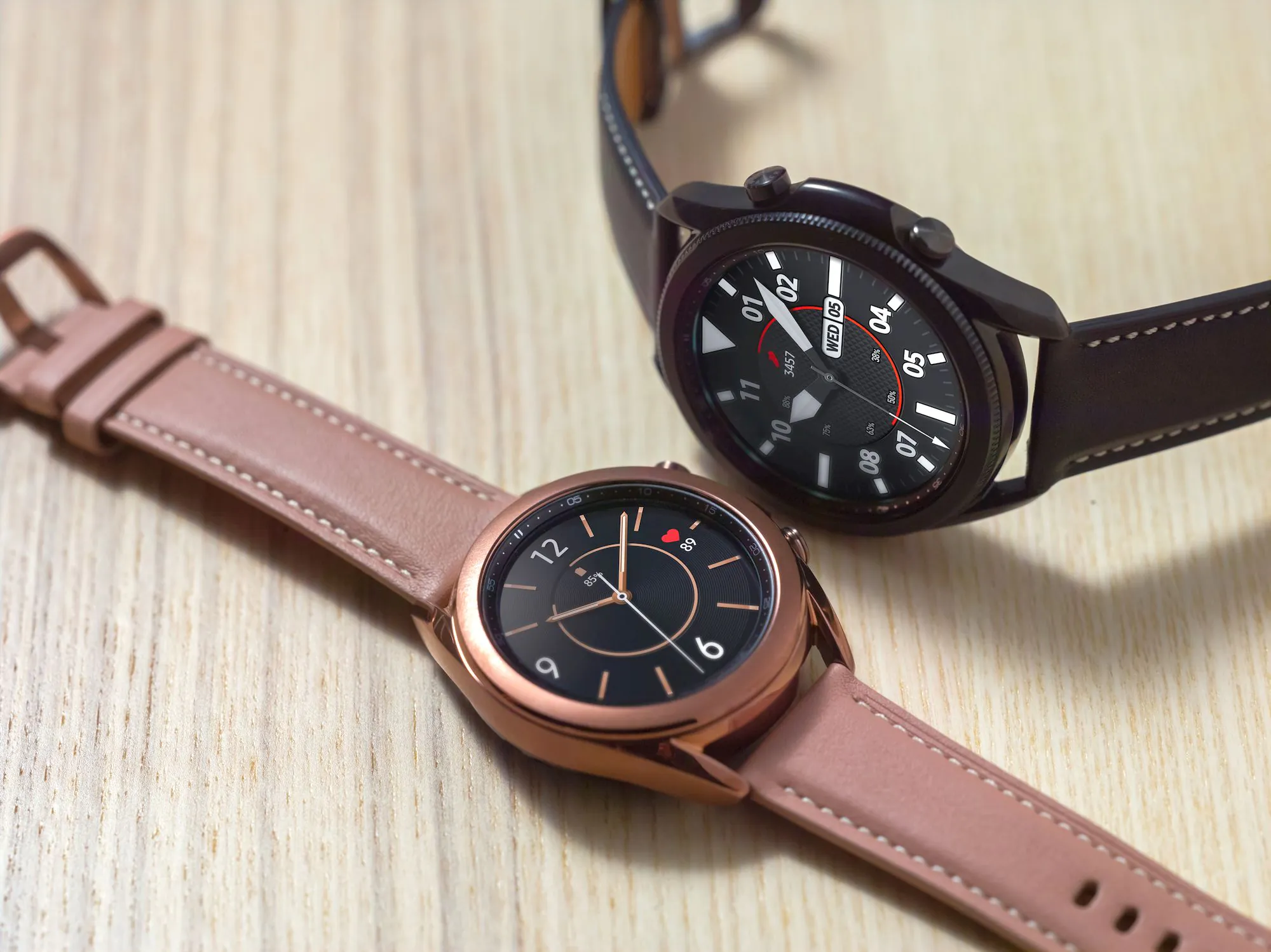
Then I got rid of my Huawei Watch and bought a Samsung Galaxy Watch. It worked fast, had a good chipset, well-thought-out software, an app for smartphones which helped you configure absolutely all functions of the watch and even install software. In comparison, the WearOS app only allows you to connect your watch and change the watch face, that’s it.
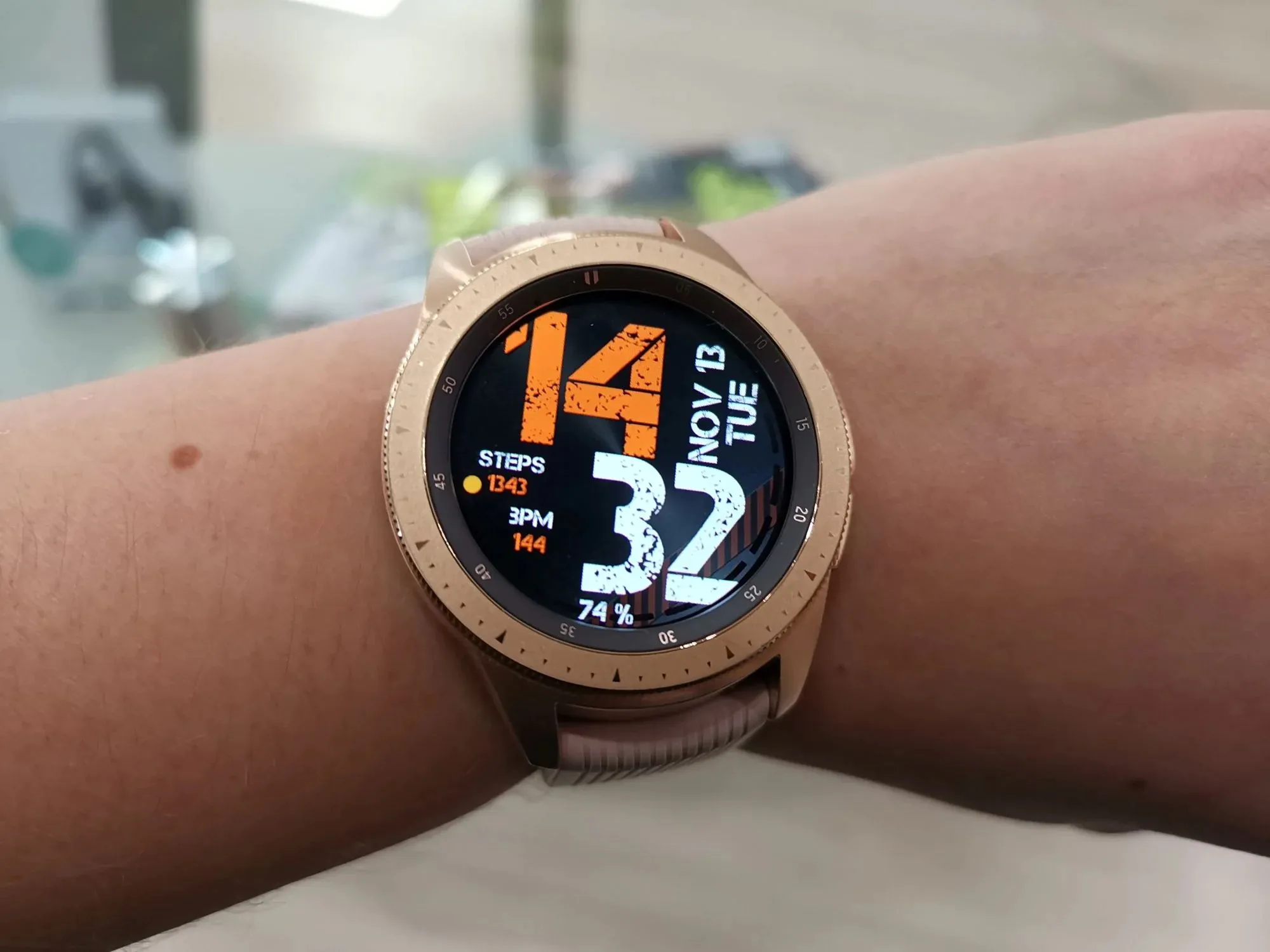
Last fall, I wanted to update my smartwatch. Samsung Galaxy Watch 3 just came out, which did not differ much from my model. I wanted to buy it, but decided to see what else was on the market. In particular, I was wondering if something has changed with WearOS in two years.
Huawei by that time did not release watch on the Google platform. In fact, practically all major companies (excluding Motorola) used their own platforms. This only confirmed that WearOS was not competitive. In all that time it did not develop, and the terribly outdated and only suitable chipset from Qualcomm could not get a new version as well.
WearOS was popular among the “fashionable” brands, which did not have the resources to make their own operating system, but wanted to release smartwatches. We’re talking about Fossil, Casio, Kate Spade, Louis Vuitton, Skagen, Montblanc, Michael Kors and so on. The models cost the same as the brands, so almost no one wanted them. I will also remember TicWatch, in their assortment there were and are available models based on WearOS, but they are not particularly popular and are not available to all countries.
In short, at the end of summer 2020, Suunto 7 caught my eye. It was a novelty and the first watch on the Google platform from a brand that produces various specialized sports items. I bought this watch at the outlet to play for two weeks and return it.
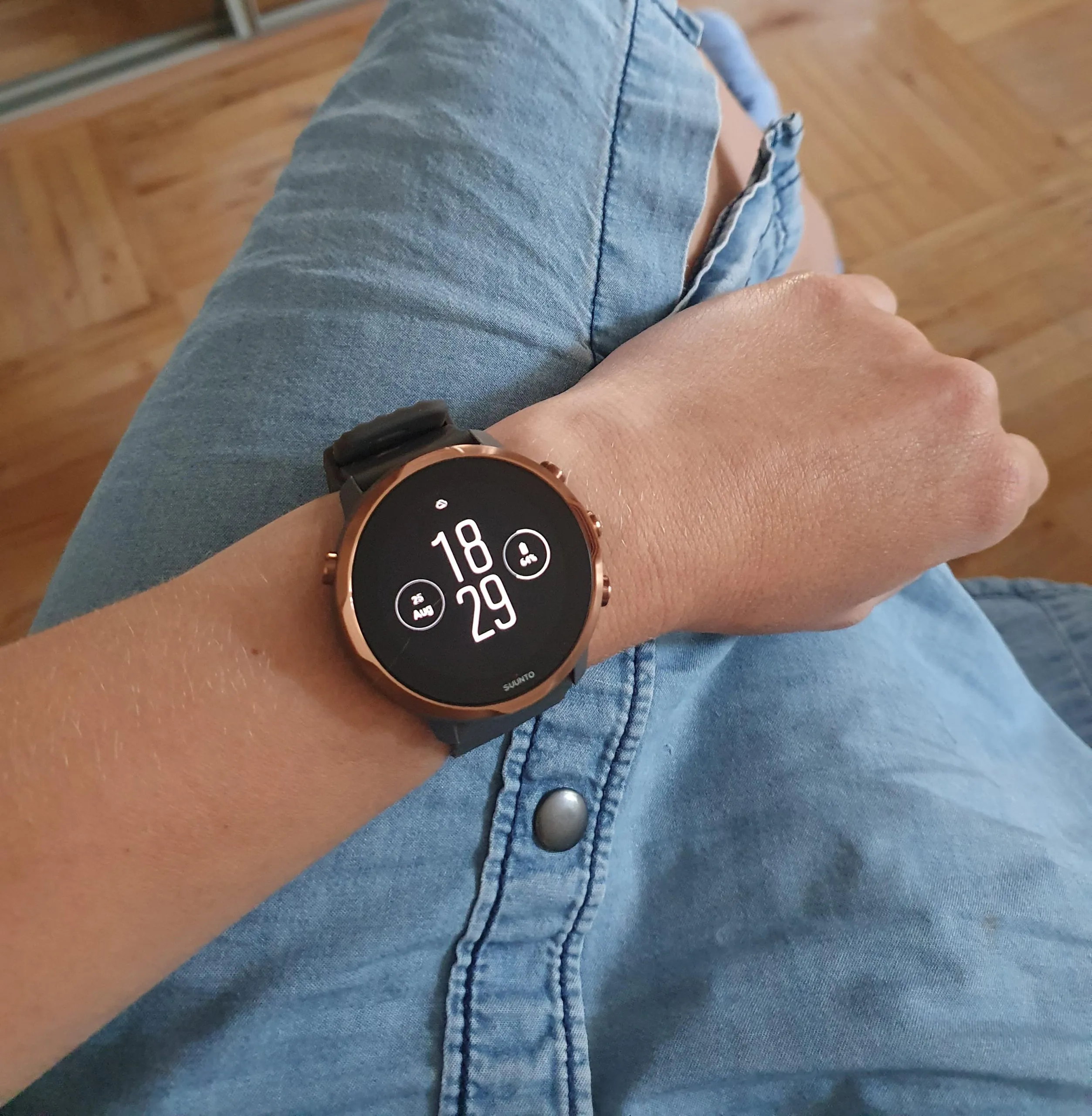
In 2020, WearOS hasn’t changed much. Yes, the processor was slightly tuned and the OS started to run a little faster. But the unstable work and glitches did not go away. Well, all the same – the WearOS utility only allows you to connect the watch to the phone, but apps, widgets, menu settings and so on can only be configured on a small watch screen! In short, I didn’t want to buy something on WearOS, so I returned the watch and ordered the Galaxy Watch 3.
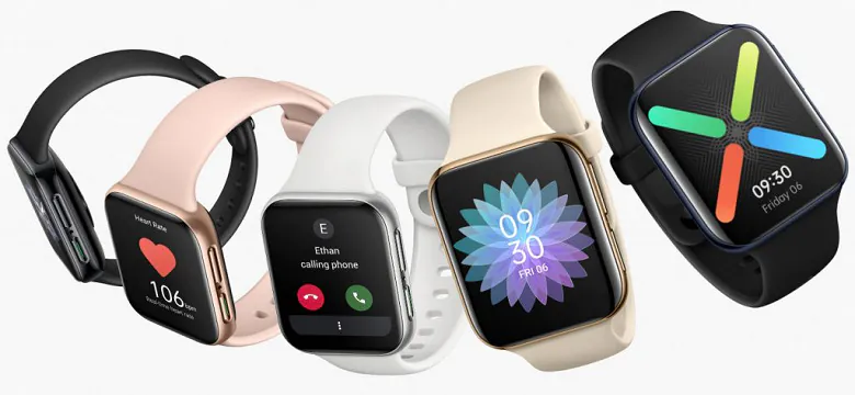
And literally right after the purchase, I found out that new OPPO Watch was released. Also on WearOS, but OPPO has worked on the shell and performance. All of the reviews I read have been positive. I regretted not being able to find out about it earlier.
I decided to personally get acquainted with the new product at the beginning of 2021. OPPO Watch has just appeared in stores, you can order it and return within a 2 week period. And finally we come to the purpose of the review! Spoiler – I liked the watch. Honestly, had I found out about it earlier, I would have bought it, and not the more expensive Galaxy Watch 3.
Oh yeah, one more thing. During the test, I was often asked: Oppo who? The brand is not well known in some countries, but it is a large and respected brand in China, no worse than Xiaomi. OPPO is part of the BBK holding, which also owns the OnePlus, Vivo and Realme brands.
Full specifications of OPPO Watch and comparisons
| Oppo Watch 41 mm | Oppo Watch 46 mm | Apple Watch SE | Samsung Galaxy Watch3 | |
| Display | rectangular, AMOLED 1.6 inches, 320×360 (301 ppi) | rectangular with rounded edges, AMOLED 1.91 inches, 402×476 (326 ppi) | rectangular, flat, AMOLED, 1.57′′, 324×394 (325 ppi)/1.78 inches, 368×448 (326 ppi) | round, flat, Super AMOLED, 1.2 inches/1.4 inches, 360×360 |
| Materials | aluminum + plastic | aluminum + plastic, LTE version in steel housing | recycled aluminum | stainless steel |
| Sensors | three-axis acceleration sensor, gyroscope, geomagnetic sensor, barometer, optical heart rate sensor, capacitive sensor, light sensor | three-axis acceleration sensor, gyroscope, geomagnetic sensor, barometer, optical heart rate sensor, capacitive sensor, light sensor | constantly active altimeter, accelerometer, gyroscope, 2nd generation optical heart rate sensor, light sensor, compass | barometer, accelerometer, gyroscope, heart rate sensor and ECG, light sensor |
| Chipset | Qualcomm Snapdragon Wear 3100, 4 cores1.2 GHz each | Qualcomm Snapdragon Wear 3100, 4 cores 1.2 GHz each | Apple S5, 2 cores | Exynos 9110, 2 1.15 GHz cores each |
| Connectivity | Wi-Fi 2.4 GHz, Bluetooth 4.2, GPS | 2.4 GHz Wi-Fi, Bluetooth 4.2, GPS, there is a version with eSIM and LTE | Wi-Fi 5 GHz, Bluetooth 5.0, GPS, Galileo, QZSS, LTE via eSIM | Bluetooth 5.0, Wi-Fi, NFC, A-GPS, Glonass, Beidou, Galileo, there is a version with eSIM and LTE |
| Microphone, speaker | Available | |||
| OS | Wear OS with ColorOS shell | Wear OS with ColorOS shell | WatchOS | Tizen |
| Moisture protection | 3 atm | 5 atm | 5 atm | 5 atm |
| Storage | 8 GB | 8 GB | 32 GB | 8 GB |
| Dimensions, mm | 41×36×11 | 46×39×11 | 40×34×11 in 40 mm model, 44×38×11 in 44 mm | 41×43×11 in 41 mm model, 45×46×11 in 45 mm |
| Mass, g | 30,1 | 39,3 | 40 in 40 mm model, 48 in 44 mm | 48.2 in 41 mm model, 53.8 in 45 mm |
What’s in the box
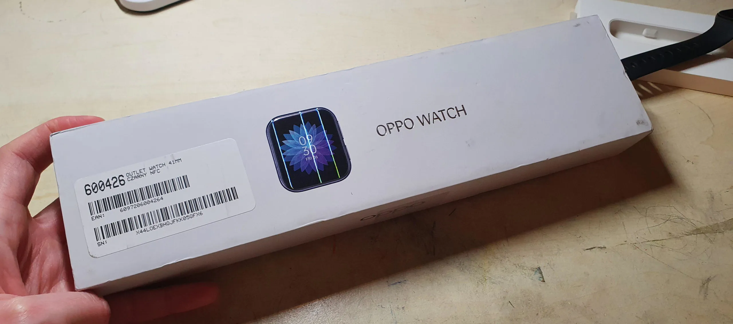
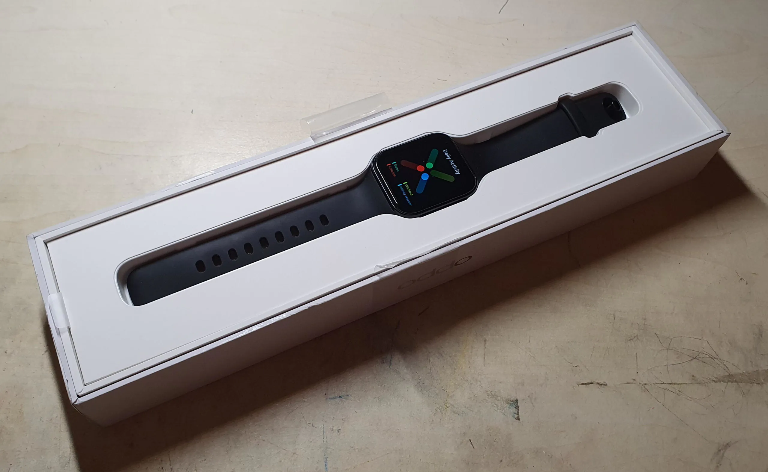
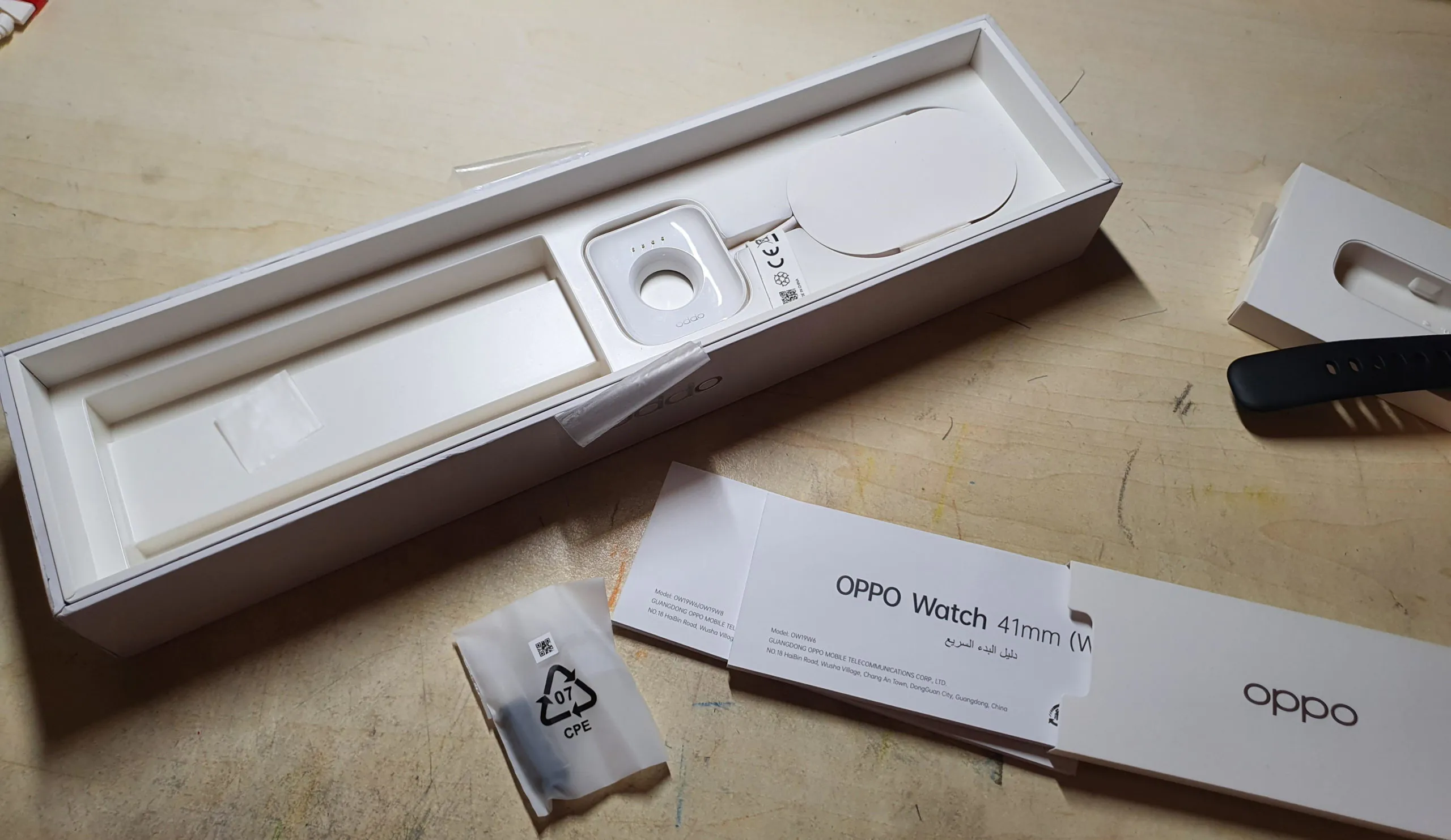
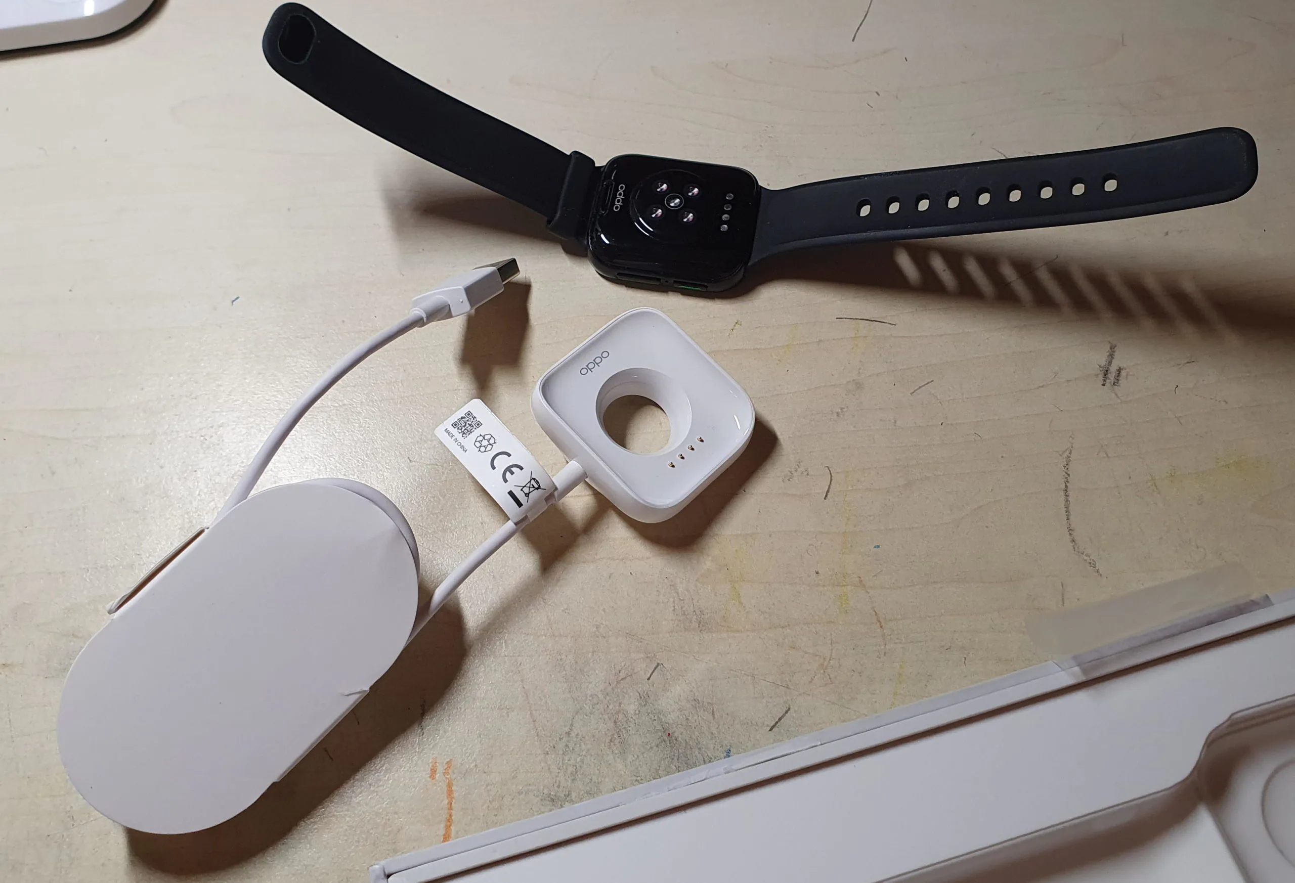
The box is compact, elongated. It has a convex and iridescent image of a watch. Inside is the watch itself, as well as the charger (with contacts, not wireless), documentation, a spare “elastic” for the band.
Design
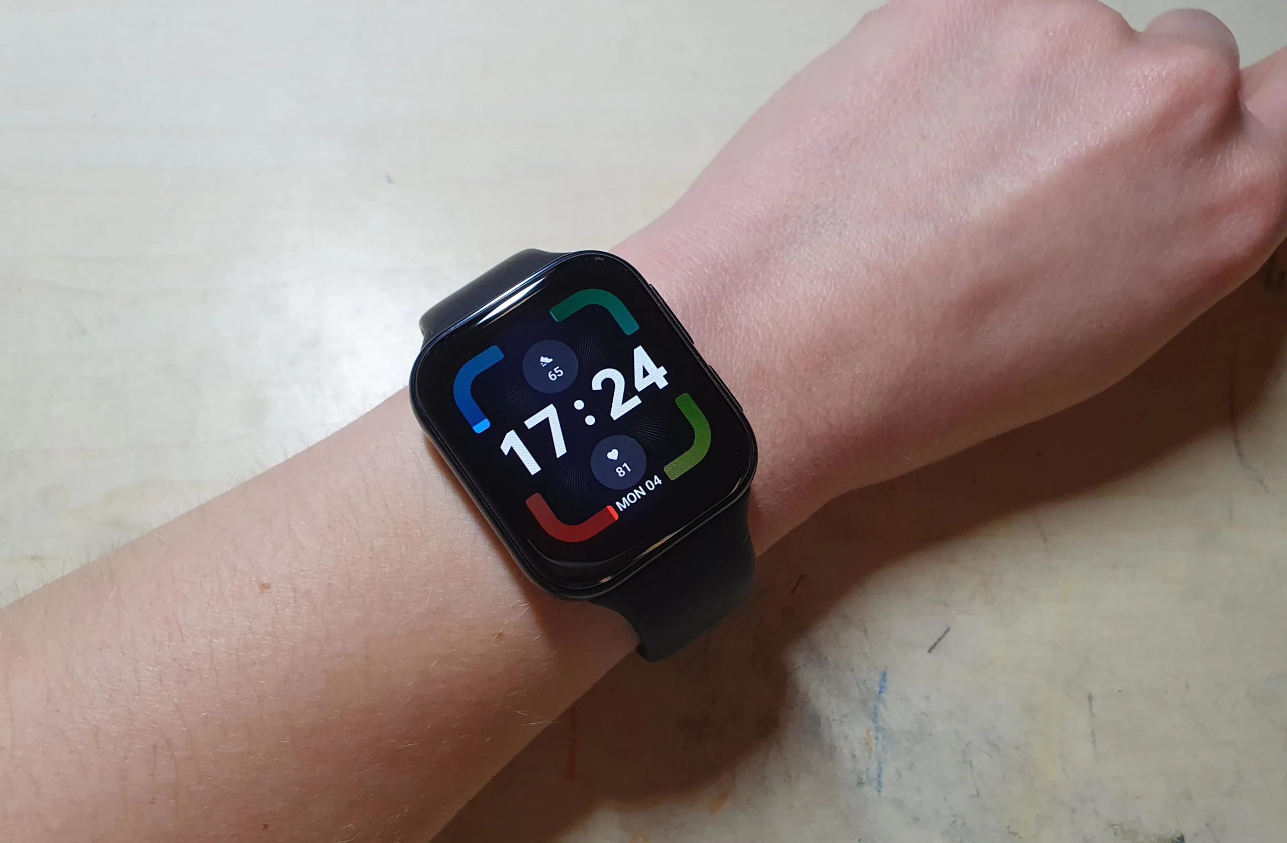
Everyone who saw this watch said “It’s Apple Watch!” Yeah, it looks a lot like it. But not enough to be confused (or am I too technically advanced). And in general, there are a lot of watches and trackers in the form of Apple Watch on the market, it’s hardly surprising.
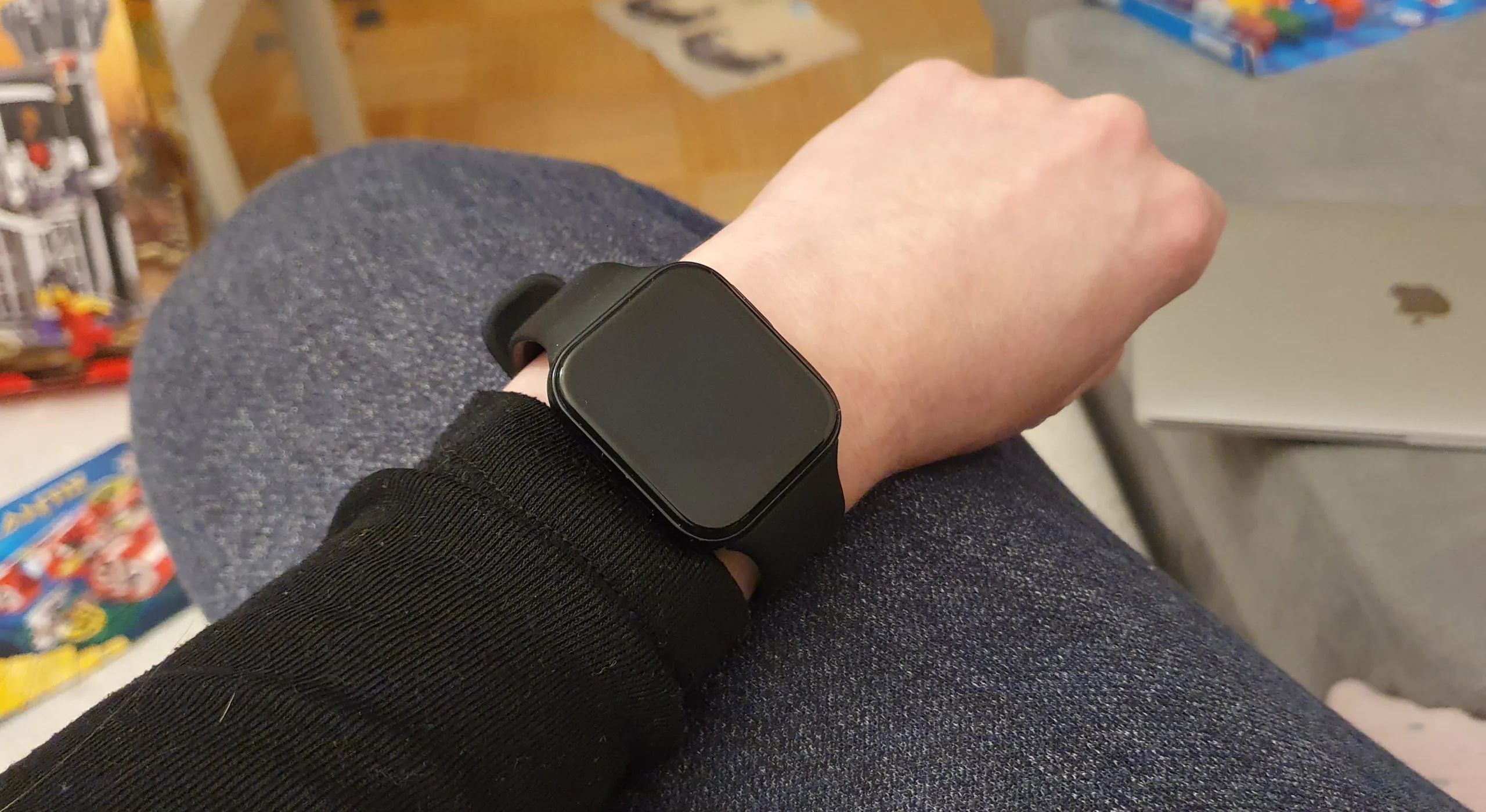
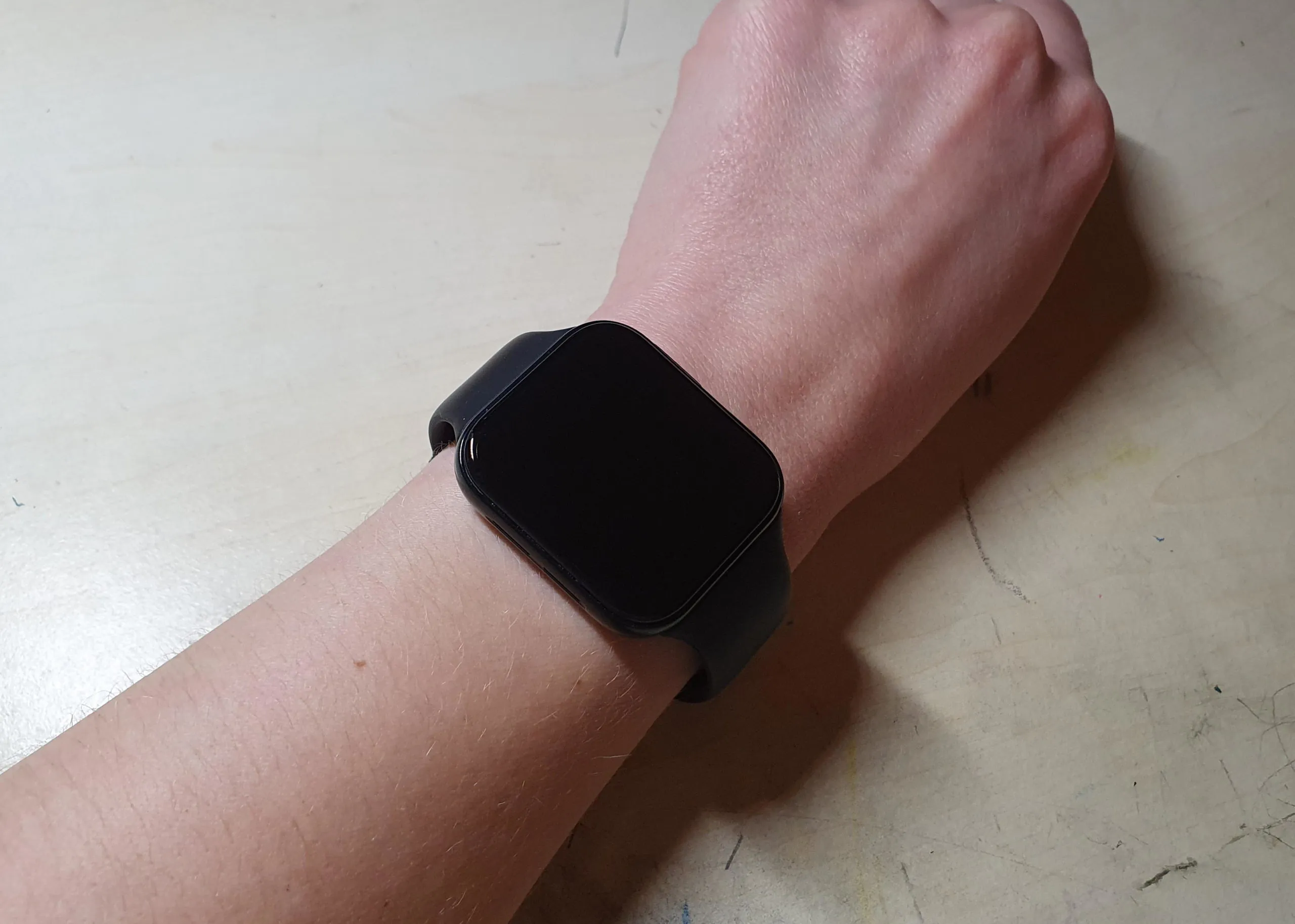
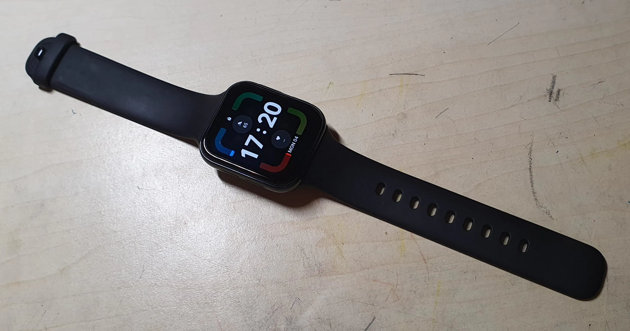
However, in fairness: a WearOS watch with a rectangular display is a rarity. At one time (2014) there was an LG G Watch, but the Koreans also refused to release models on WearOS. So in terms of format, OPPO stands out.

The OPPO Watch is available in two sizes – 41 and 46 mm. And it differs not only in size, but also in glass type (the smaller model has a flatter one with slightly beveled sides, the bigger model has a very rounded glass, the bezels (the smaller model is wider), the battery capacity, the level of protection against water (3 atm versus 5 atm), as well as eSIM support.
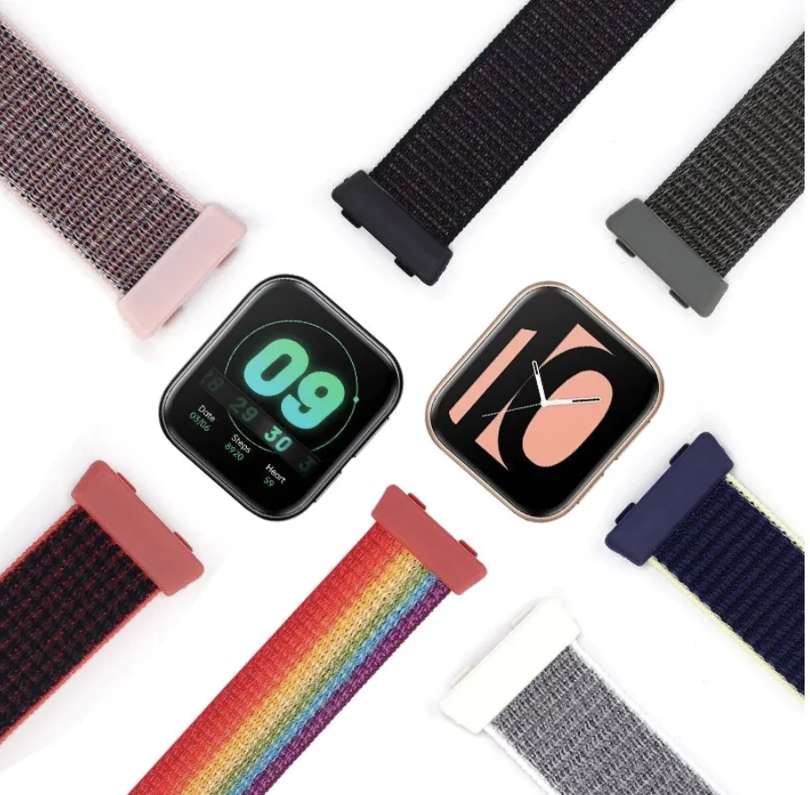
It’s available in black and gold colors. The second looks brighter, more classy.
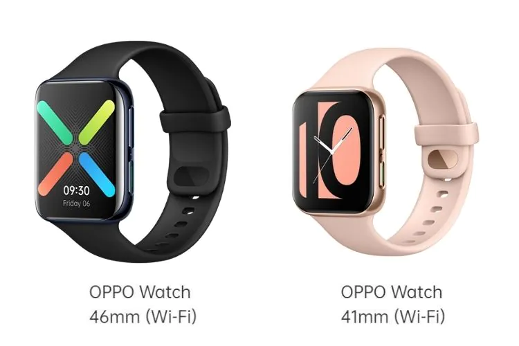
I tested the 41mm model. Although I want the 46 mm one now, it looks more interesting.
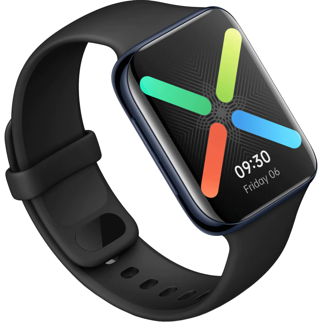
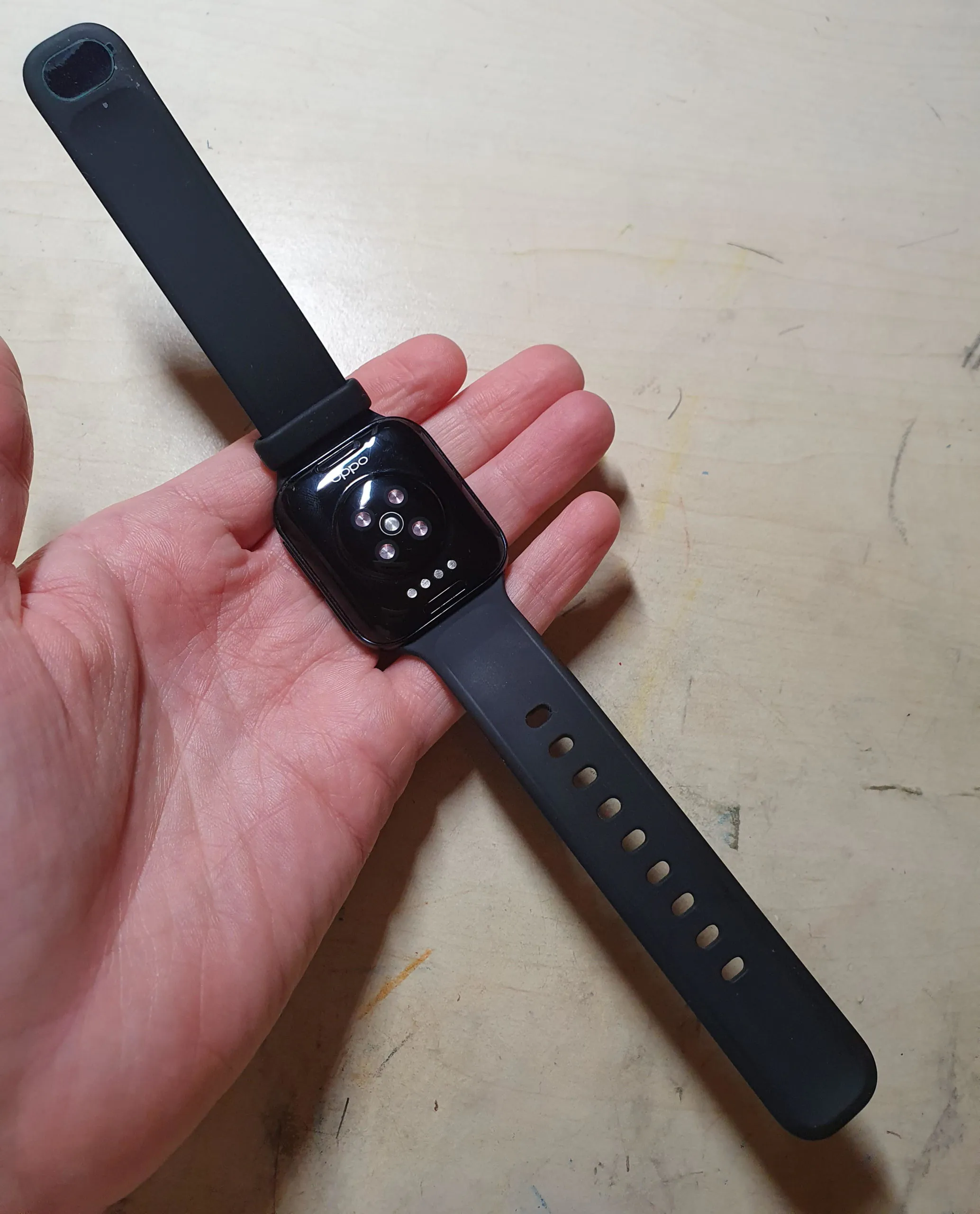
So let’s take a look at OPPO Watch 41 mm. It has a silicone band. The clasp is uncomfortable, tight, it is difficult to fasten it even with two hands.
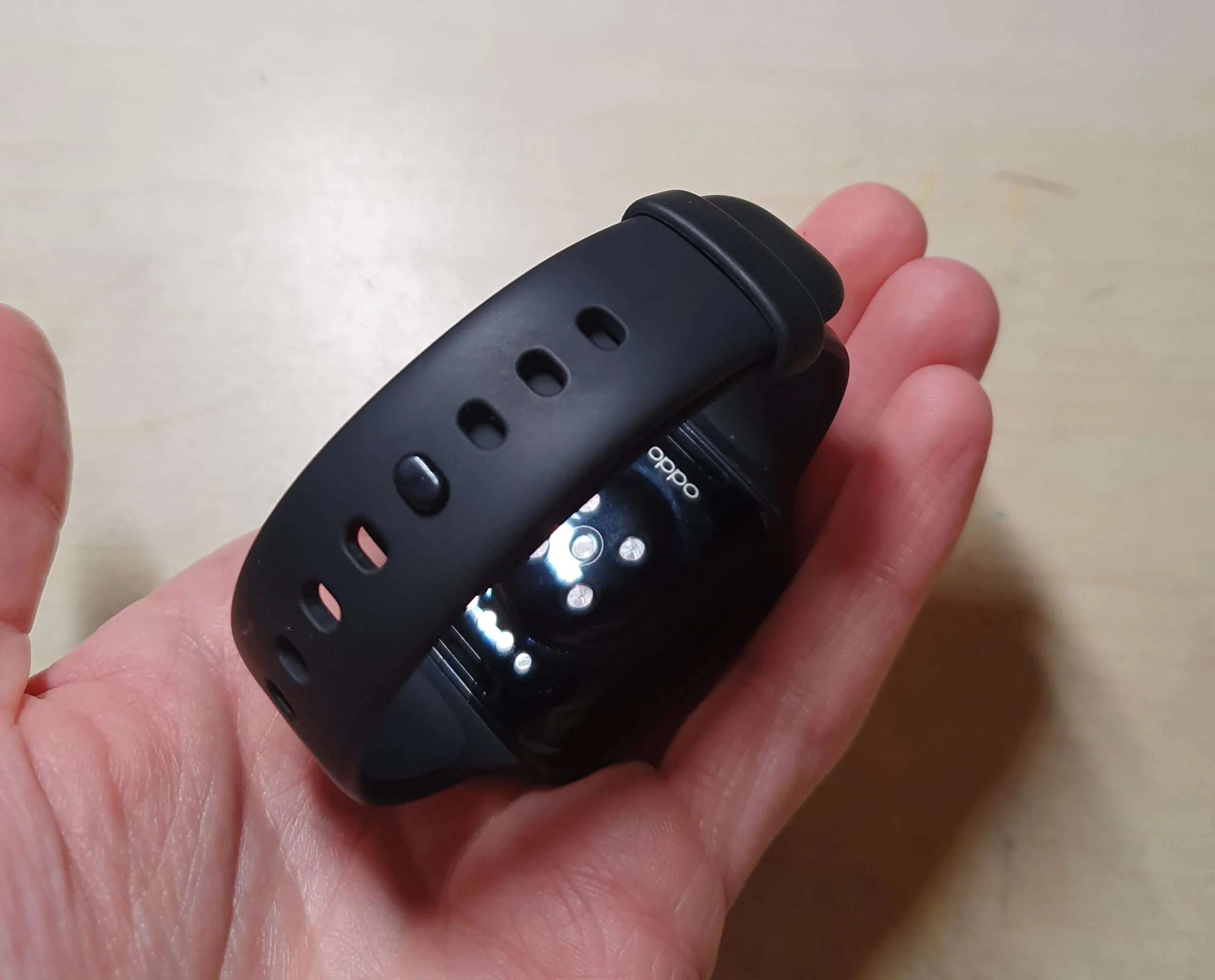
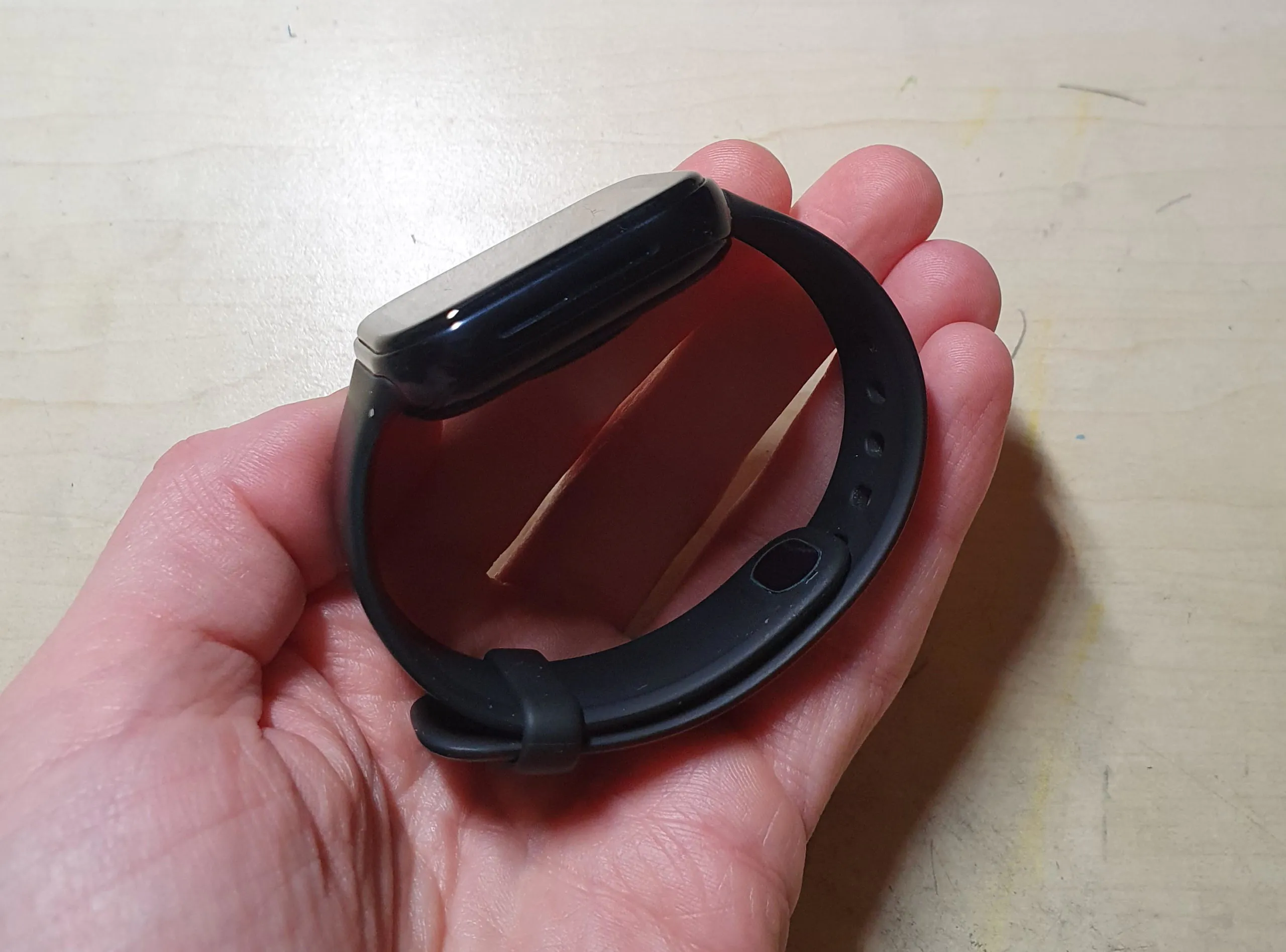
The bands are replaceable, there are already a lot of them on Aliexpress. For example, I adore these, and for Samsung watches I use only them.
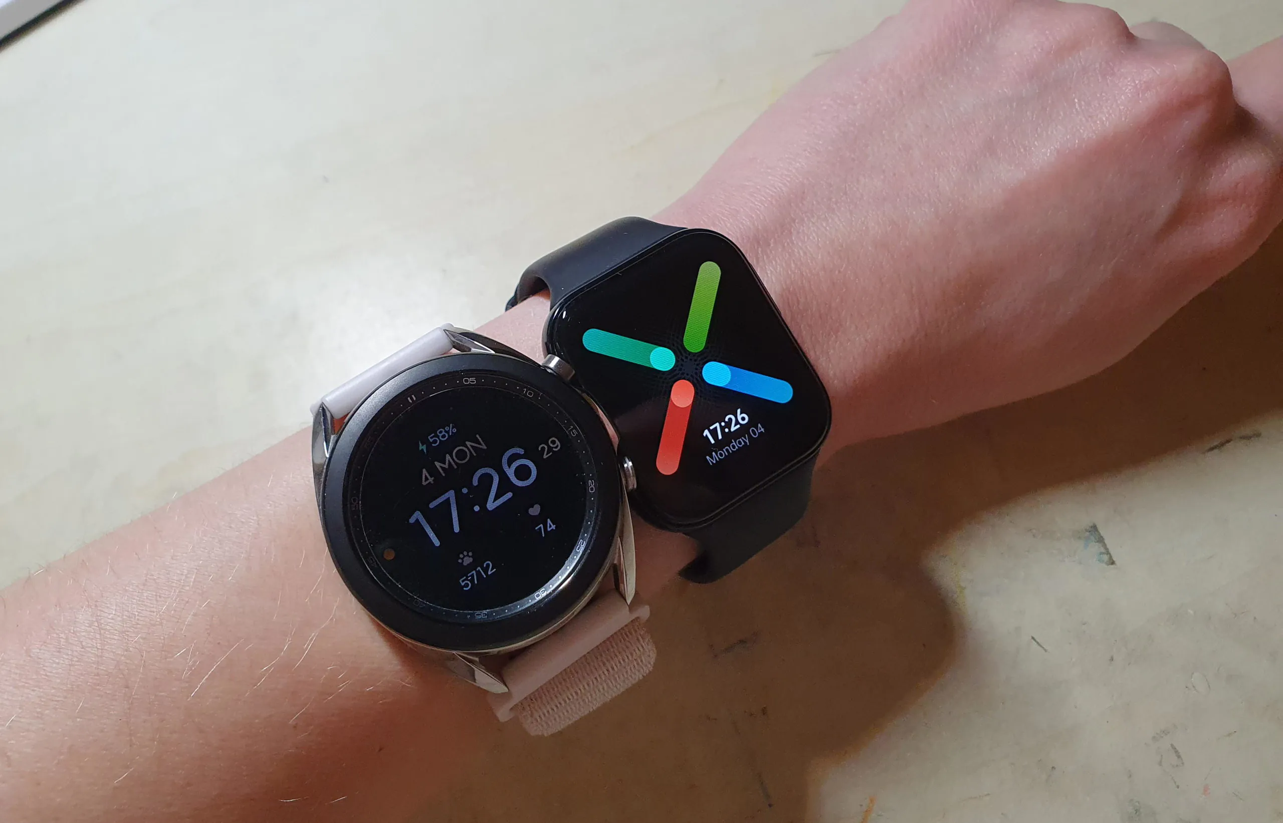
The 41mm OPPO Watch is lightweight and compact. I also have Galaxy Watch in a “mini” version, which is much thicker. OPPO is lighter, you barely notice it. I also don’t feel the Samsung watch, I’m used to it, but the fact remains – OPPO Watch is more convenient.
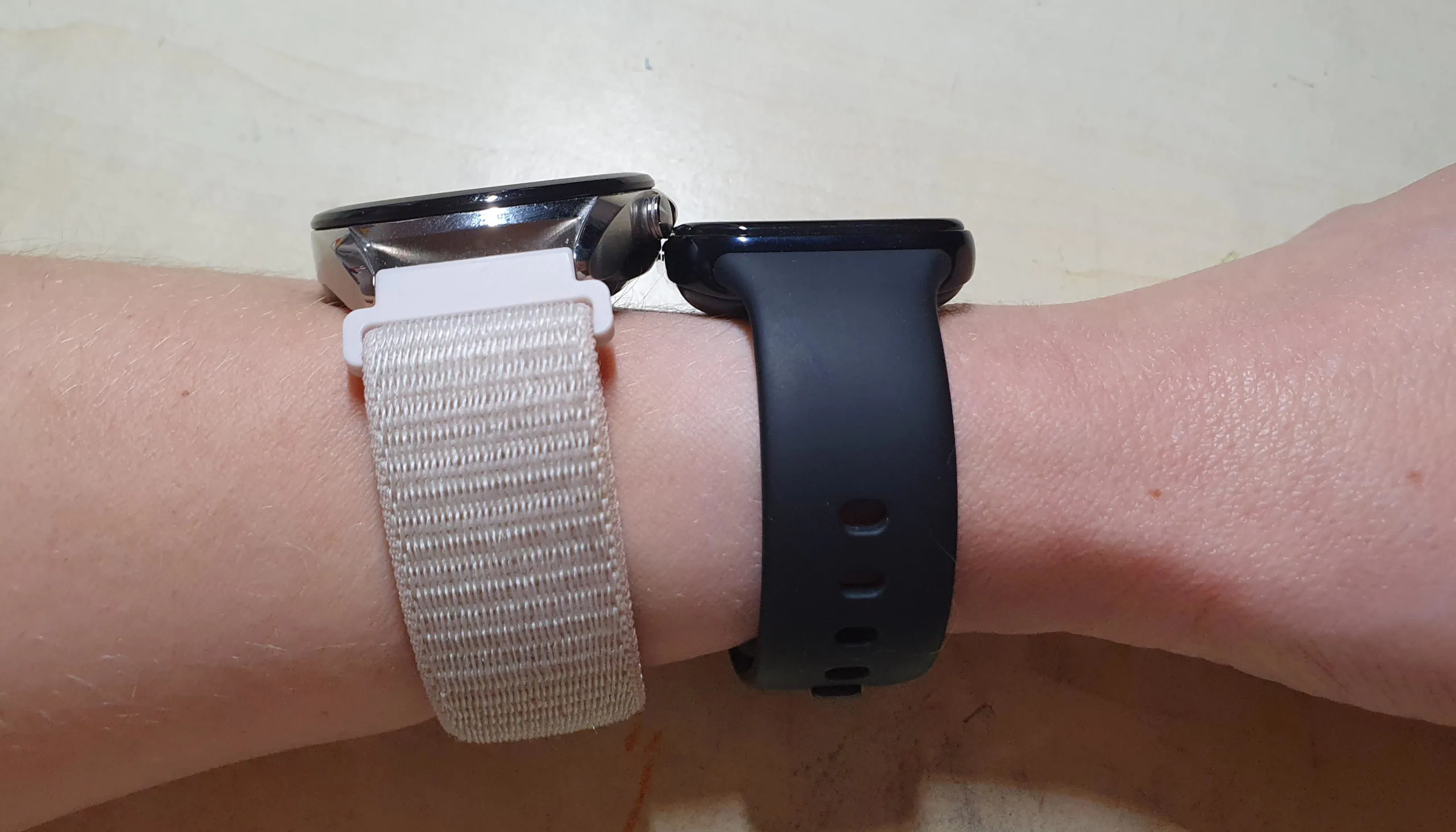
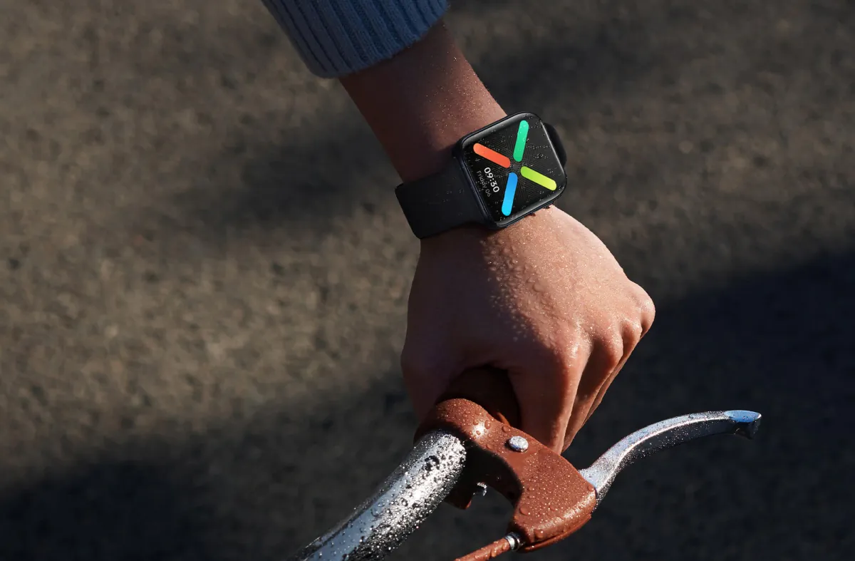
The 46mm model doesn’t look too huge either. Although it is more suitable for a large hand. A larger display is more convenient, whatever you say.
The control keys are located on the right side of the watch. There are two of them. One is responsible for calling the list of apps and for the “go back” command. The second is shorter (with a green stripe), customizable, by default it calls the workout start menu, I then reassigned it to Google Pay. There is a microphone hole between the buttons. On the other end of the watch there are speaker slots.
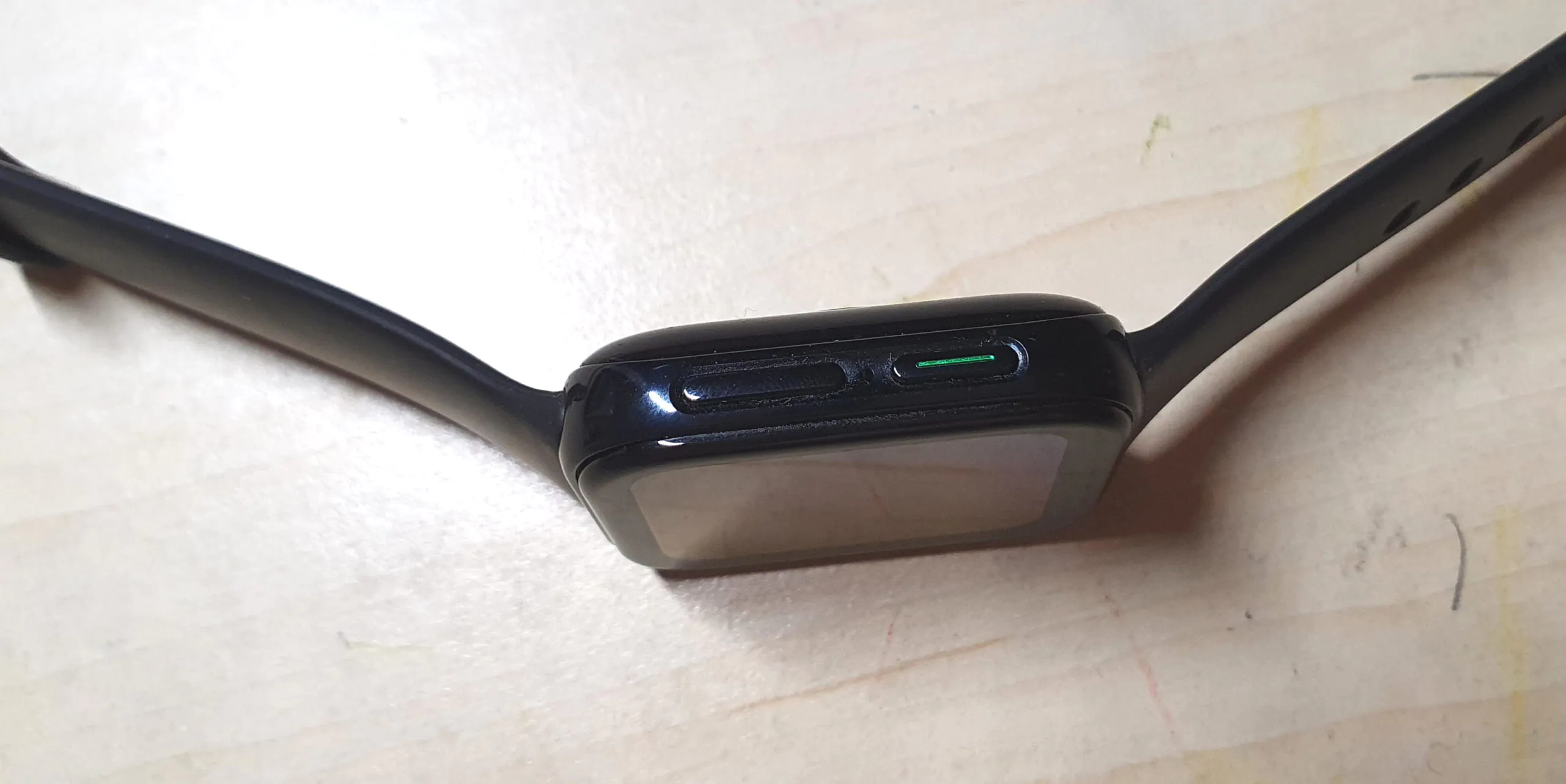
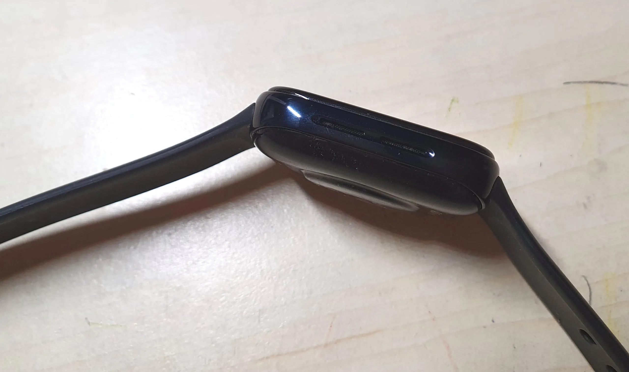
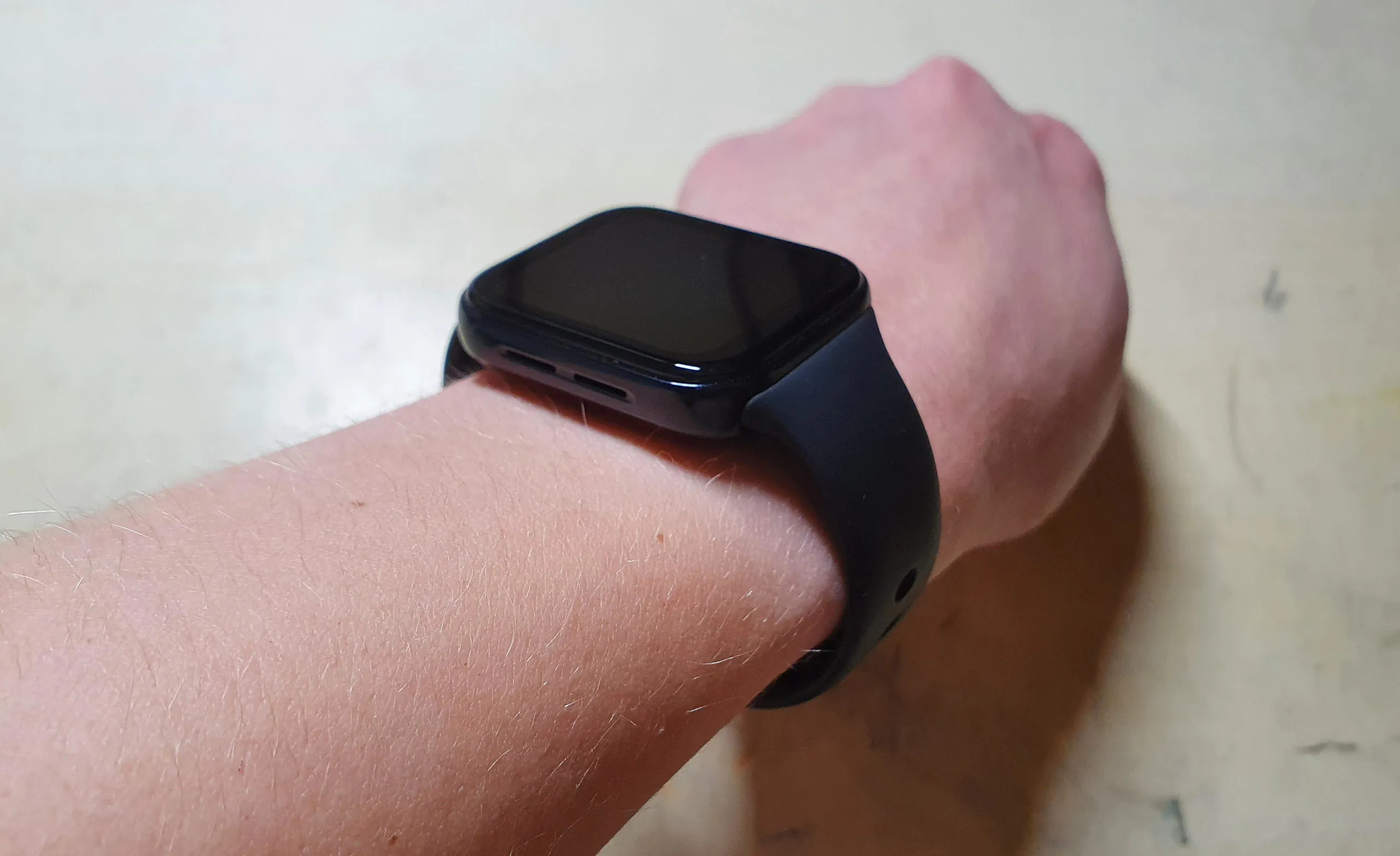
The frame of the case is made of metal (although it looks like glossy plastic), the back panel is plastic. The glass seems quite durable; during the test, even minor scratches did not appear.
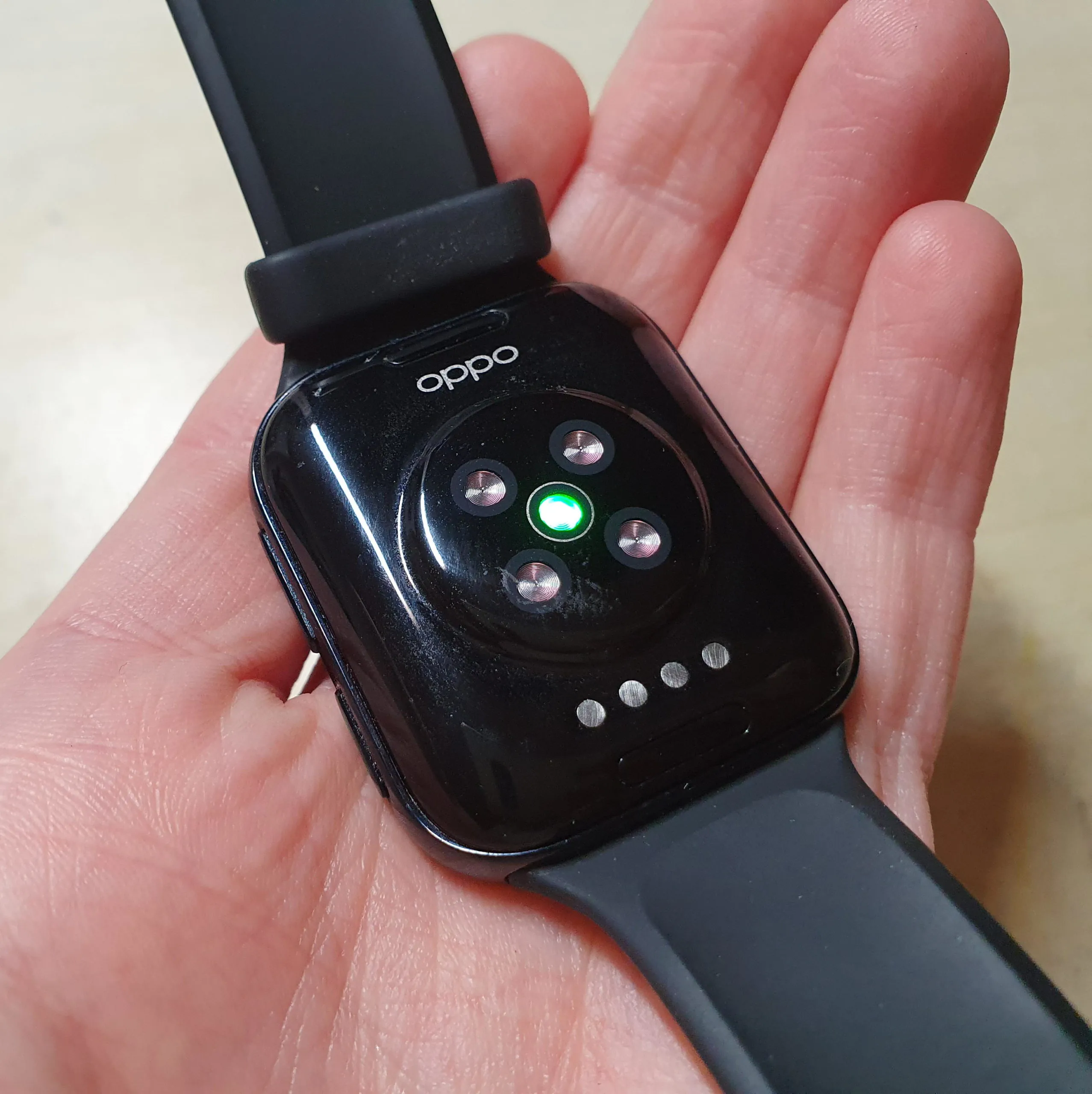
The back panel houses an optical heart rate sensor and charging contacts. The build quality is perfect.
I will add that the watch case is protected from moisture. The smaller model has a standard of 3 atm, the bigger one has 5 atm (like the Apple Watch or Galaxy Watch). Judging by the description, the former will only withstand splashing, diving, and swimming, and even taking a shower is not recommended. But the latter is good for diving and swimming. It seemed strange to me, since the swimming mode can also be found in the 41 mm model.
The OPPO official website for both versions states: “The OPPO watch can be worn while swimming in a pool or in open water, but it is not suitable for snorkeling, hot showers, hot springs, saunas, diving, surfing or other water entertainment in which the device may come into contact with a high pressure stream of water. The waterproofing quality may decline over time. ”
Personally, I swam in the pool, no problems. But you better not dive, especially with the OPPO Watch 41mm.
Screen
The smaller model received a 1.6-inch display and a resolution of 320 × 360 (301 ppi). The larger one has 1.9 inches, 402 × 476 (326 ppi). So yes, the 46mm OPPO Watch has a higher pixel density. It also, as already mentioned, has rounded side edges of the screen. The smaller model has a larger bezel, but this is not striking.
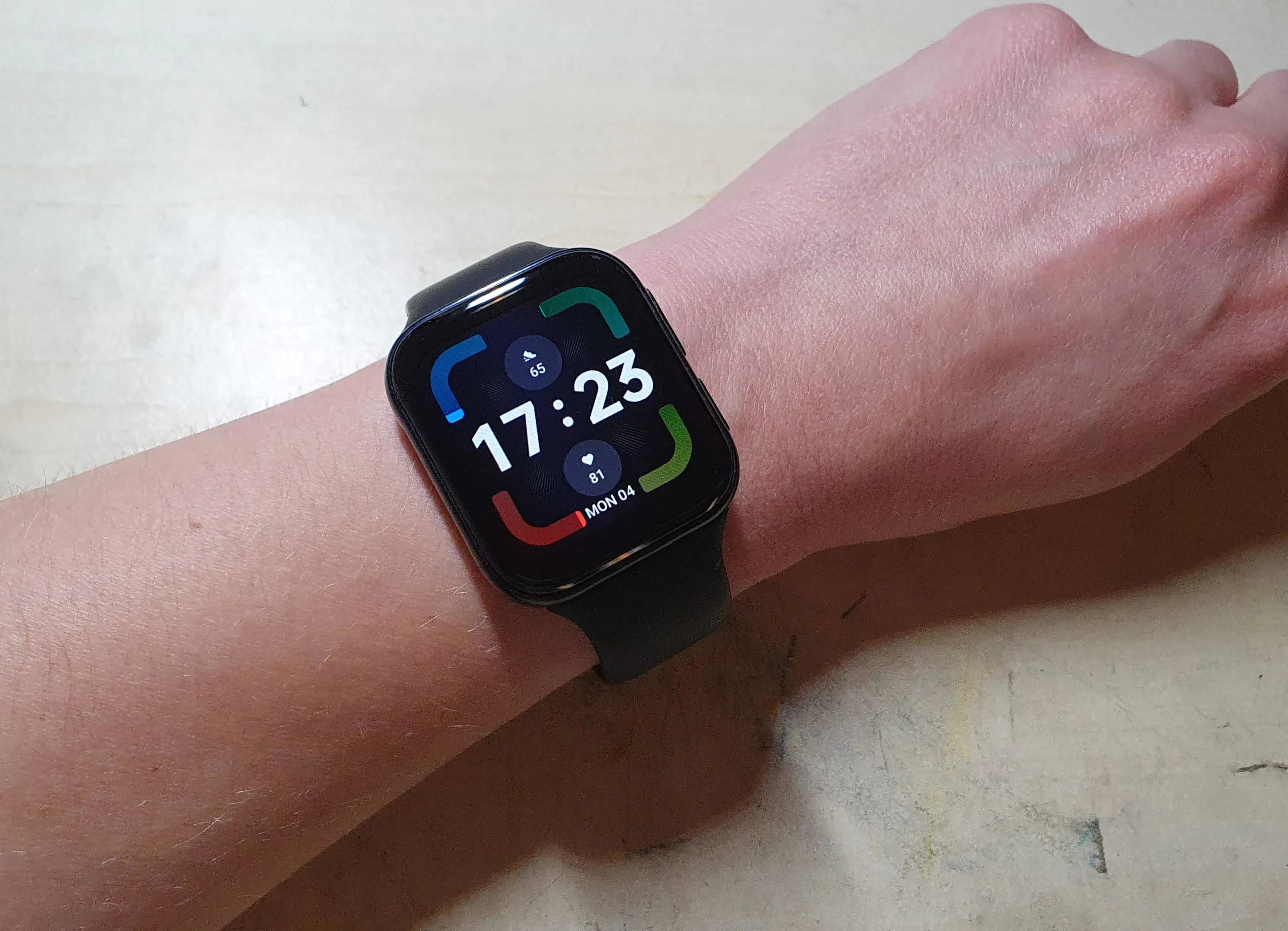
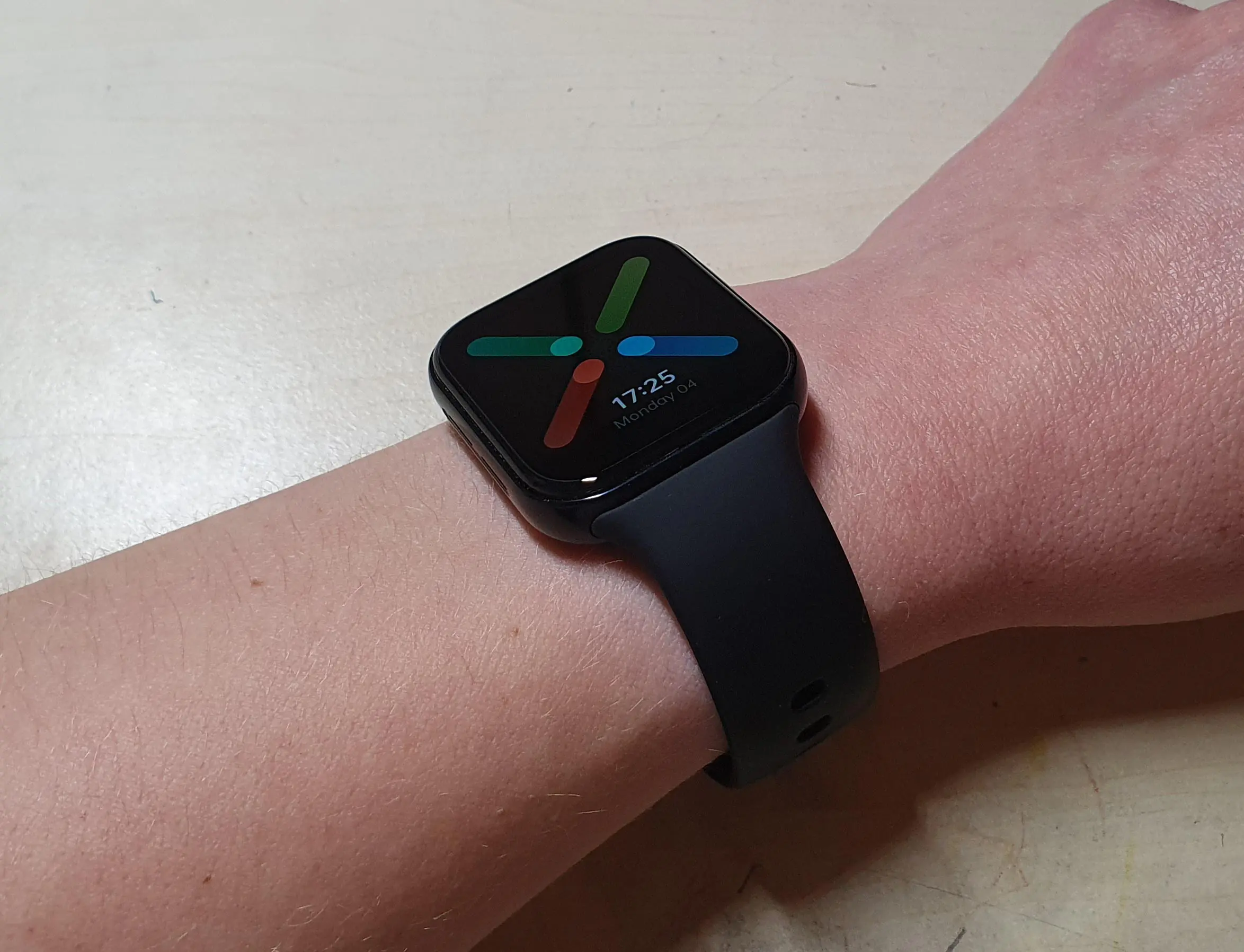
Both models are equipped with AMOLED displays. The image is high-quality, clear, and juicy. The depth of black is such that the bezels are practically not visible at all – like one big screen. The brightness of the display can be adjusted automatically, since there is a light sensor. Works great. Readability in sun is also great.
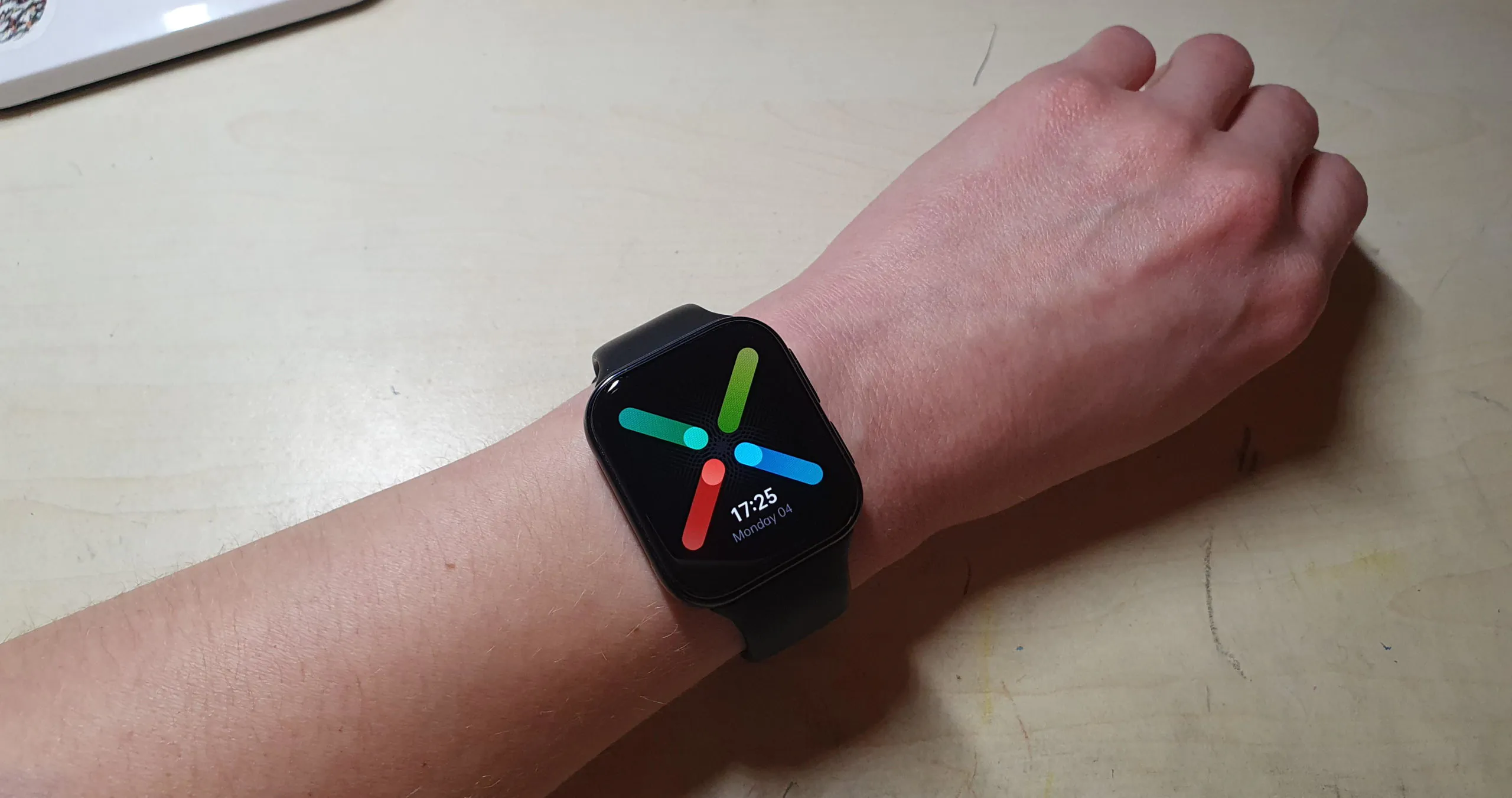
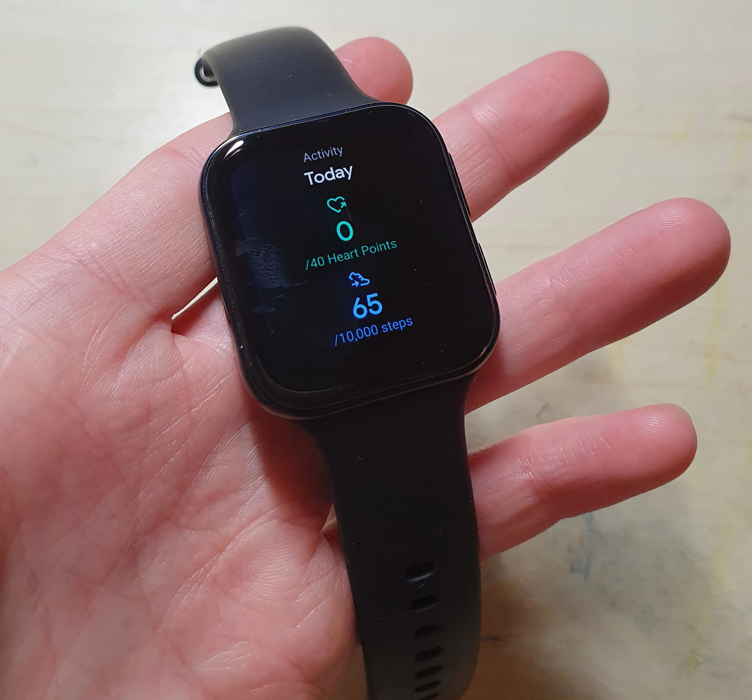
I will add that personally, after several years with round smartwatches, I liked using rectangular ones more. Somehow it is more natural or something (for a gadget than can do much more than just show time) and more convenient to perceive information. All the same, the round screen, for obvious reasons, “eats up” useful space. It’s subjective, of course.
OPPO Watch hardware
The smart watch is powered by the Qualcomm Snapdragon Wear 3100 chipset (4 cores, 1.2 GHz). This is a slightly improved version of the Snapdragon Wear 2100 from the distant 2016, and its performance on other watches leaves much to be desired. However, OPPO managed to perform a miracle.
1 GB of RAM and 8 GB of storage are available. Personally, I see no reason to fill my watch with music or audiobooks. But there are people who go jogging without a smartphone, and it may be convenient for them.
Features, sensors, paying
Everything here is the same as with competitors – an acceleration sensor, gyroscope, geomagnetic sensor, barometer, heart rate monitor, light sensor. Wi-Fi 2.4 GHz (sorry, no 5 GHz), Bluetooth 4.2, GPS (works flawlessly).
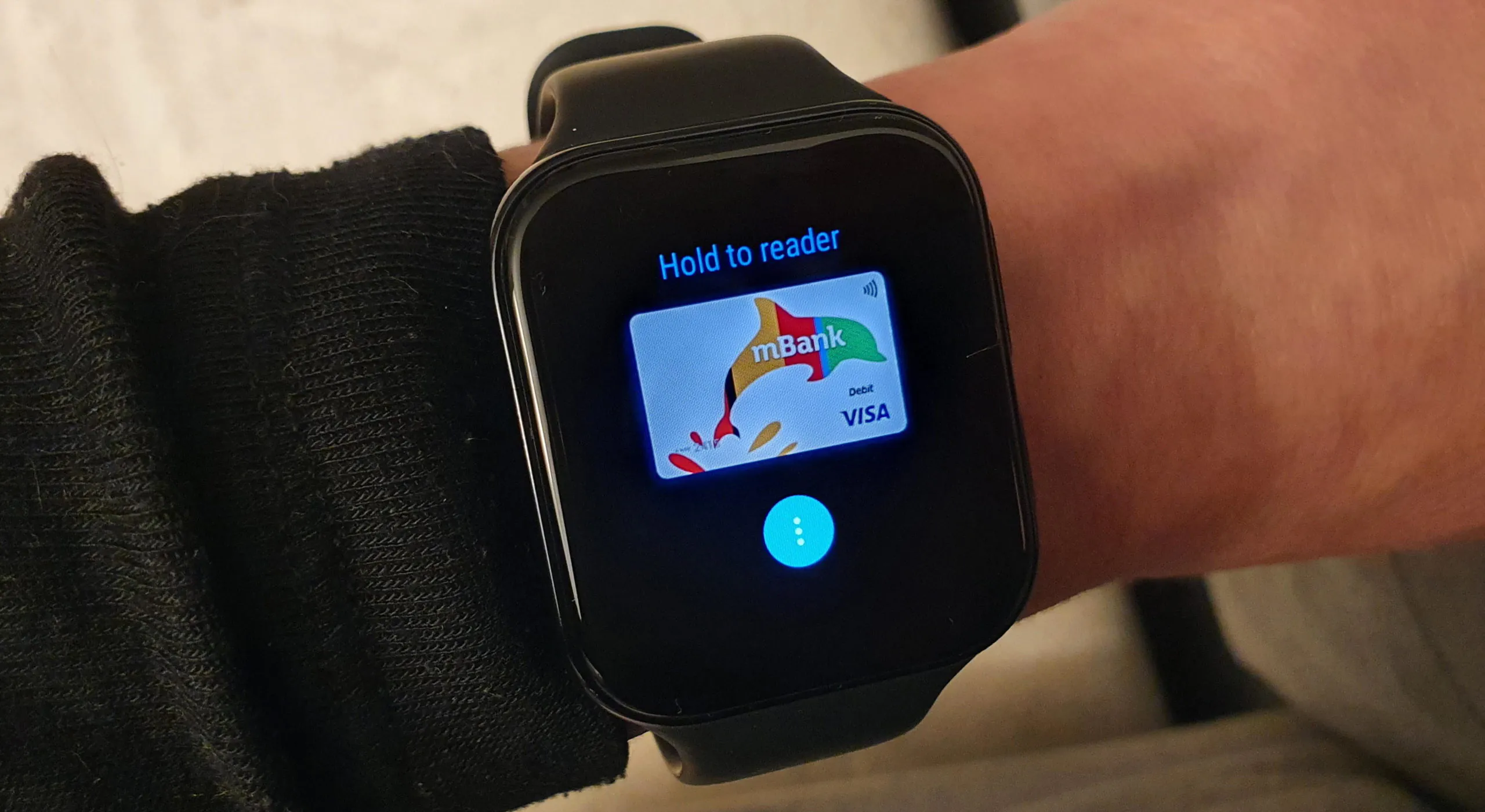
There is also NFC. Other manufacturers are inventing their own Gamin Pay, AliPay, Samsung Pay and so on, but OPPO didn’t have to create anything of their own since Google Pay is on board. The card can be added in a couple of clicks, during the test I paid many times in stores with no problem. It’s so cool! The Galaxy Watch also has a payment option, but I live in Poland, and Samsung Pay does not work here, so an expensive watch remains without a useful option.
WearOS with a new look and fitness features
Let’s move on to the main thing – the operating system. So what did OPPO do to it that I stopped hating WearOS? Well, they optimized it and added the ColorOS shell. The interface is fast. And also smooth and lag-free. If I didn’t know it was WearOS, I would never have guessed. Apparently, everything can be optimized if desired. The only strange thing is that what Google cannot do, OPPO can, just like that. Where there’s a will, there’s a way.
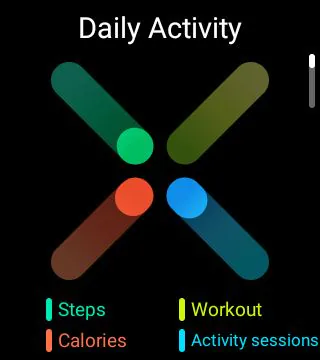
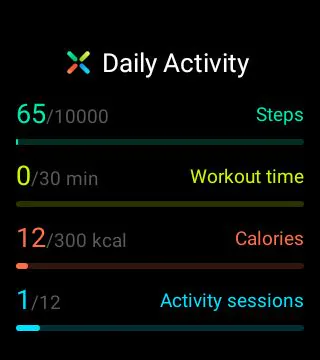
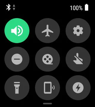
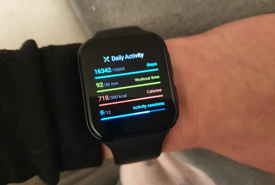
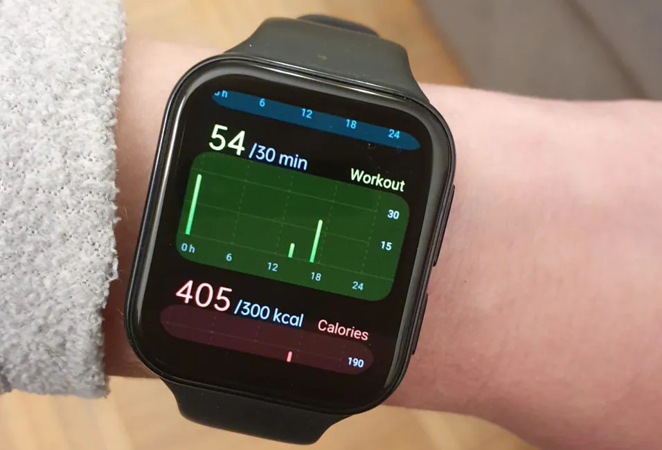
Overall, the interface is simple. Gesture from top to bottom calls a curtain with settings. Just like in pure WearOS, and in regular Android. Bottom-up gesture calls the notifications section. Right swipe calls Google Assistant. Left swipe activates widgets (screens with information such as the number of steps taken, sleep data for the last night, heart rate history, weather, news, and so on).
The UI has a “go back” gesture to return to settings, apps, and so on. It is necessary to make a swipe from left to right like in an iPhone. Very comfortable. I got used to it in two weeks and even started trying to do the same on the Galaxy Watch.
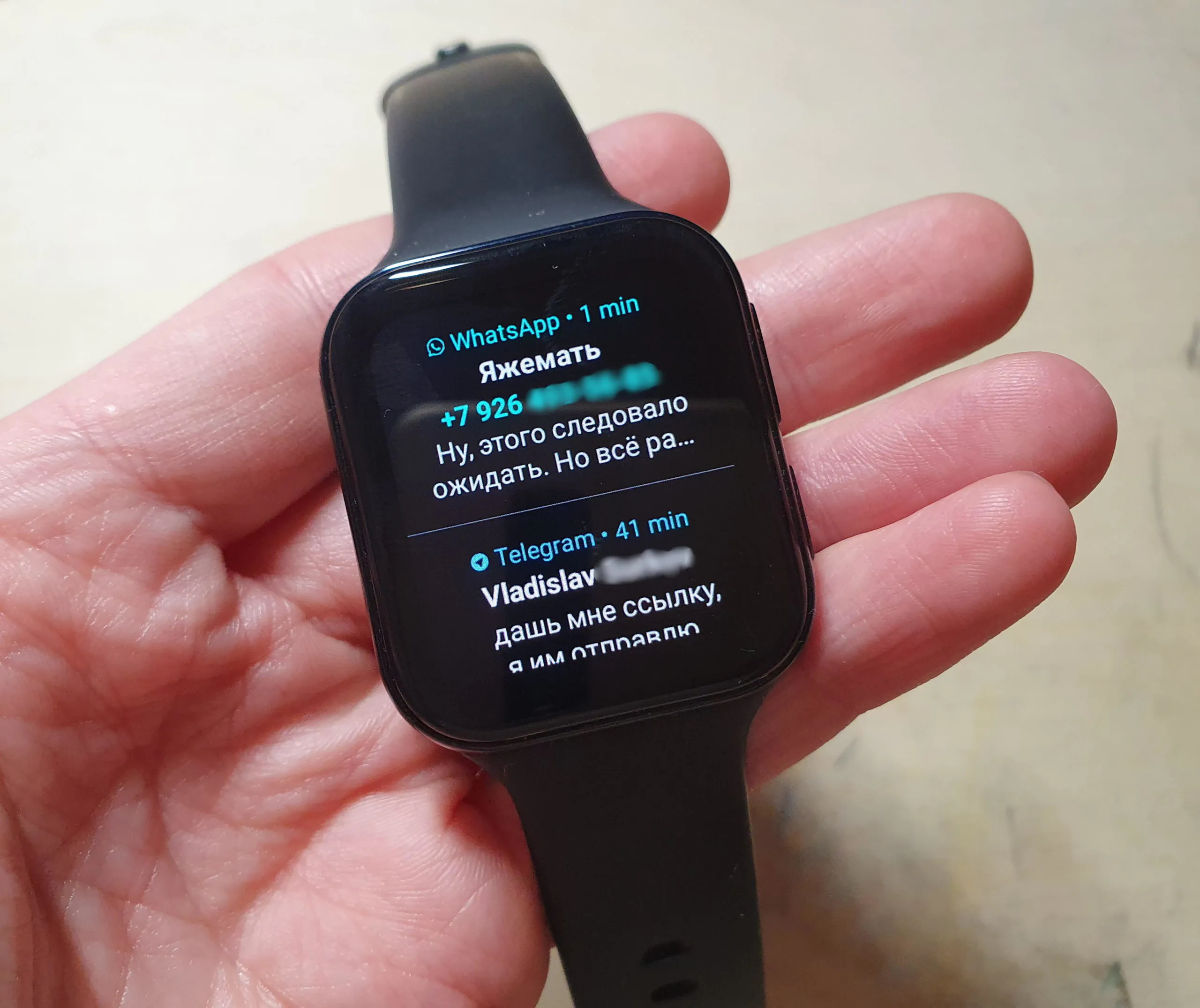
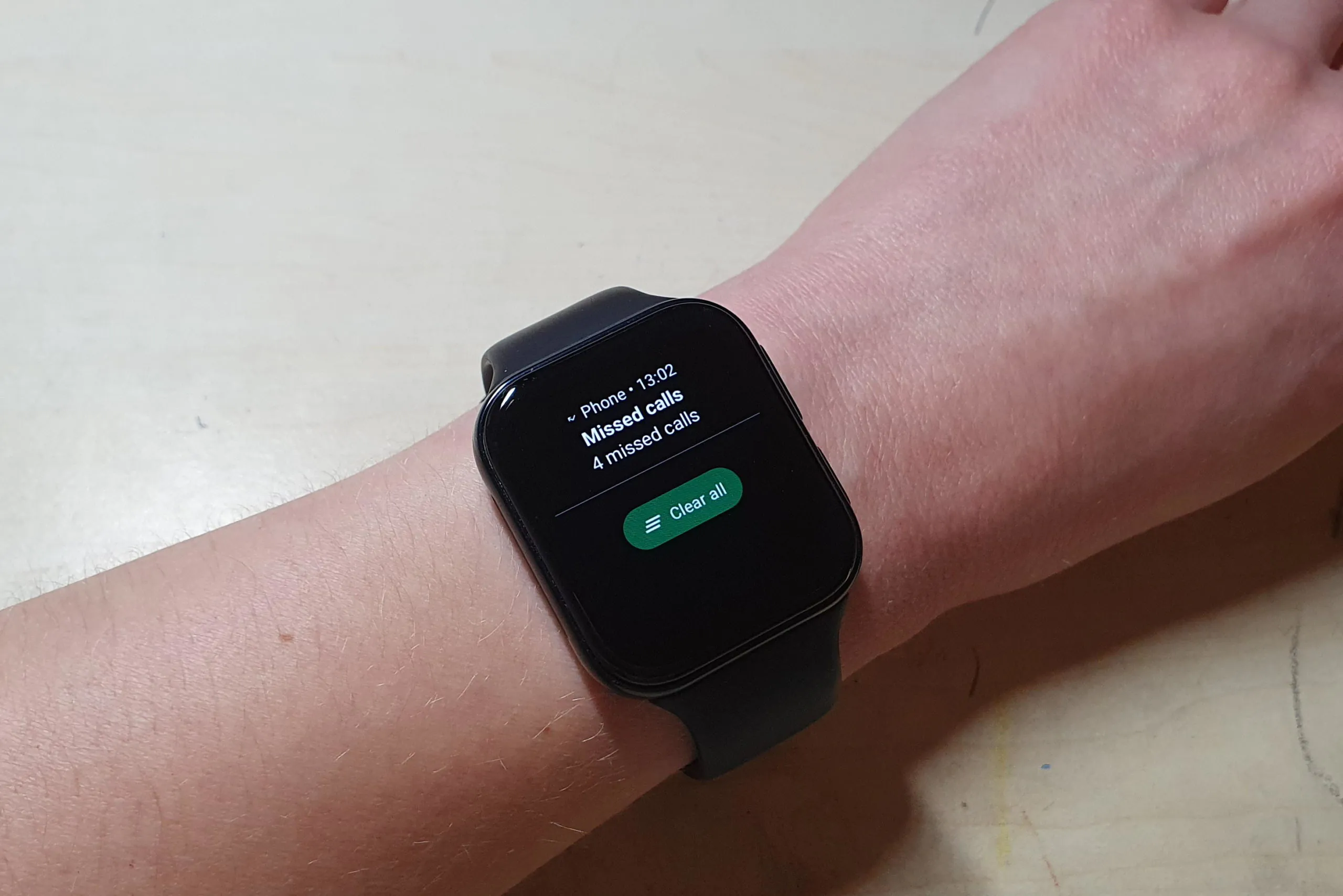
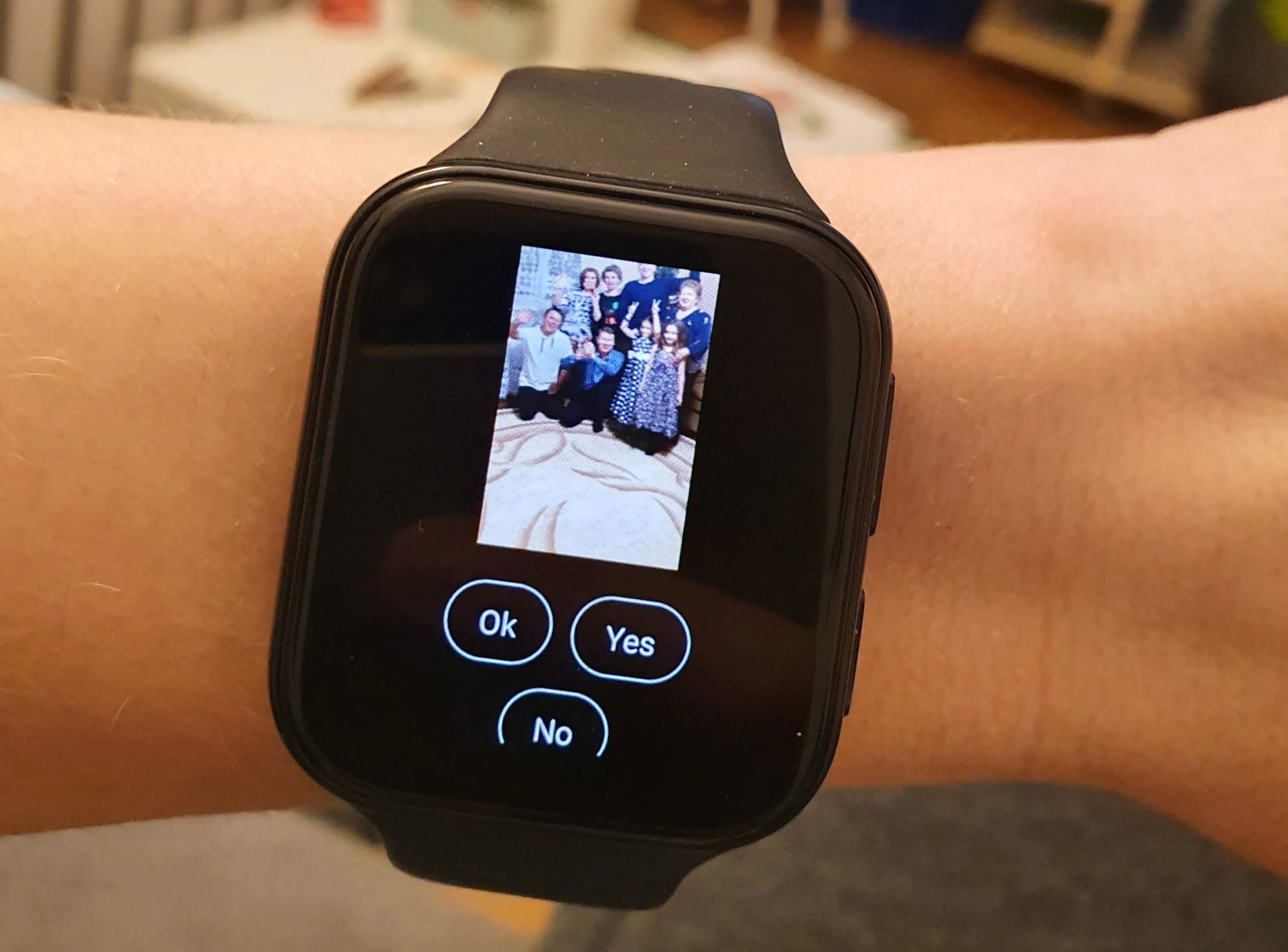
Notifications look great, there is a lot of information on the screen. You can reply – either with a template, or write something on the keyboard, or dictate with a voice (Google’s recognition is excellent).
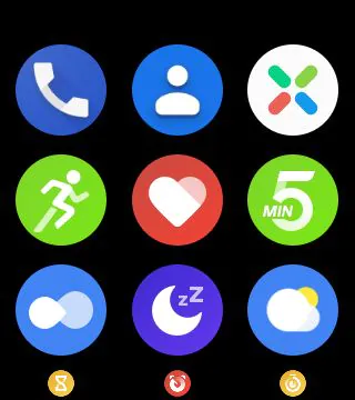
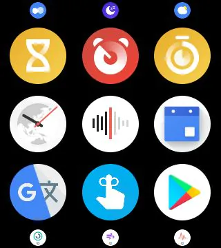
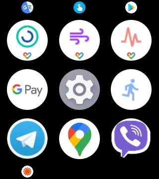
The list of all applications is called by the top physical key. First, there are utilities from OPPO, then from Google. Moreover, they partially duplicate each other. For example, there are two heart rate apps, two for breathing exercises, and two for tracking workouts. In my opinion, the Oppo ones work faster, but the Google ones were left for those who prefer to use them.
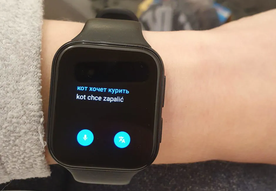
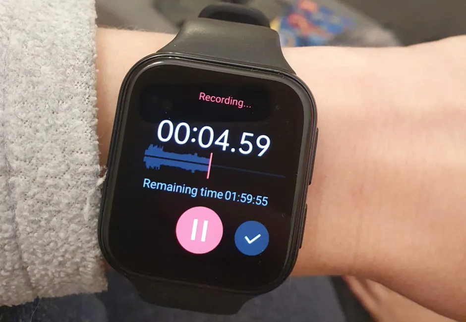
There are also apps such as notes, calendar, timer, weather, even a voice recorder and translator (with voice recognition).
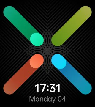
As for the watch faces, there are few of them. I especially missed options with detailed information about steps, calories, heart rate, and so on (it’s better than just pretty pictures and arrows). However, it is realistic to find something better, even if choice is very limited.
Just don’t install third-party programs like Facer that offer a choice of watch faces. Still, they are mostly for round screens, secondly, ugly, and most importantly, these apps just plain don’t work correctly, so don’t even bother, honestly.
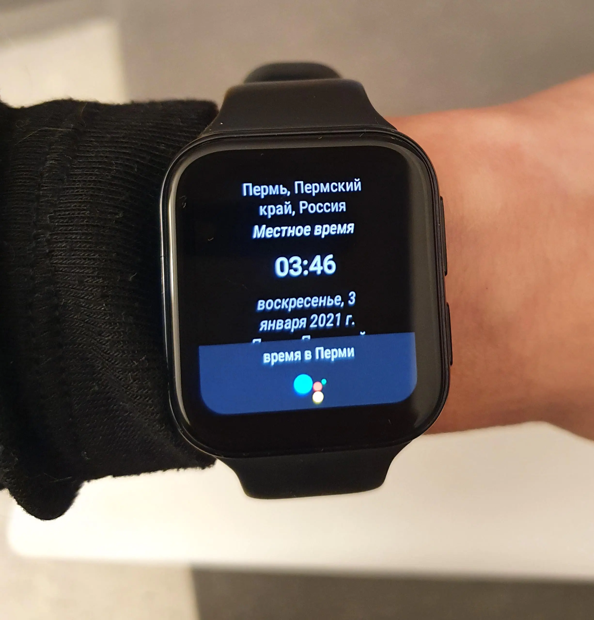
What I also missed in Samsung Watch is a full-fledged Google Assistant, with which you can chat in your native language (Samsung has Bixby, but it can only work with English). Not that I’m a fan of voice assistants, but when this thing is right at your fingertips and can answer any question, it’s more convenient than looking at your phone.
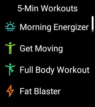
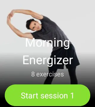
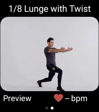
The watch, like many of others, is able to “kick” you if you sit still for a long time. And it doesn’t just kick, but offer a series of 5-minute workouts in order to warm up. With a fashionable guy as a model, and a video!
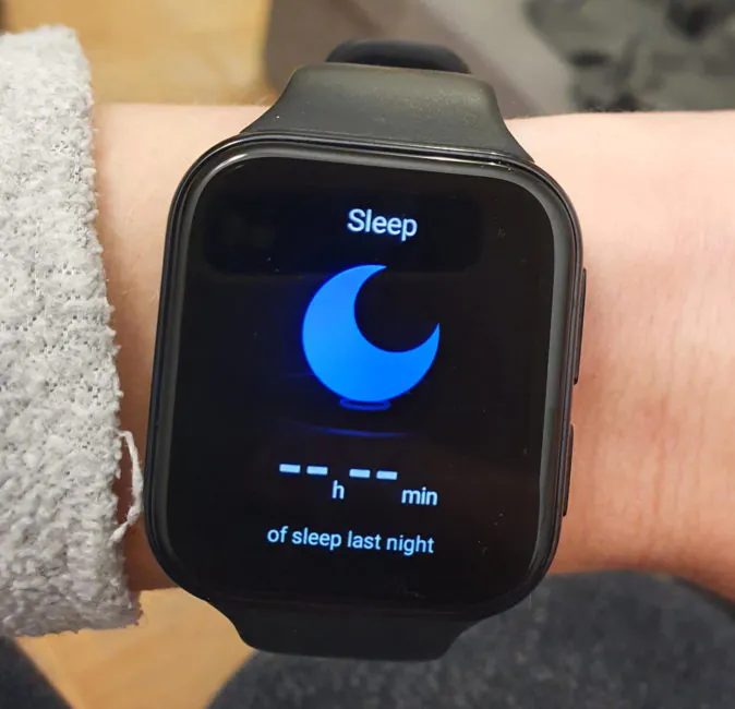
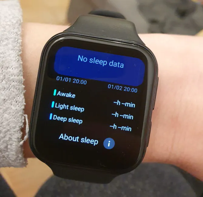
It also knows how to track sleep, but I don’t really trust gadgets in this regard, so I didn’t pay attention to testing this function.
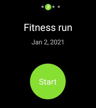
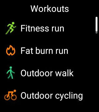
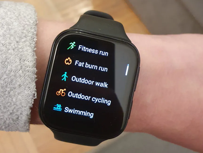
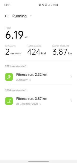
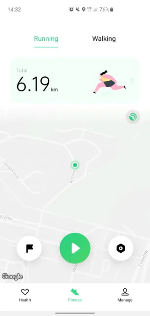
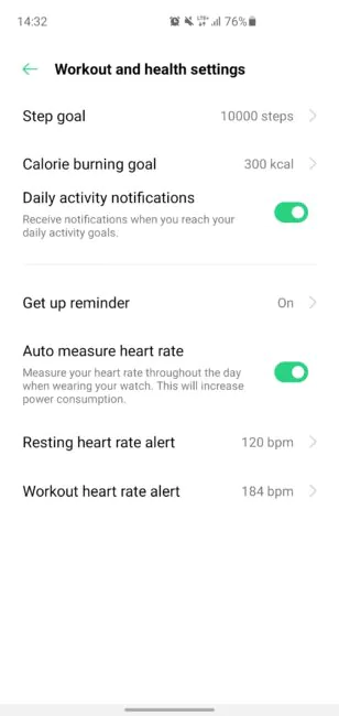
But I love fitness. The OPPO app offers workouts such as running (two types – normal and fat burning), walking, cycling, swimming. The Google Fit app has more workouts, including yoga, skiing, rock climbing, and so on.
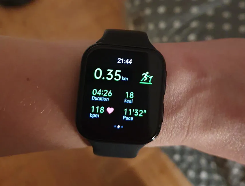
It’s all fine, the OPPO app is convenient, all the basic data during training is immediately available. The operation of the sensors, in my opinion, is adequate, everything is clear – pulse, number of steps, mileage. There was a difference in comparison with Samsung Watch, sometimes by 10-15% in steps and kilometers. Who is right and who is wrong – I don’t know. But I would assume that the Samsung is “righter”, since it is more expensive and the sensors are better. In any case, it is not critical.
There is also no automatic workout tracking. In Samsung Watch, this feature is important to me. I am an active person, I walk a lot, ride a bike and so on. But I am too lazy to poke the watch and start a workout every time. That watch recognizes activity and records data by itself. OPPO Watch doesn’t do that. On the other hand, it is not a critical option for everyone.
But it can work with calls. Convenient if, for example, I am in the kitchen, and the phone is in another room. Or if I’m riding a bike and don’t want to stop and take my cell out of my backpack. Voice quality is good.
There’s also no trendy function of measuring blood oxygen. Although it is not necessary, really. If serious problems arise, it is best to go to a doctor and trust medical equipment. The same can be said about newfangled options for measuring pressure or ECG.
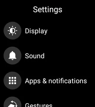
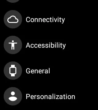
OPPO Watch settings are standard for WearOS.
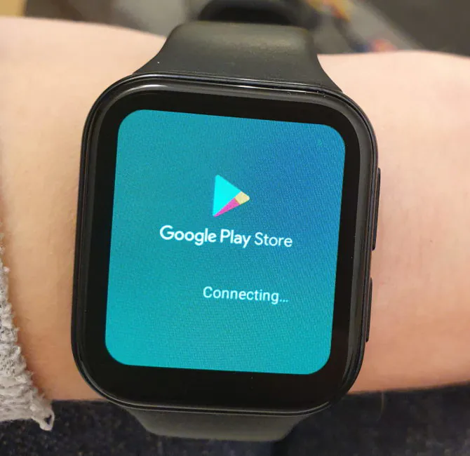
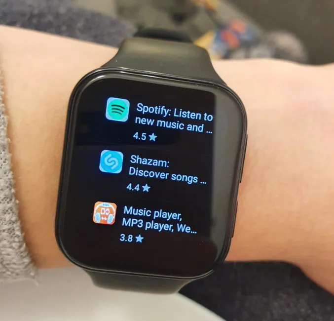
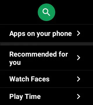
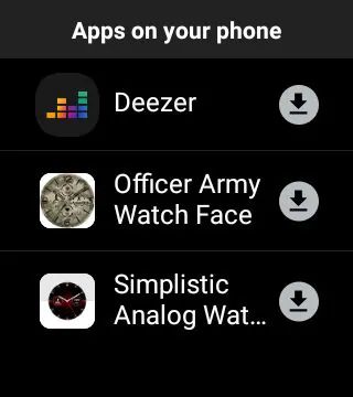
How is a full-fledged smartwatch different from everything else that looks like it? It has the ability to install third-party software. For this, the OPPO Watch has Google Play.
Frankly, rummaging through the software catalog on the mini-screen is not very pleasant, but there is no other way (for comparison, you can install software to the Galaxy Watch comfortably through the companion app for a smartphone). But any WearOS software is available on OPPO Watch. This is good, since I read somewhere earlier that there will be no full compatibility. You can install a full-fledged Telegram, Deezer, Google Maps, games and so on.
Smartphone connection
As mentioned, there is a WearOS app that you need to install on your phone. It allows you to connect the watch, turn off the watch, change the watch faces on it and literally a couple of settings, that’s all. The rest can be done on the small screen of the watch. In fact, there is no need for this utility, you can connect the watch and phone, and then remove the icon from the desktop.
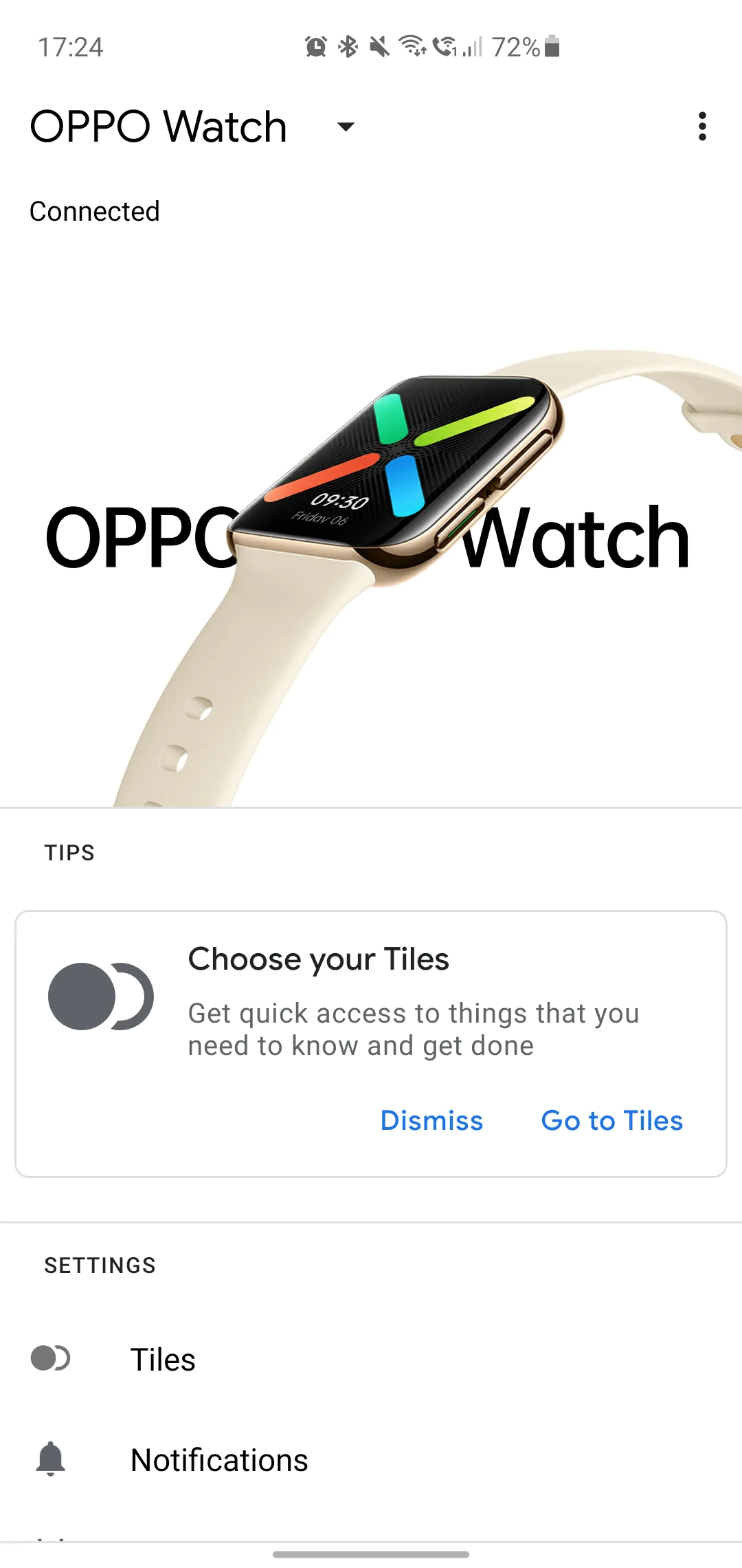
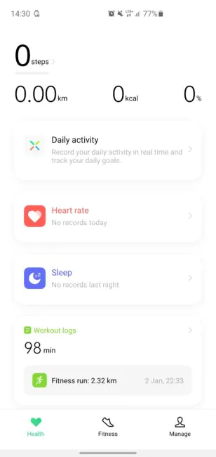
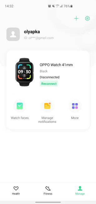
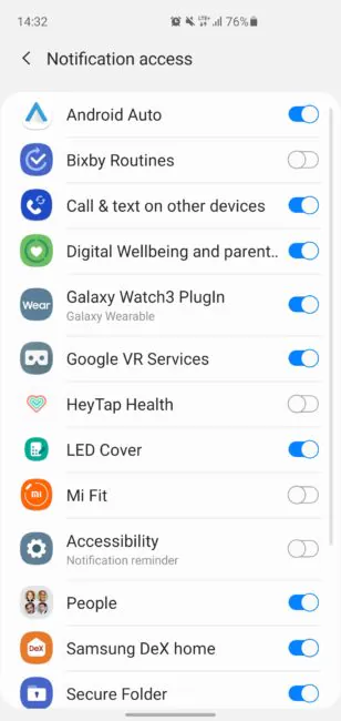
OPPO Watch The watch will prompt you to install the OPPO app called HeyTap Health. Something like Huawei Health, Mi Fit, Samsung Health, and so on. An app where workouts, sleep data, heart rate are recorded. You can skip installing it and use Google Fit.
The Bluetooth connection with the phone is reliable; if the connection is lost, the watch will notify you.
OPPO Watch battery life
Now, those who are ready to start writing “but my Xiaomi tracker/Huawei smart watch costs ten times less and lasts three weeks!!!”, just stop.
OPPO Watch is a smartwatch. Full-featured, feature-rich, with high-definition OLED screen, and the ability to install apps. You might even say it’s a mini-smartphone on the wrist. It will not work for two weeks (except in the “wristwatch only” mode). If battery life is important to you, buy fitness trackers and “smartwatch bracelets”. A true smartwatch is a little different. If its capabilities are rich, some things will have to be sacrificed.
For example, the revered Apple Watch lives for one day at the most. And nobody whines about that. Galaxy Watch also survives for 2-3 days maximum.
OPPO Watch was criticized for battery life in reviews, and I prepared for the worst. But it’s not that bad! The smaller model with a 300 mAh battery lasts for two days. It quickly ran out of juice on the first day, but that’s because of the system and app updates.
Normal use scenario is notifications, payment, answering calls, jogging every other day for 30-50 minutes. If you actively use the training tracking mode, then the watch will easily survive a day.
The 46mm OPPO Watch is equipped with a 430mAh battery. Judging by the reviews, it’s about the same: the larger screen takes its toll.
If you turn on the power saving mode (the watch will only show the time and date, measure the pulse and count the steps), then, according to OPPO, the gadget will last up to 21 days.
Fast charging is supported – 30% in the first 15 minutes and about 1 hour 15 minutes to the maximum. For charging, the watch is placed in a cradle with metal contacts – no effort is required for this, it is held securely, the control buttons remain accessible.
Verdict
OPPO made a very good smartwatch on Google’s “barely alive” WearOS. The company has managed to optimize the operating system in such a way by using its shell, which made it very fast, smooth and glitch-free. Among the pros is a beautiful AMOLED screen with good resolution, compact size, interchangeable bands, Google Pay payment, water protection and tracking of various types of workouts. I also think that a rectangular screen is more convenient as well.
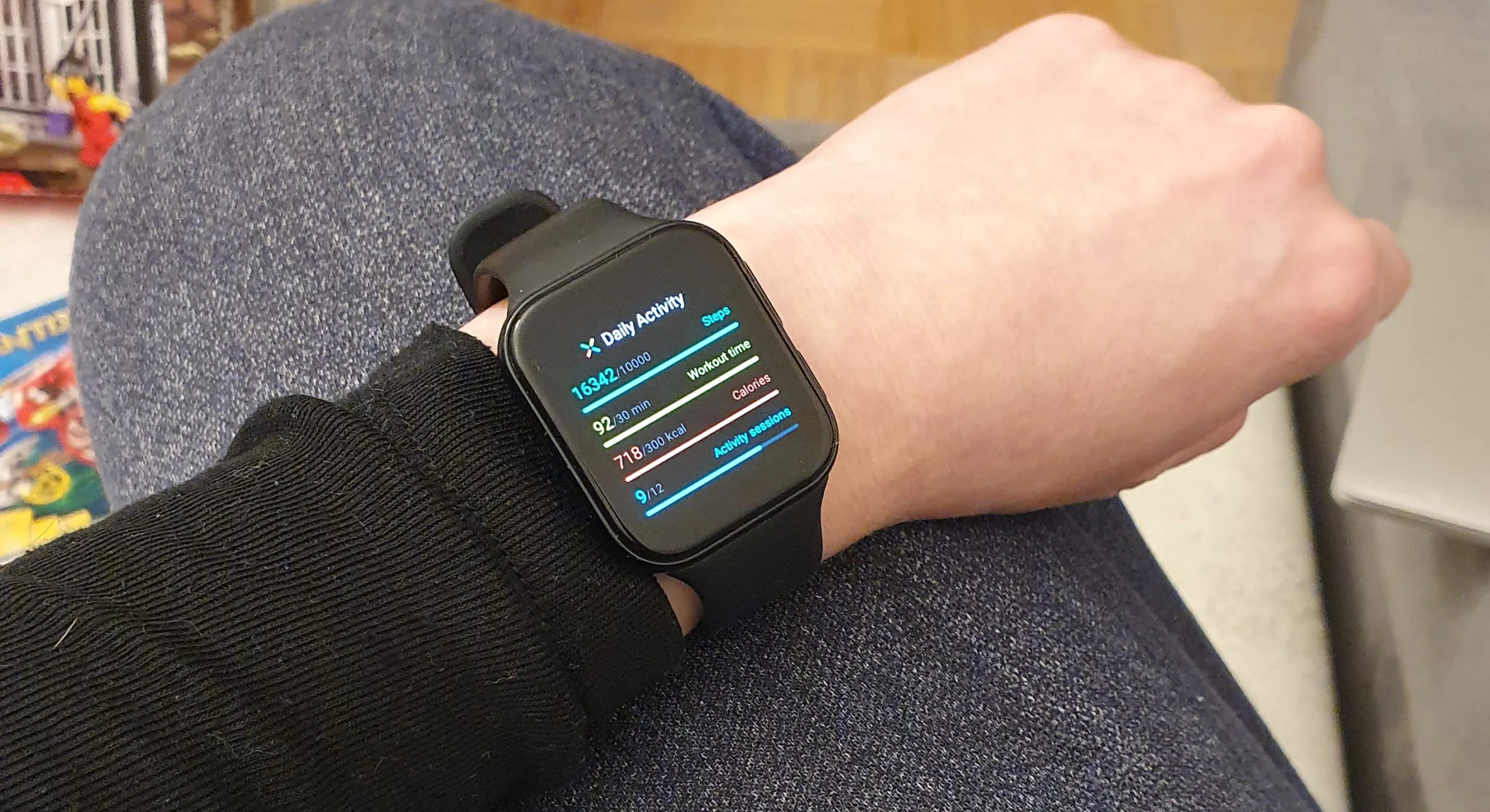
But still, there’s a mediocre buckle, the battery life could be better (but in theory it would increase the size and weight of the gadget), there is no pulse oximeter, automatic detection and tracking of activities.
In my opinion, OPPO Watch is not much worse than the Samsung Galaxy Watch 3 and is certainly more functional than any fitness trackers (including those akin to smartwatches, but with proprietary software). This is exactly what WearOS should have been if Google gave a damn about it.
Of course, if you have an iPhone, then you need to buy an Apple Watch, there will be no sense buying a smart watch on Android. And if you want to save money, you can buy any fitness tracker. If you also use an OPPO smartwatch, share your impressions!
Subscribe to our accounts:


