© ROOT-NATION.com - Use of content is permitted with a backlink.
It might seem that I start the EMUI 10 review from afar, but people in-the-know will surely understand why. Huawei’s smartphone business is now in a difficult situation. Due to U.S. sanctions, the Chinese manufacturer cannot certify Google services for its new smartphones. It will be difficult to say whether the conflict will be resolved in the near future. In any case, Huawei is actively preparing a backup platform; that’s why it’s been developing the recently introduced Harmony OS and its own mobile services.
Read also: DON’T PANIC! Huawei won’t die, and that’s why
The fate of Android on future Huawei and Honor devices is uncertain. Nevertheless, the company, which has invested enormous resources in the development of the ecosystem for many years, is prepared to release EMUI 10 firmware based on Android 10. By the way, all previously released Huawei smartphones will not be affected by sanctions. Moreover, it is kinda funny how this situation involuntarily accelerated the release of a new version of EMUI 10 for current devices.
Read also: “My children prefer Apple products” – Founder of HUAWEI Ren Zhengfei’s Big Interview
Which smartphones will get EMUI 10
Huawei plans to begin the gradual distribution of the anniversary update in the near future. The first in the list are the current flagships, such as Huawei P30 Pro and Mate 20 Pro, and by the middle of next year, the manufacturer will complete updating all devices, including last year’s flagships, mid-rangers and many Honor smartphones.
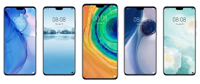
A complete list of devices that will receive EMUI 10 (and links to our reviews):
- Huawei P30
- Huawei P30 Pro
- Huawei P30 Lite
- Huawei P20
- Huawei P20 Pro
- Huawei P Smart 2019
- Huawei P Smart+ 2019
- Huawei P Smart Z
- Huawei Mate 20
- Huawei Mate 20 Pro
- Huawei Mate 20 Lite
- Huawei Mate 20 X
- Huawei Mate 20 X (5G)
- Huawei Mate 20 Porsche RS
- Huawei Mate X
- Huawei Mate 10
- Huawei Mate 10 Pro
- Huawei Porsche Design Mate 10
- Huawei Porsche Design Mate RS
- Huawei Nova 5
- Huawei Nova 5 Pro
- Huawei Nova 5i
- Huawei Nova 4
- Huawei Nova 4e
- Honor 9X
- Honor 9X Pro
- Honor 20 Pro
- Honor 20
- Honor 20i/20 Lite
- Honor View 10/Honor V10
- Honor View 20/Honor V20
- Honor 10
- Honor 10 GT
- Honor 10 Lite
- Honor Play
- Honor Note 10
- Honor 8X
- Honor 8X Max
- Honor 8C
- Honor Magic 2
- Honor 8A
I have been testing the beta version of EMUI 10 on Huawei P30 Pro for almost a month and a half. During this time, I have studied the new firmware well enough to introduce you in detail to its main features. Go!
EMUI 10 Ideology
During the presentation of EMUI 10 in August in Dongguan (China) and later at IFA 2019 in Berlin, key features of the OS have been highlighted by the company.
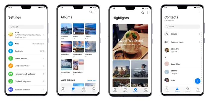
The first is the so-called “magazine style”, which implies large headlines, enlarged fonts, controls and the distance between them, a clear grid for the location of objects, and ease of the interface in general.
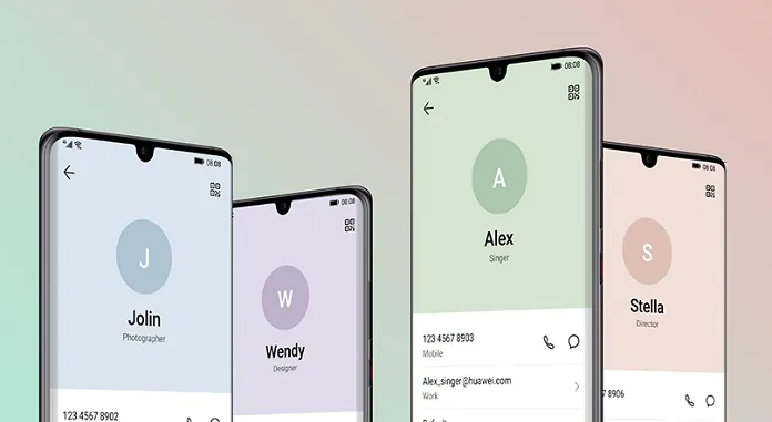
The second feature of EMUI 10 is the “Morandi color palette”, named after the Italian artist Giorgio Morandi. His work was dominated by pastel colors, which were used in the interface as auxiliary, along with the traditional blue, white and black colors of Huawei.
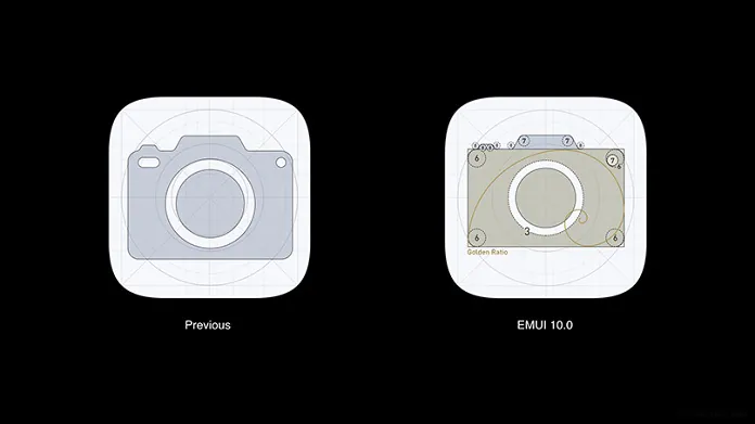
In addition, EMUI 10 supports the rendering of third-party badges using the adaptive mask of Huawei, providing a consistent display style. The principle of the “golden section” is used.
EMUI 10 desktop
The main feature of the new desktop in EMUI 10 is the increased size of elements. By default, a grid of 4×6 icons is used. And the labels themselves have slightly increased in size. Nevertheless, the scheme can be changed to 5×5 or 5×6. To do this, go to Desktop Settings/View. There is also a style lock to prevent accidental changes, automatic alignment and enable/disable the far left screen displaying Google Feed content.
Significant changes touched the second desktop theme with a separate application menu. Let me remind you that by default, EMUI uses the desktop on which all the shortcuts and widgets are placed. However, in the system settings it is possible to activate an alternative desktop theme with a separate application menu, traditional for the Android system. Previously access to the application menu was carried out using the archaic dedicated button in the bottom panel of shortcuts. In EMUI 10, the button was removed and it is now replaced with a gesture from the bottom up on the desktop. This a gesture has long been used in clean Android.
In the menu of all applications, the icons are located 4 pieces in a row, you can’t change this grid in any way. It is also impossible to disable the very top row of recommended application icons, which are actually the last running programs. The menu uses vertical scrolling, application shortcuts are arranged in alphabetical order. On the right is a panel for quick search for programs by the first letter. In addition, at the very top of the menu there is an interactive search bar for all installed applications.
In fact, it seems to me that it is easier to use the global search, which can be activated by swiping down. You start entering the name of the required application or settings item, you get an interactive output, which changes with the input of each next letter. In addition, calendar events, contacts and other elements of the system are also here.
Notification curtain
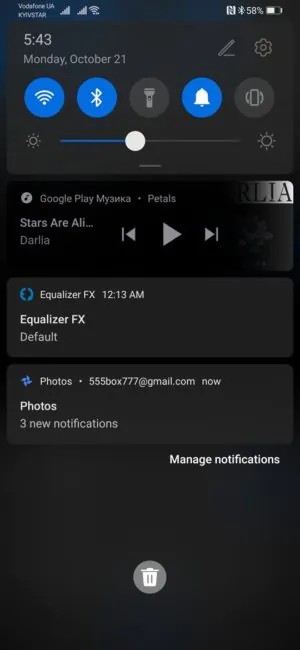
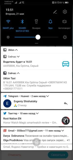
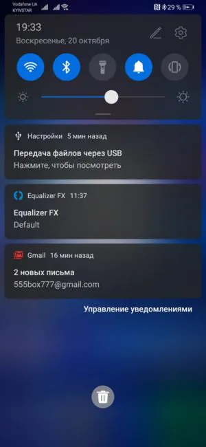
The most pleasant changes, in my opinion, have occurred in the notification curtain. It has become translucent, neat notification cards with rounded corners are clearly separated from each other. In addition, notifications can be opened by pulling them down or by clicking on the arrow on the right. In detailed notifications, you can perform certain actions, for example, write a quick response in the messenger, mark the message as read, or delete it. A slider appeared on the Play Music card to scroll through the current track.
If there are a lot of notifications in the curtain and they do not fit on the screen without scrolling, then the cards below the viewing area are simply grouped into a separate panel with icons.
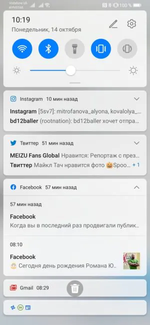
The switch area received round icons. As before, only the top row is visible by default. All icons can be opened by pulling the panel down. Clicking on the time at the very top launches the alarm clock application, and the date and day of the week activate the calendar. But only with the switch panel rolled up, which is a bit strange. When you click on the pencil, the screen for setting the location of the switch icons opens, and clicking on the gear will take you to the settings menu.
In general, the curtain has become more aesthetically pleasant, functional, informative and convenient to use.
Actually, here designers retain the general trend in the design of the EMUI 10 interface – its airiness. Indentation between the lines became larger, the font increased slightly.
As in many other places, the title field at the top became larger in height, its font also increased. But when you scroll down, the field and title become smaller. Yes, we already saw something similar in Samsung One UI. But Huawei did not stretch the title field right up to the split-screen, justifying it with the convenience of using with one hand.
Dark theme
The interface option in dark colors was also seriously improved. By the way, its setting was transferred from the menu item “Battery” to “Screen and brightness”. And besides, you can move the button to quickly turn on the dark theme in the notification panel.
The dark theme is now more deeply integrated into the system. Its activation automatically switches the interface of all built-in applications of Huawei and many third-party programs to dark mode. For example, Google Keep, Chrome, Gmail, Instagram. And widgets on desktops also switch to their darker versions, if possible.
Earlier, in EMUI 9, notification cards remained bright even with dark theme active, which looked rather strange. But now, in the blind, everything is in order. Even more so – it looks very cool.
Animations and transitions in EMUI 10
In principle, I never cared about the animations. But in EMUI 10, designers and developers managed to hook even me. The behaviour of the elements and the change of windows looks pretty impressive. When you click on the icon on the desktop, it seems to be pressed deep into the screen, simulating elasticity, and then it unfolds in the application window. When you exit the application to the desktop, its window minimises to a shortcut.
By the way, the smoothness of animations in EMUI 10 is also improved due to the fact that additional frames were added to them. In general, the system feels faster. Thanks to improved intelligent resource allocation, improved responsiveness of the interface and reduced latency.
Camera
No new features and capabilities have appeared in the camera. But the interface now feels very polished. All elements of the camera interface have become a little larger.
EMUI 10 follows three basic principles to ensure the best balance between functionality and aesthetics: simplicity, clearness and dynamic. When the user moves to adjust the parameter, the change in the value is displayed in large font in the centre of the screen in the form of large prompts, and other visual interface elements simply disappear for a while. By giving priority to user actions, the system minimises distractions, thereby increasing visual perception.
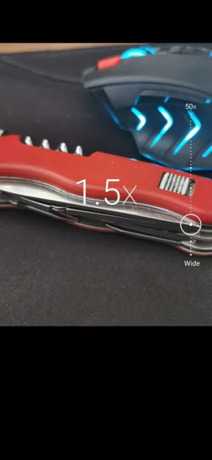
You can zoom in while shooting using the pinch-to-zoom method, a special slider or by clicking on the main values on the slider – x1, x5, x10, wide-angle up to x0.5.
Verdict
In general, EMUI 10 does not bring any real functional innovations. Some settings have been moved to more logical locations. But in general, in addition to changing the “engine” (version of Android) this is a purely visual update. And I personally like it. The interface began to look relevant and more modern. I especially like the new notification curtain. The camera application has become more convenient and intuitive. Perhaps, by the time of the global release, Huawei will add some new features to the new version of the shell.
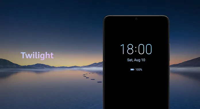
At the moment Android 10 has some inconsistencies. For example, why did the icons in the curtain and the settings menu become round, and on the desktop they are still square with rounded corners? Perhaps a new theme with round icons will be ready for the official release, otherwise it’s illogical.
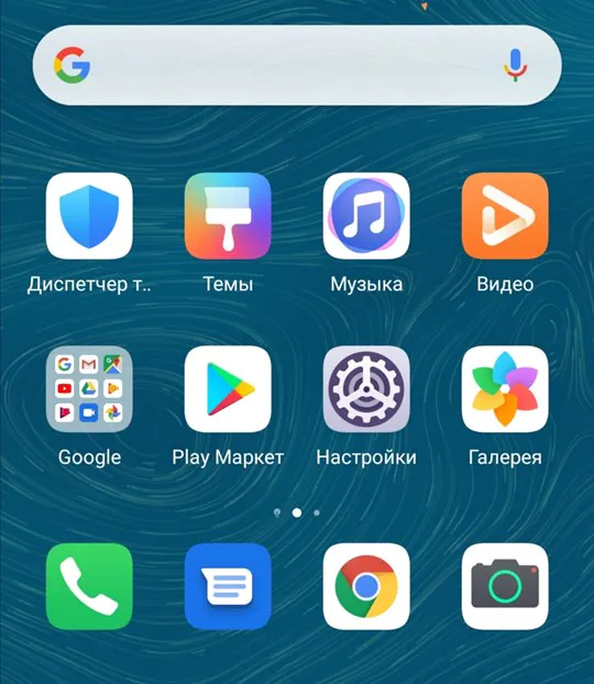
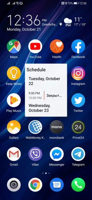
However, personally, I easily solved this “problem” with the help of a theme from the official store. Earlier in an article on using themes in EMUI I said that only Chinese stuff is present in the official theme store from Huawei. But now the situation has changed a little for the better – there are a lot of really neat themes there.
Perhaps EMUI 10 will be the last version of the Huawei shell based on Android OS. Or maybe not. I don’t want to predict. And it is the best one yet to come from China.
Subscribe to our accounts:







how i record call????????
If you have activated the recording of calls to on EMUI 9, then after upgrading to EMUI 10 the functionality will remain. But if not, it won’t work. There is an application for recording calls from Huawei, but it is not installed on EMUI 10.
The only option is:
1) roll back to EMUI 9
2) install and activate the application for recording calls
3) upgrade to EMUI 10.
Huawei Call Recorder APK – https://drive.google.com/file/d/1DVD6twk16UtvwvD-S1kXh46LKZmLQNWe/view?usp=sharing
HOW TO DOWNGRADE EMUI 10 TO EMUI 9.0 / EMUI 9.1 ON THE HUAWEI SMARTPHONES:
1. First of all, enable “Allow HiSuite to use HDB” from Settings. This will allow you to connect your device and computer (HiSuite) without the use of USB debugging mode.
2. Open the HiSuite software on your PC.
3. Connect your Huawei device running EMUI 10 with PC using a standard USB cable.
4. Once the connection is successfully established, you’ll see the device model number on the HiSuite window.
5. Now click on the ‘Update’ button on HiSuite.
6. Select ‘Switch to Other Version’.
good
after update on honor 10 lite from android 9 to 10 when open any app or do anything “hwhiaids engine” is work Automatic?? and The temperature of the device increases and the performance is slow And the battery runs quickly
I don’t like the fact that you can’t see what wi-fi or bluethooth you’re connected to unless you scroll down on the curtain.
It’s true :(
But someone in Huawei decided that users do not need this.
I have mate 20, recently I just updated it to emui 10. I noticed that the battery is decreasing very fast. Note that I seldom use my phone during work, so it kind a in standby mode. Is anyone has this problem also?
On the Huawei P30 Pro, I did not notice such a problem. But I can recommend a full factory reset with data cleaning and set up your smartphone from scratch. Save all data to the cloud or PC first.
I found a nice icon pack with round icons in the Huawei theme store – Blossoms Bloom:
You need to put it on any custom theme, because if on a predefined one, then not all icons will be round. I don’t know why so ..
Hi, can anyone tell me the name of the theme used in those screenshots with rounded icons? The round icons look really cool…thanks
Hi! It’s Aura:
I found a nice pack with round icons in the Huawei theme store – Blossoms Bloom:
You need to put it on any custom theme, because if on a predefined one, then not all icons will be round. I don’t know why so…