© ROOT-NATION.com - Use of content is permitted with a backlink.
Along with the flexible Galaxy Fold Samsung showed the newer S series, celebrating the 10th model. Before, starting with S6, we were offered two versions of the device – the normal-sized and the supersized. Now, along S10 and S10+ there’s a third variant – Samsung Galaxy S10e. For me, the most interesting model. Let’s take a closer look,
Samsung Galaxy S10e Specifications
- Display: 5.8″, Dynamic AMOLED, 2280 × 1080 pixels, aspect ratio 19:9, HDR10 +
- Processor: Exynos 9820 Octa, 8-core, 4 Cortex-A55 cores with a frequency of 1.95 GHz, 2 Cortex-A75 cores with a frequency of 2.31 GHz and 2 Mongoose M4 cores with a frequency of 2.73 GHz
- Graphics accelerator: Mali-G76 MP12
- RAM: 6 GB
- Storage: 128 GB
- Support for microSD memory cards: up to 512 GB
- Wireless networks: Wi-Fi 802.11 a/b/g/n/ac/ax, Bluetooth 5.0 (A2DP, LE, aptX), GPS (A-GPS, GLONASS, BDS, GALILEO), NFC
- Main camera: double, main module 12 megapixel, aperture f/1.5-2.4, 26 mm, 1/2.55″, 1.4µm, Dual Pixel PDAF, OIS; optional extra wide-angle module 16 megapixel, f/2.2, 12 mm, 1.0µm
- Front camera: 10 megapixel, f/1.9, 26 mm, 1.22µm, Dual Pixel PDAF
- Battery: 3100 mAh
- OS: Android 9.0 Pie with One UI 1.1 Shell
- Dimensions: 142.2 × 69.9 × 7.9 mm
- Weight: 150 g
Price and positioning
The official cost of Samsung Galaxy S10e is about $930. In some markets there is a modification with 6 GB of RAM and 128 GB of storage. Four case colors are available: Prism White, Prism Black, Prism Green and Canary Yellow.
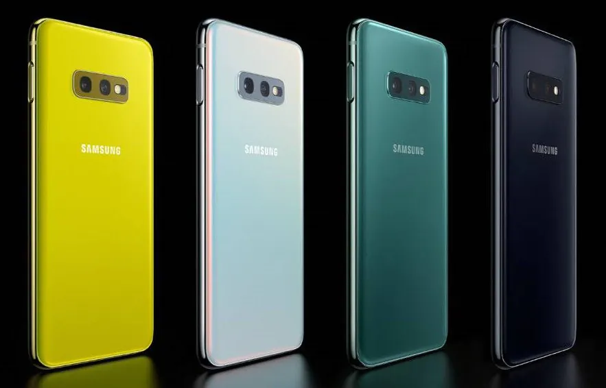
Based on the cost, you can safely conclude that this is by no means a “lightweight” flagship or a simplified version. Well, maybe a little bit… But what does separate it from its siblings?
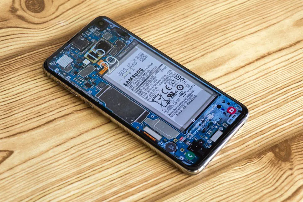
Design, materials and build quality
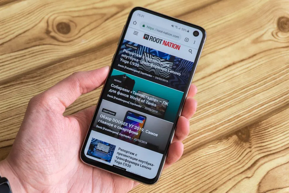
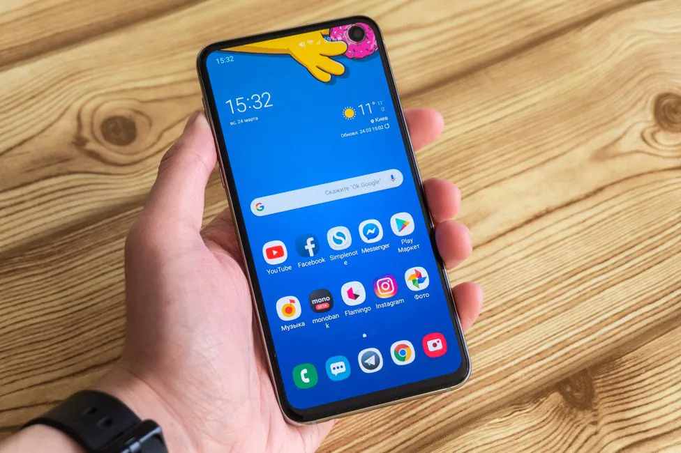
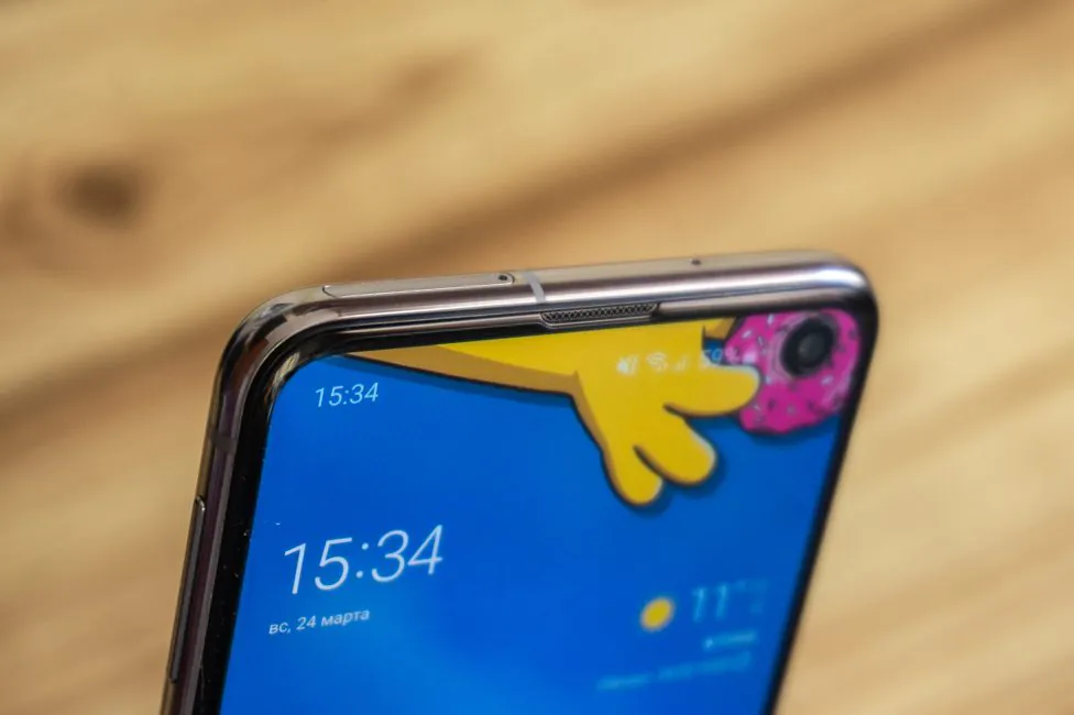
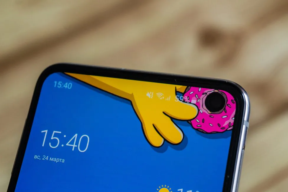
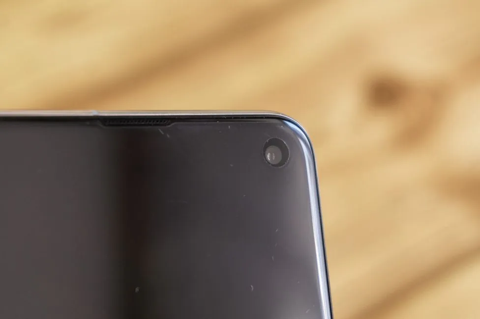
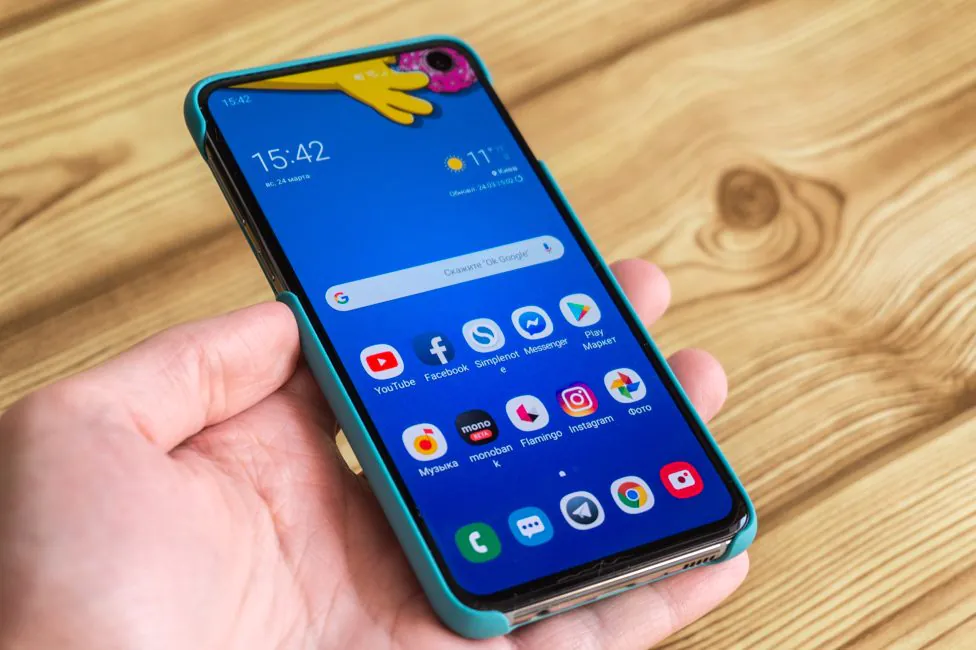
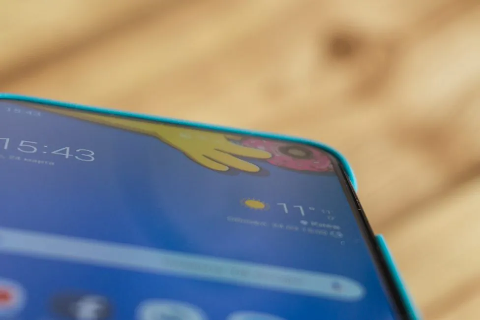
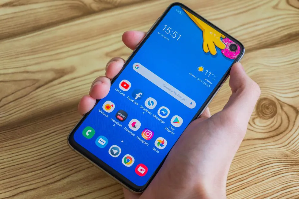
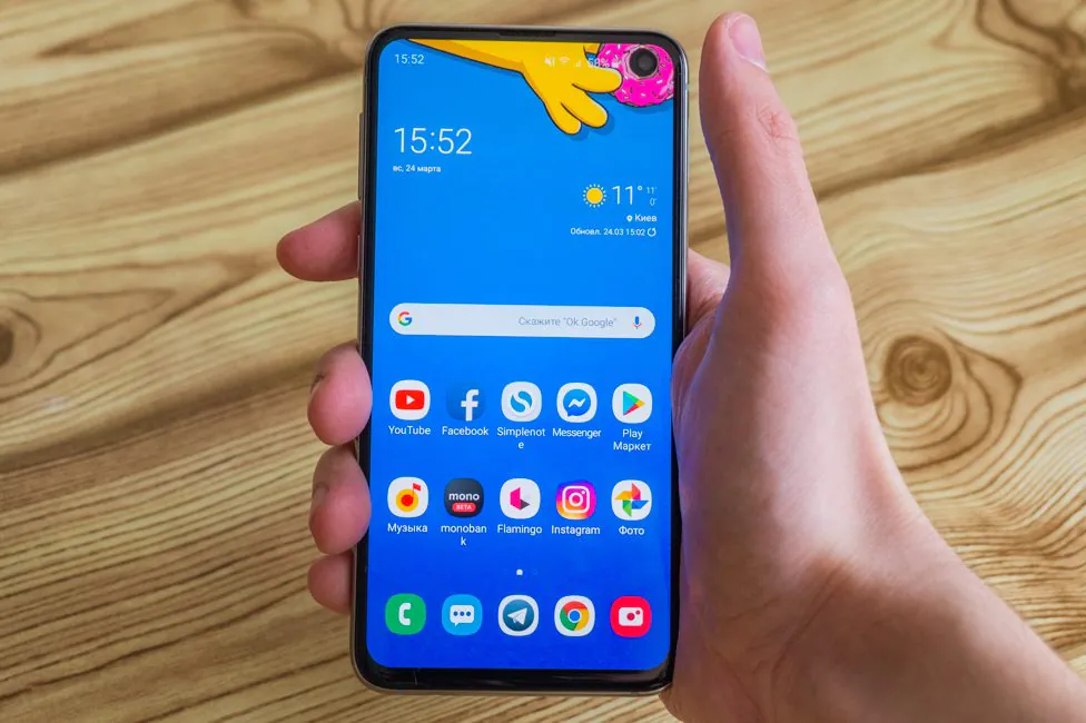
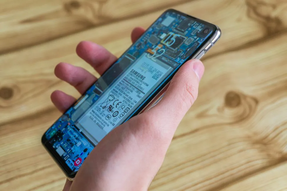
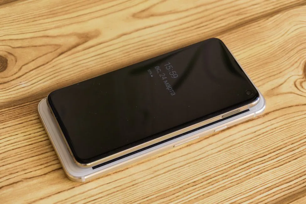
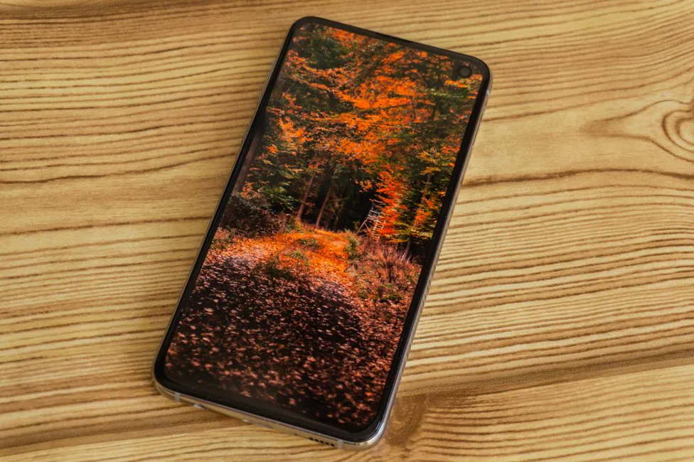
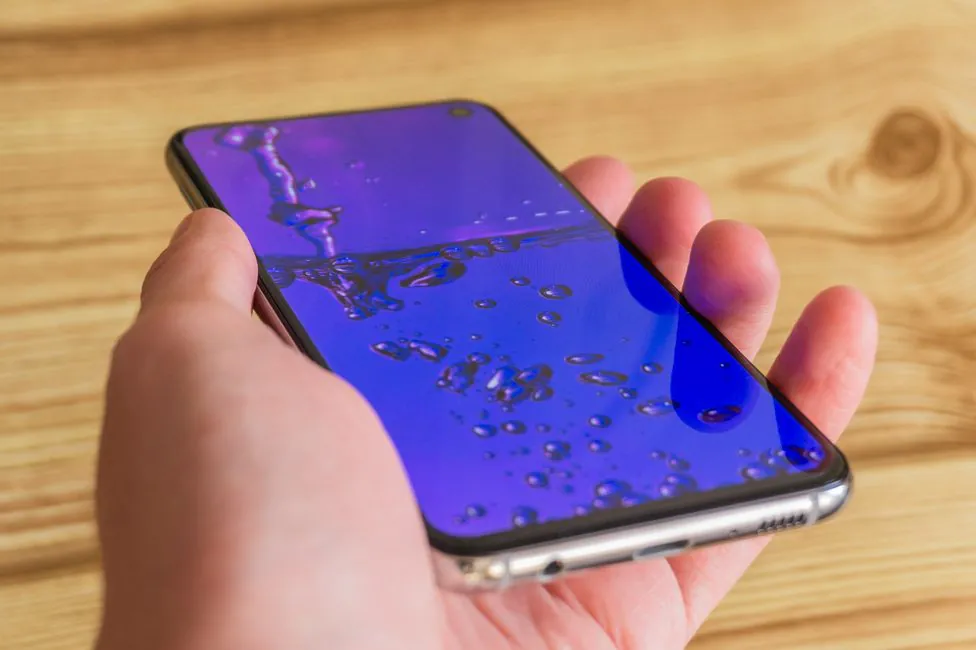
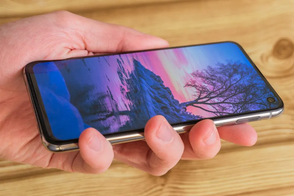
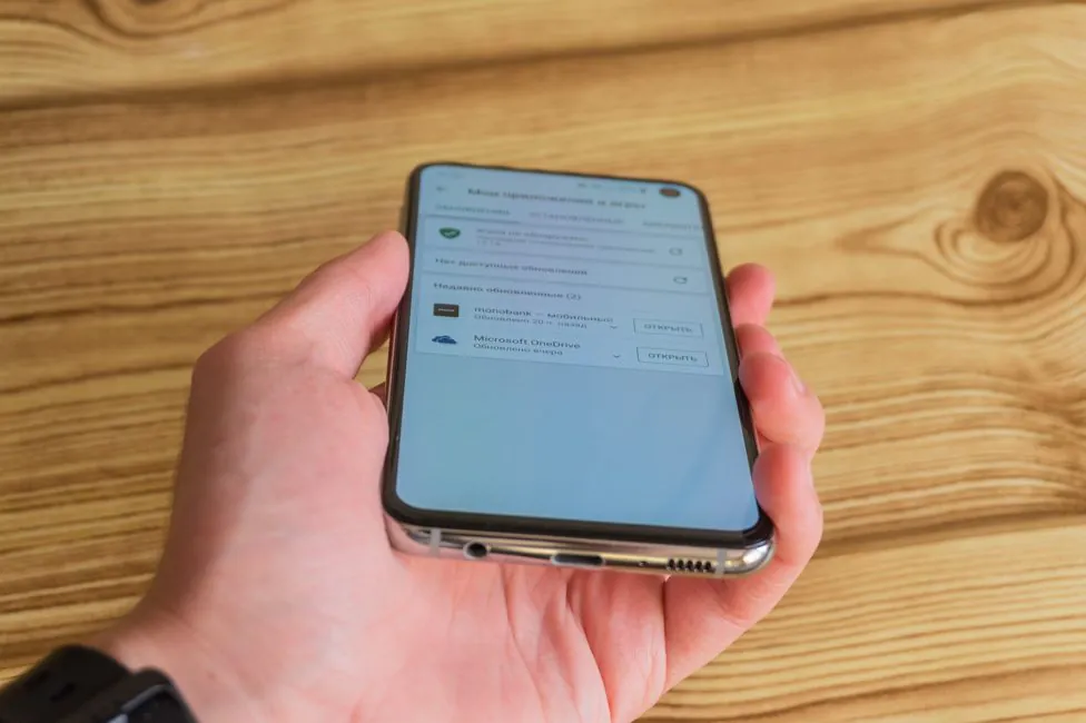
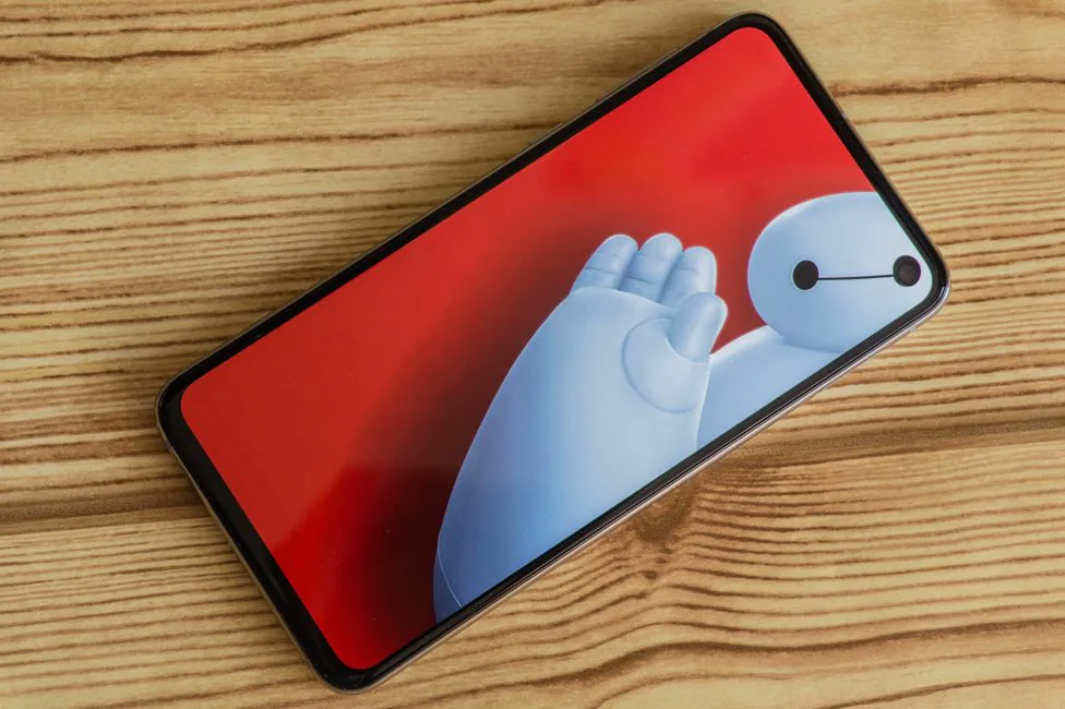
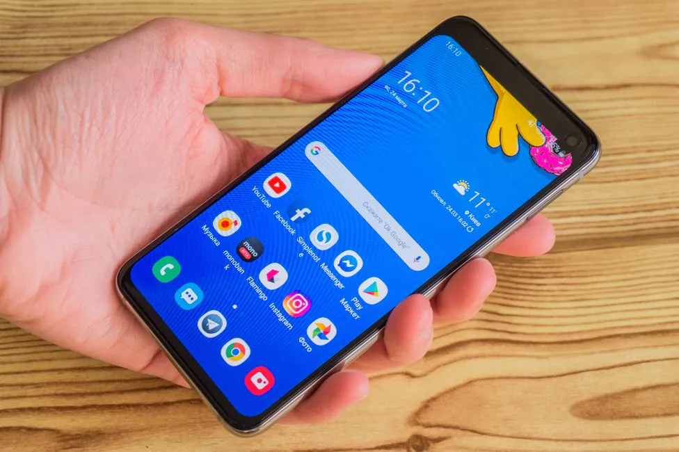
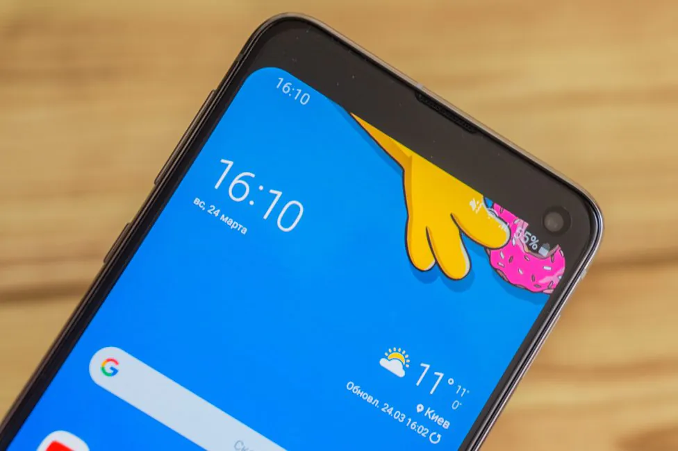
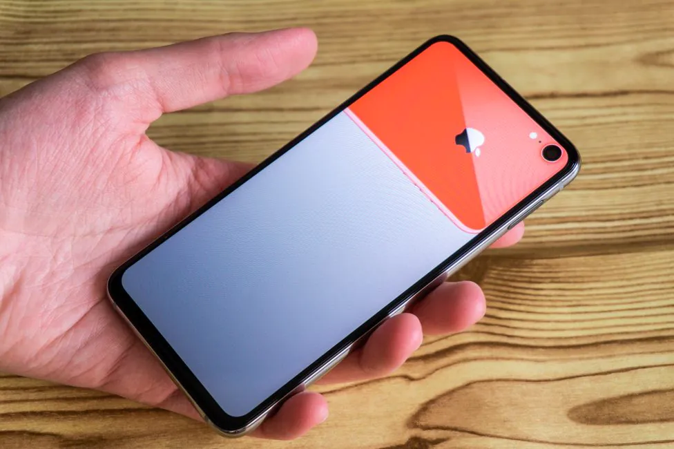
Samsung Galaxy S10e is basically the same as the senior models. Thin bezels and round notch with a camera in the screen. For this arrangement the matrix has a hole cut by a laser. This type of display is called Infinity-O.
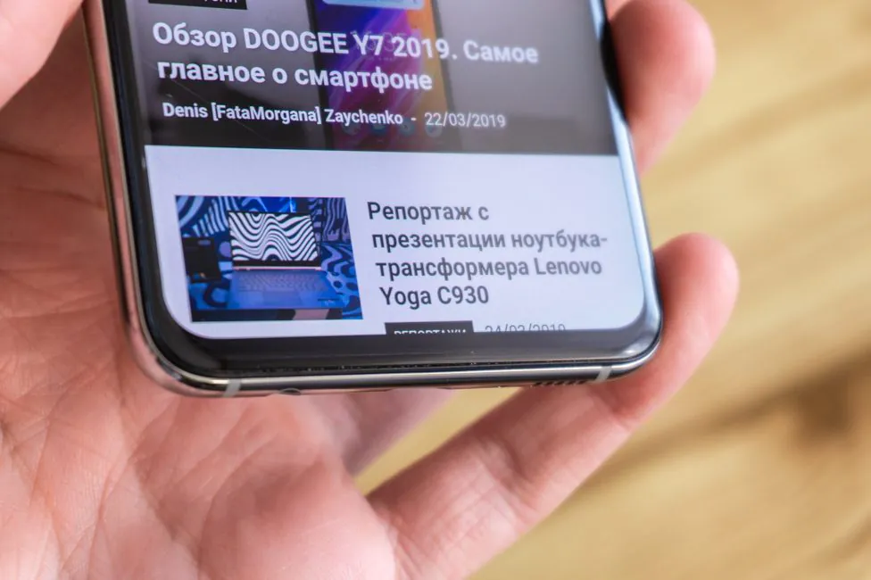
The bezels of the smartphone are as thin as possible, without bending it at the sides. In 10/10+ there is a bend, as a result of which the side bezels are even smaller. It is fair to say that the lower frame is, of course, a bit thicker than the others. But I can’t say I am bothered.
How critical is this simplification in principle? It is difficult to give an answer, because this medal has two sides. Perhaps the lack of bend in front does not look as impressive. But what if we look at the practicality of this solution? There are no false touches, it will be easier to pick up and stick a protective film or glass. The glass in the front is not completely flat. There is a slight rounding around the edges of the display.
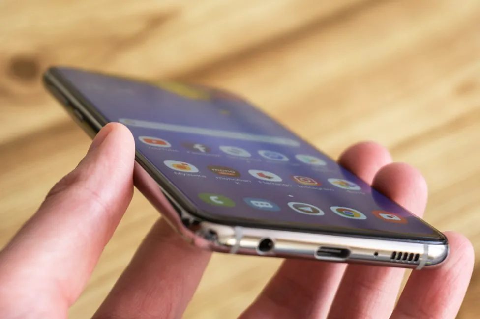
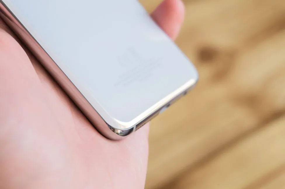
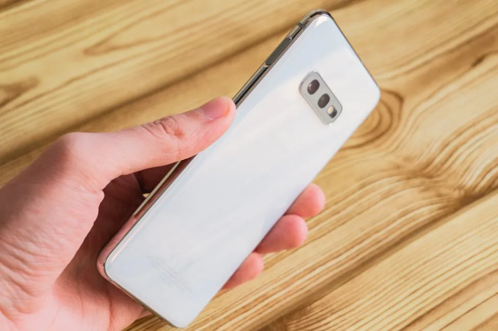
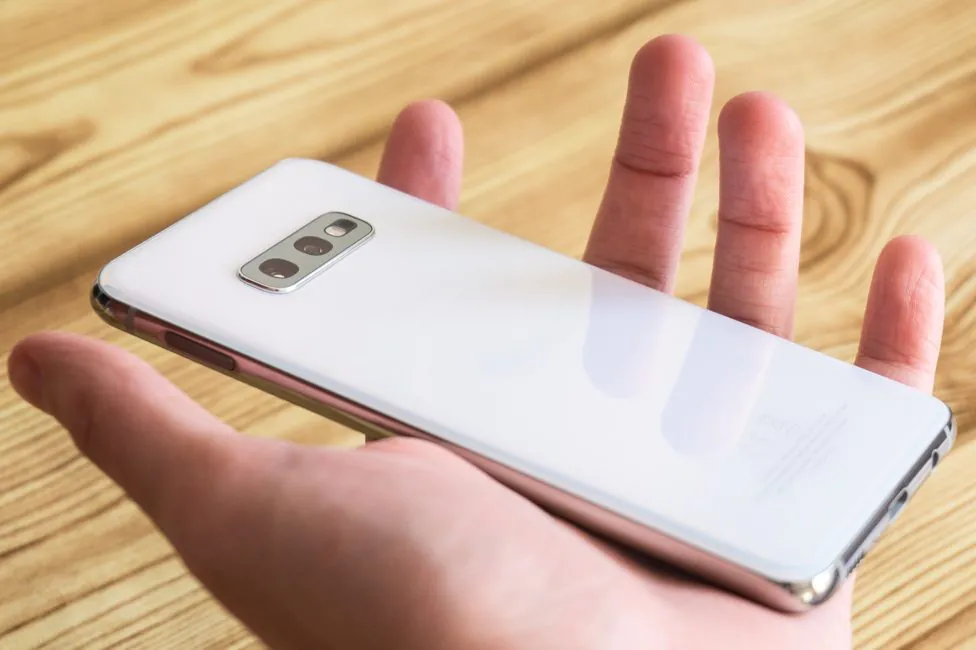
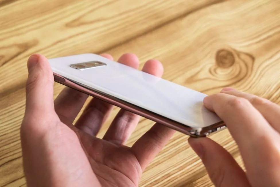
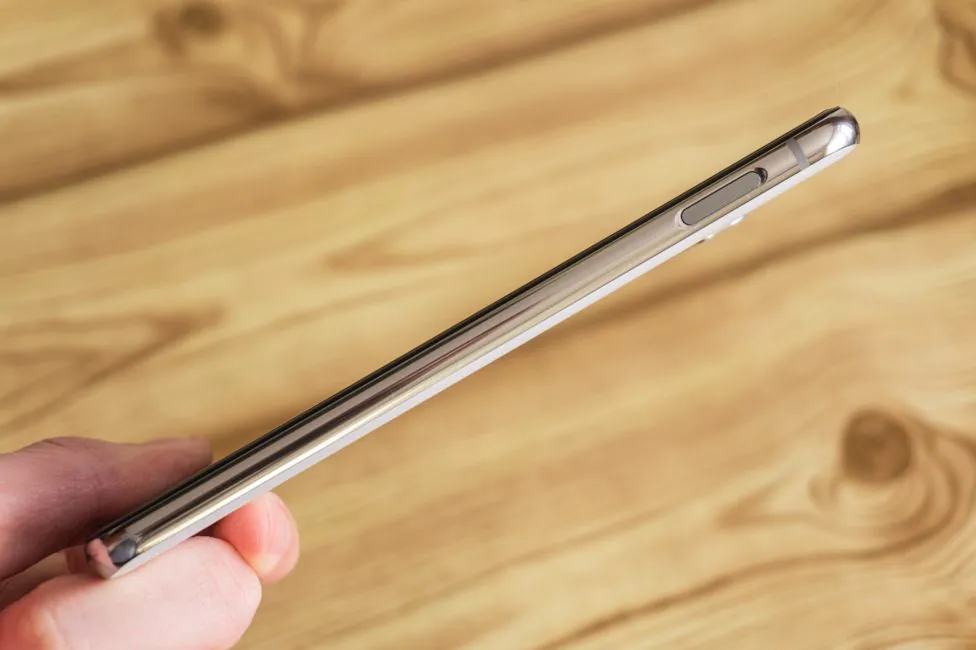
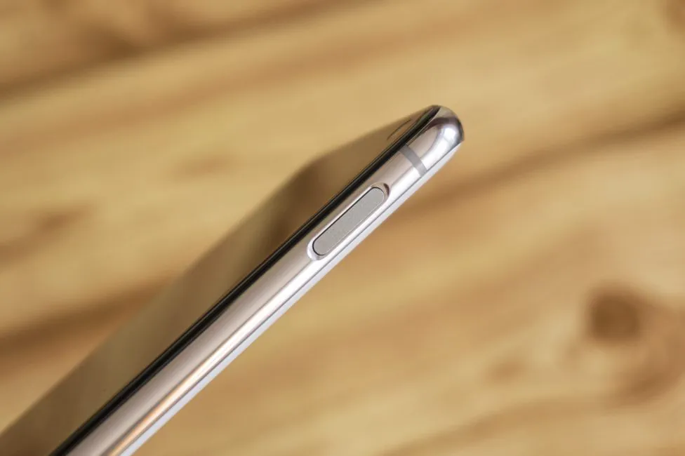
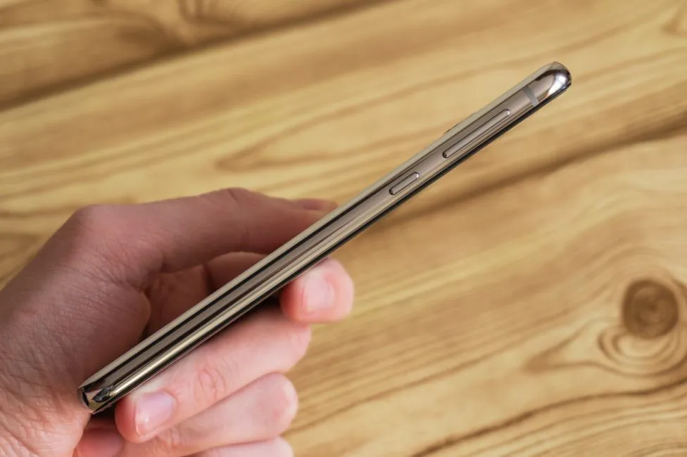
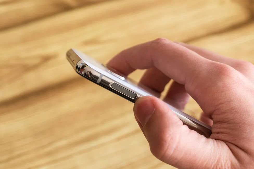
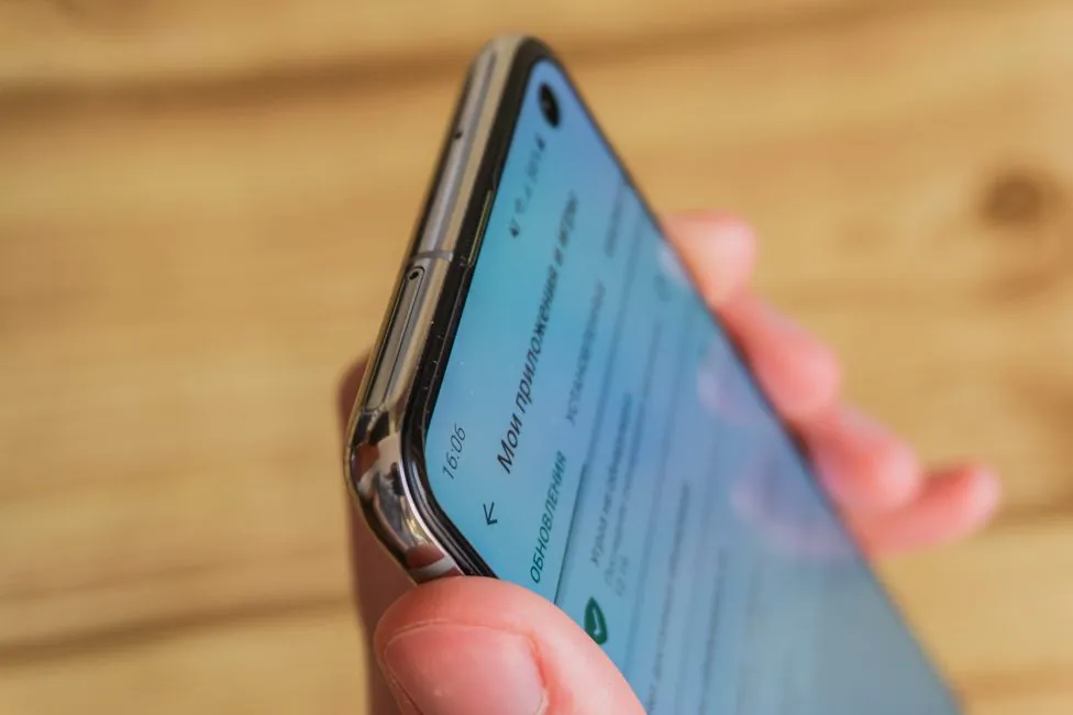
The frame around the perimeter of the case is made of traditional material – noble aluminum. In the case of white pearl color, the frame is also polished to a shine, almost mirror-like. This combo looks great.
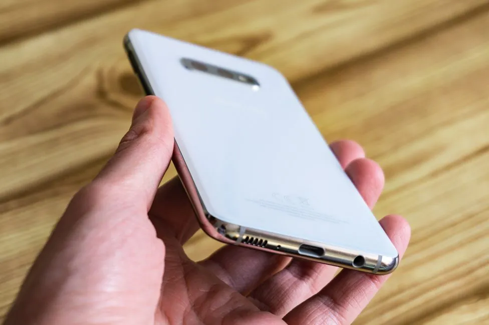
The back plate is made of glass. This glass has rounding too, but already more pronounced than the front. Due to this, the frame is also visually narrowed.
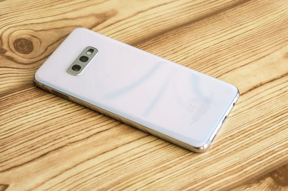
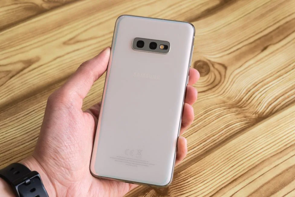
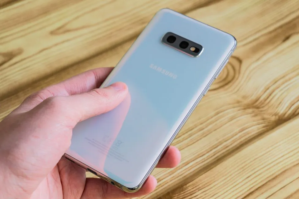
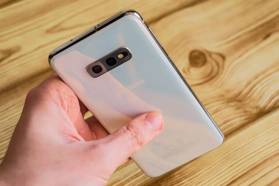
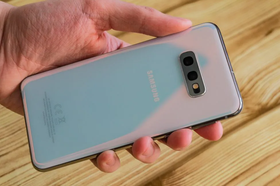
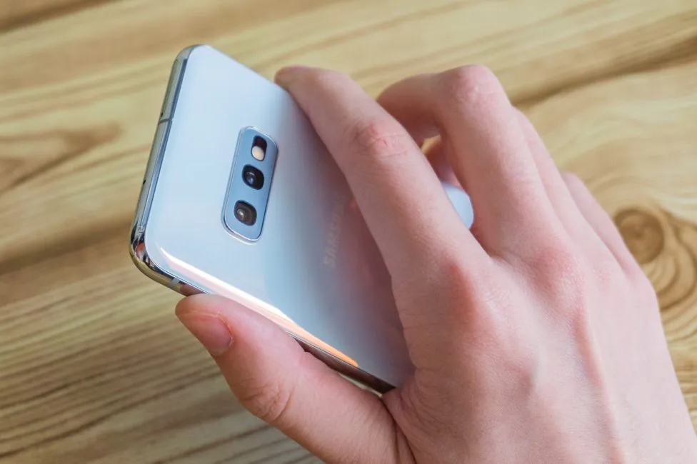
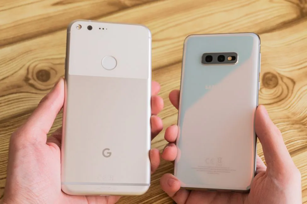
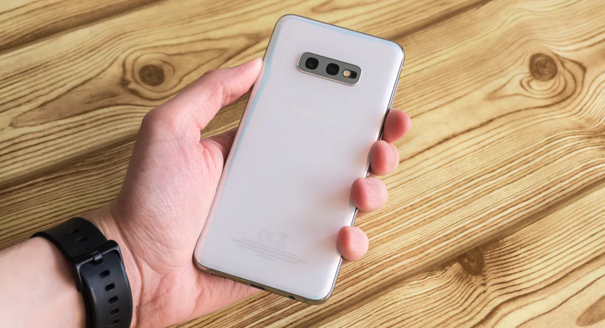
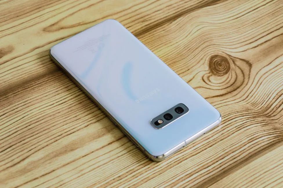
The color of the body is called Prism White. But is it actually white? Not a gradient, but the shade varies depending on the light and angle. It also looks very, very interesting, and if you look closely, you’ll see there is some kind of texture.
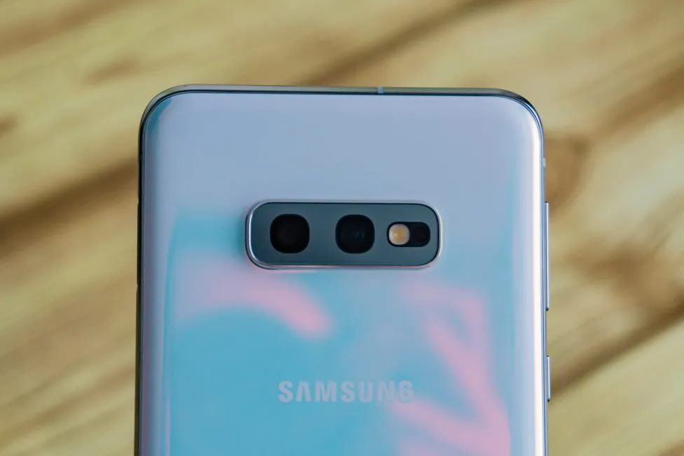
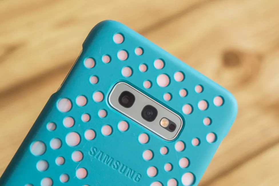
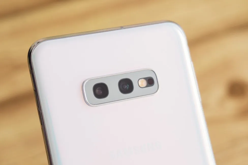
I would also like to note the location of the block of cameras, or rather the fact that it is horizontal and central. I roll my eyes at the sight of a vertical block in the upper left corner all the time. And yes, there’s no wide notch – another thank you from me.
So what do we have here? The smartphone looks cool and fresh. Even the lack of bending in front does not bother me personally. Now briefly go back to the materials used. At first glance, there are no compromises – a usual metal and glass sandwich. But glass here is the main feature. Naturally, it’s Gorilla Glass, but when the bigger brothers have the sixth generation in the front, the smaller one has the fifth. But behind them they are the same – GG 5 in all three, if you do not take into account the ceramic version of S10+.
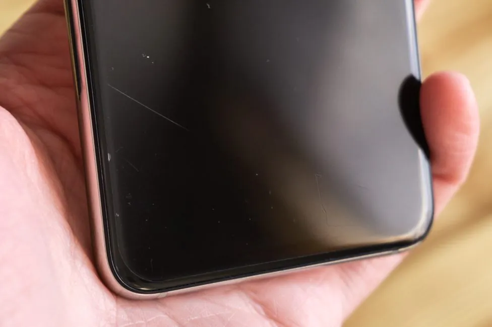
As expected – there is an oleophobic coating, and the device is rather slippery. Fingerprints are noticeable, but are easy to remove. A protective film is glued in front. And it scratches real bad.
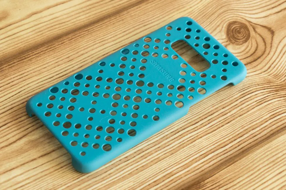
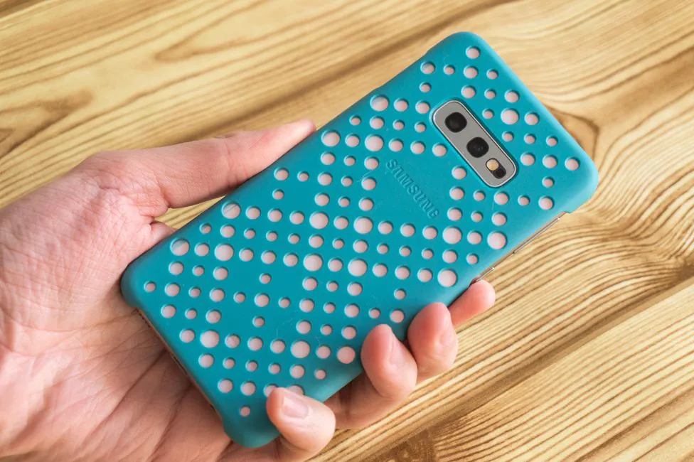
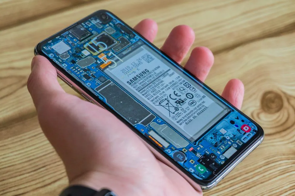
You better place the phone into a protective case. That way you’ll feel safer. I have one of the original covers – Pattern Cover in blue.
Samsung Galaxy S10’s build quality is top notch, as befits any self-respecting flagships. I can only fault the power button, which is a little loose here. By tradition, the case is protected from water and dust according to the IP68 standard. Which means impression for 30 minutes to a depth of 1.5 meters should not damage the smartphone.
Elements’ configuration
We have a speaker in front. In the notch is the front camera, that much is clear. LED indicator is absent.
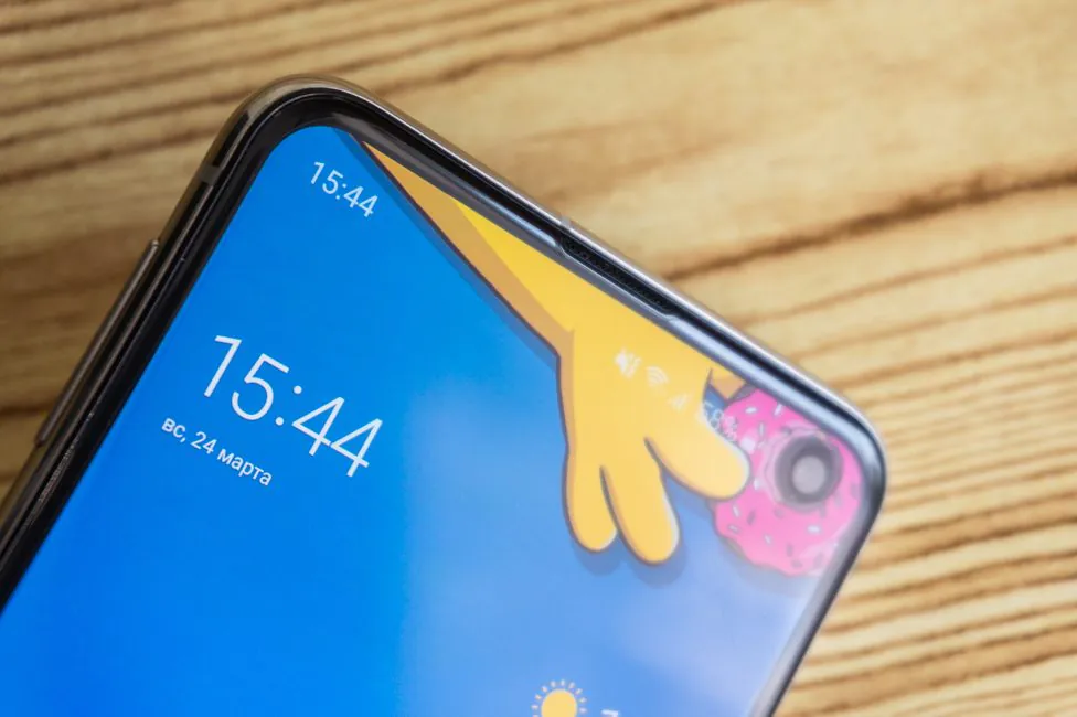
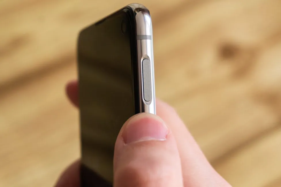
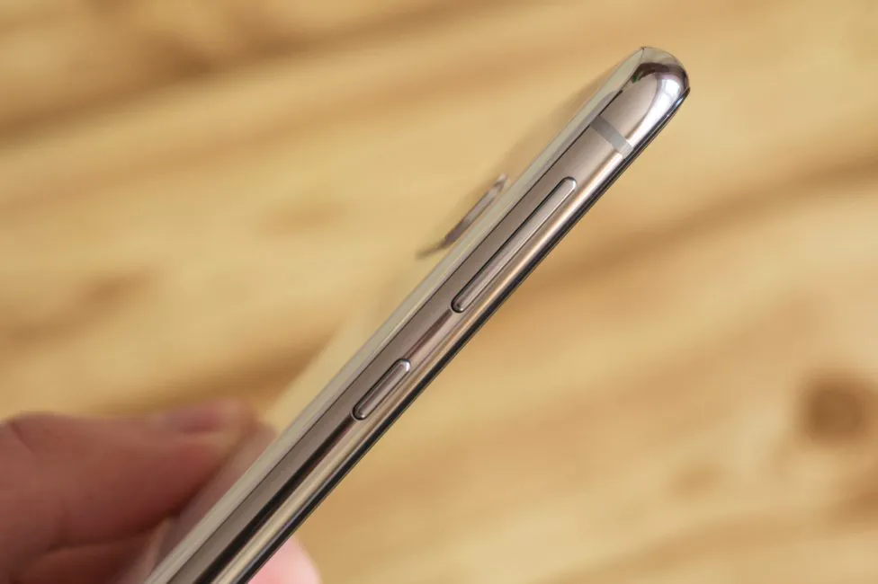
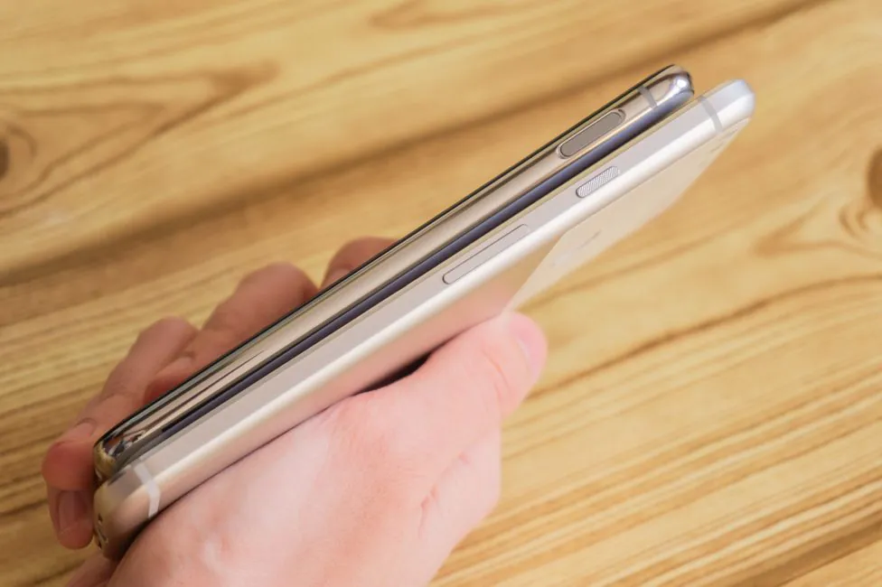
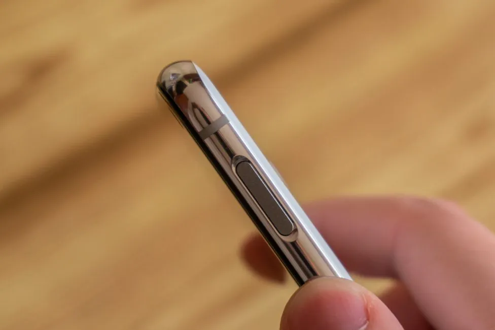
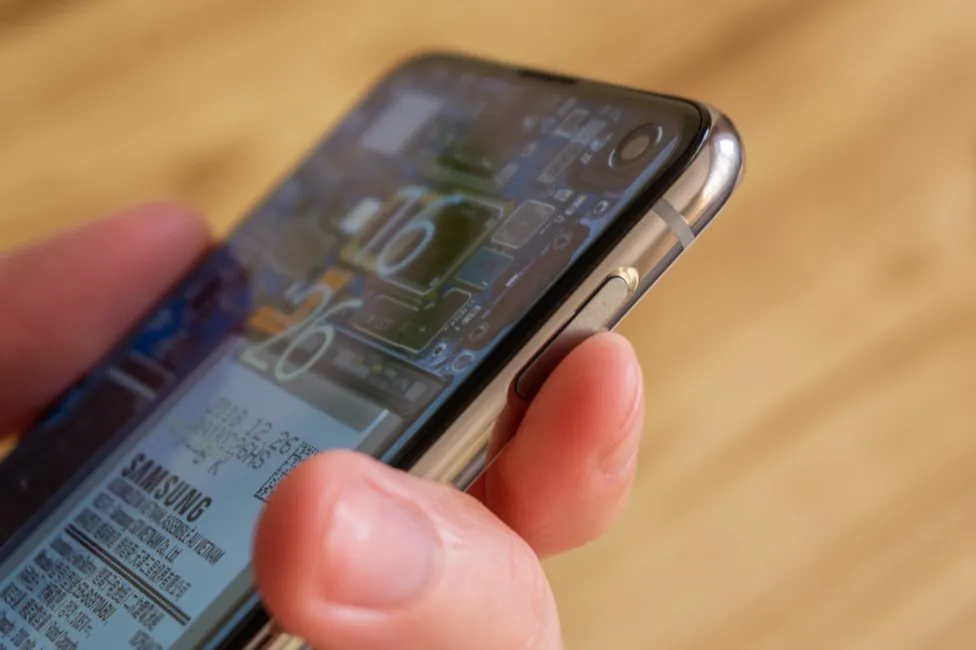
On the right side is a groove with an elongated power button. The button surface is flat and serves as a fingerprint scanner.
On the left there is a paired volume button and a separate button to call the Bixby assistant or another action.
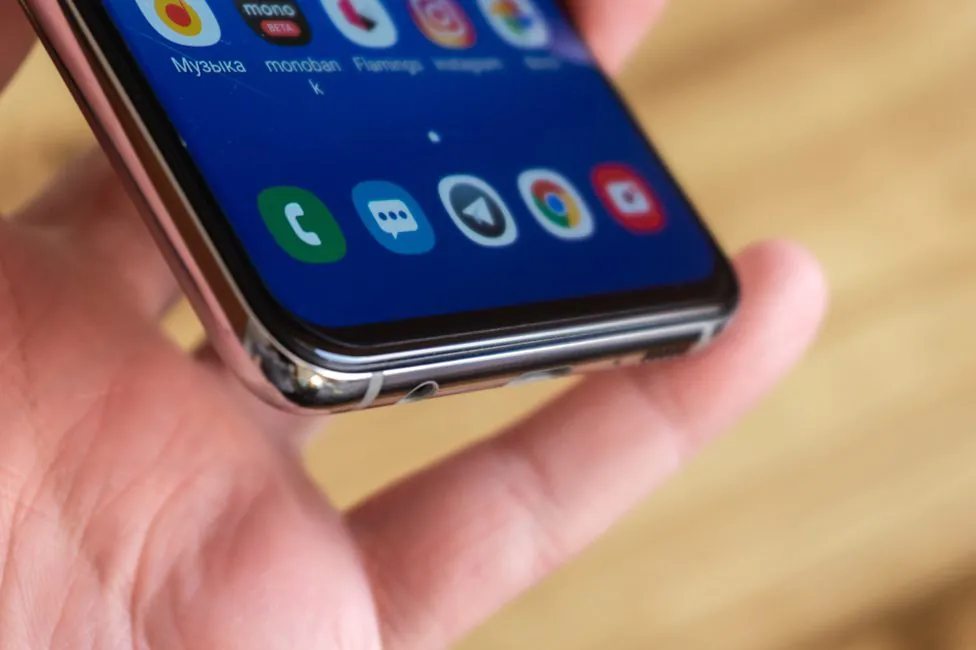
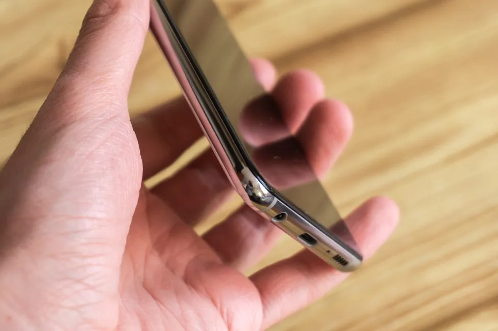
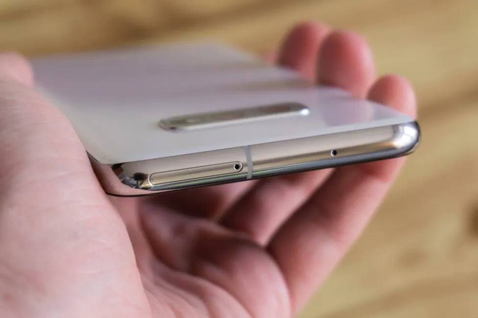
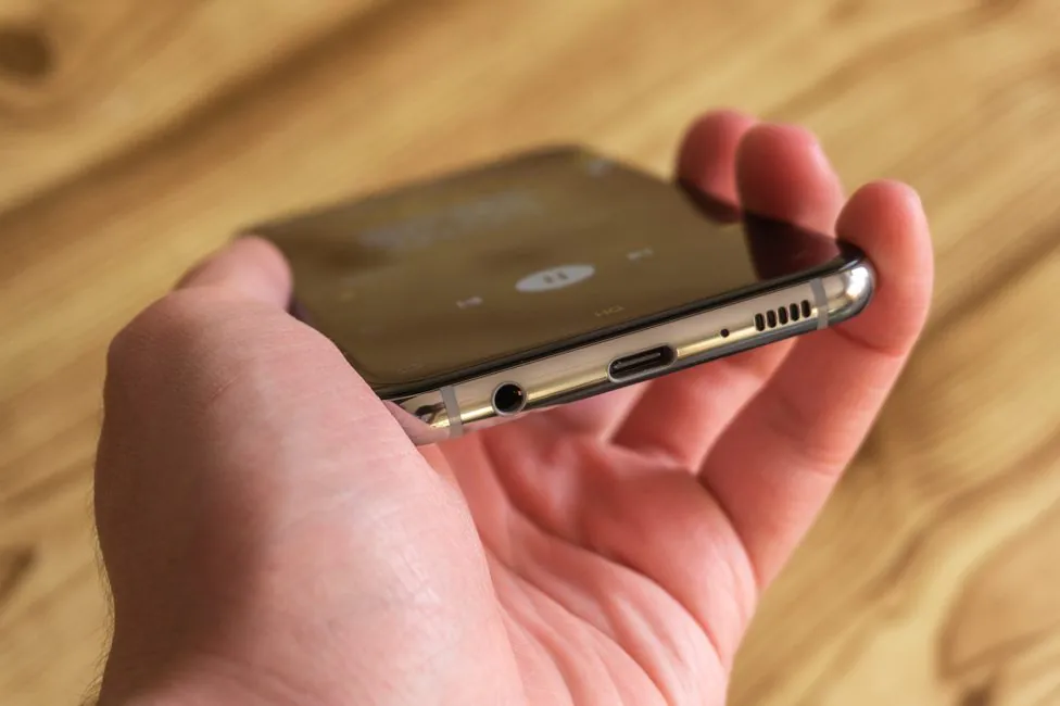
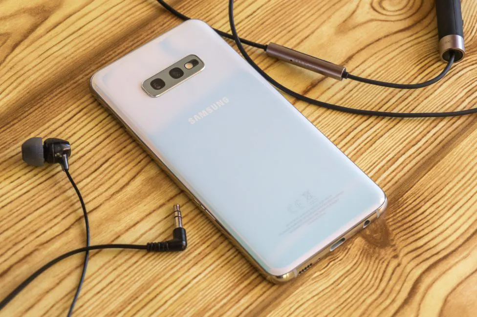
Below everything is as it should: Type-C, microphone, five elongated cutouts with a multimedia speaker and a standard 3.5-mm audio port. Type-C is slightly shifted downward, but the audio jack is still here, which is undoubtedly good.
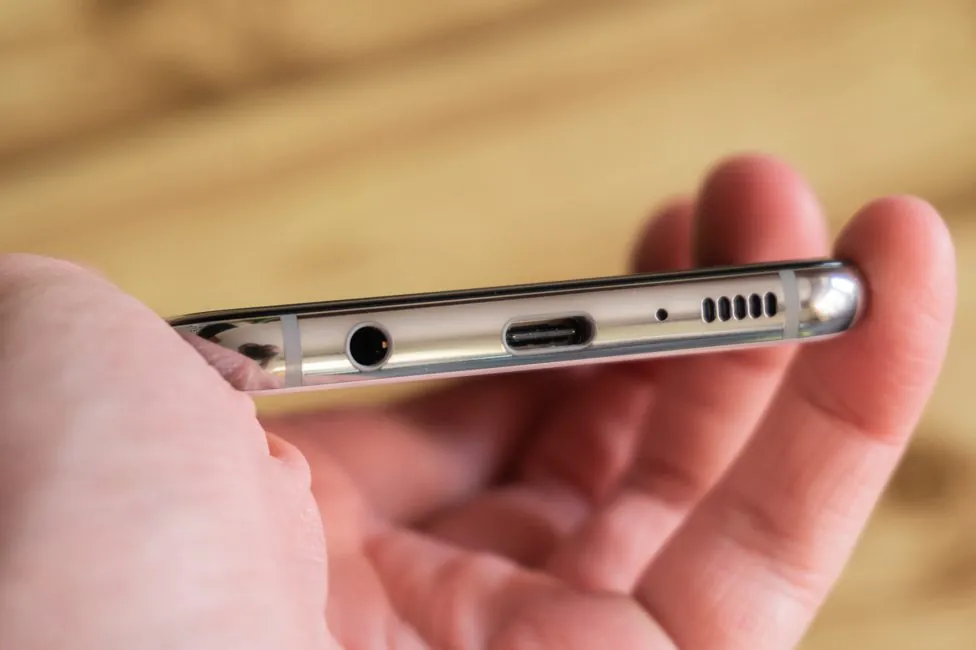
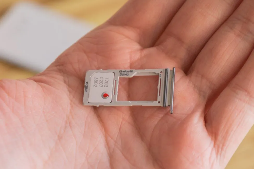
On the top is another microphone and a slot for two nano-format SIM cards or one SIM card and microSD memory card.
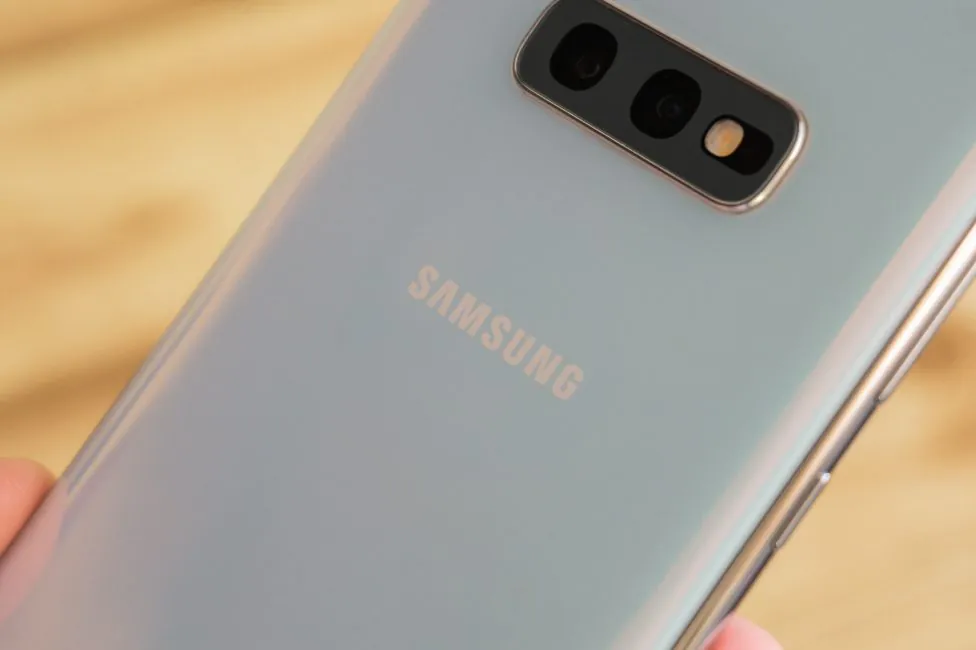
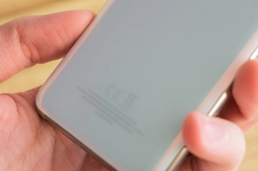
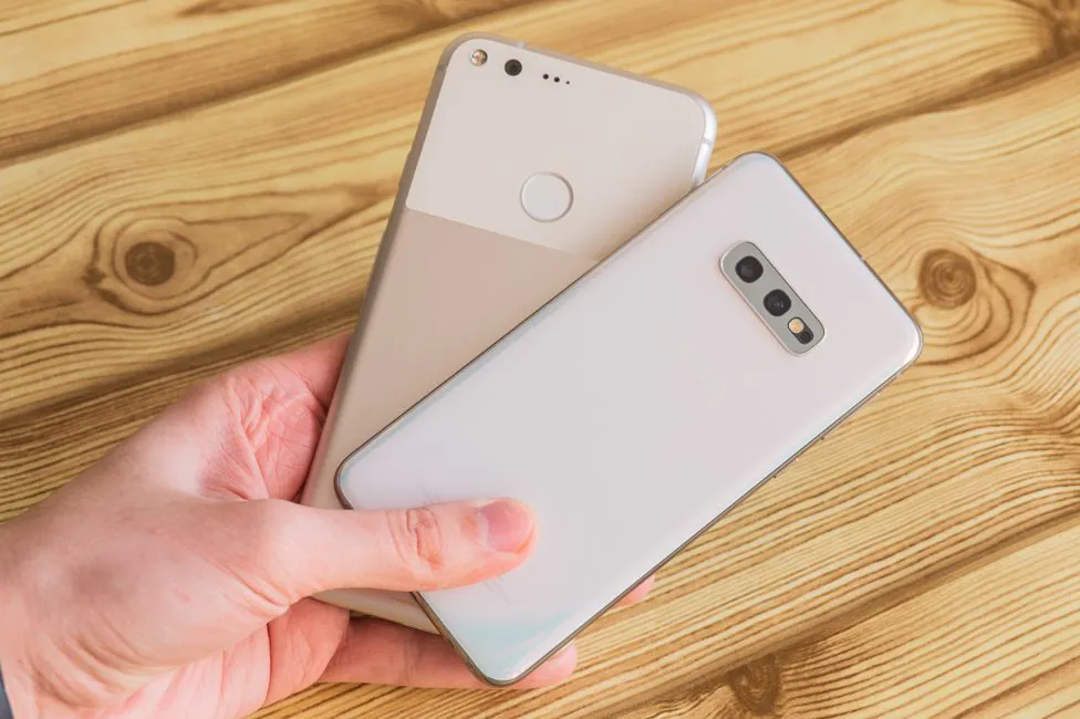
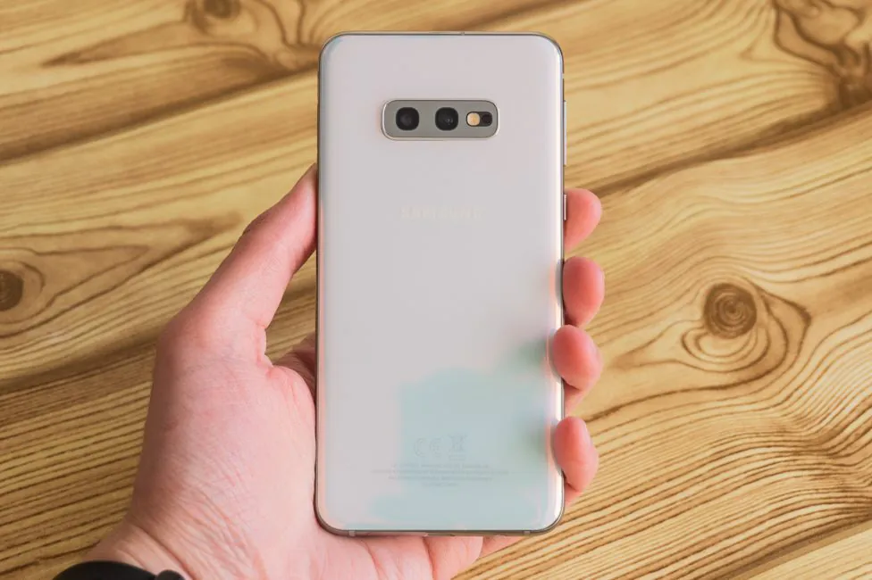
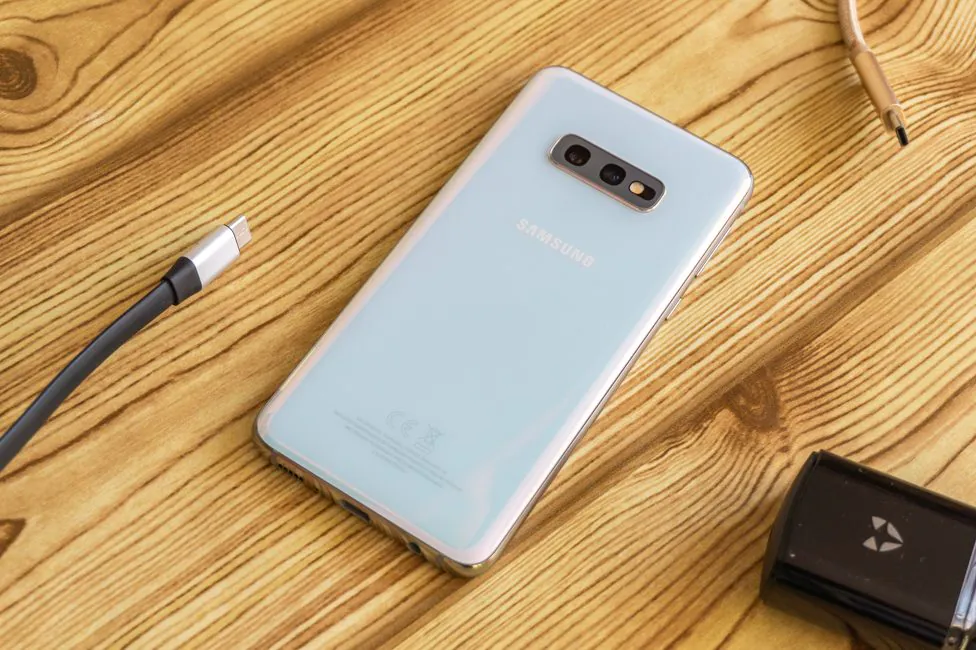
The rear panel has a unit with two cameras, a flash and an ambient light sensor (measures the level of illumination for switching the diaphragm), but without a heart rate sensor. The block protrudes above the body, but has a protective frame and recessed glass. Below is the Samsung logo, and at the bottom are service markings.
Ergonomics
Now to the best thing about Samsung Galaxy S10e. You might be surprised to see a new compact flagship nowadays. Bezels are decreasing, diagonals are growing and everything seems to be fine. But with the market oversaturated with 6″ models, 5.8″ phones seem like a godsend.
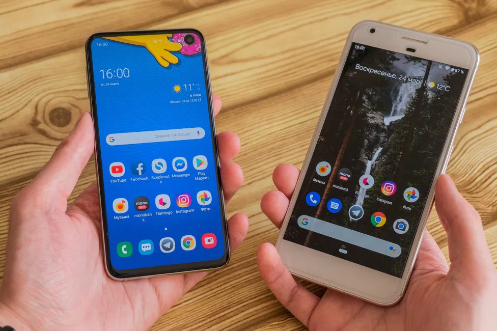
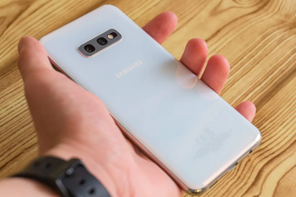
The smartphone has excellent weight and dimensions. You can use it – you should use it – with one hand. It feels very comfortable in the hand – you can reach anything on the screen.
Consequently, there are no problems in terms of ergonomics by definition. Perhaps the power button (also: the fingerprint scanner) could be placed lower. But it is a matter of habit. My right thumb is ideally placed on the pad.
The same goes for the volume button and the Bixby assistant’s call key. Yes, Samsung continues to include it, but at least allows to (partially) to reassign it. However, there weren’t any accidental touches like it was with Note9.
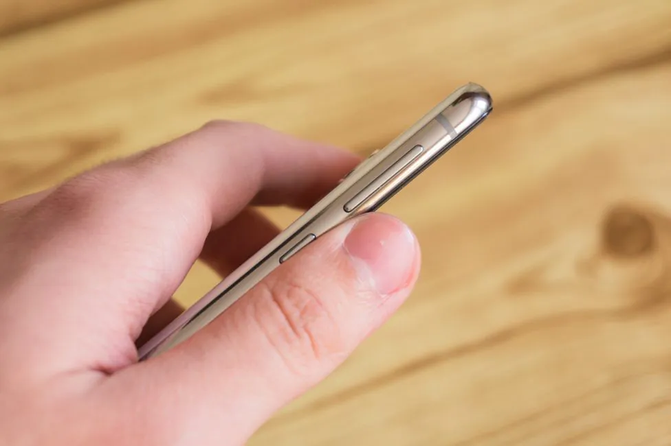
In short, Samsung Galaxy S10e is the most convenient smartphone I’ve used lately. And this makes a great difference. And not only from the senior flagships, but in principle from devices from other manufacturers. If you are tired of large smartphones, then there’s simply nothing better At least – in the world of the green robot for sure, while Apple fans have X/Xs of similar size.
And finally, to hammer my point home, here’s S10e next to Google Pixel XL, which has a typical 5.5″.
Samsung Galaxy S10e Display
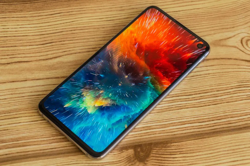
Samsung has always been known for quality screens. Galaxy S10e has a 5.8-inch display with a Dynamic AMOLED matrix. The display resolution is 2280×1080 pixels, 438 ppi density, 19:9 aspect ratio. Marketing word “Super” has been replaced by the term Dynamic – I don’t know why. Maybe it’s HDR10+. We don’t really care, to be honest.
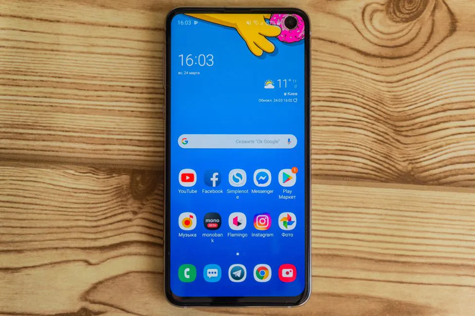
The screen itself here is very, very good, which is not surprising. Excellent juicy color rendition, and also perfect black color. The stock of brightness is high and the screen remains readable in any conditions. There are good viewing angles. In general, it’s a really great display, and that’s about it.
White color is slightly different at different angles. Nuances of the matrix.
S10e is a little inferior to the brothers when it comes to the resolution of the display. But let’s be frank – FHD+ is enough for this screen. Moreover, the resolution is the same even for S10/S10 out of the box, although in fact there is more. So you shouldn’t worry much about this.
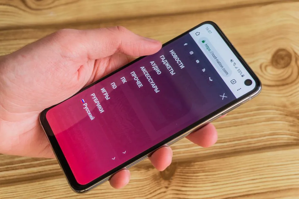
There are not as many color settings as you would expect. But everything is basic and hardly anyone needs more. Colors can be displayed in both saturated and natural mode. The first gives all the charm of technology like high saturation and contrast. You can also adjust the white balance to your own preferences. The second provides the DCI-P3 color space. Or a simpler, the most natural, “calm” picture without embellishment. But you can’t correct the screen even more.
For comfortable use at night you can turn on the blue light filter. If you do not like Infinity-O notch, you can mask it. But then black is filled with a very large area on top, and the icons of the notification lines are shifted down. It looks so-so, to be honest.
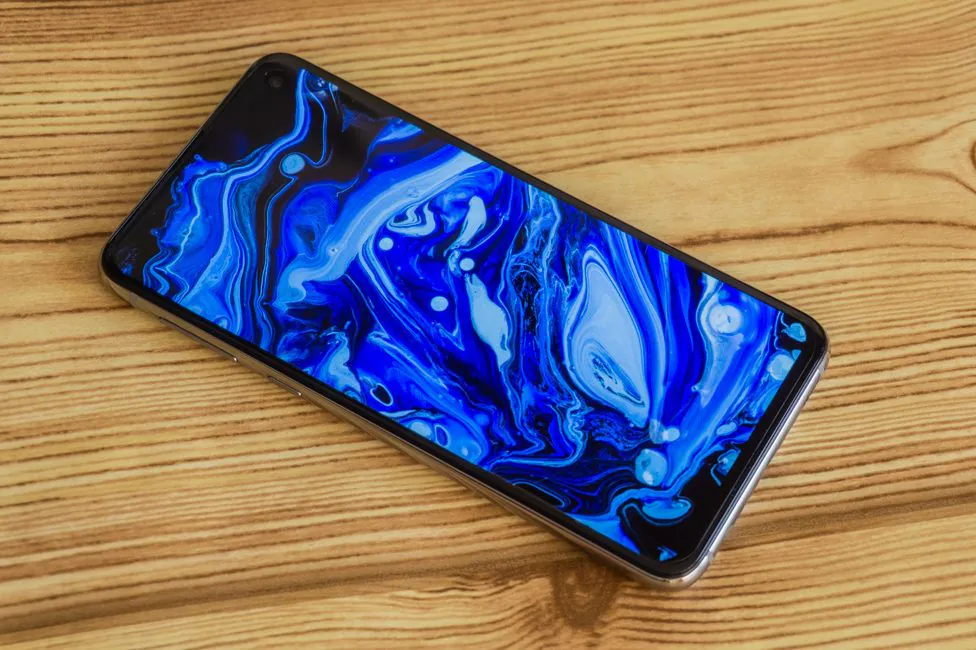
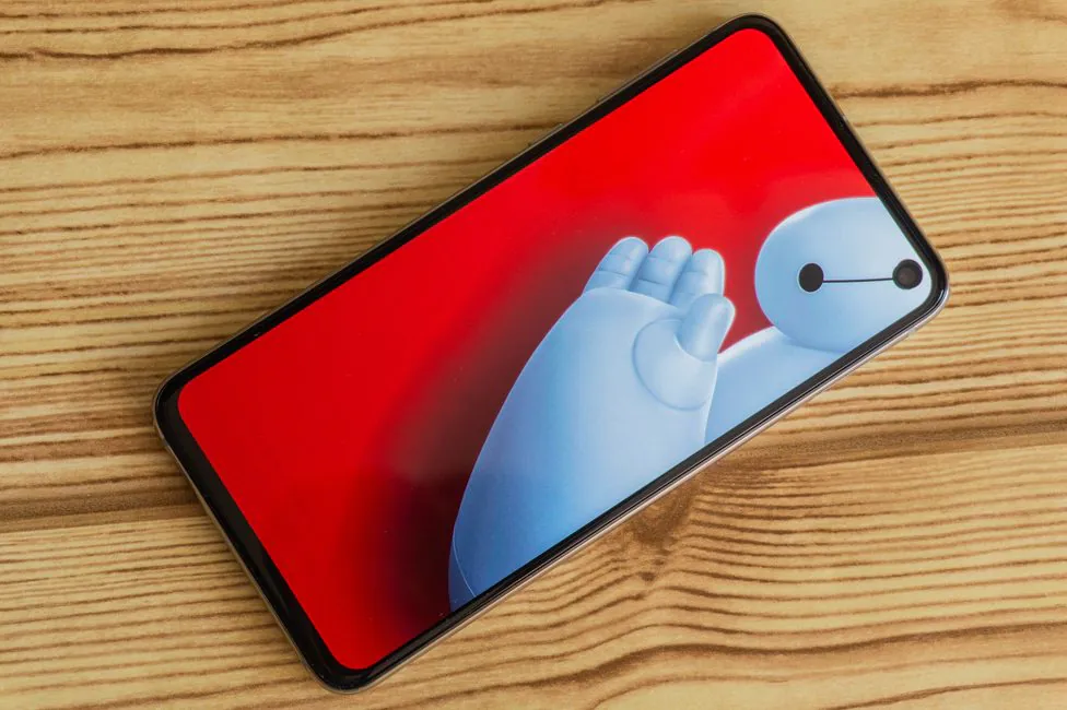
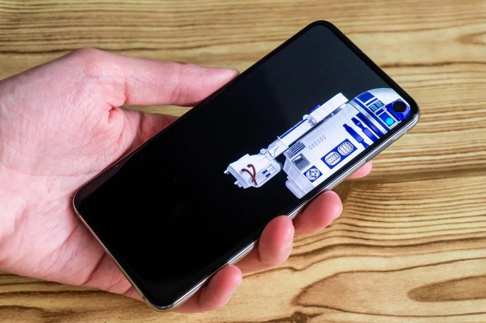
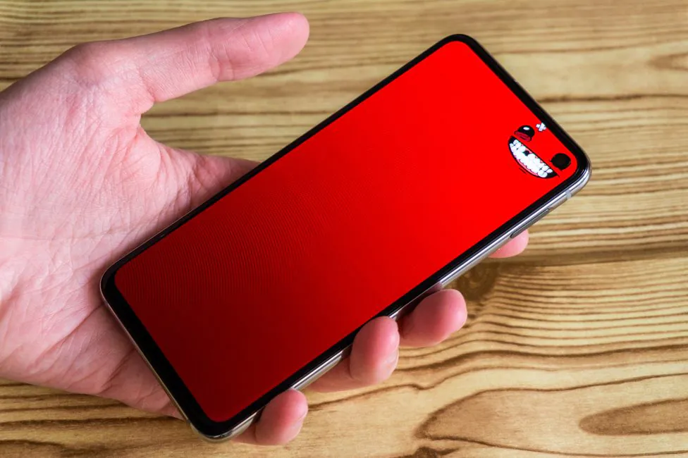
And in general, the notch looks good with different special wallpapers. It does not interfere or distract. Moreover, the collection of pictures is constantly updated and the lock screen with the desktop can however like you want.
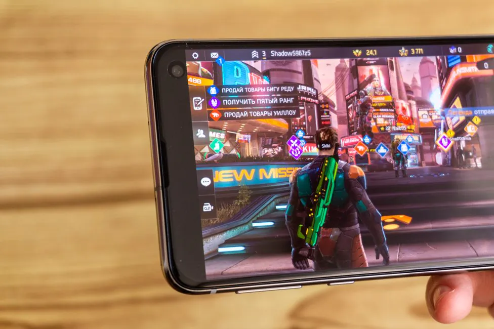
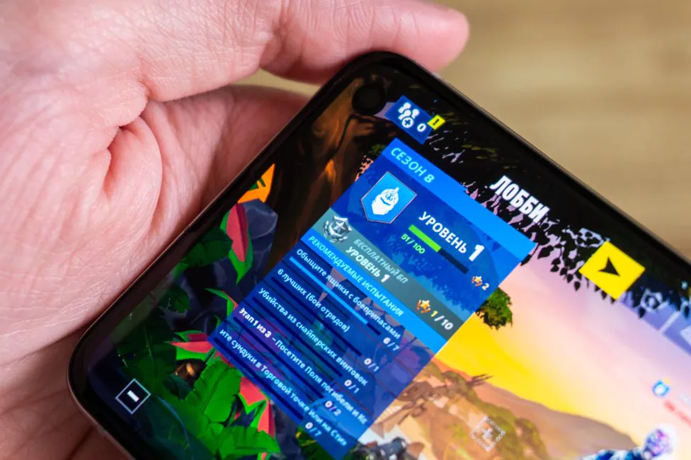
Although not all apps are adapted. But you can force them to expand to full screen. For example, most games currently are not full screen by default. This means that from the side with the hole there is a wide black stripe. If you force the inclusion of full-screen display it’ll look good, but some elements of the UI might go missing. Videos on YouTube open in full screen, while taking away part of the image. But you don’t lose much.
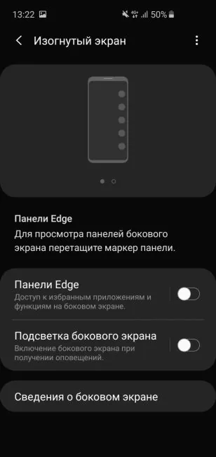
Despite the absence of curved edges, the feature of highlighting faces for incoming notifications and Edge panels is here. As is protection against accidental touches and increased sensitivity.
There’s Always On Display. You can select the display modes (always or according to the schedule), as well as the orientation of the screen. The style and color of the AOD dial allow customization.
Performance
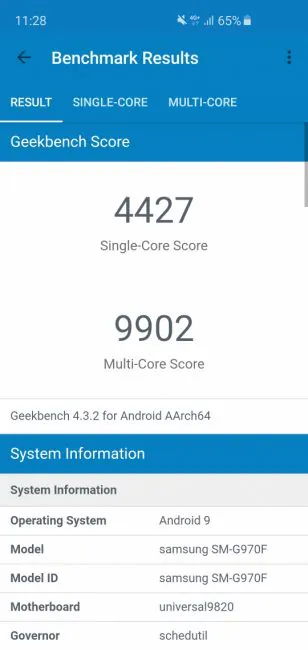
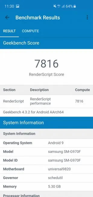
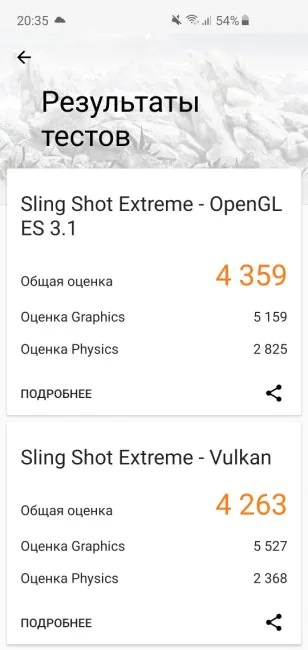
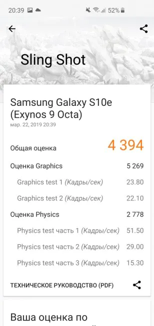
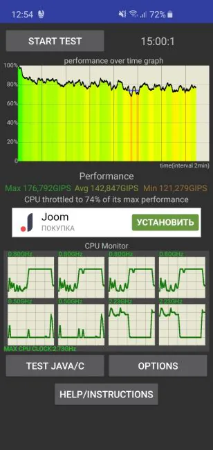
Samsung Galaxy S10e works on the new flagship chip from Exynos 9820 Octa, like the other models. As always, some markets get as powerful Qualcomm Snapdragon 855. Official Snapdragon phones can be bought in the US or China. The Exynos 9820 is an 8-nm processor with eight cores, four Cortex-A55 with a frequency of 1.95 GHz, two Cortex-A75 at 2.31 GHz, and two more Mongoose M4 cores at 2.73 GHz. Video processing is entrusted to Mali-G76 MP12. Synthetic tests show cosmic numbers.
Exynos version of the smartphone implies that the amount of memory in it can only be in one configuration. These are 6 gigabytes of RAM and 128 gigabytes of storage. But in certain regions, where the Snapdragon 855 version is sold, you can find a 8/256 GB version.
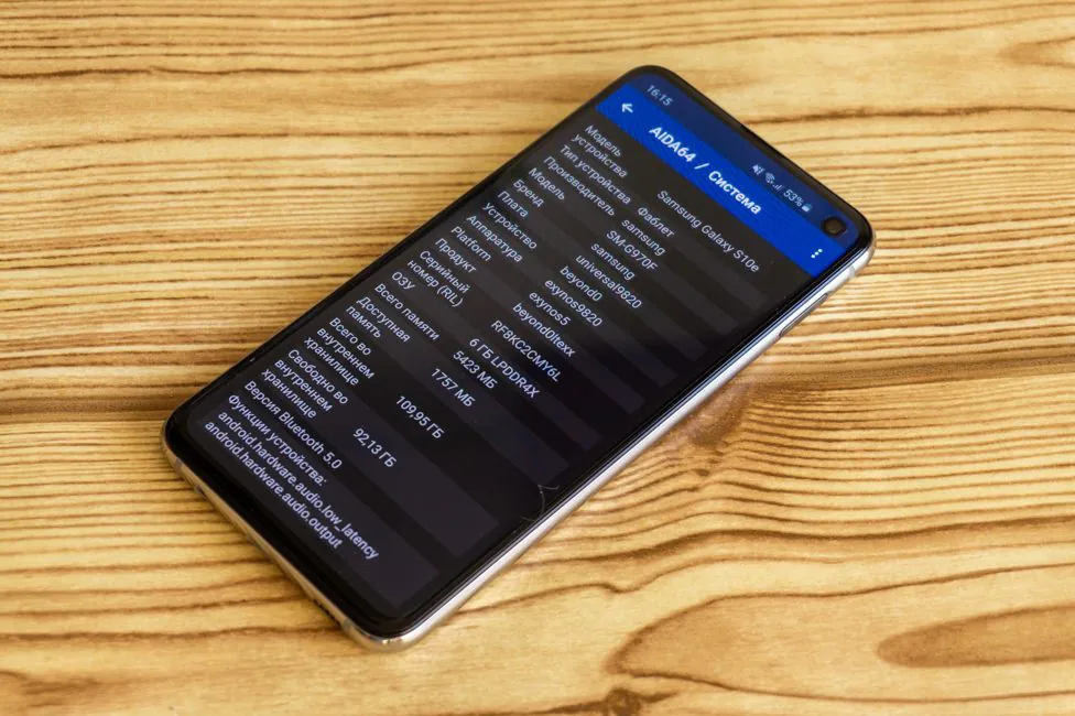
However, those 6 GB is enough for all applications you need to run at same time. Applications are not unloaded, dozens are kept in memory. In general, very good.
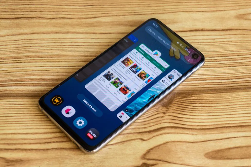
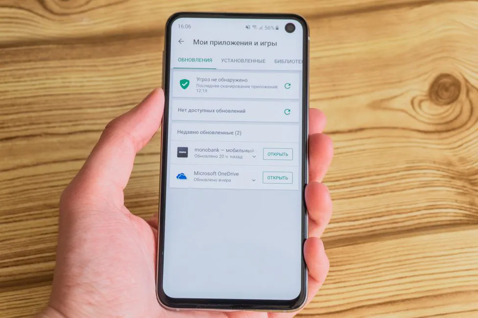
From 128 gigs of storage, 109.95 GB is available. it should be enough for the overwhelming majority. If not, use the second slot for microSD. But the slot is combined. An additional small bonus to customers – 100 GB in OneDrive for 2 years.
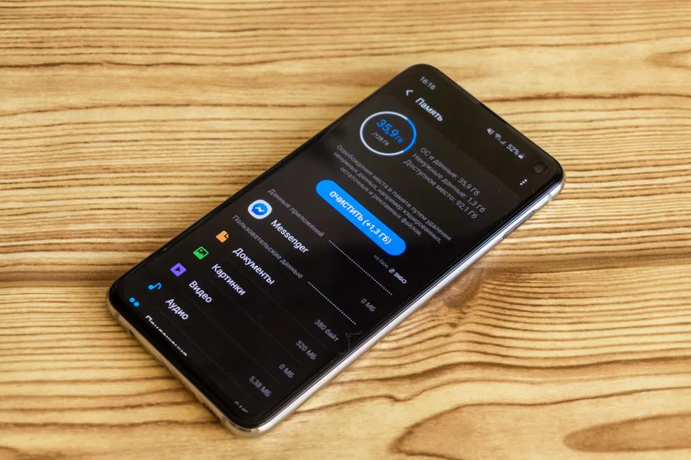
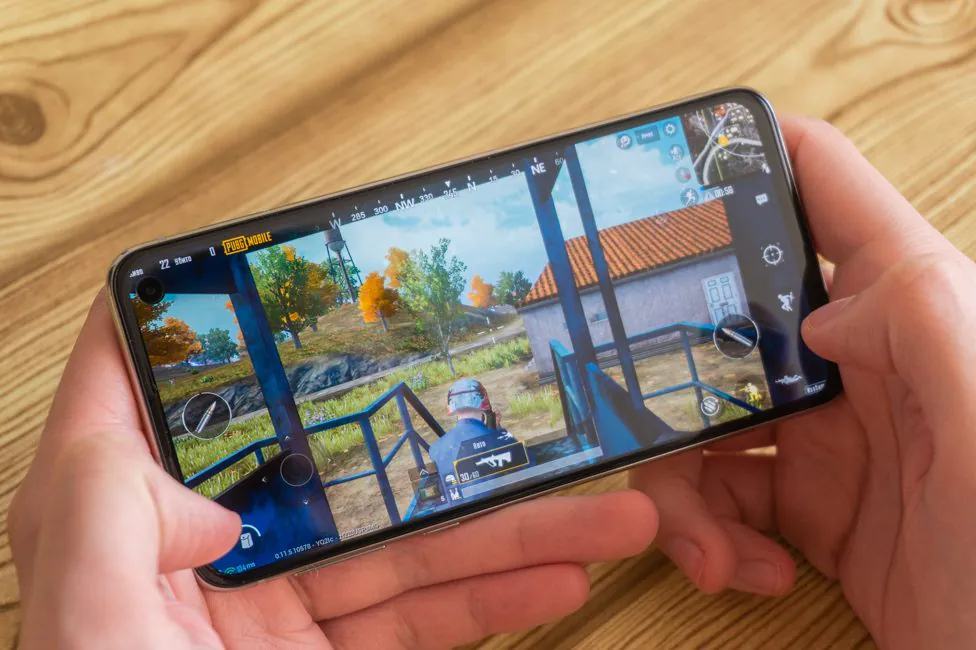
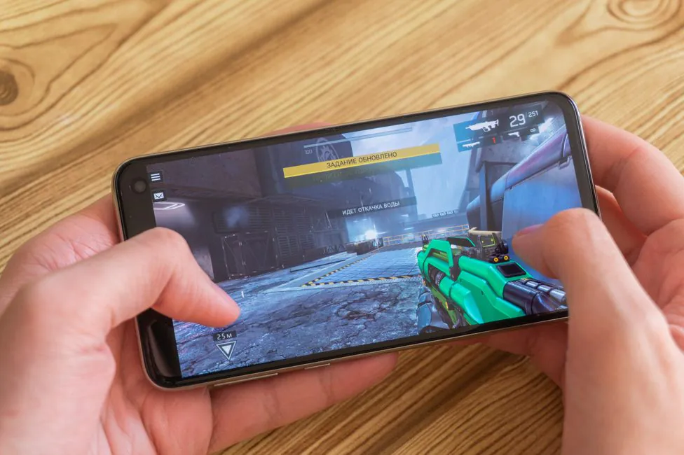
The Samsung Galaxy S10e OS feels fast and smooth. Even the loss of two gigs of RAM in comparison with S10/S10+ is unlikely to be critical. No slowdowns at all. With games, too, everything is quite good, you can safely count on high or ultra-graphics settings in most of them. But there are some hiccups: Fortnite on the “epic” settings is not smooth in all scenes, and limited to 30 fps. For 60 FPS you will have to set “high”. PUBG Mobile with Shadowgun Legends run on maximum settings.
Samsung Galaxy S10e cameras
Now in the flagships, including S10 and S10+, it is customary to install three cameras with different focal lengths. But in S10e Samsung decided to remove one module – the telephoto one. It is used for optical approximation (zoom) without loss of quality. Thus, in the smaller “ten” there are only two modules in the main unit. The main wide-angle 12 megapixel, with a replaceable aperture of f/1.5-2.4, EGF 26 mm, sensor size 1/2.55″, with 1.4µm. Dual Pixel PDAF, optical stabilization (OIS). The additional module is ultra wide 16 megapixel with a f/2.2 aperture of 12 mm and a pixel size of 1.0 µm, it gives a viewing angle of 123°, but lacks autofocus and optical stabilization.
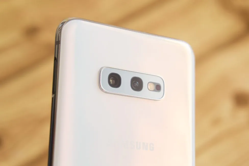
How great this loss is, everyone will determine for themselves. On the one hand, this lens offers a natural perspective that is useful for some scenes. From another point of view, in some conditions a digital approximation is used from a standard module, so what is the reason for the additional lens? But let’s get down to business.
The main module shots as expected (perfectly) in almost all situations. In bright lighting conditions the smartphone shows a high level of detail, excellent color reproduction and a fairly decent dynamic range. There is no reason to doubt that the camera will satisfy the average user. In worse conditions the photos suffer, with smaller details. Still, the result is adequate. Generally speaking, this is a good camera. But is it really better than S9’s? Not really.
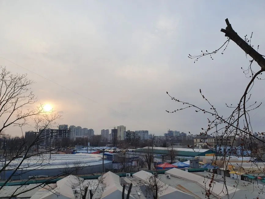
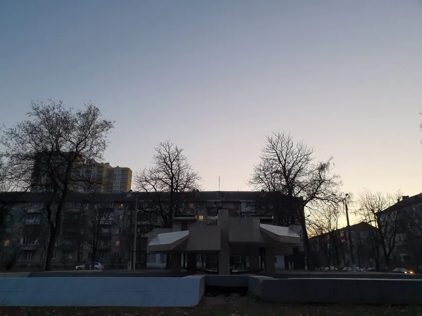
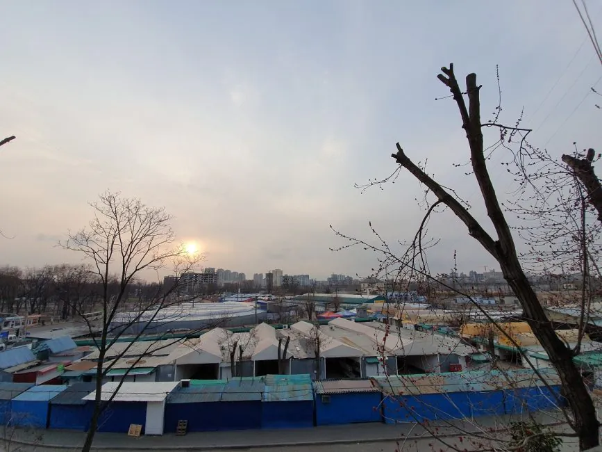
PHOTO EXAMPLES IN FULL RESOLUTION
The automatic mode or autofocus are fine. Macro is just great, as always with Samsung. There is automatic recognition of the scene (total up to 30 different) and further optimization of the frame. Photos enhancements are there, and they are especially noticeable in terms of saturation. In addition you can display of various tips on the shooting screen – the so-called photo recommendations. Of the other features there is a blur of the background with a good final result. You can change the degree of blur and even the effect of blur.
The super-wide module is obviously useful in capturing as many objects as possible in one frame. It is also quite good, even excellent, as for such a wide angle. But at dusk or at night it has a hard time.
Video can be recorded at a maximum resolution of UHD at 60 frames per second. However, if you need some additional features like a tracking autofocus, you will have to lower the resolution. But in any case, it records video very, very well, with excellent optical stabilization. Additional electronic stabilization appears only if the user switches to Full HD. There’s super slow-motion shooting from 960 fps only in HD-resolution, standard slow motion in the usual Full HD. Time lapses are written with the same resolution.
The front camera in S10e is 10 MP, f/1.9, 26 mm, 1.22µm, Dual Pixel PDAF. As you could see, it has the same focusing system, which is very, very good. In general, I can only praise this camera which makes great selfies. It also blurs the background. What is interesting is that by default the “cropped” image is displayed, and the maximum viewing angle can be obtained by pressing the corresponding button on the shooting screen. The video is recorded in UHD, in 30 FPS maximum.
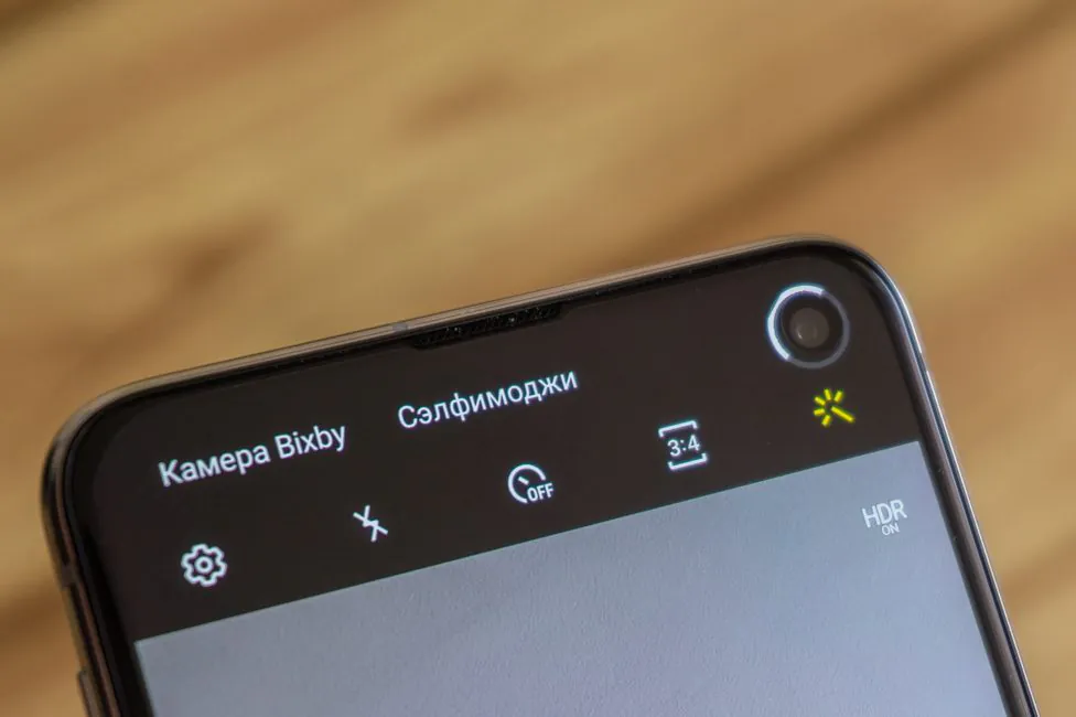
The camera application is convenient, there are many modes and settings, selfiemoji, very cool manual mode, RAW and so on. But for some reason now it’s impossible to set manual parameters for video. Also now you can shoot Instagram Stories directly in the camera’s proprietary application. What is it for? Well, for example, you want to take a picture on a wide-angle lens, because Instagram app does not allow switching between cameras. That way the quality of such publications can be improved, since for some reason it leaves much to be desired for all Android smartphones. Even though I cannot say that it is perfect – I can’t see any difference at all.
Unlock Methods
There is one issue with Samsung Galaxy S10e, it concerns the fingerprint scanner. There’s no trendy in-display fingerprint sensor, only the older one. In this case – the one combined with the power button on the right side. No innovation on that front.
However, this did not affect its quality at all. It works very quickly, literally as soon as your finger touches the area. Samsung paid attention to the possible false triggering of the scanner, at a time when it is not required. Thus, if the option to always recognize fingerprints is enabled in the settings, the smartphone will immediately read the fingerprint. It works even when the screen is off – put your finger and you’re in. If you turn it off, you will first need to take the device out of sleep mode by double taping the screen or pressing a button. In addition, with swipe on the area, you can open or hide notifications.
Scanning the iris is no more. Only face recognition remains. If we talk about the response rate of this method, it is quite high. In the dark, the display brightness may be enhanced to highlight the face. There is an option for accelerated recognition and it is worth mentioning here. The Internet seem to think that Galaxy S10e/S10 S10+ believes photo to be a real person. Thus, an outsider can access the smartphone. I checked it out and here’s what I found.
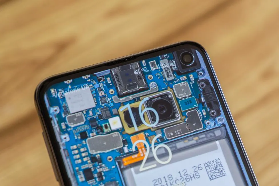
With the active accelerated recognition, the smartphone was fooled by a photo. But with it disabled it was not possible to repeat this, I never worked on the photo/video.
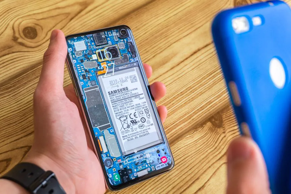
Bad – yes, but no one tries to fool you. Samsung in the description speaks unequivocally about the increased likelihood of mistaken video or photo recognition. I do not claim that this method is the safest, or impossible to get around. Some people fooled the device with a photo in the standard mode. But I do not understand why is it so important. If you have something to hide, use the fingerprint scanner. Most apps require it by default.
Samsung Galaxy S10e Battery life
The smartphone is compact, and it affects the built-in battery, which is 3100 mAh. Not much, but it’s enough for the one day.
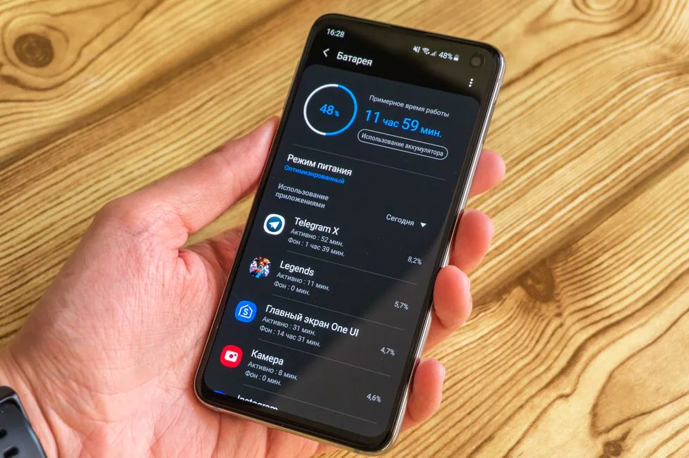
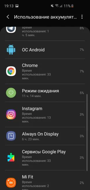
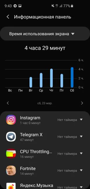
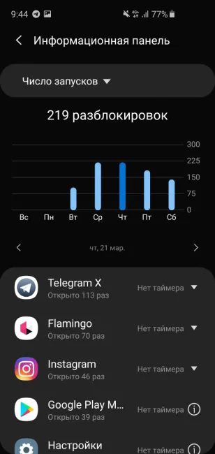
The test model constantly uses GPS in the background. My user case includes: instant messengers, social networks, listening to music, surfing the net, but without games and with Wi-Fi/LTE. Of the other factors that affect the operation time, the Always On Display function worked from 8:00 to 20:00. The result is 4 to 5 hours of screen activity. Nothing out of the ordinary.
The charging speed with the standard means was not personally verified, but fast charge is obviously supported. As well as wireless. And reverse wireless, Wireless PowerShare. You can turn on the reverse charging and recharge any device, provided that it supports the Qi-standard. Another smartphone is not the best idea, but Galaxy Buds are charging fine.
Sound and communication
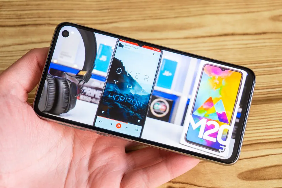
The quality of the earpiece speaker in Samsung Galaxy S10e is excellent. In addition to its standard function, it also plays along with the main speaker at the bottom. This constitutes stereo sound, which in one way or another should be in any flagship. Consequently, we have excellent quality and loudness, which is enough for absolutely any tasks. You can listen to music, watch videos, and play comfortably. At the very maximum volume there is some kind of distortion that hurts your ears a little. Slightly lower the level and everything returns to normal.
In wired or wireless headphones the sound quality is excellent – and loud.
In the settings, you can adjust it with an equalizer or with the help of Dolby Atmos effects. They can also be applied to speakers.
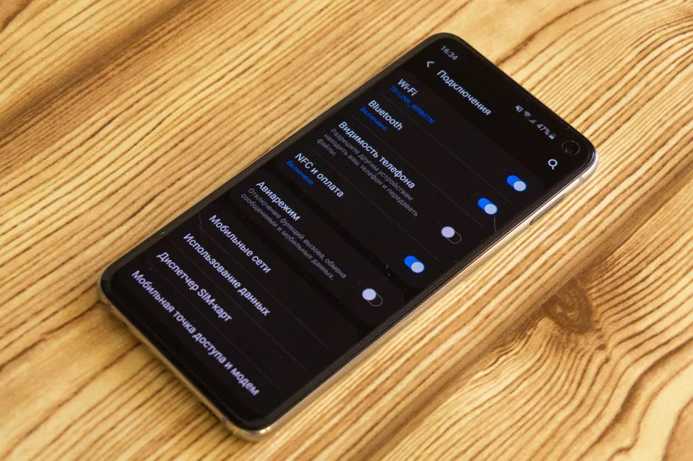
In matters of communication capabilities, Galaxy S10e is one of the most pumped on the market. I have no complaints about cellular communication. Module Wi-Fi 802.11 a/b/g/n/ac/ax – it supports all modern networks and even the latest ax-standard (or Wi-Fi 6). Bluetooth 5.0 (A2DP, LE, aptX) – there’s nothing better. GPS (A-GPS, GLONASS, BDS, GALILEO), and ANT+ all work perfectly. NFC is always installed in the top Galaxy models.
Firmware and software
Not so long ago, Samsung Experience shell was replaced by a new interface – One UI. Android 9 Pie is hidden under it. The shell is very pleasant and fresh because of the new design. It is modernized and convenient for use with one hand.
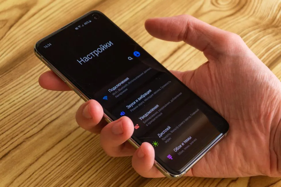
It is not necessary to guess why – in the upper part there is basically the name of the menu, and below it are the working items. This is observed not only in some basic places, but also in system applications. The night mode is also an important aspect. It is similarly applied to system applications. And AMOLED is just a godsend.
Functionality is at the top level. You can remove the traditional navigation buttons by replacing them with swipes. You can clone applications. Traditionally, there are customization tools, a number of gestures, and much more.
The Bixby call key can be partially reassigned. But Samsung really doesn’t want the assistant to be ignored completely. There are two ways to make use of the dreaded button, the first: one click on the Bixby button, double click- action/launch the application. The second option: a single press for some action, a double press is for Bixby. You can completely ignore the assistant. But you can make use of the button nonetheless.
You can also create your own commands. It is done according to the if – then principle, like in programming. But that’s a topic for another time.
I also liked the fact that Samsung did not forget about the original system and builds things like Digital Wellbeing into its shell. Even the menu of running applications is very similar to that in Android Pie. We will not point the finger, but someone has to learn from this approach.
Verdict
Samsung Galaxy S10e is everything we desperately needed. When was the last time you saw a compact smartphone with top of the line specs? Sony did something like that, but we have already forgotten about it. And S10e is like a breath of the fresh air. There are some compromises, but those can be forgotten doe to the size of the phone.

It is a good looking and comfortable flagship with great display, powerful hardware and good cameras.
It’s not very affordable, but if you need a modern flagship that’s convenient to use, you can buy Samsung Galaxy S10e right now.

Subscribe to our accounts:


