© ROOT-NATION.com - Use of content is permitted with a backlink.
Cooperation with Google did not pass unnoticed for the Huawei, the Chinese manufacturer plans to upgrade pretty quick their current smartphones to Android 7.0. And, of course, first of all, this process concerns the current flagships, for example, Huawei P9. Official update should arrive on devices “over the air” until the end of the year. But now the most impatient users have the option to install the new firmware in the status of the final beta and try to update EMUI 5.0 original shell. That’s about we’ll talk today.
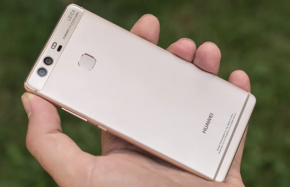
Installing Android 7.0 EMUI 5.0 on Huawei P9
I will not focus on the installation procedure. Detailed instructions are on the Internet. Has updated is not easy, yet it is a test version of the firmware. Briefly enumerate the steps through which you must pass:
- Unlocking the bootloader – get the unlock code on the official website, turn on “factory unlocking” and “USB Debugging” options in the developer menu, connect your smartphone to your Windows PC and are run a couple of commands in fastboot.
- Installation of a custom recovery TWRP – connect your smartphone to your Windows PC and run the script.
- TWRP update to the latest version from recovery – from the SD card using the “install image” command.
- Installing firmware and additional programs through TWRP of 2 archives – install zip from SD card without intermediate reboot.
I am in no way agitating all owners of Huawei P9 immediately install this firmware. After all, this is a beta version, which means it has some flaws. Moreover, the official update “over the air” will arrive soon for everyone. You just need to wait a bit. In the meantime, you can read about the new EMUI 5, to find out what awaits you after the upgrade. Let us proceed.
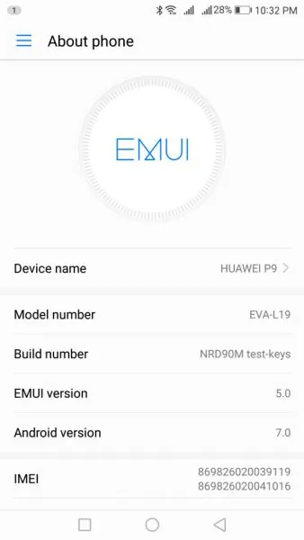
Lock screen
The changes affected this element less than the least, but I have to talk about it in the review.
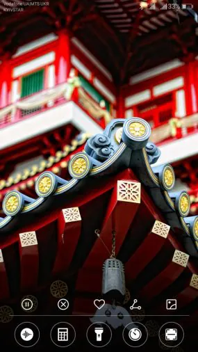
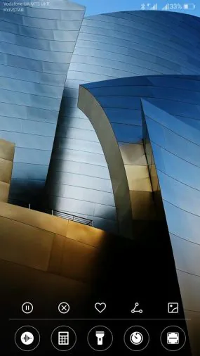
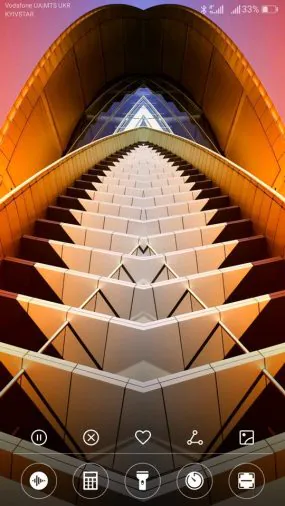
The main feature of the lock screen in EMUI 5.0 (as in previous versions) are changeable background images. This feature is called “lock screen magazine” and it is set in the menu. You can customize the loading of images from the Internet, add a background manually and subscribe to threads. In addition the lock screen shows clock, quick launch camera is present. Immediately displaying notifications and music player when music is played.
The next point – the pop-up panel at the bottom. Somewhere we have already seen this. Really not sure who came up with the first such feature, may be Huawei. The panel has a rotation control tools for background pictures – you can stop and resume their change, add to favorites, delete, share, set your background from the gallery. You can also view all backgrounds of lock screen by a simple scrolling left or right.
Below – shortcut icon necessary (for Huawei opinion) applications and features. Voice recorder, calculator, flashlight, clock, bar-code scanner. Change icons to your is impossible.
Appearance of unlock screen and the bottom panel is transforming depending on events. During music playback, the background image is changed to the album cover and the bottom panel loses background management tools. There are only quick access shortcuts.
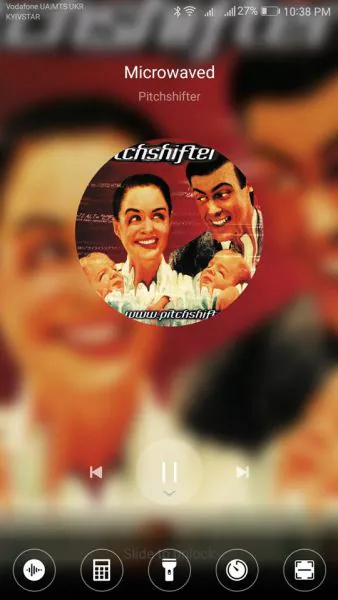
Desktop EMUI 5
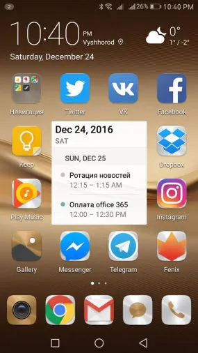
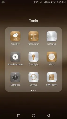
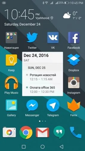
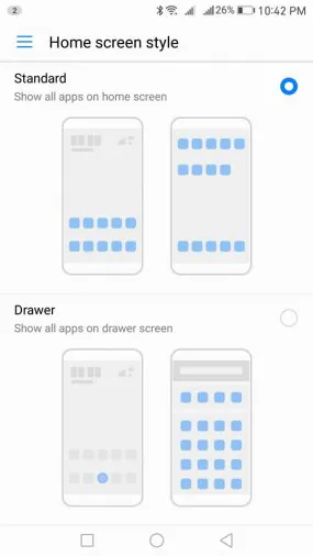
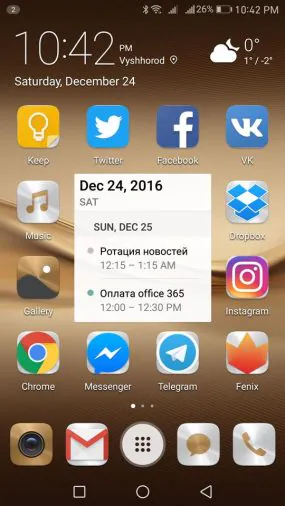
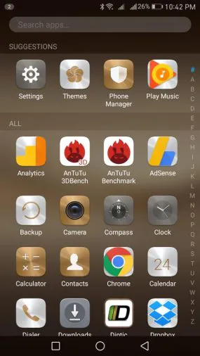
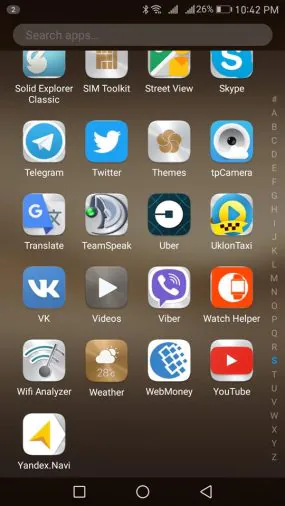
At first it seems that this element has not undergone any changes. All due to the fact that the default is an old theme with icons “Medal1”. In fact, one major change still present. In the settings you can switch between the 2 versions of the desktop – without the application menu and with it. In fact – there are 2 separate launcher, each with its own set of shortcuts and widgets, which can be adjusted independently of each other. The appearance of the desktop can be changed through the application “Themes”, more on that below.
As in the previous version of the firmware on the desktop in EMUI 5, you can create folders and call a global search on the device swipe down.
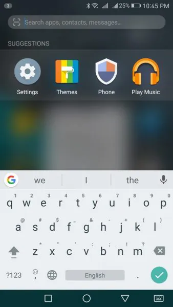
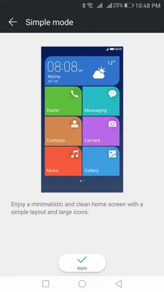
In addition, you can convert your desktop into a simplified look that fits, for example, the elderly, children with special needs or those who have moved on Android from Windows Phone and do not want to give up the tiles.
Status bar
Indicator panel in EMUI 5 slightly changed design of icons and the main innovation is present, which I do not like. Instead of notification icons we see a digital counter.
![]()
It can be disabled in the settings. But then it is absolutely not clear if there are any new notifications or are not.
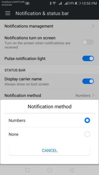
The main trouble of this solution is that permanent notices, for example, a music player, affect the counter too. Confusing and inconvenient solution. I have not found how to restore the usual display of icons in the status bar. I would like to see this opportunity in the final firmware.
Notification bar
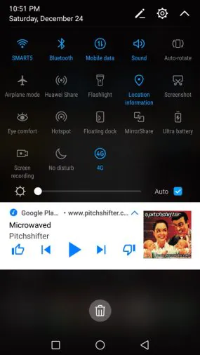
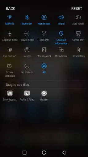
This element in EMUI 5 is completely redesigned. Instead of two separate tabs for updates and switches, we see one. At the top – panel with switches and screen brightness slider, which expands by swiping down, opening the extra buttons. The location and structure of the buttons can be edited by clicking on the appropriate icon.
In addition, the design is completely changed, it has become more “tangible”. We see contrasting blue buttons on a black background and white cards of notification with the possibility of the committing quick action. Advanced display and a set of actions with the notification opens by tap. Read notifications can be “brushed away” by side swipe.
In general, I like the new notification bar in EMUI 5 how design and functionality. It became a less loaded than in the old version and more ergonomic.
In EMUI 5 window was more like it, “pure” Android offers to us. Instead of horizontal scrolling here right now vertical list with the cards. Locks for fastening applications in the memory remained, but now you just need to press them.
You can close applications with side swipe. There are memory capacity gauge and clear button – close all applications except the fixed in memory.
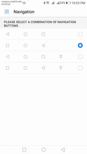
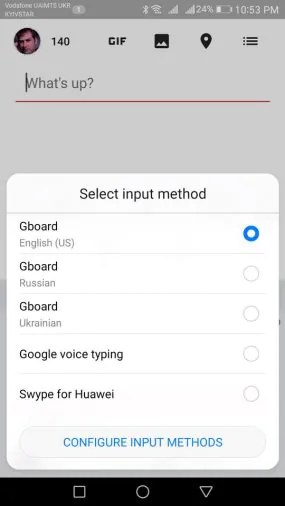
Everything remains the old – the onscreen buttons, design and location of which can be adjusted in the menu. In addition, you can add an additional button to call notification bar. While typing in the panel appears a button for quickly selecting of the keyboard layout.
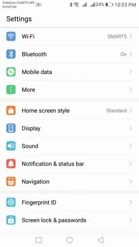
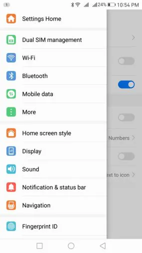
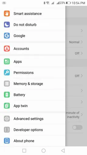
In settings you can, as before, go with a special icon on the desktop or from the curtain notifications. Menu design in EMUI 5 seriously changed. It became completely white, at the top of the search string is present. Icons are more flat and have restrained colors, not as acidic as previously. The main feature of the settings menu structure is that after going to a certain point, you can call the main list on the left side and quickly move to another location without turning back.
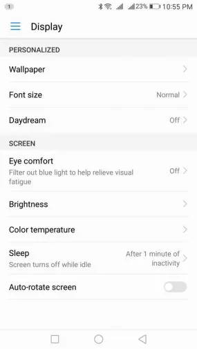
Itself composition and procedure of the main settings menu has not changed, but you will notice a few new features.
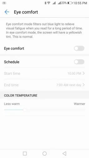
For example, in the display settings view protection mode. appeared It can be activated manually via a button in the notification bar or on a schedule. In addition there is the possibility to manually adjust the color temperature of the screen in this mode.
Another of the notable innovations – a clone application. This function determines the program, mainly social networks and instant messenger clients to which you want to go under different accounts.
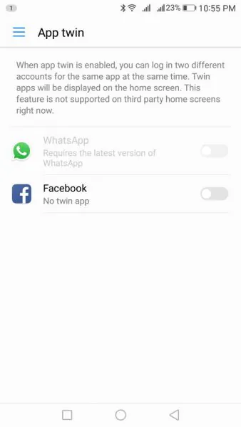
Accordingly, it creates a separate icon for such application. But then there are only WhatsUp and Facebook. Perhaps a list of supported applications will expand in the final version of the shell.
Features of EMUI 5
It is worth noting the following built-in functions that are in EMUI 5 for Huawei P9.
Working with screen in gloves – increases the sensitivity of the touch panel display.
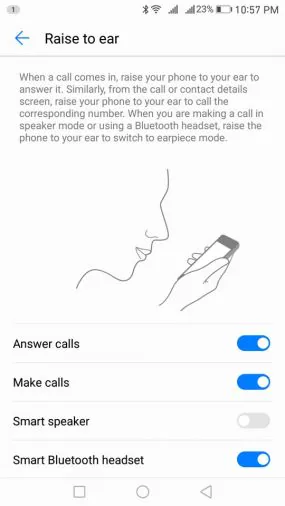
Gestures and movements. There is an opportunity to answer the phone by bringing to ear, or dial the number when you open the contact window. Also, if the phone is connected to a bluetooth-headset, the phone will automatically switch to the earpiece with this. Conveniently, damn it!
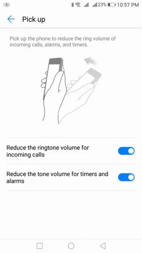
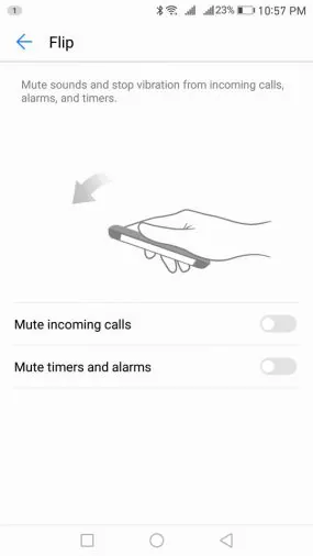
Also, the phone will reduce the volume of the signal, when you take it in your hands and disable the sound if you turn the device.
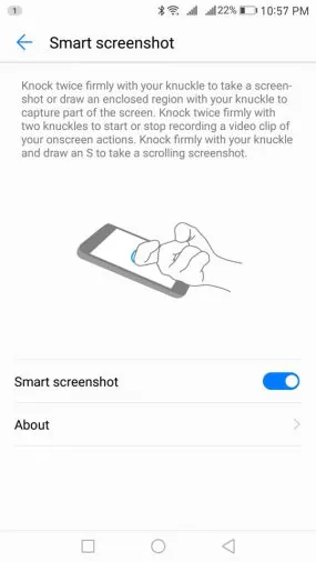
A defined set of actions you can perform using tapping or drawing characters on the screen with your finger knuckles. For example, do a regular and long screenshot, a video recording from the screen, run different applications, and more.
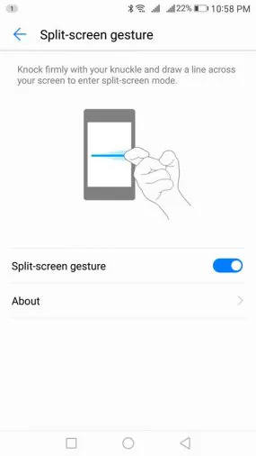
Among other things, it appeared to allow the running of two applications in the split screen. You can run and stop by long pressing on the multitasking button, or swipe across the screen with knuckle. This mode is not supported by all applications, but most of them. It is possible to adjust the height of the zone (1/2, 1/3, 2/3) for each application by simply pulling the slider separator. Or disable mode, bringing the slider to the edge of the screen and leave it on a single application.
Built-in Huawei applications
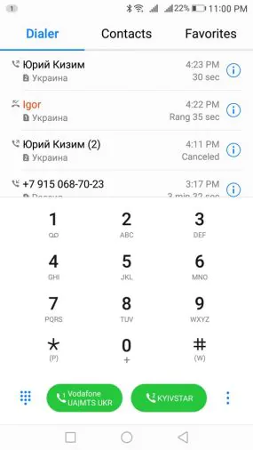
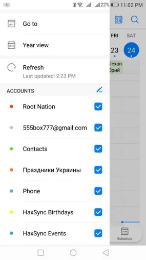
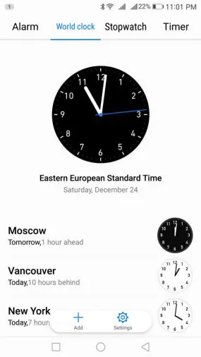
All applications by the manufacturer received update of appearance to match the design of the firmware. Phone and Contacts, SMS, clock, calendar, phone manager and the email client – they got the white background and light controls.
In EMUI 5 I especially like the fact that all major activities and access to the application settings menu handed down in the lower part of the windows, it is not necessary for them to drag up on a fairly large screen. It’s comfortable.
Branded widgets have also become completely transparent or white with little transparency, so as not to stand out from the general interface style. And they finally got rid of the rounding at the corners.
Camera
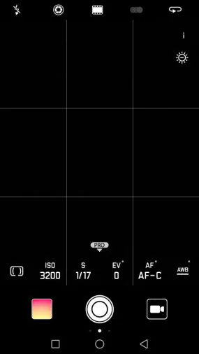
The camera application is practically not changed. At least I did not notice anything. Apparently, the company decided not to break something that works so well.
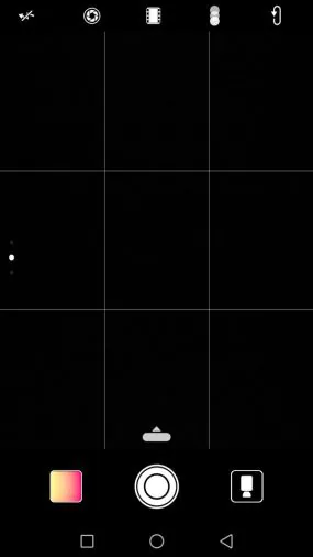
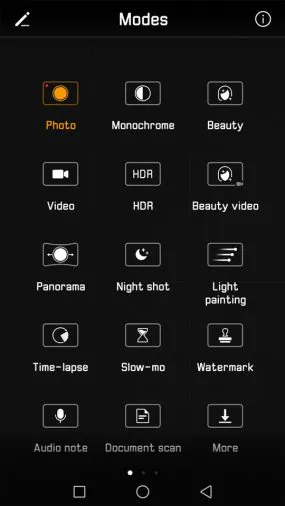
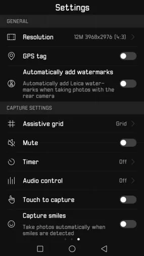
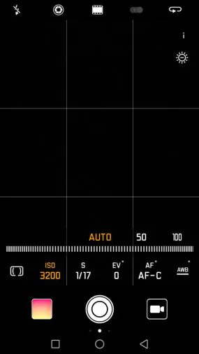
The main camera screen still supports swipes: on the left – fast mode switching, on the right – the camera settings for photo or video. Manual settings can be caused by pulling the slider next to the shutter release button.
By the way, it seemed to me, or trigger camera is really faster. And the camera can quickly run and take a snapshot by double-clicking the volume down from a locked state.
Performance
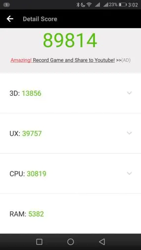
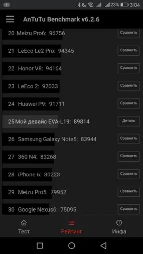
Here, if any changes have occurred, and then only for the better. Definitely not become worse. Synthetic benchmarks do not show any significant changes – all within the measurement error.
Smartphone interface extremely smooth and just lightning fast, Huawei P9 with EMUI 5 does not slow down at all anywhere.
Fingerprint scanner breakdowns immediately before, and now functions as it seems to me, faster than the speed of thought. And he is not wrong. Never. If this is your finger and it is registered in the system.
Battery life
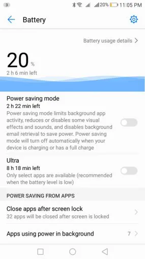
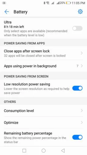
Menu “battery” has undergone very large changes. Missing modes “smart” and “productive”, disappeared setting “protected applications”. Now there is the normal mode (by default), “power saving mode” and “energy saving”. The last two are similar in name, but they are completely different things. The first saves battery power in the background by reducing the activity of applications and synchronization, as well as slightly dims the brightness of the backlight. The second – the classical maximum power saving mode in which the smartphone becomes phone and only selected applications work, initially telephone, SMS, contacts, and you can also add 3 applications to your taste.
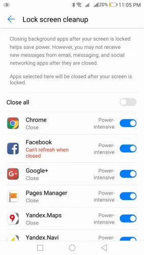
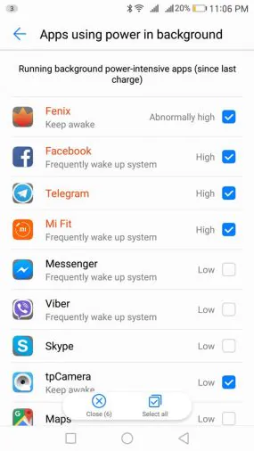
If earlier it was possible to determine applications that the system could not close in the background, it is now all the way around, you have to select the programs to be closed every time you lock your smartphone screen. Basically – the essence is the same. Leave only the important applications, others mark for closing. Also, in the process, as in the past, the system warns you of energy-intensive applications and its can be closed in a special menu.
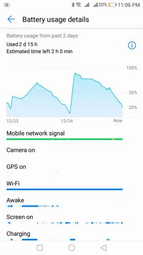
What happens to autonomy in practice during the transition to a new version of the OS? So far, it seems to me that all the stories about Android 7 greatly saves battery power – another myth. Really – nothing has changed. Huawei P9 works the same as on the Marshmallow. Maybe something still is not completed, I do not see the changes because of the test nature of the beta firmware and something will change in the final version. But for some reason I little hard to believe in it.
Design customization
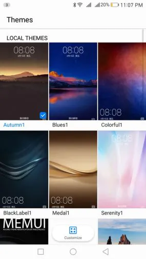
This is very important actually. Because, as I said, when the new firmware is loaded for the first time and you see the same old EMUI on the desktop, it becomes a little sad. Of course, I hope that the final version of the firmware will have the new themes. But at this point in the beta version there is only one local and there is no way to load the theme from the Internet.
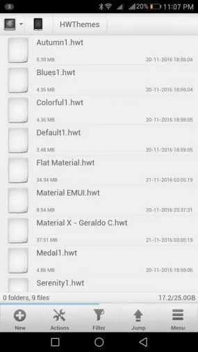
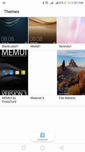
Nevertheless, the question is easily solved by downloading and installing a separate themes. On the Internet there are a great variety of themes for EMUI in hwt format. Downloading file and throws it into HWThemes folder, which is located in the internal memory of the phone. This theme is available for selection in the Manager. Elements of different themes can be combined. In EMUI 5 work for the 4th version of the shell themes. However, they do not affect the notifications bar and the settings menu, but the icons, desktop wallpaper and built-in programs, such as dialer and SMS, are changing.
For example, I found some themes and combine them in the best way for themselves, and set their wallpaper and closed the issue with the design of the firmware till the better times.
Conclusions
First of all I want to thank Huawei for operative update my smartphone to the latest version of Android. Also, a low bow, because nothing is messed. On the contrary – even done better! Despite the status of the beta version of the software, for a week I did not see any bugs in the tested firmware. Moreover, there is not even the slightest hint of slowing down. Software runs absolutely stable at this stage, so we can safely wait for the official update very soon.

As for EMUI 5.0 – I liked it, the desire to return to a previous version does not arise. This update is a worthy development of proprietary shell, which is refreshed interface design, completely got rid of it skeuomorph, and became even more comfortable and ergonomic, and also received a number of new features. For me personally, one negative aspect – a new way to display notifications in the status bar using the meter. I hope that in the final version of the shell 5.0 will have the usual display of icons.


