© ROOT-NATION.com - Use of content is permitted with a backlink.
I was going to write this post back in November, when I finally waited for the purple iPhone 14 Pro Max. I live in Poland, and there is traditionally a shortage here, I don’t know if it’s artificial or if everyone is so rich, but even if you order a new product on the day of the launch, you have to wait 4-5 weeks for the Pro and Pro Max models, and if you miss the moment, even longer, sometimes until the New Year. So I ordered in October, waited until the end of November, and waited. But I’m only writing my impressions now, as I had other important tasks to do.
I’m sure this article will be useful to readers, especially since I’m not going to do a typical review and describe what’s on the left and what’s on the right of the phone, how loud the speakers are, and what version of Wi-Fi it has. My colleagues have already written about all this on various websites 100 thousand times. I will share my impressions of the transition from the 13th model and my long-term experience of using it.
In general, this article can be considered the third part of my epic about the transition to the iPhone. I published the first one in 2021 and talked about how I bought an iPhone after 5 years with Androids and had a hard time switching. Now I’ve managed to get along with the iPhone (my favourite phrase on this topic is “you can get used to sleeping on the ceiling”), but I don’t like all the things described in that article as much as I did on the first day. It’s just that when you get used to it, it’s not so stressful.
As for the second part, I also wrote an article about how I expanded my ecosystem – I bought an Apple Watch (they are really the best on the market), as well as AirPods (they are complicated and I don’t use them anymore). Well, now let’s talk about the iPhone 14 Pro Max.
Why upgrade?
Before the 14 Pro Max, I had an iPhone 12 Pro (only six months, a nice phone, but, firstly, too small for me, and secondly, the short battery life was just killing me), then a 13 Pro Max (too big, but the screen and battery were fine).
With the release of the new iPhone 14 Pro Max, I decided to upgrade. I was asked more than once “Why?”. The answer is generally concise – I want to and I can. I’ve been writing about smartphones for many years and it’s a bit of a whim to always have a new flagship. And I can afford it.
At one time, I couldn’t decide to buy an iPhone again for a long time (after a break of several years) precisely because of the price. It was very expensive and getting more expensive every year. And when I decided, it became a kind of investment. I sold the 13 Pro Max with a few months of warranty left at a good price, and I didn’t have to pay much extra to jump to the 14 Pro Max. Of course, flagships on Android are losing value both more and faster. So now it’s not easy to even decide to jump, although the Galaxy S23 Ultra almost convinced me.
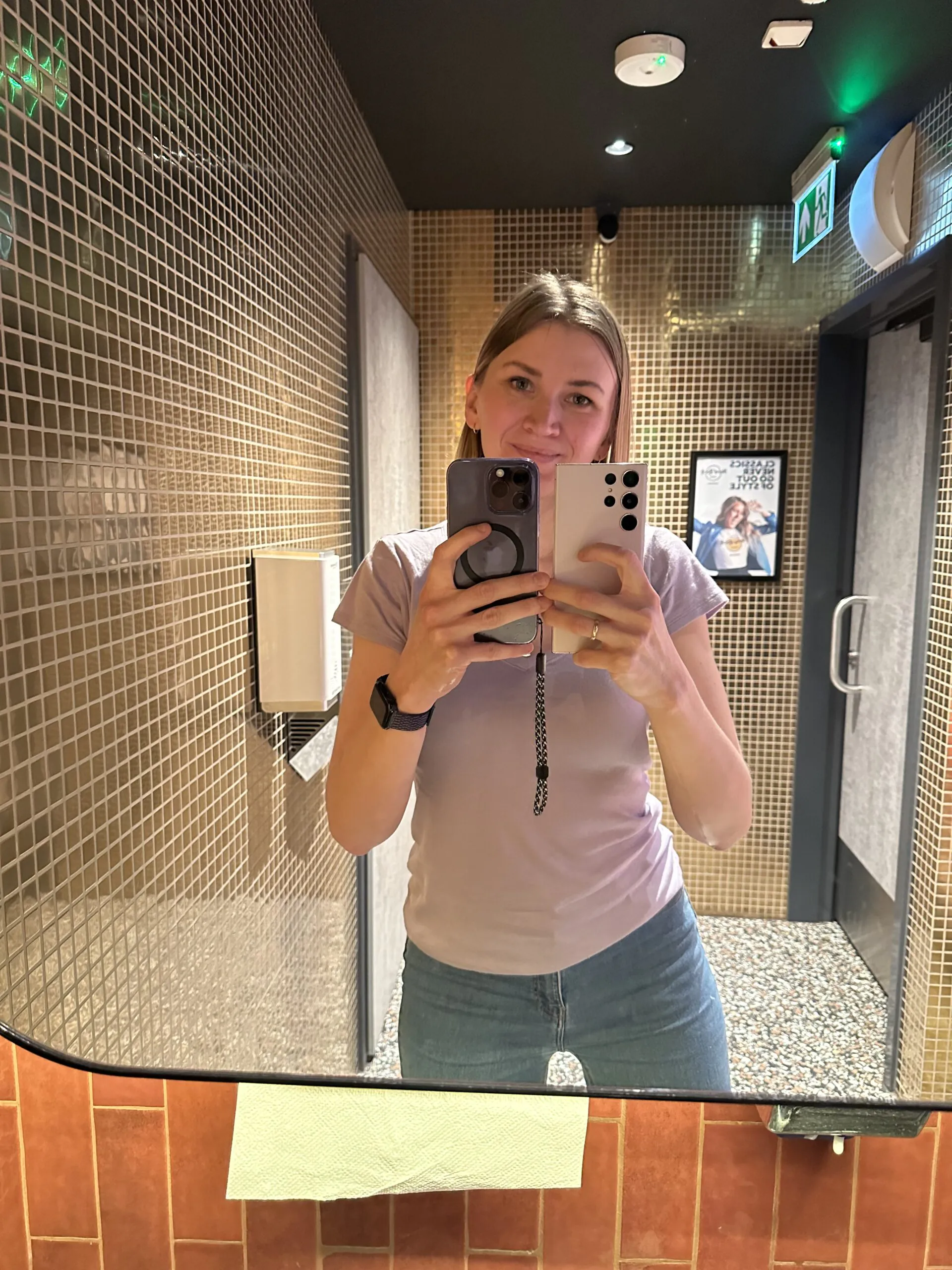
Appearance of the iPhone 14 Pro Max
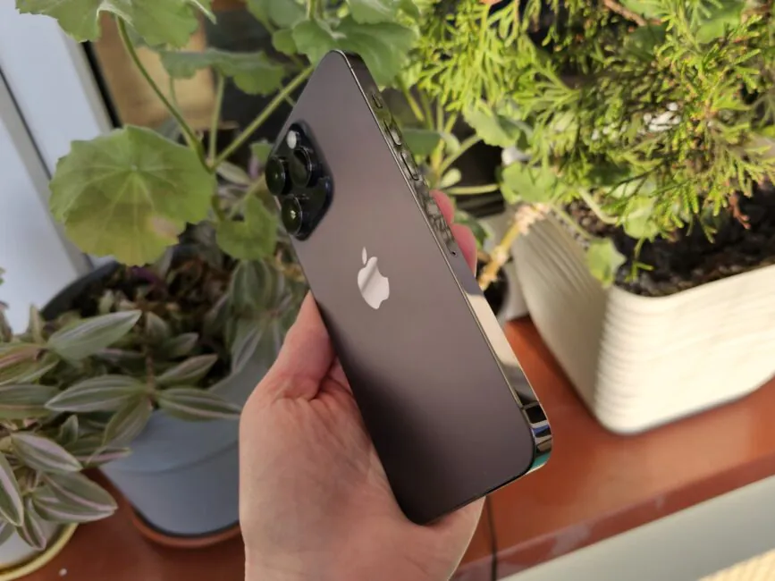
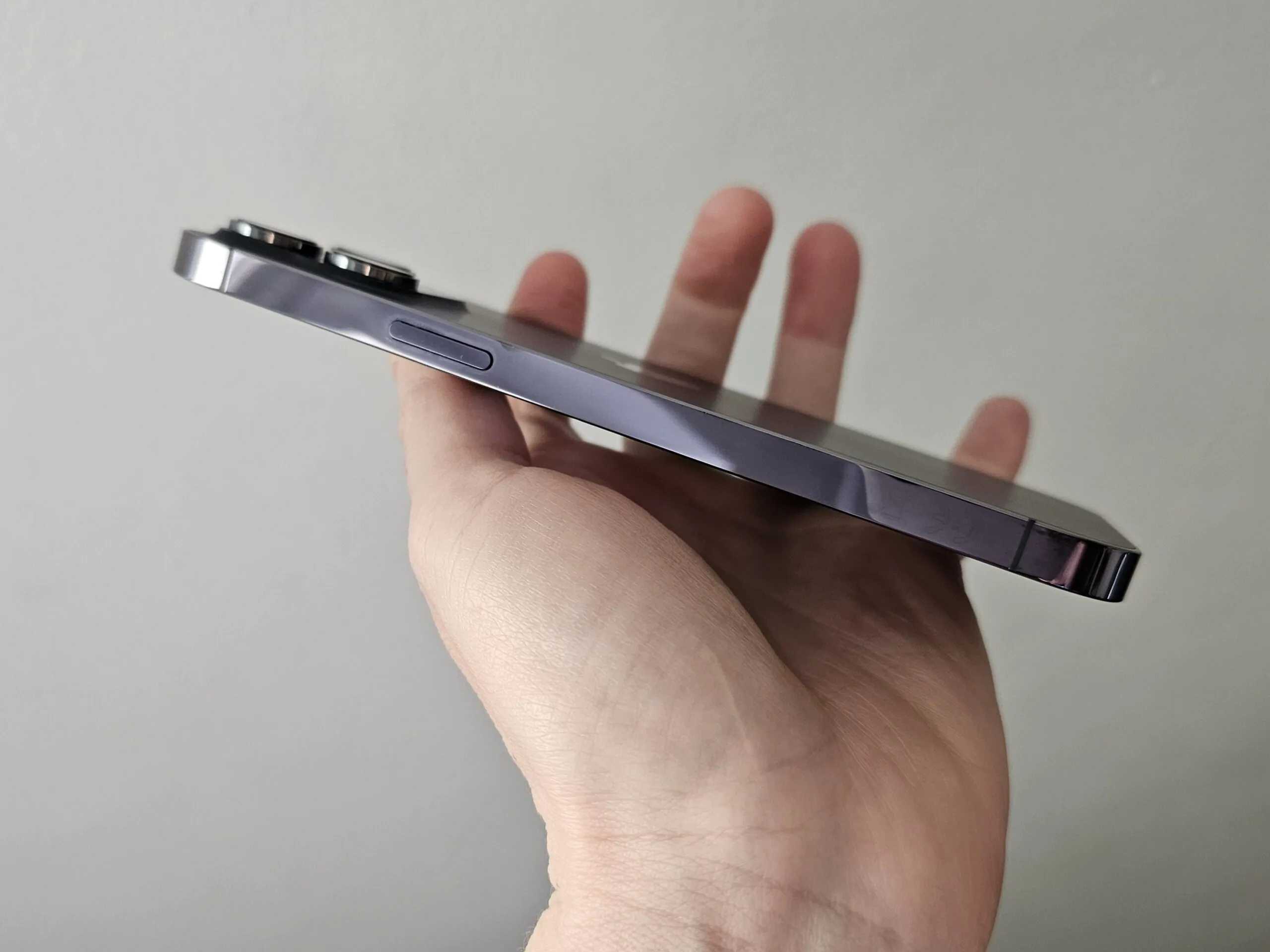
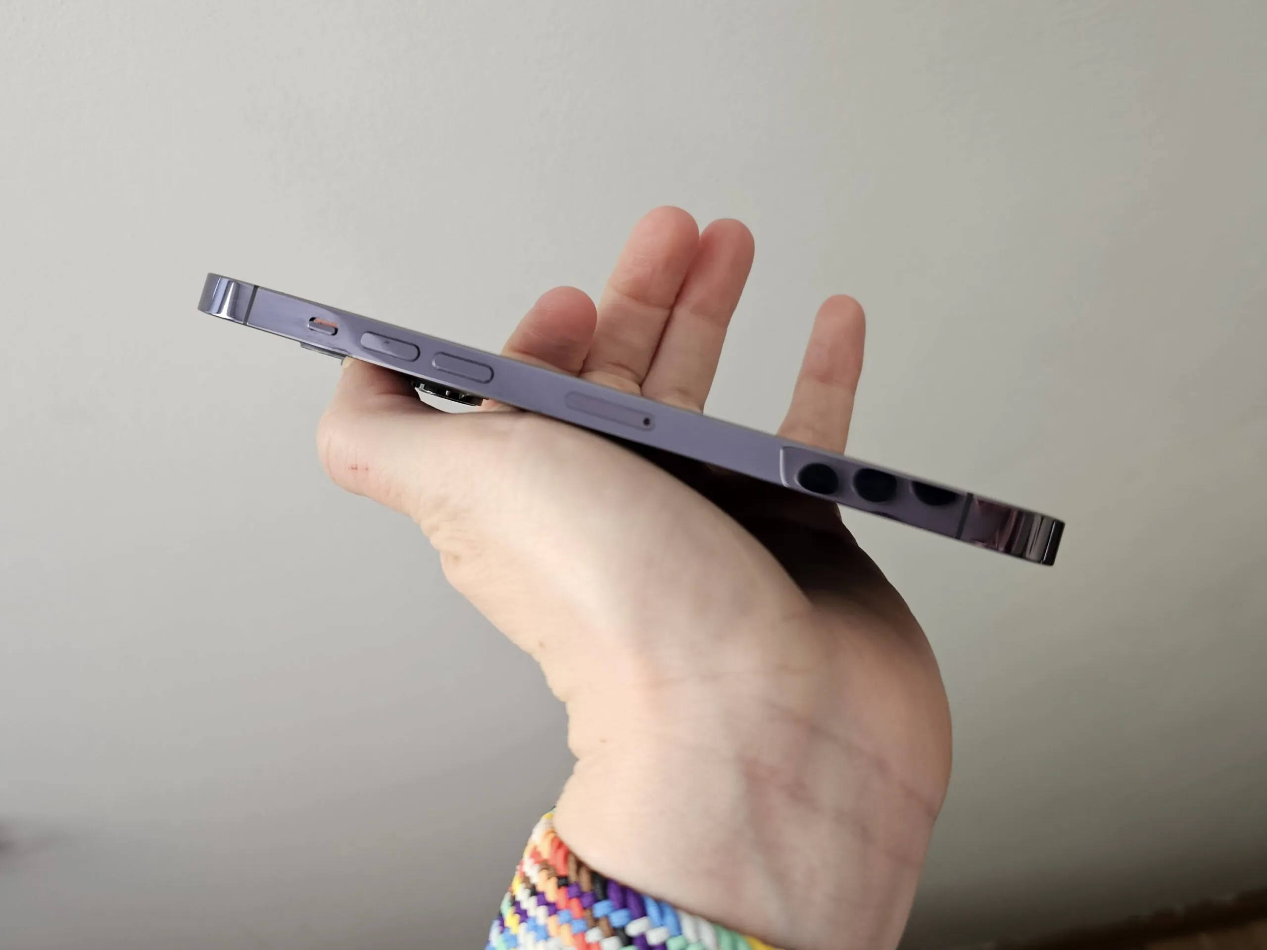
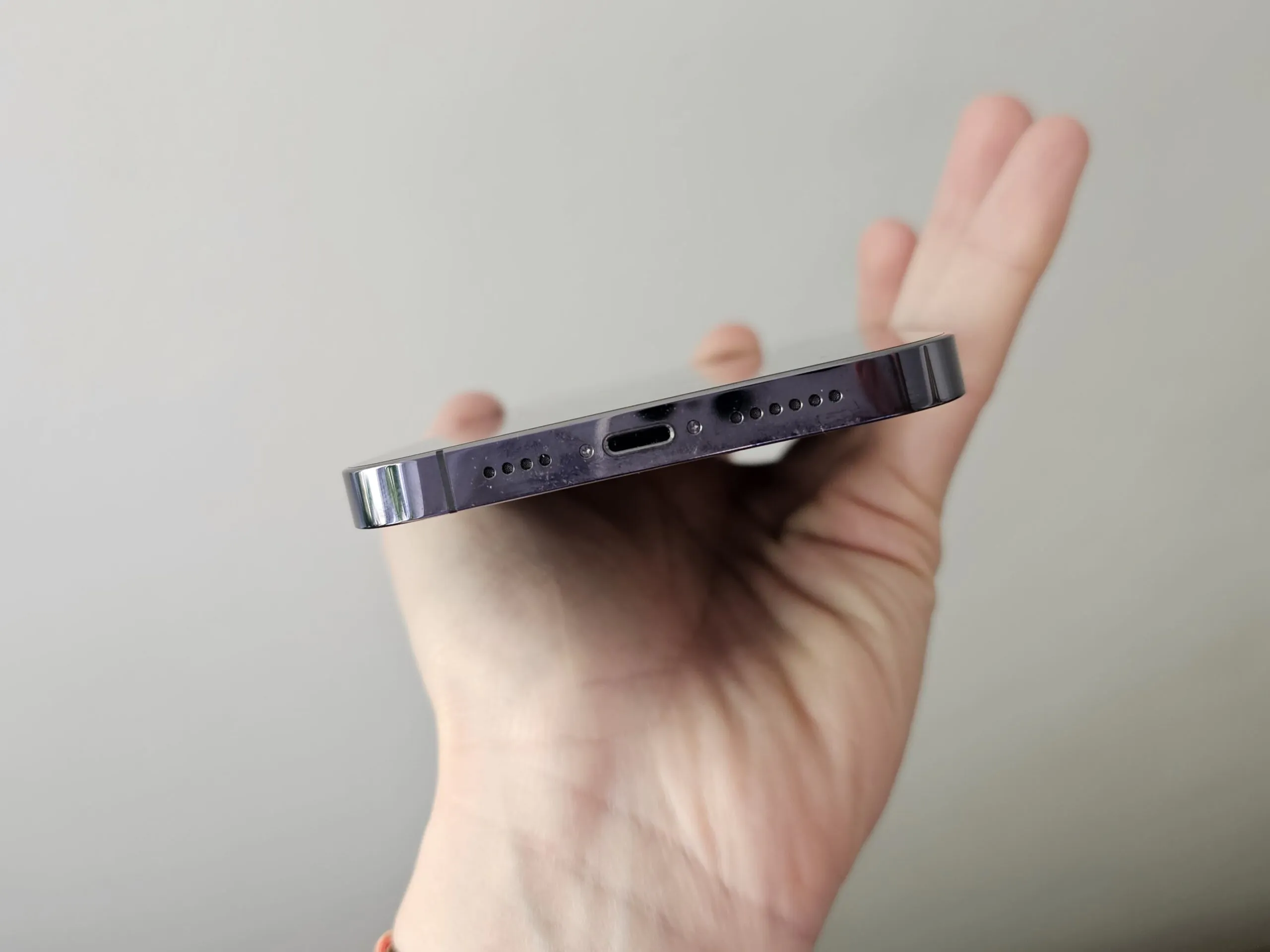
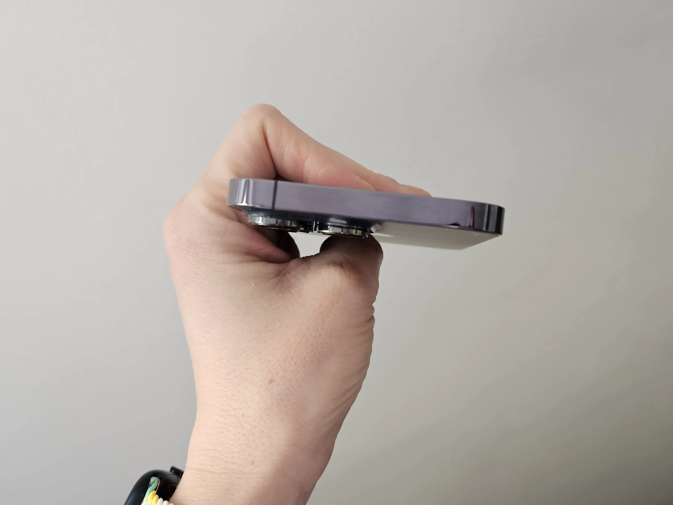
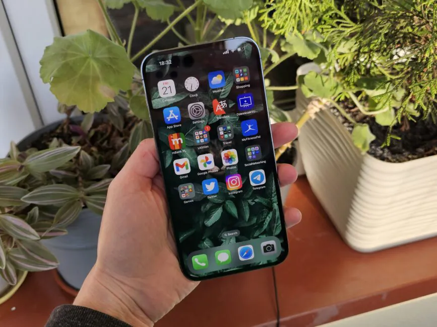
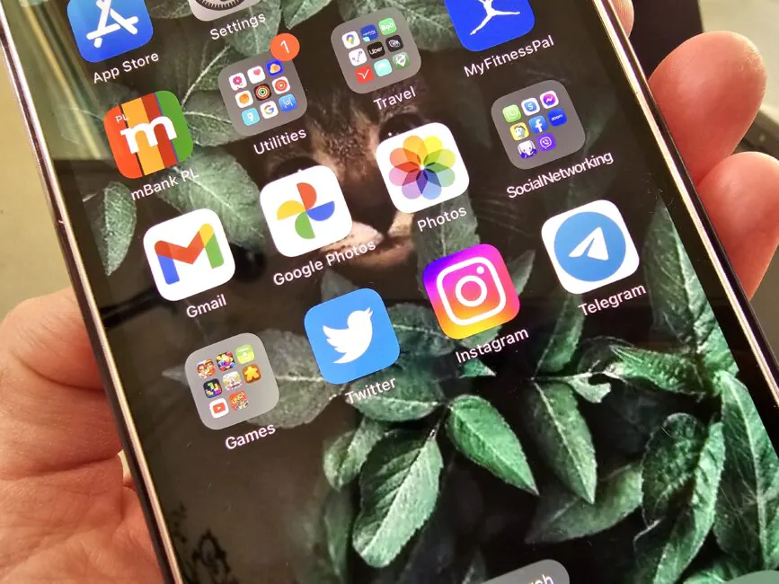
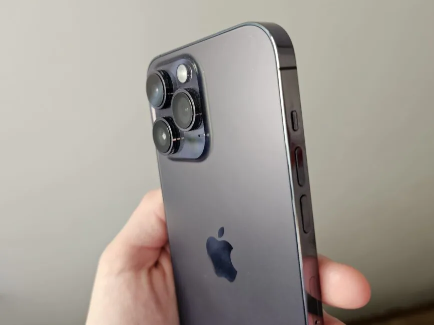
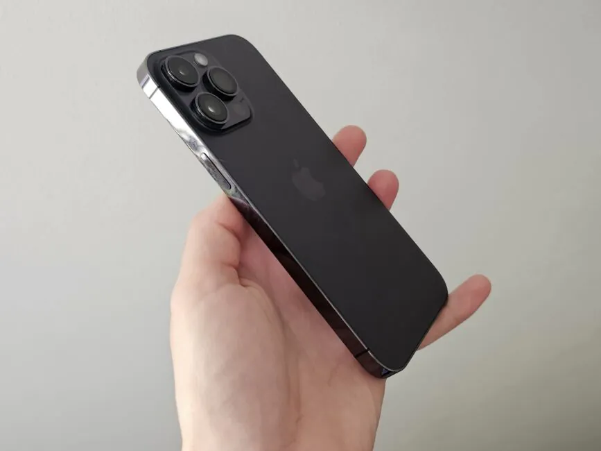
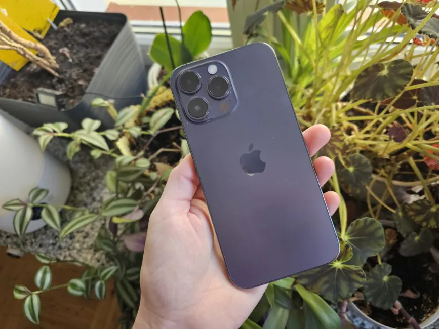
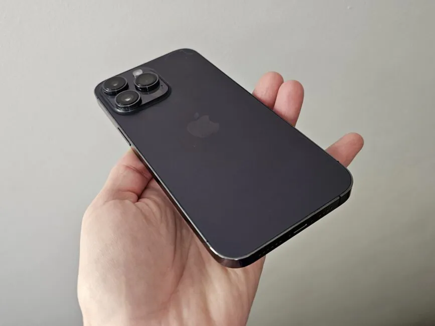
There’s not much to write about here, because nothing has changed for several years in a row. Although, I’m lying, not so much. Firstly, since the phones have not changed externally, I thought that my rich collection of 13 Pro Max cases would fit the new phone. But it didn’t – the buttons and camera modules are slightly offset. Not much, but… I don’t know if it was on purpose or if there was no other way out, but the fact remains that I had to change the cases.
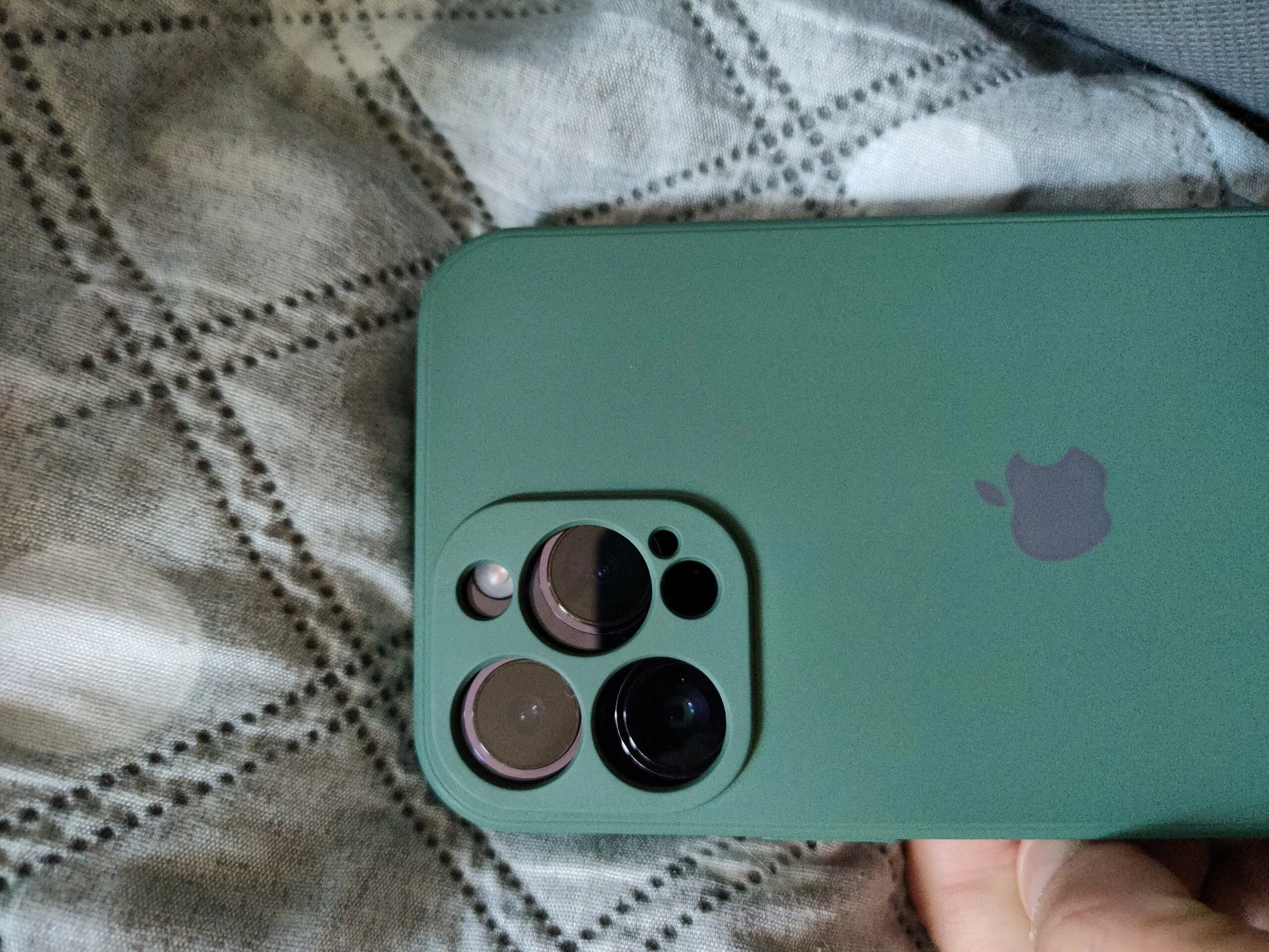
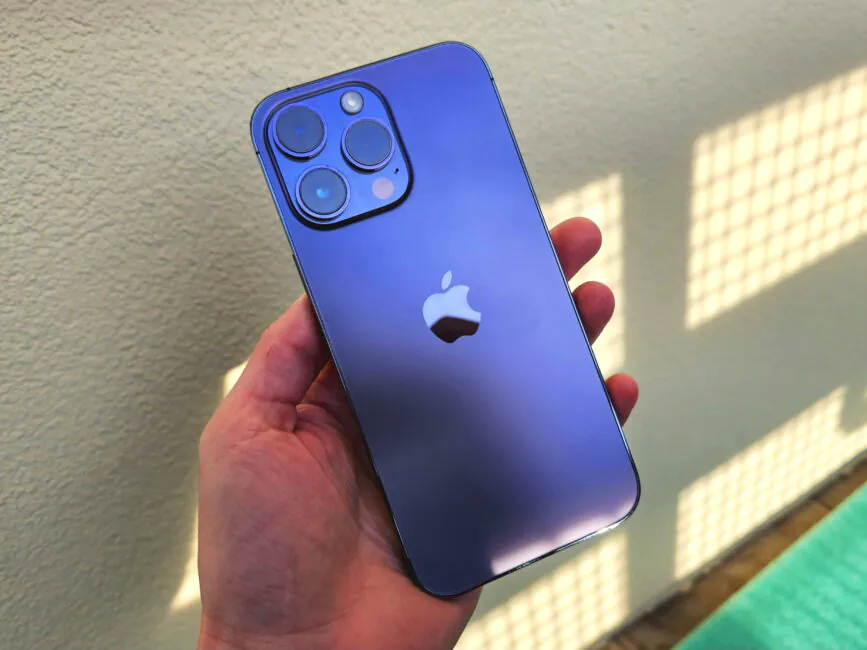
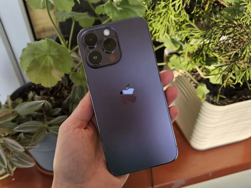
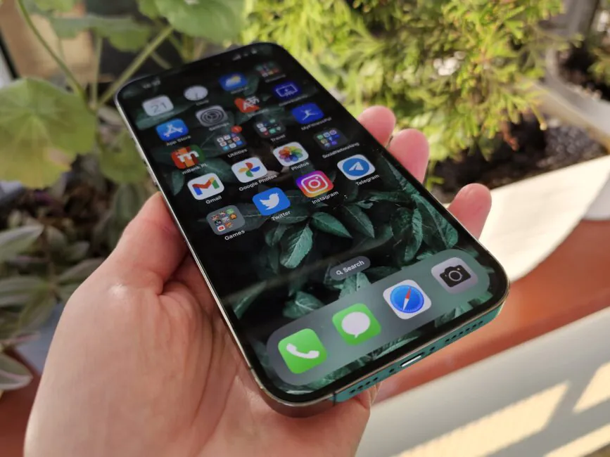
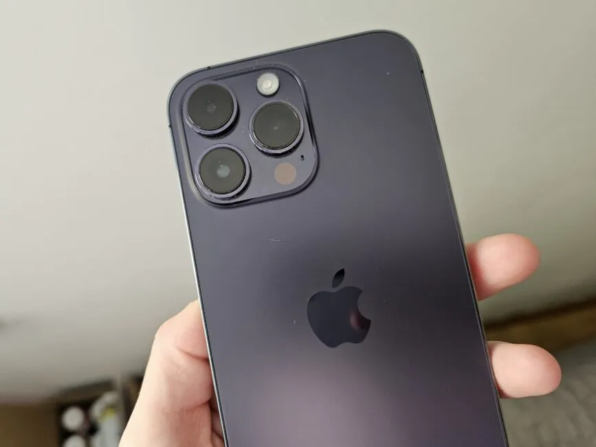
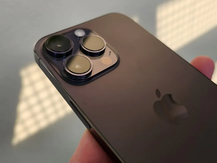
And also the colour. There was no blue in the 2022/2023 season, but instead a purple Deep Purple appeared. I didn’t know which one to choose: black and white are not interesting, gold is harder to sell, but purple is something new. Although in reality, I can’t say that the colour is interesting, unless you are a fan of purple.
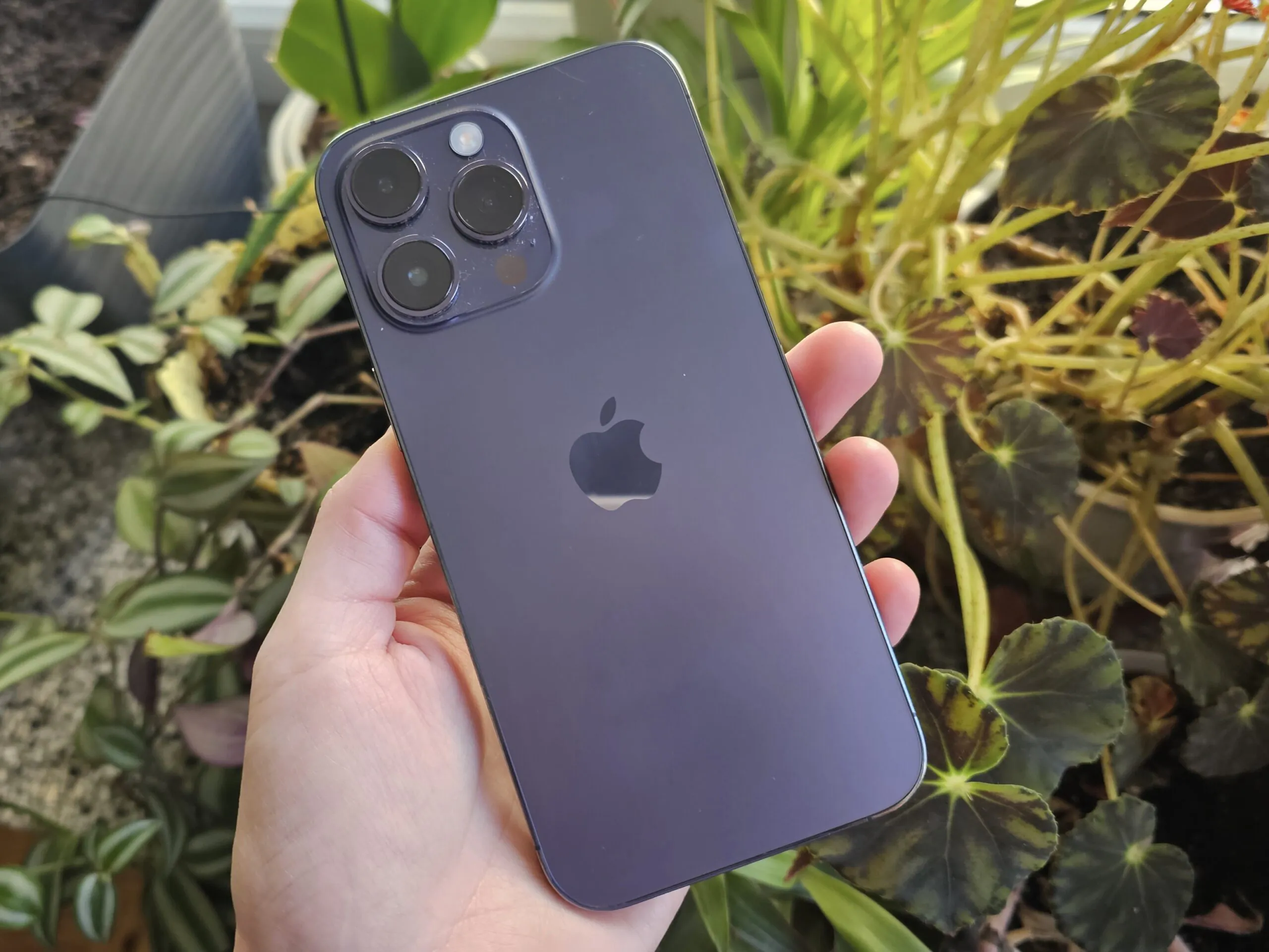
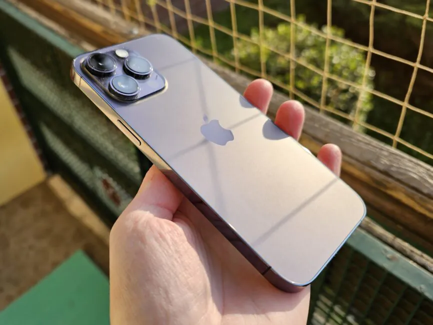
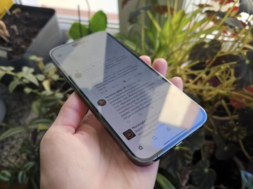
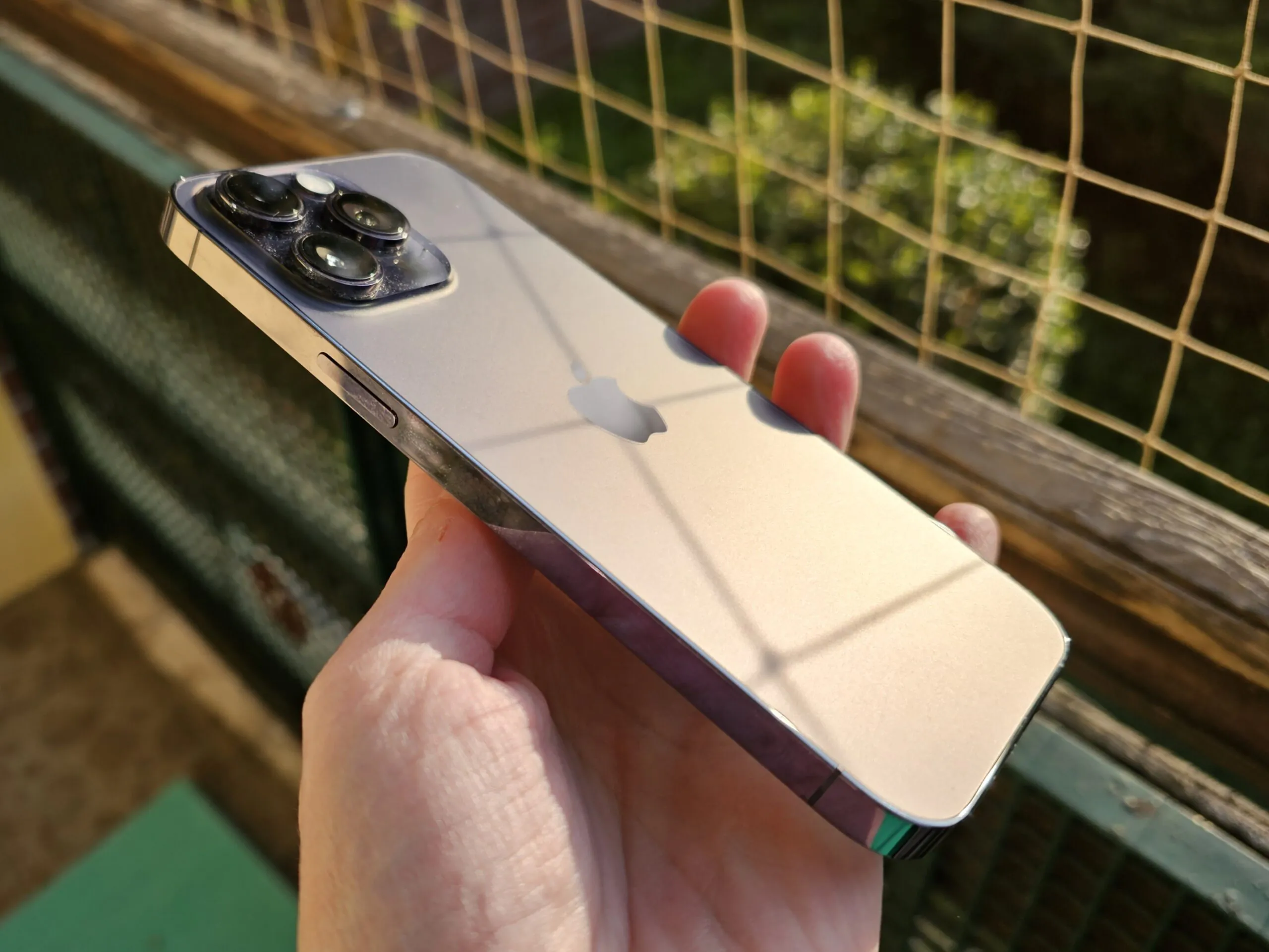
The rest of the iPhone is just like an iPhone. It’s huge, clumsy, with not the smallest screen bezels, and the ergonomics are tight. I test a lot of phones, and some Android flagships are even bigger in size, but at the same time they are not so thick and sharp-sided, so they are much more pleasant to hold.
But this is not new, I said the same thing about the 13 Pro Max. It’s just that if you need an iPhone, as well as a large screen and the longest-lasting battery, then there is simply no choice but the Pro Max. You can get used to anything.
Read also: Apple AirPods Pro 2 vs Huawei FreeBuds Pro 2: which headphones to choose?
Screen and “dynamic island”
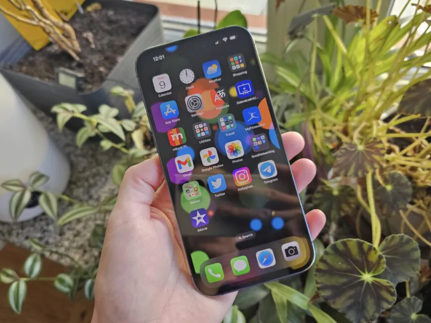
There are a number of innovations here. Firstly, a revolution by iPhone standards – the refresh rate is now 120Hz and everything looks smoother than before.
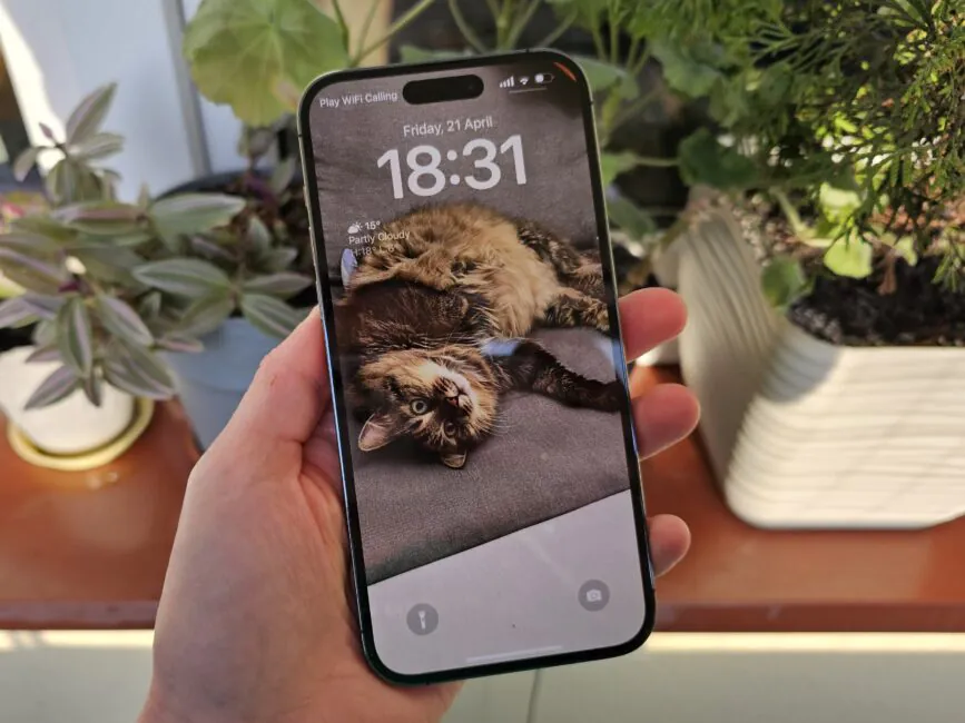
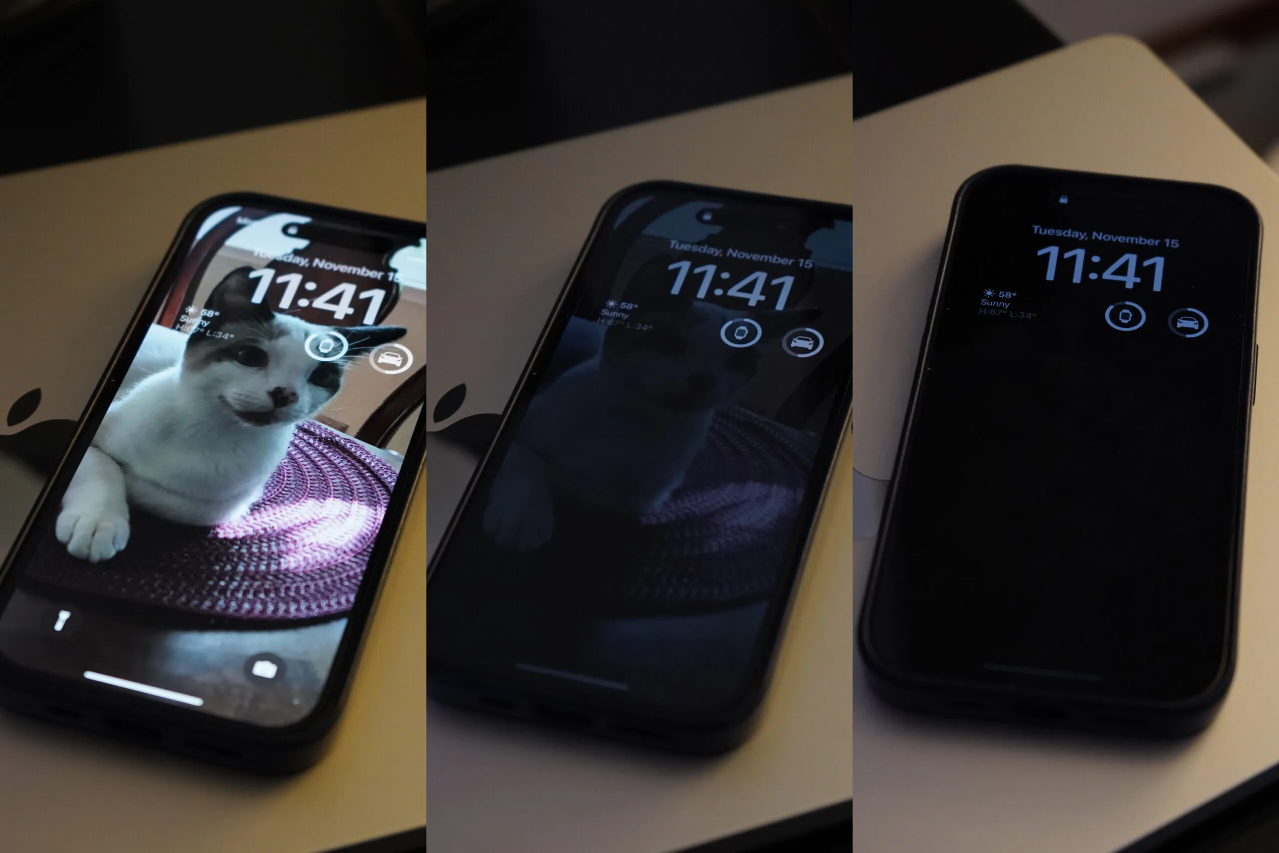
Another revolution is the Always On Display mode. However, it hasn’t changed my life, because I don’t like screens that are always on – why waste battery. But if you are interested, the refresh rate is reduced to 1 fps and the brightness becomes minimal (the picture is dull, grey), so it’s not a black screen with certain notifications in white font, as is the case with Android competitors. However, in the December update, it became possible to disable the display of wallpaper, so you can still get a black screen if you want.
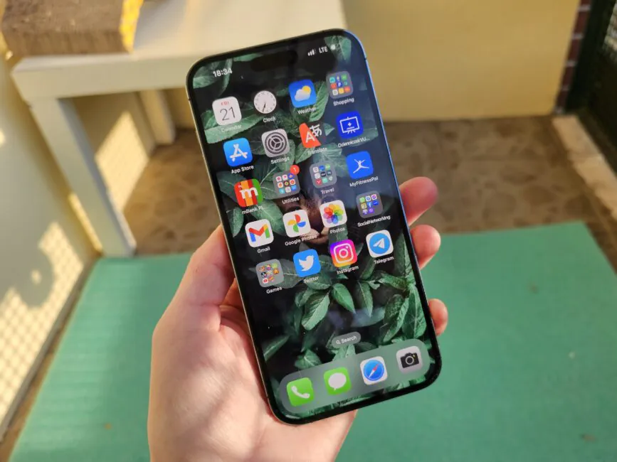
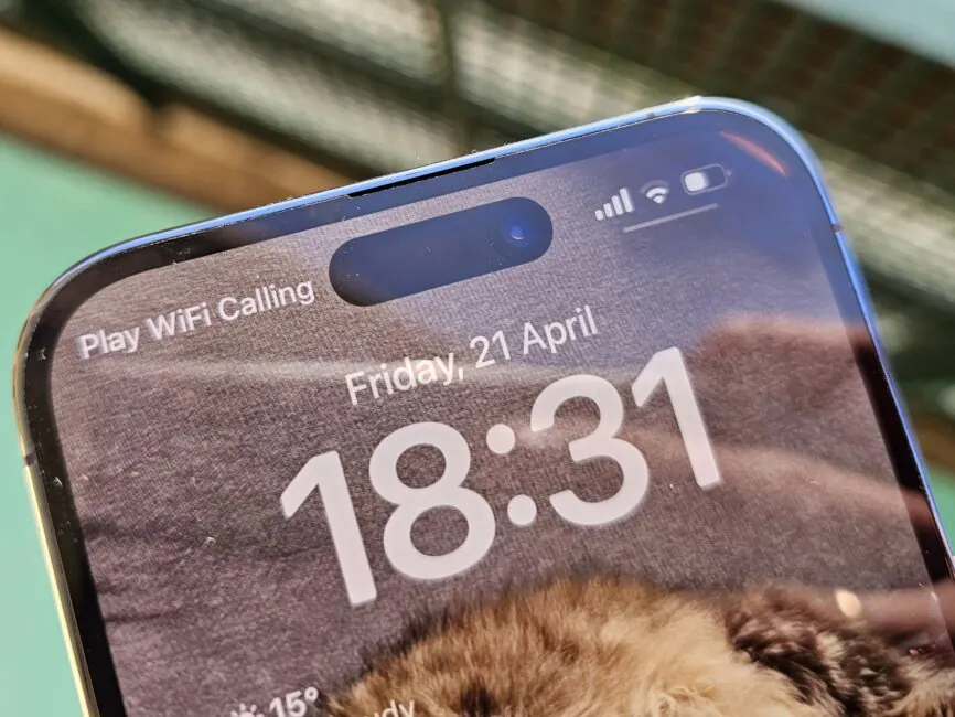
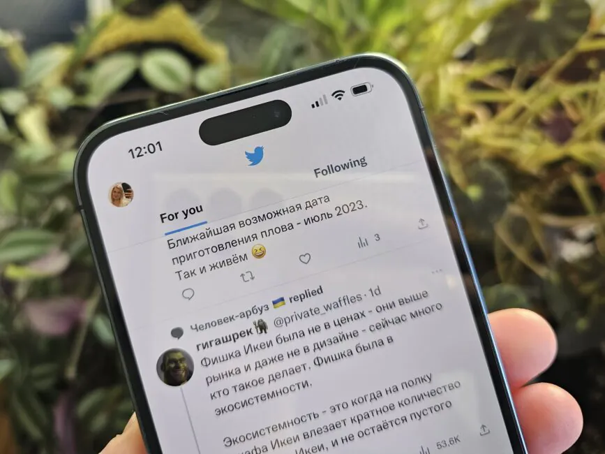
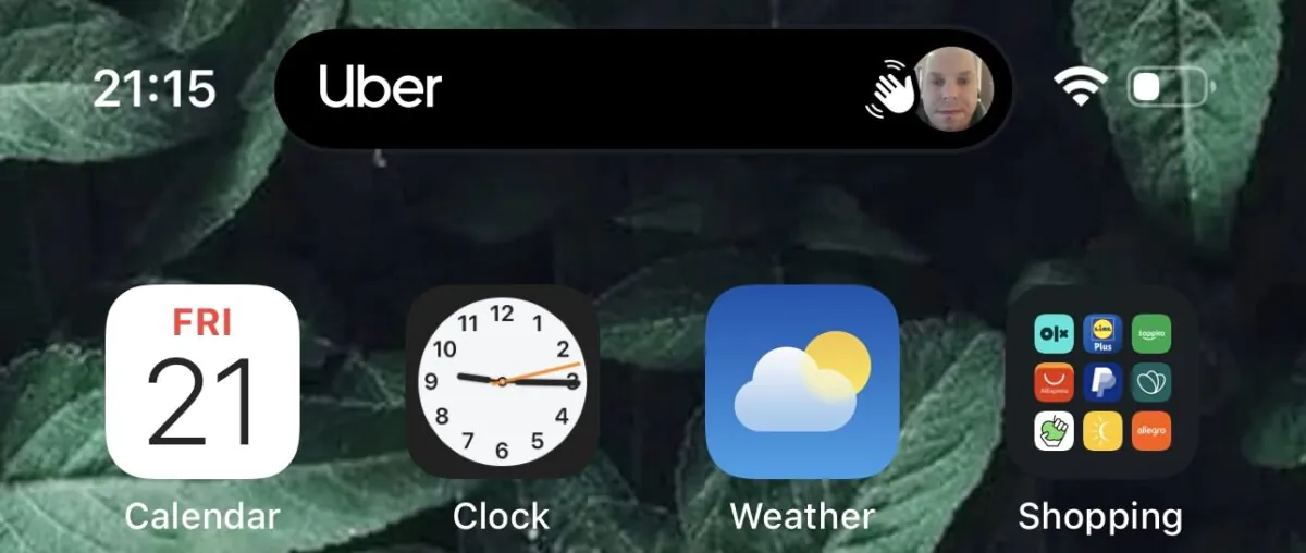
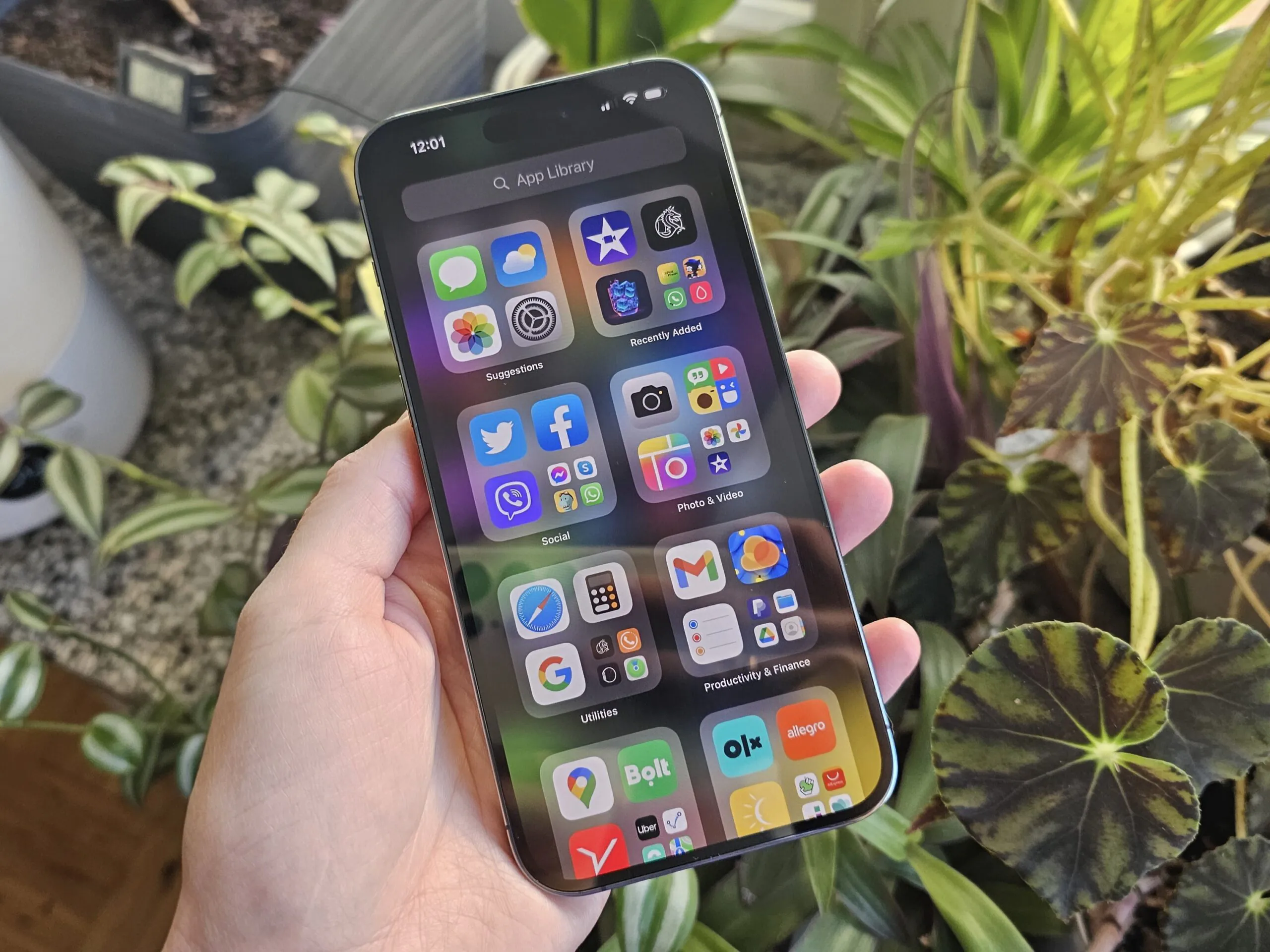
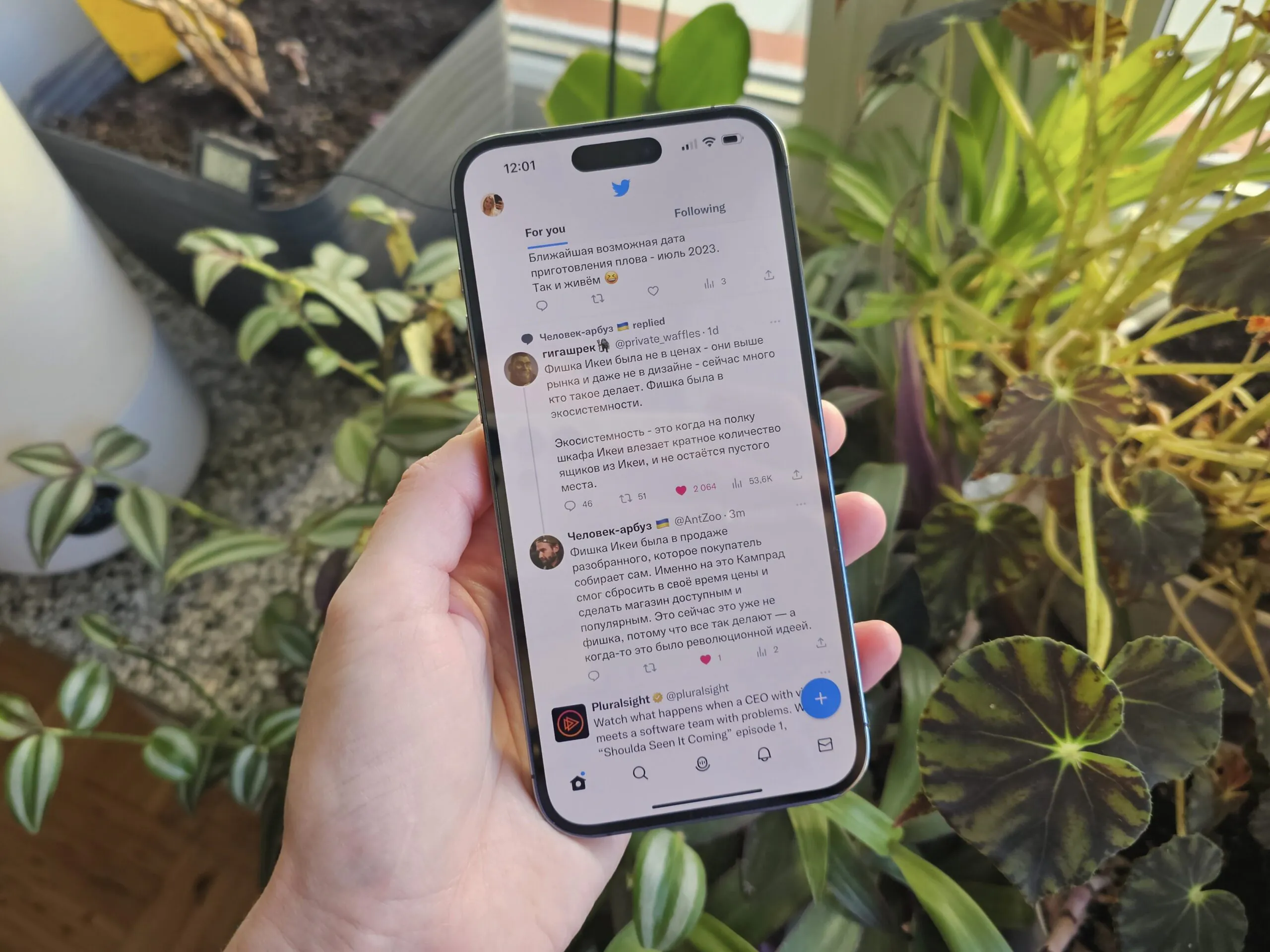
Another striking innovation of the Pro 14 Series is the dynamic island. Instead of a large “mono-brow”, an oblong cutout for the front cameras is now used. Opinions about this innovation are divided, but I like this approach. Firstly, the usable screen space has increased. Secondly, the notch hurt my eyes at first, but after a couple of days I got used to it and stopped noticing it.
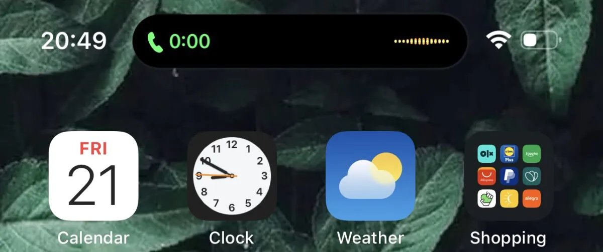
And most importantly, this cut was beaten at the software level. And this is the very “Apple magic”. A small detail that no one else has thought of and that cannot be adequately replicated. I think you’ve seen how dynamic island works at least in commercials.
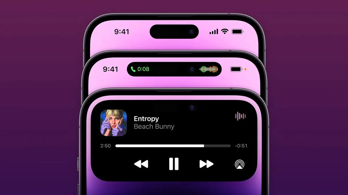

“The Dynamic Island can lengthen, expand, and display useful information. For example, during face recognition, an authentication animation appears there. If you go somewhere with the navigator in the background, there will be tips. If you call an Uber, you’ll see how many minutes it will take for the car to arrive, and then you can follow the progress of the trip. If you order food, you’ll see in the “cutout” that the order has been accepted and whether the courier is on his way. If you are listening to music, the “dynamic island” will have a mini-equaliser and the cover of the current track. It’s done well and with heart.
Surprisingly, competitors are not even trying to copy the “dynamic island” yet. Xiaomi has only introduced a budget phone with an elongated notch for the front-facing camera, but this solution makes no sense, except for a minimal visual resemblance to the iPhone, and there are no animations.
But realme did not make an elongated notch in the budget novelty C55, but instead made a “mini capsule” – a kind of analogue of animation in iOS. So far, it only displays information about the charging connection, data on mobile Internet usage and steps taken. They promise more, but it is unlikely that the choice will be huge, and you shouldn’t expect third-party applications to support this feature, which is not the case with Apple.
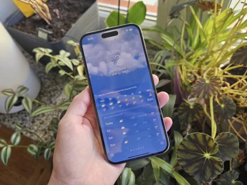
In general, the iPhone has a beautiful high-quality display with excellent colour reproduction, high definition, and excellent viewing angles. Readability in the sun is excellent, but until the phone decides that it has heated up (this happens even in pleasant +20-23 outside) and reduces the brightness by almost half. Then look for a shade or use it as you wish.
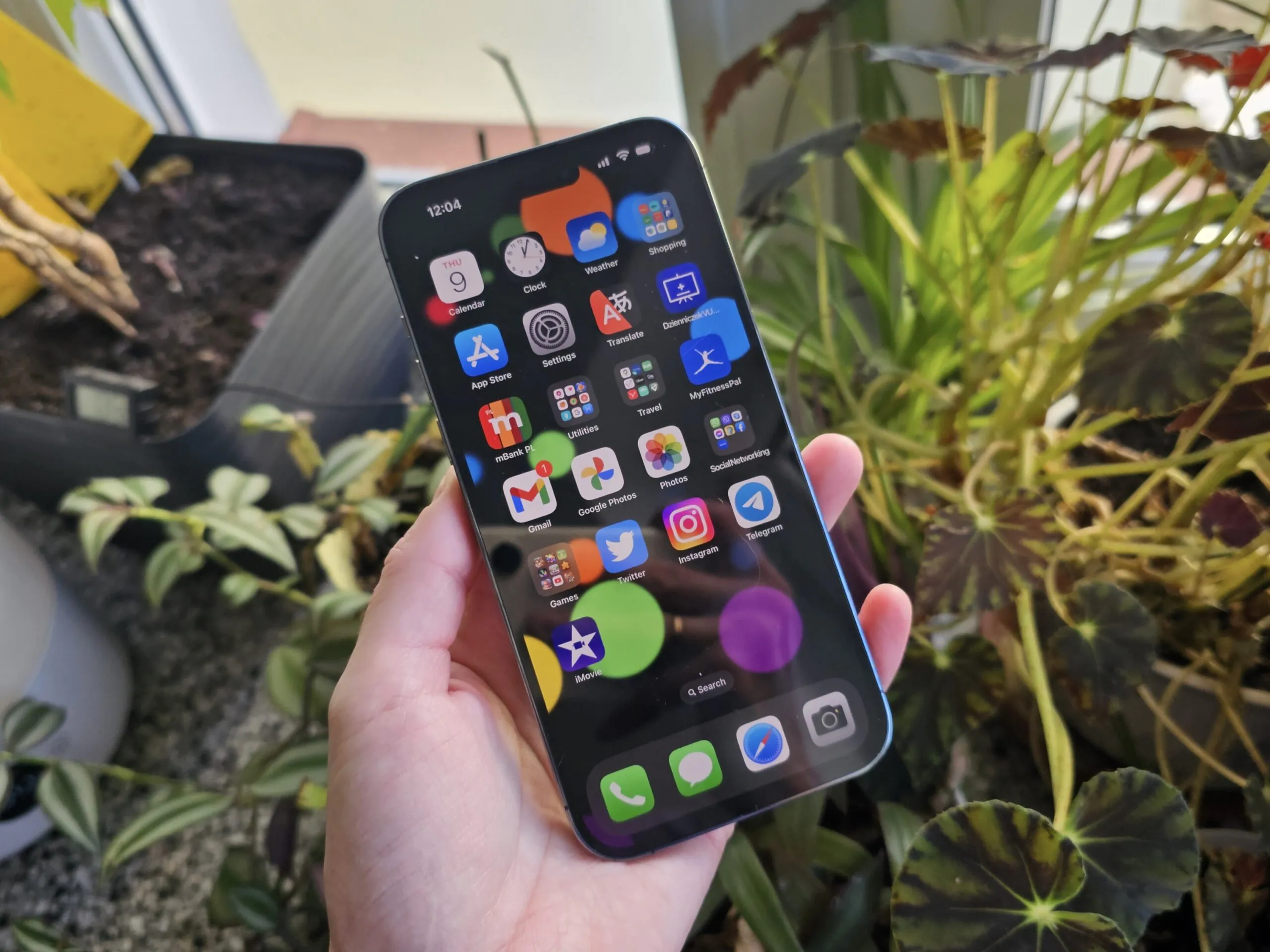
It’s also AMOLED, and Apple hasn’t taken care of flicker reduction (yet?). Personally, I notice it from time to time at minimum brightness. However, this feature does not bother me and my eyes.
Read also: Samsung Galaxy S23 review: the cool compact flagship
iPhone 14 Pro cameras and what’s annoying about them
Every year, the cameras in iPhones become “faster, taller, stronger”, and this time there are many improvements. The first revolution is that the main sensor is now 48 megapixels after many years of 12 megapixels.
However, this is not Android, so you can’t just select the “48 megapixel” mode and shoot. In any case, we get a reduced 12 megapixel footage, but reduced for our benefit – the clarity is higher, the sensor captures more light (or rather, Apple claims 65% more).
If you still want 48 megapixels, you can shoot in ProRAW format and in native resolution, but such frames need to be processed, which is not for everyone. And they weigh 50-70 MB. Most people still use point-and-shoot cameras. That’s how I do it too.
In general, I can’t say that the new 14 Pro is any better than the 13 Pro, especially if the lighting is perfect. But yes, the clarity is better, in low light in particular. Although not enough to make an upgrade just for the sake of the camera.
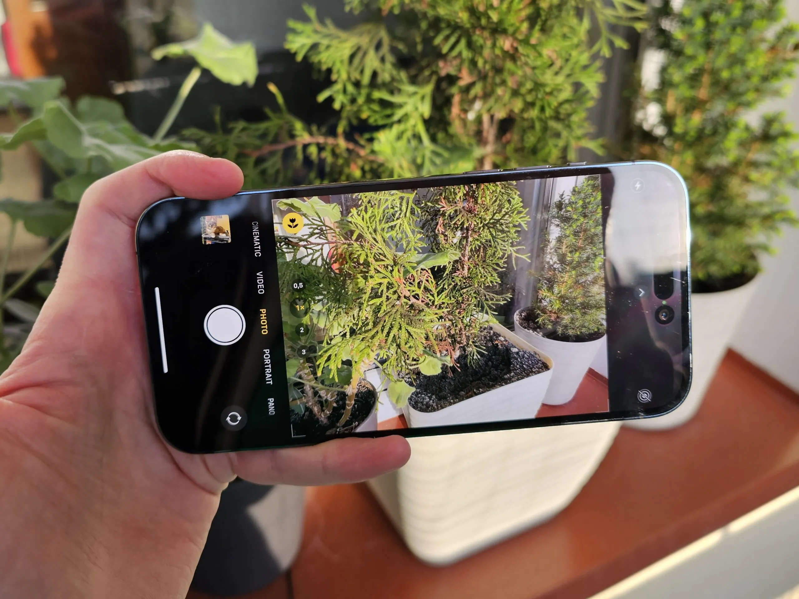
Although the telephoto lens zooms in 3 times, the 2x option is back, which is still useful. The wide-angle has a new sensor. The quality is okay (but not in low light, unfortunately). And there are nuances, more on them below.
The front camera has improved “on paper”, but, in my opinion, the 13 took good pictures, and the 14 takes great pictures. A zoom has appeared in portrait mode. And the Action video mode has been added, which is adapted to powerful shaking, but I rarely shoot video, so the lack of 8K in iPhones doesn’t bother me, so why so much?
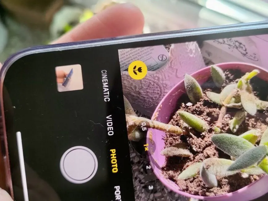
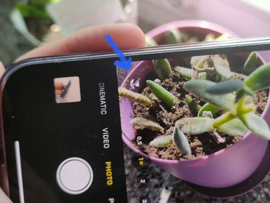
Now let’s talk about something that has changed noticeably and is annoying. I’m not an expert in optics and camera modules, but due to the change in the main module (I think its size), the focal length has changed. Because of this, the iPhone 14 Pro Max switches to a wide-angle lens in macro mode even when you are not very close to the object. The 13 Pro Max did this only when the approach was strong.
Let me show you an example. At this distance from a small object, the main module is still able to make a clear shot. Then you need to switch to a wide lens.
 Here’s a comparison: on the left, the shot above, on the right, an attempt to get closer, and the pasta is no longer in focus.
And now a photo from the main lens (left) and a photo from the macro lens (right). In this light, there are no major quality issues, but you can see that the blurring of the background is ugly.
So what is the problem with switching to a wide-angle module too early? The fact is that the quality of the wide-angle is far from being as good as that of the prime lens. And the weaker the lighting, the more noticeable it is – noise and blur appear. And even if the lighting is good, the background is not as gracefully blurred when using a wide-angle lens as it is when using the main lens (as we saw above). Here are some more examples (the wide lens on the right):
As a result, most photos with some objects in the foreground are not of the best quality. It’s a shame to buy such an expensive phone and get “shit photos”, you must admit! It may be difficult to draw conclusions from thumbnails, but take my word for it, I’ve been testing phones for over 15 years and have held all the latest flagships along with my personal iPhone.
You might say that you can turn off the ultra-macro mode by tapping on its icon in the corner. You can, of course.
But this does not solve the problem – up close, the main lens simply does not focus (the 13 Pro did, and competitors like the Galaxy S23 Ultra and Huawei Mate 60 Pro do focus). To get the shot in focus, you almost have to go to the other side of the room! I’m exaggerating, but yes, you need to shoot from a distance. What’s the problem with that? Firstly, in order to post photos somewhere, you need to process them, crop them, it takes extra time. Secondly, when you look at an object in the lens from a distance, it’s not always clear whether it’s sharp, so I’ve taken bad pictures more than once.
This problem became especially acute when spring came and flowers bloomed. I love photographing flowers. And not only in super-macro mode (it’s good here, provided the lighting is perfect and there is no wind), but also just close-ups with a beautifully blurred background. The iPhone constantly switches to wide mode, and I have to forbid it. Later, when I look at the photo more closely, I see that many objects are simply out of focus. Here are a few examples (the object on the right is enlarged for clarity):
Among other things, my job is to take photos of equipment for reviews. Often, I need to take pictures of small elements, such as side edges, buttons, connectors. I have to switch to a wide-angle camera and the quality is poor, especially if there is not much light. Or, again, you have to shoot from a distance and then spend a lot of time framing the photo. In general, it’s a pain in the neck for your money. A couple of examples from the “out of focus again” series (I have a lot of them):
 And here, it may not be very clear, but in less than ideal lighting conditions, the photo quality of the wide-angle module is not at all pleasing:
And one last example. Once I was testing a budget smartphone, the realme C55, and I accidentally got a very good shot at sunset (below left). I wanted to repeat it with my iPhone to get better quality and post it on social media, but it was not to be, the “wrong” focal length did not allow me to focus on the birch bud, and switching to a wider angle “killed” all the magic. Photos from the iPhone 14 Pro Max are on the right.
I hope Apple will do something about this in the next generations. Either the main module will be changed. Or the wide-angle will be finished so that the quality of macro photos from it is not so sad.
What else is wrong? In general, everything is fine, but after the experience of testing flagships from other brands, I really miss a better telephoto lens (now it just zooms in with mediocre quality, it could be better) and a better zoom! The zoom is there, but at the level of “average” lenses from other brands. Nevertheless, it is not so rarely used, in such an expensive phone I would like to see something more decent. Let’s see what the iPhone 15 will surprise us with.
But in general, we are looking at an expensive smartphone that clicks great photos in any light. Since I’m not doing a full-fledged review, I won’t show pictures from different modules and in different modes here, but I’ll show you a few examples so that you don’t limit yourself to just bad shots like the ones above.
Read also: Xiaomi 13 smartphone review: almost perfect
Performance, memory, software
Every year, new processors are introduced, now it’s A16. Yes, the performance increases by some tens of percent. But even today, the 12th iPhone is still fast, and the 13th and 14th are certainly fast. I think that even if Apple rolls out something revolutionary and increases performance by as much as 50%, we won’t even notice it unless we run special synthetic tests. In short, everything is fine with the power. And how else could it be, for the money.
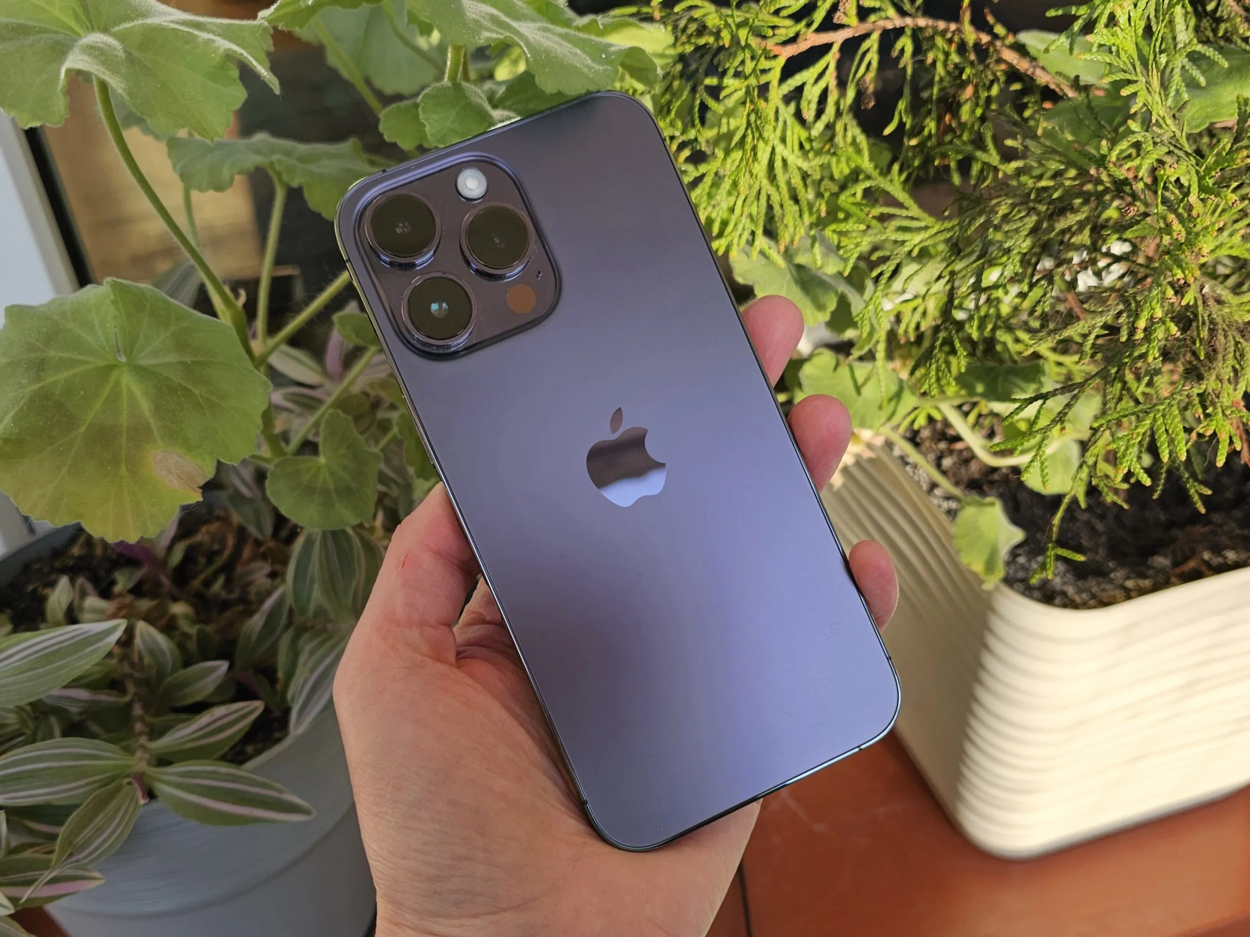
As for memory, I have a basic version with 128 GB, I’m not so rich to pay more. It’s enough for a few thousand photos and videos, the necessary applications (I hardly play games), and I use everything else in the clouds. More than half of the disc space is free. However, if you think about Android competitors, most of them in this price range offer at least 256 GB of storage.
Software is software, once a year there are big updates and something is added, while thanks to long support, old models remain relevant.
iOS is iOS – with its pros and cons, it’s not perfect, but there are no ideals. I’m used to it and it’s fine.
Battery life of the iPhone 14 Pro Max
At the presentation, they said that the battery life has increased. I can’t say that I noticed it, it seems that both the 13 Pro Max and 14 Pro Max work the same way… and for a very long time. This is a really important advantage of the Maxes – their longevity. I am a person with 6-8 hours of screen time a day, I rarely let my phone out of my hands, it is a tool for work, and a means of communication, entertainment, learning new things, etc. From the top models, I have only had pro-maxi iPhones with me from morning to evening, and recently I have added the Samsung Galaxy S23 Ultra. So not only iPhones…
But what is annoying about the iPhone is the lack of really fast charging. Even with the iPad power supply (there are no more powerful options), you will only get 20-27 watts at the peak. In practice, this means half an hour from zero to 50% and almost an hour and a half to 100%.
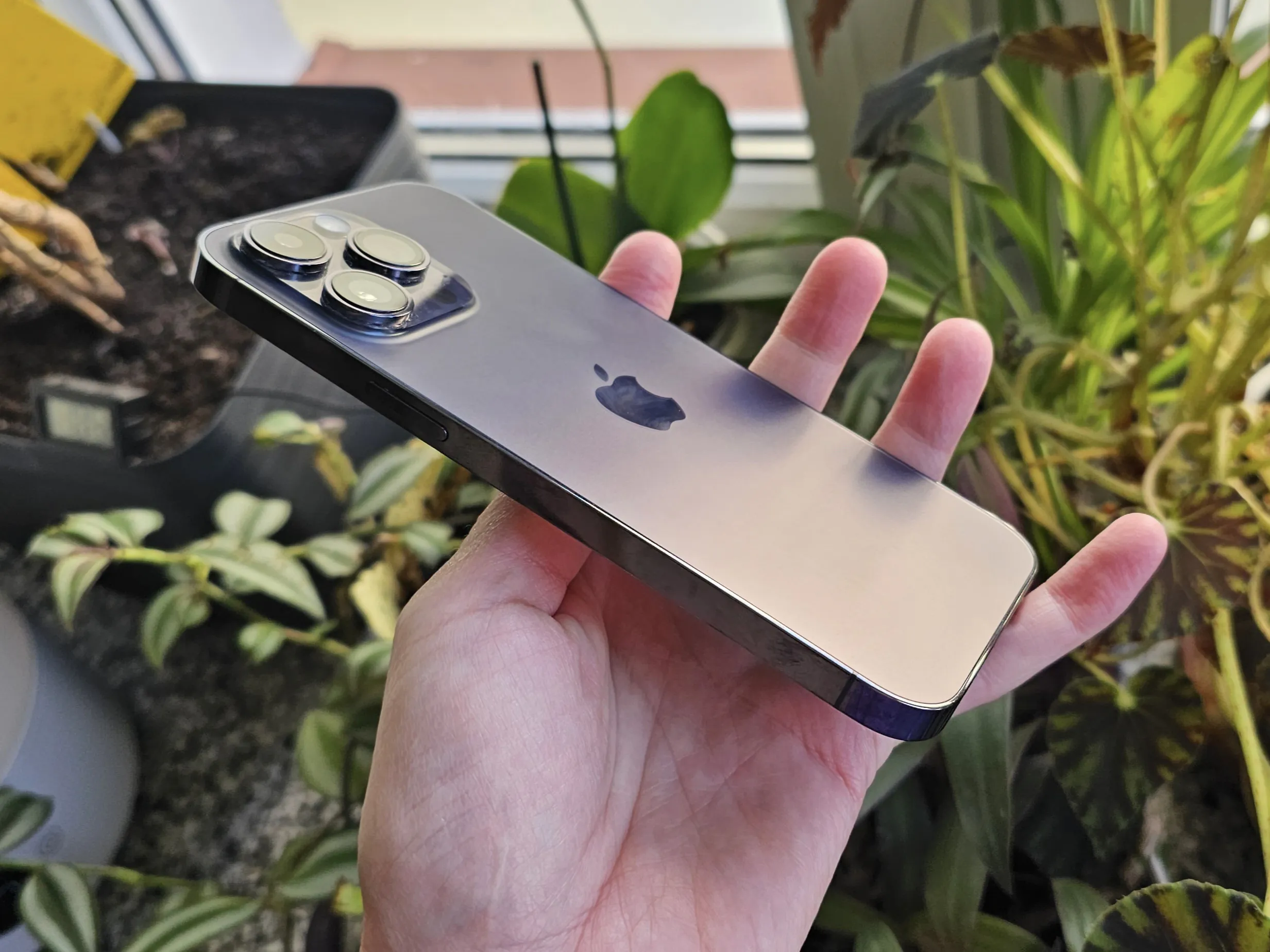
Of course, I can already hear the fans shouting “we don’t need this!!!!!”, saying that fast charging damages the battery and so on. I don’t want to get into a holier-than-thou argument, but I’ll just say that there have been a lot of studies on fast charging, and it doesn’t affect the battery life so much that it becomes noticeable within 3-5 years. And very few people use their phones for that long. The typical wear and tear of lithium batteries is much more noticeable, so there’s no need to worry.
But the convenience of fast charging is great: you connect your phone for a short time at any time and you have enough charge to last you until the end of the day. After testing modern Android smartphones, going back to the iPhone with its slow charging feels like the last century.
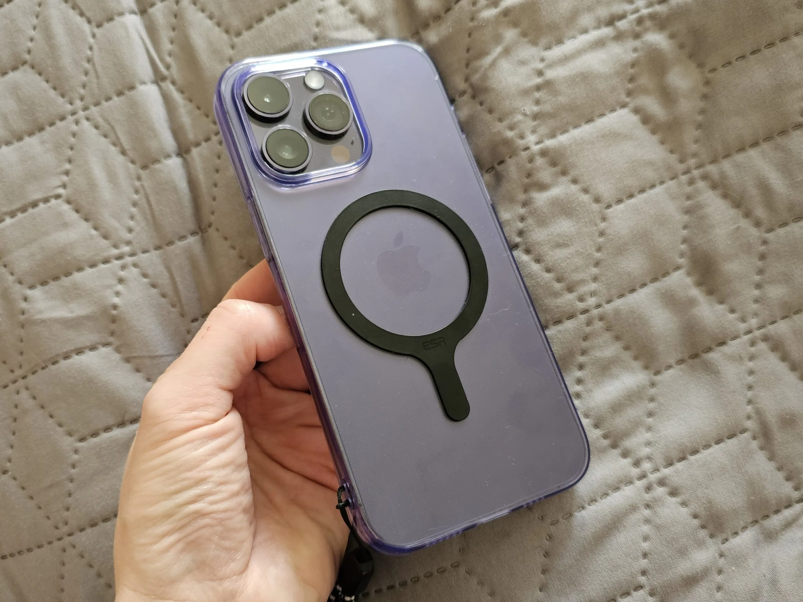
There is wireless charging with MagSafe, which is convenient. It took me a long time to gather my thoughts, but in the end I bought a Belkin 3-in-1 charging station (for a lot of money, because I wanted an Apple-certified one). Now I won’t accidentally move my phone off the charger at night because it charges by my bedside. I didn’t change all the cases to the ones with MagSafe, I just put stickers on the existing ones, which is cheaper.
Read also: Test drive of the Realme GT3 smartphone: Need for speed
Summary
It has long made no sense to change top models every year, they are so packed with technology that they do not become obsolete even in a few years. It doesn’t make much sense to change an iPhone 13 to an iPhone 14 unless you have a great desire and extra money. But it’s worth replacing the 10th or 11th, you’ll feel the difference in terms of the screen, performance, cameras, and a fresh battery is good.
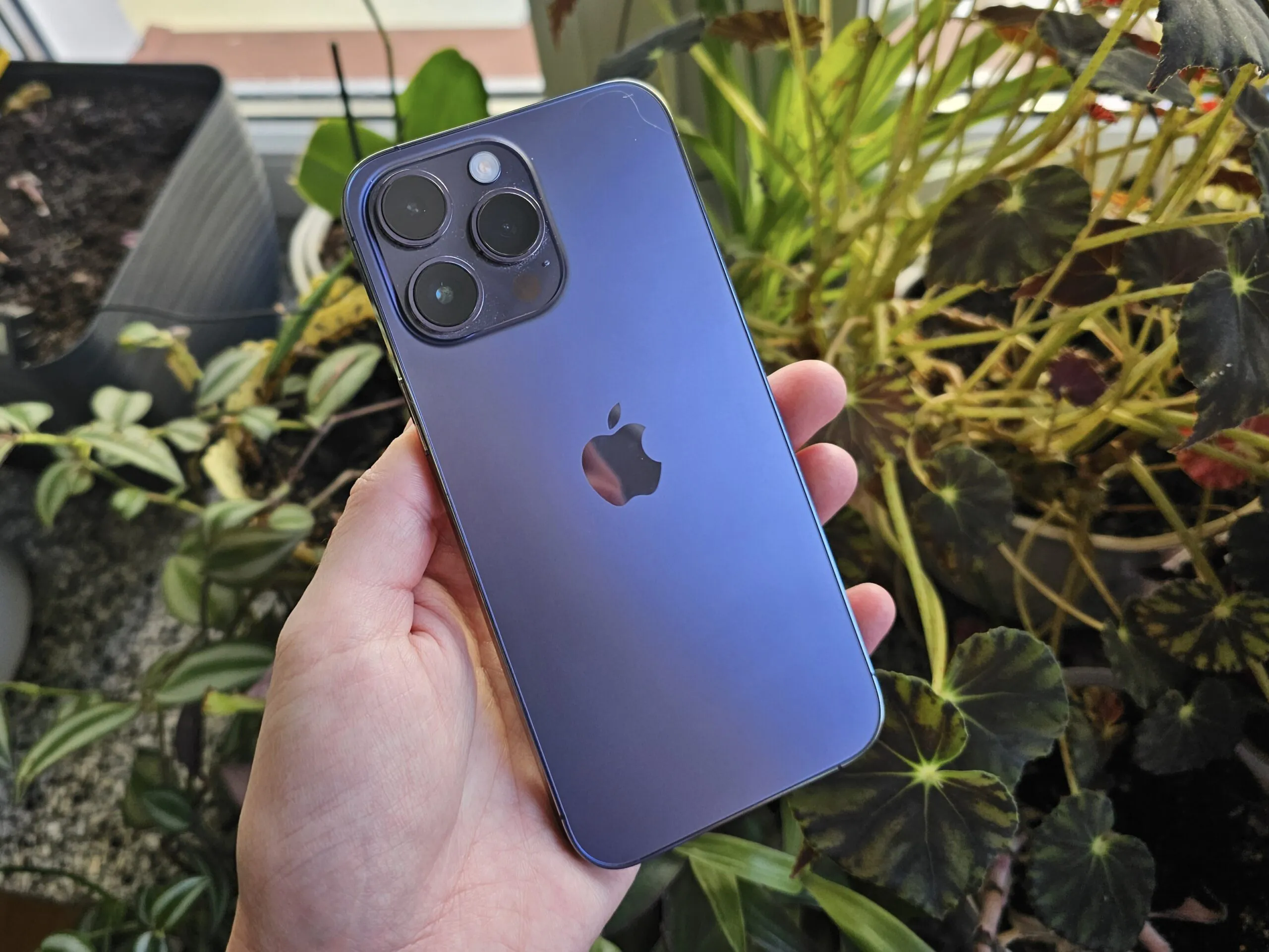
All in all, the iPhone 14 Pro Max is a successful flagship… for fans of Apple technology. It’s beautiful, made of premium materials, with perfect build quality, a great screen, great cameras, super speed, long battery life… But since I regularly test various new products in the line of duty, I can’t say that this is the perfect device. For Apple users, yes, it is the most advanced. But otherwise… The same Galaxy S23 Ultra (my review) has better cameras, and the rest is no worse.
Or take a brand new Huawei P60 Pro. Yes, Google hasn’t been there for a long time and won’t be, but everything can be solved. And cameras are a real delight, especially TV cameras, and the iPhone has room to move. Although, of course, it can be said that for a typical point-and-shoot user, the minor differences between the cameras of different flagships are not so important and the iPhone will be more than enough. But I’m one of those “point and shoot” people, and the new focal length of the iPhone 14 Pro annoys me terribly, it’s inconvenient to shoot something up close.
I don’t think the design of the iPhone 14 Pro Max is successful, even if it is a kind of classic. The device is too big, heavy and clumsy – in the Android world, there are competitors with the same or larger screen diagonal, but at the same time more streamlined and compact. As for the software, it has many advantages, but there are also annoying disadvantages, and some things are definitely better implemented in Android. But, of course, I’m talking about Android on the example of advanced models with a similarly high cost, there is no point in comparing iPhones with mid-range and budget models.
That seems to be all. If anyone has any questions, additions or objections, please feel free to comment! And thank you for your attention!
Read also:
- Huawei P60 Pro review: The world’s best mobile camera again?
- Samsung Galaxy S23 Ultra smartphone review: An unprecedented flagship


