© ROOT-NATION.com - Use of content is permitted with a backlink.
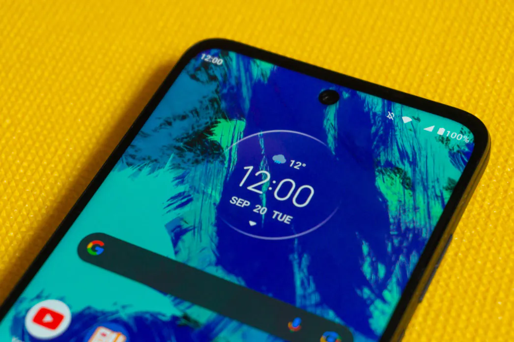
In mid-summer of this year, a new budget smartphone from Motorola, the Moto G32, was introduced. It is the direct successor of the Motorola Moto G31, which in turn was released at the very end of last year. In this review, we will get acquainted in detail with an inexpensive model, find out the strengths and weaknesses of the device, and also how the G32 differs from its predecessor.
What’s in the box
The Motorola Moto G32 we tested wasn’t a commercial model and didn’t have all the trinkets you usually get, but we do know that along with the smartphone the user receives a 33 W power adapter, a USB Type-A/Type-C cable, a transparent silicone protective case, a SIM eject tool and some papers.
Design, materials, build quality
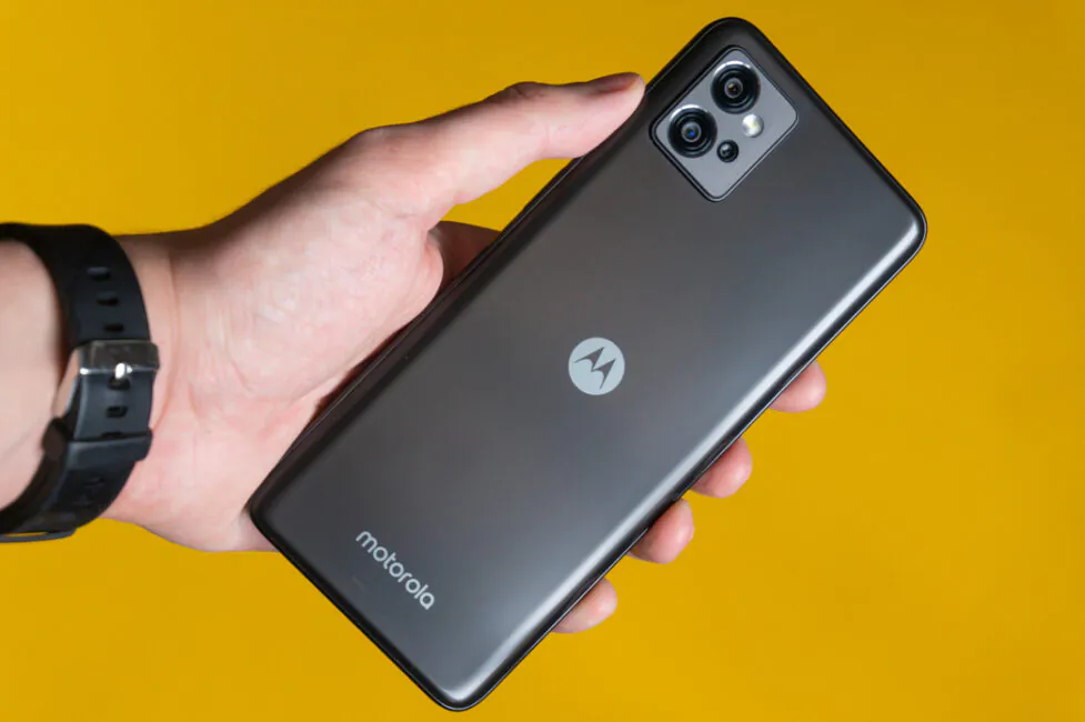
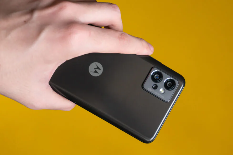
Compared to its predecessor, the design has changed quite a lot and the smartphone looks, shall we say, more presentable, classy, and more expensive in general. Let’s leave the question of the practicality of the new design open for now, but at least I personally like the visual performance of the Motorola Moto G32 much more than the Moto G31. On the other hand, some design features intersect in one way or another with countless other devices, and someone may well think differently.
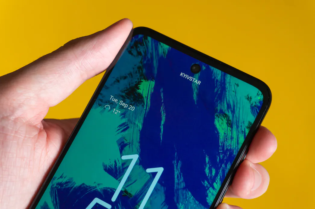
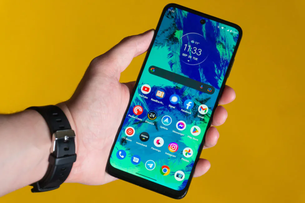
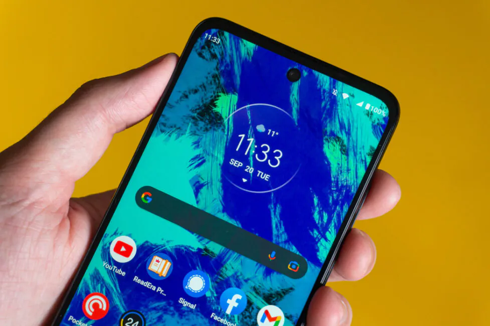
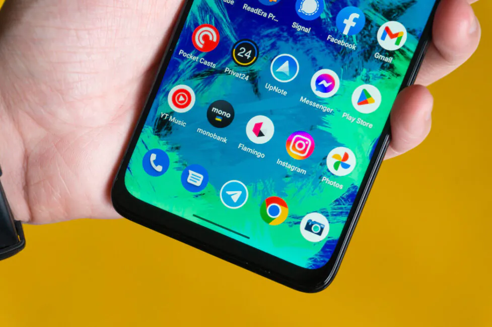
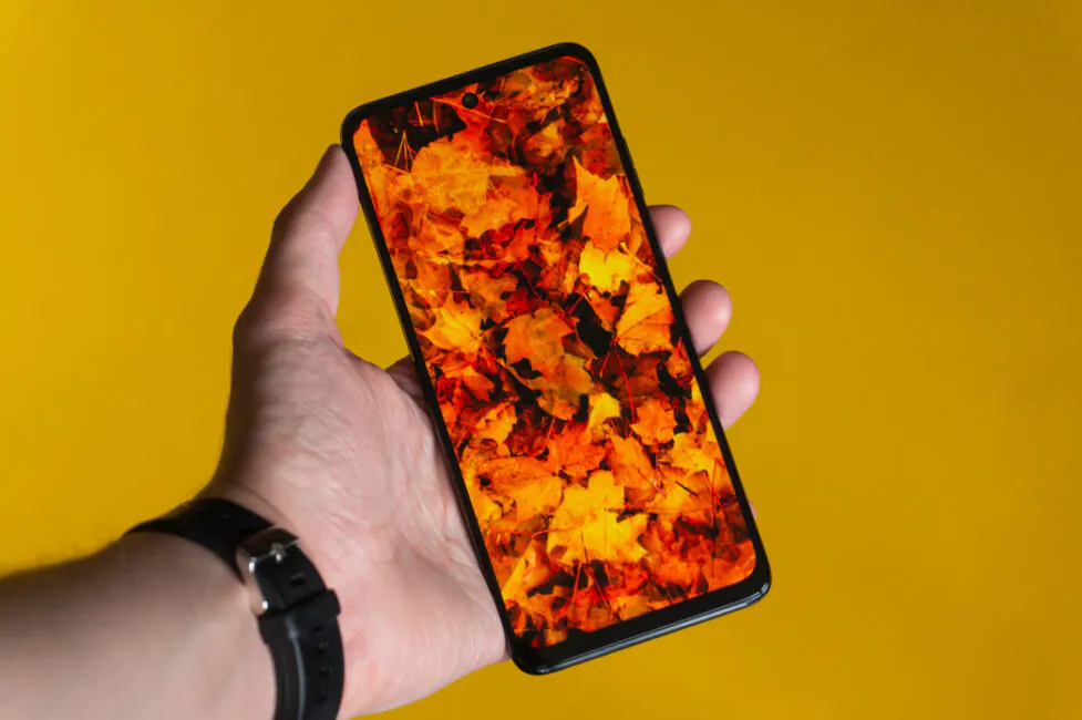
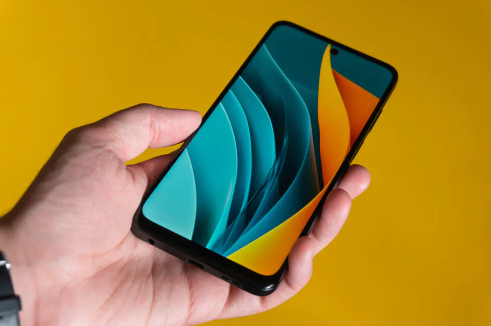
From the front, the smartphone does not stand out much, again, however, there are also pleasant changes. So, the bezel at the bottom is now less wide, and the peephole of the front camera embedded in the screen has lost its silver edging and is thus less striking. But in a global sense, there are no unique features here. The bezels, as usual, are of different widths and the margins above and below are thicker than the side ones. And no matter how thin the indentation at the bottom gets, it still remains relatively massive overall. But the smartphone is inexpensive, so it can definitely be forgiven.
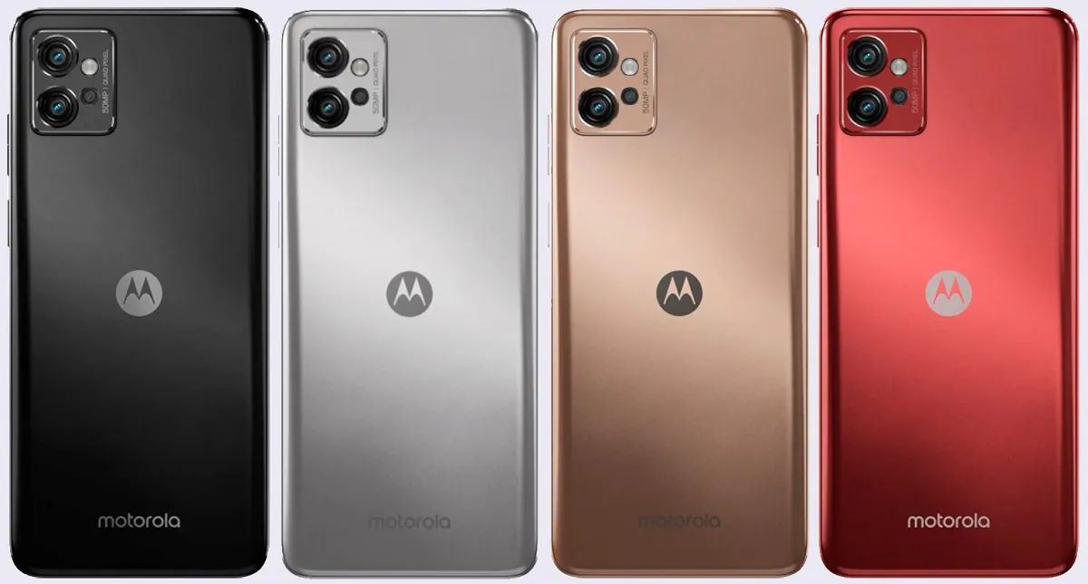
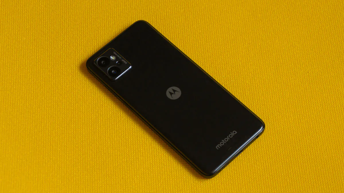
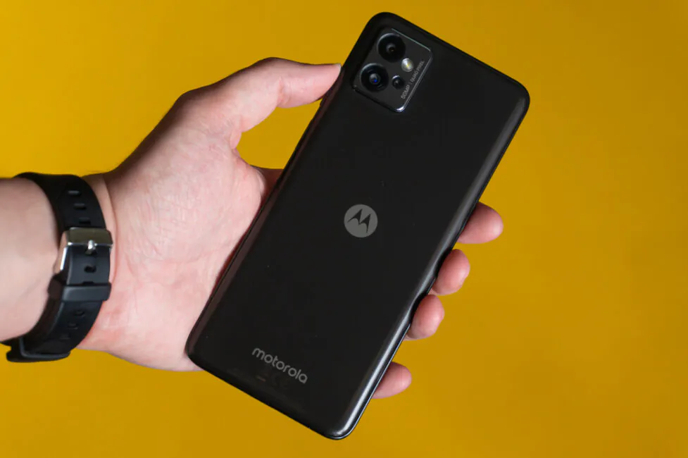
The back side of the Moto G32 is interesting primarily for its finish. Instead of being embossed with many small “grooves”, the panel is now completely smooth. Not matte, not glossy, but smooth and without any texture. Feels like glass laptop touchpads, perhaps. But the panel itself is completely plastic, as is the frame around the perimeter of the case.
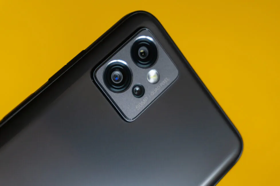
The camera block has also changed and repeats the strict shape of the device body. It is a small two-level rectangle with rounded corners. The lower wide base is made of plastic and painted black, while the upper level is painted gray and is metallic, with a mirrored bevel around the perimeter and around the camera eyes. Each module is slightly recessed and in additional edging, which is best seen around a pair of large sensors. The block itself does not protrude very much above the surface of the back, but on a flat surface the smartphone still sways.
In total, the Moto G32 comes in four colors: Mineral Grey, Satin Silver, Rose Gold, and Satin Maroon. The back of the smartphone and the frame around the perimeter are painted in the main color, but in front, all three options look the same. Plus, none of the colors stand out in any special way. But keep in mind: the darker the color, the more prints, stains and other traces of use are visible on it.
Ergonomics
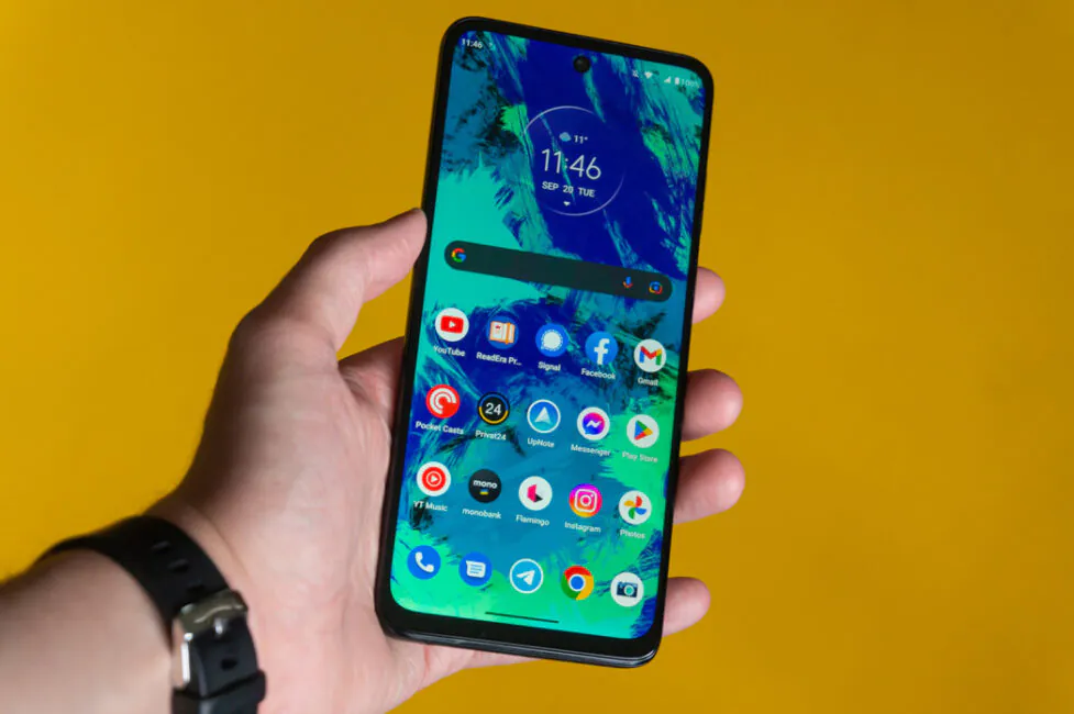
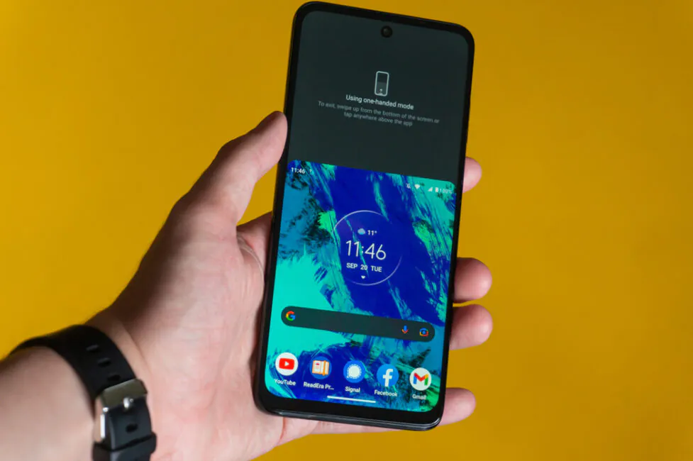
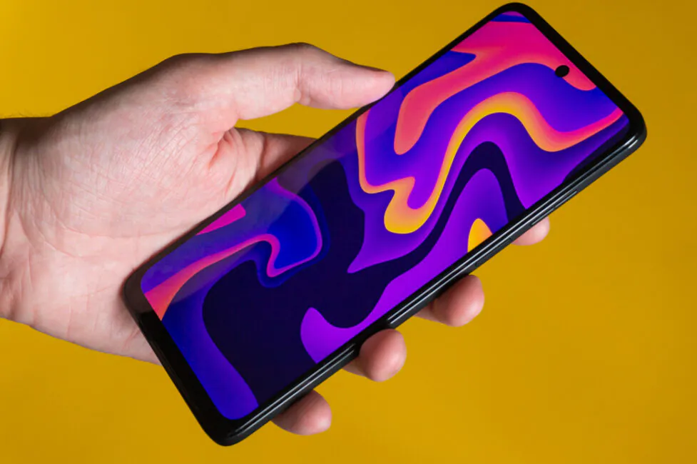
The Motorola Moto G32 has quite ordinary body dimensions, as for a modern 6.5-inch smartphone. The body dimensions are 161.8 × 73.8 × 8.5 mm, and the weight is 184 g. It is not very easy to use it with one hand, because such dimensions do not allow you to comfortably reach the top of the screen. You have to either change the grip or use your second hand or turn on the one-handed control mode. The latter is activated by a simple swipe down from the bottom of the screen with gesture navigation and the entire user interface is shifted to the middle of the display.
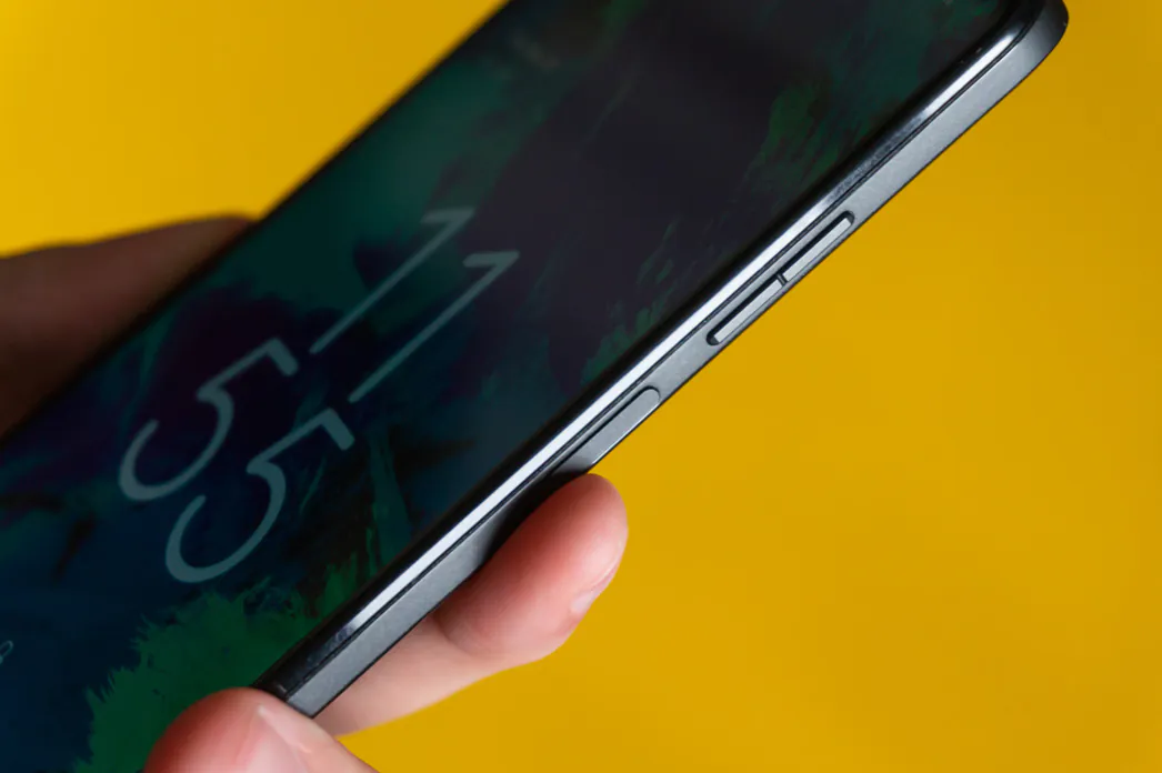
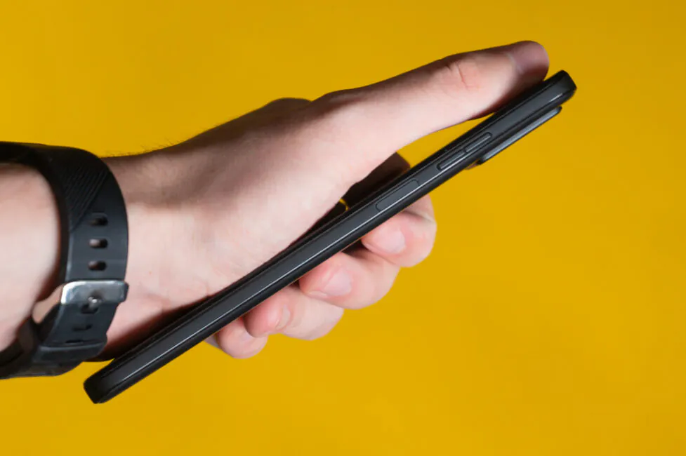
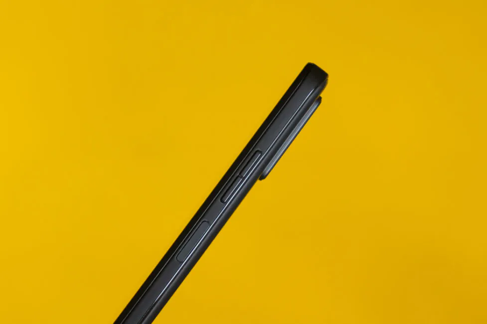
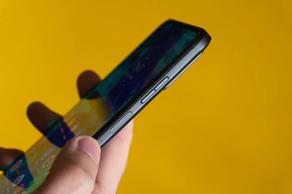
The location of the physical power and volume keys is a little high. That is, you can reach them with an outstretched finger, but if they were a little lower, at least half a centimeter, it would be more comfortable. At the same time, the smartphone feels completely normal in the hand, thanks to the smooth beveled edges of the back and flat ends that you can grab onto. Overall, in terms of ergonomics, the Moto G32 does not stand out in any way. Not worse, but not better than other smartphones with a similar diagonal.
Display
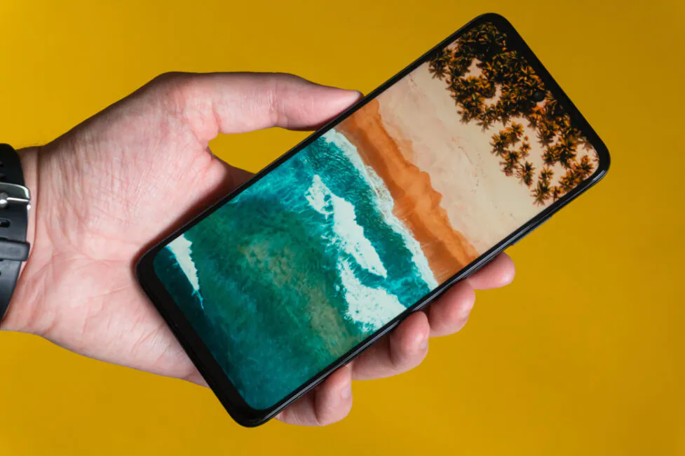
The 6.5″ display of the Moto G32 utilizes IPS LCD technology with a resolution of Full HD+ (2400×1080 pixels), an aspect ratio of 20:9, a pixel density of 405 ppi, and, most importantly, a refresh rate of 90 Hz. That is, compared with its predecessor, the screen has changed. So, instead of an OLED panel with a classic frequency, the new product again uses an IPS matrix with an increased refresh rate. Why again? Because the Motorola Moto G30 had a 90 Hz IPS display, though of a lower resolution.
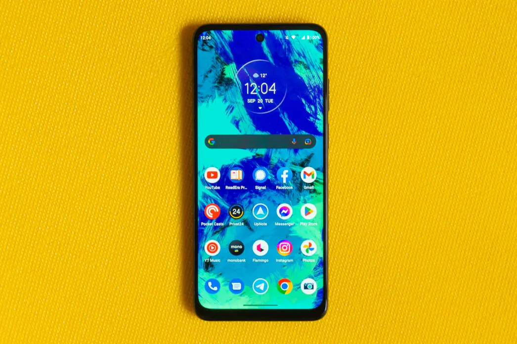 You can treat this decision in different ways. On the one hand, we have lost the deep blacks, high contrast, and brightness that high-quality OLED displays are famous for. On the other hand, they received a high and eye-pleasing refresh rate.
However, Motorola smartphones have high-quality IPS screens with excellent factory calibration, and the Moto G32 display is no exception. The picture relative to IPS is bright and contrasting, with pleasant moderately saturated colors and wide viewing angles.
Performance
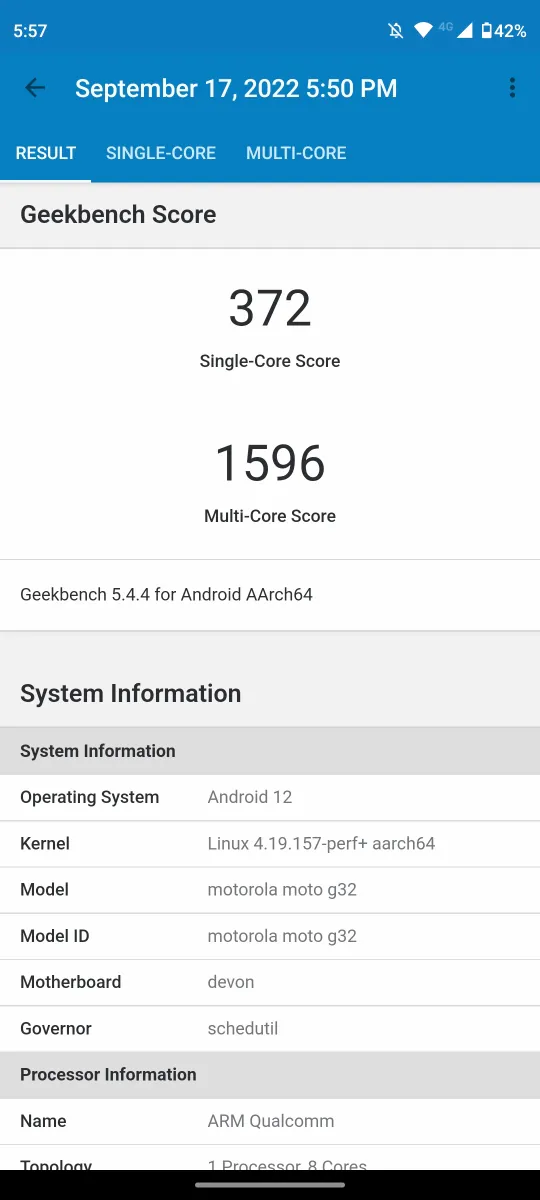
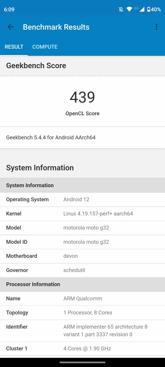
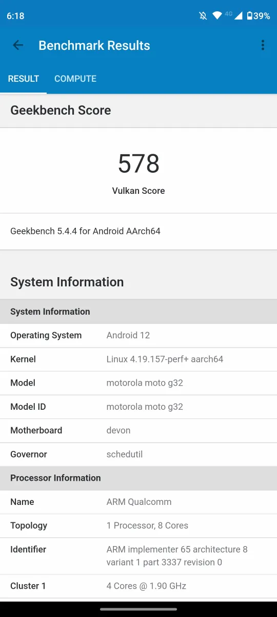
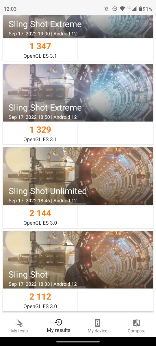
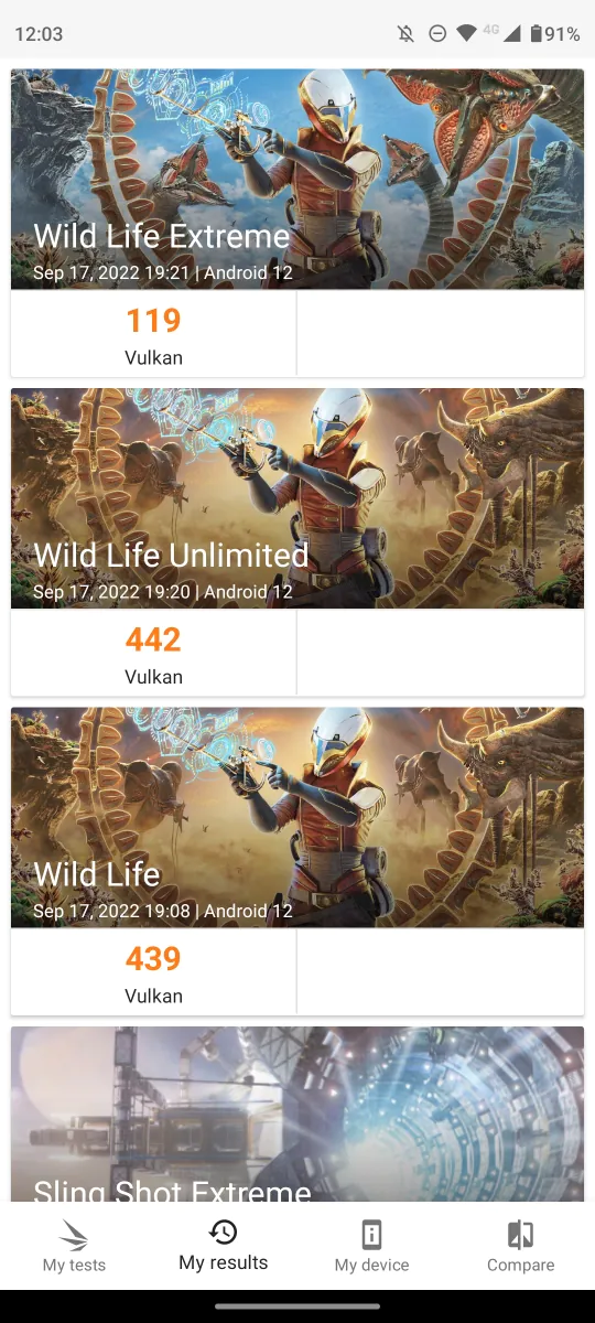
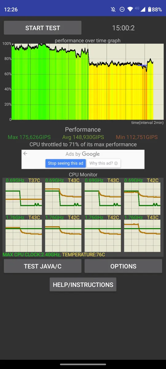
Inside the mid-range Moto G32 is the Qualcomm Snapdragon 680 4G. This chipset was introduced last fall and has 8 cores, which are divided into two clusters: 4 Kryo 265 Gold cores operate with a maximum clock speed of up to 2.4 GHz, and 4 Kryo 265 Silver cores with a maximum clock frequency up to 1.9 GHz. The graphics are relatively unpretentious, previously used in other mid-range Qualcomm processors. Processing speed even being tested to seamlessly show high-graphic games and live dealer casino games that require seamless connection and perfect resolution. In performance tests, the results are also not very high, which was expected.
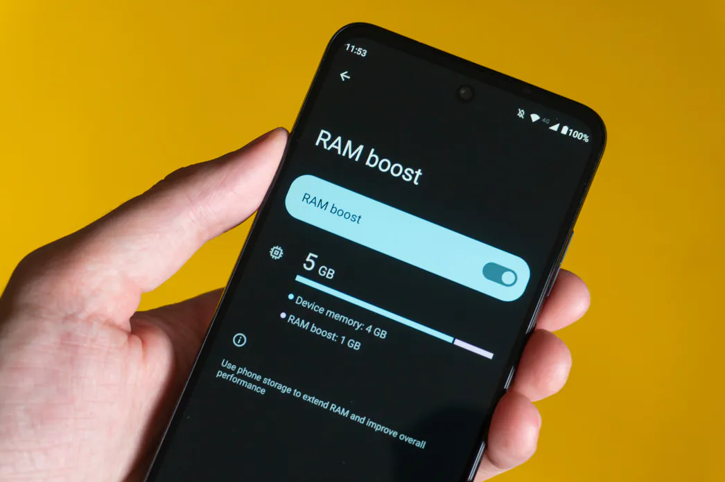
In the settings, you can expand the RAM. But if usually in different smartphones the amount of virtual RAM varies between 1-3 GB for 64 GB drives and 3-5 GB for 128 GB, here even for the second option only 1 GB.
Storage-wise, there are two versions: 64 and 128 GB, UFS 2.1 type. Availability similarly depends on the market, but there can be three different modifications of the Moto G32: 4/64, 4/128, and 6/128 GB. Our sample has a 128 GB drive, of which 110.11 GB is available to the user. At the same time, storage can be easily expanded with a microSD card up to 1 TB.
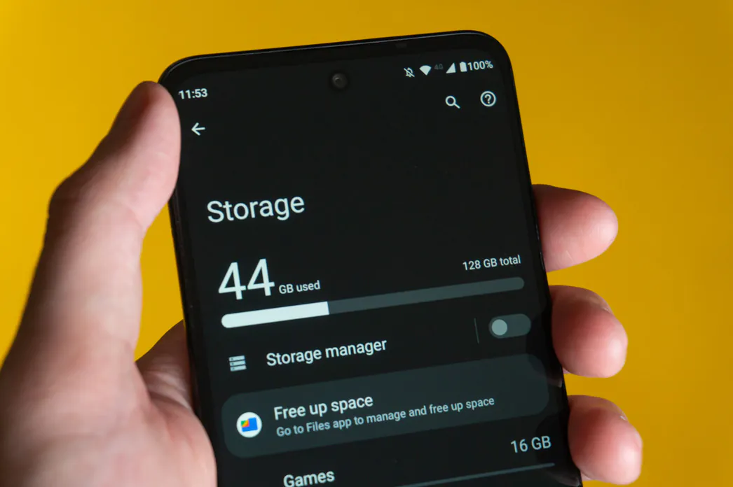
The Moto G32 is fast: the interface is smooth, and applications open quickly and do not freeze. All system animations are also smooth, with the exception of moments when app updates from the Play Store are downloading and installing in the background. In other words, I don’t have much to say about the Moto G32 in terms of responsiveness and speed. Absolutely adequate behavior in the system and most applications, as for a mid-range smartphone.
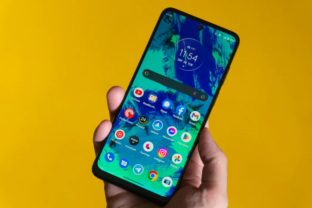
In games, it shows average results. Often, you will have to choose low or medium graphics settings in order to get a comfortable FPS value. Casual games run fine.
Read also:
- Moto 360 3rd gen smartwatch review: long term experience and positioning
- Motorola Moto Edge 30 Pro review: is it really a flagship?
Cameras
There are three modules in the main camera unit of the Moto G32: wide-angle, ultra-wide-angle, and macro. The usual for a modern inexpensive smartphone. In addition, judging by the characteristics of these cameras, they do not differ at all from the cameras of the Moto G31.
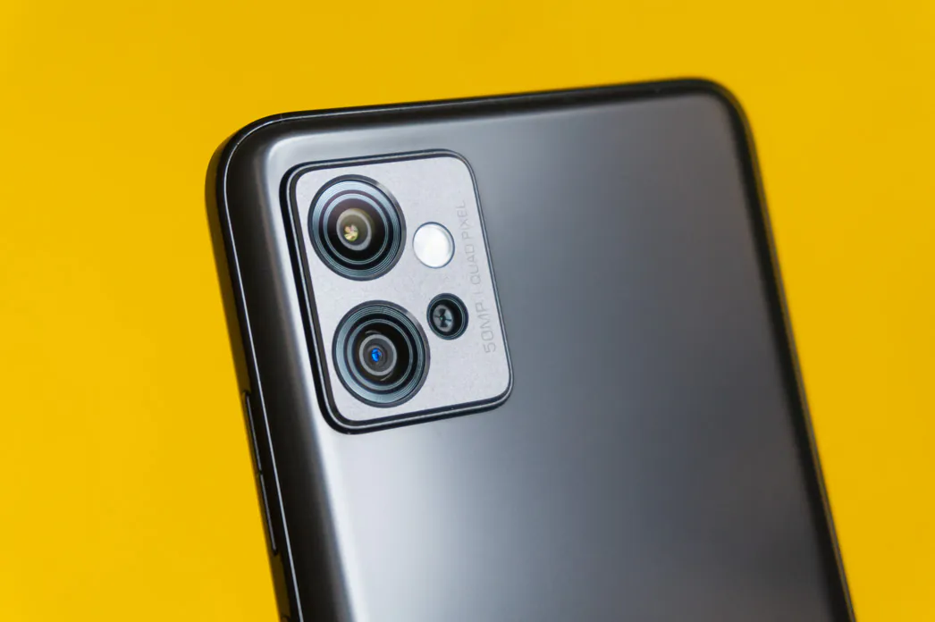 The main module of the Moto G32 makes decent photos, for a smartphone of this level. However, as soon as the lighting worsens, the overall quality of the photo decreases as well. Noises appear, sharpness drops, and further down the list. Shooting in the evening is problematic because the dark areas of the photo contain very little information and even automatic HDR has little to no effect on the situation. Night mode is there and it can brighten up the shot, but you should not expect more. In short, a typical budget smartphone camera, which should suit an undemanding user.
The ultra-wide-angle module does its job and captures a lot of things (118°), but the quality of the photos is predictably worse. It does not have a wide dynamic range. It’s best to use it in excellent lighting because in other conditions the pictures appear bleak. In some situations, it will definitely be useful, but you are unlikely to want to use it too often.
Don’t expect anything from the macro module. Low resolution, faded unnatural colors, fixed focus – that is all you get. Even in perfect lighting, the results are very, very weak, not to mention in other situations. This module has nothing special to offer in the case of the Moto G32, which can be said about the macro of any other budget smartphone.
The maximum resolution when shooting video on wide-angle and ultra-wide-angle cameras is 1080P at 30 FPS. In the settings, you can turn on electronic stabilization and it is used for both modules, although by and large it is not needed for an ultra-wide angle. However, with stabilization turned on, the image is cropped quite strongly and the viewing angle narrows noticeably. Stabilization efficiency is… average, small twitches are still noticeable in places. And so video shooting is clearly not the strongest side of the Motorola Moto G32: the colors are not saturated, the detail is poor even in good lighting. Moreover, this applies both to video on the main module and on the ultra-wide-angle one.
Unlocking
The fingerprint scanner is built into the power button and is located on the right side of the device. What is especially nice, the button itself looks just like a large standard power button. The fingerprint scanner itself is disguised as a button and disguised quite well.
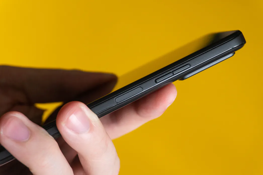
There are no issues with the operation of the fingerprint scanner: it works quickly and accurately.
Face unlock is also there, which is predictable. In my experience, this method is slower than a regular fingerprint scanner, even in ideal lighting conditions. In complete darkness, it will not work under any circumstances.
Battery life
The built-in battery capacity of the Motorola Moto G32 is 5000 mAh, the usual. Together with energy-efficient hardware, the Moto G32 demonstrates a very decent level of battery life, even with a rather big display with a refresh rate of 90 Hz. Active users of this smartphone can count on a full working day from morning to night.
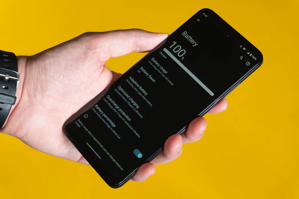
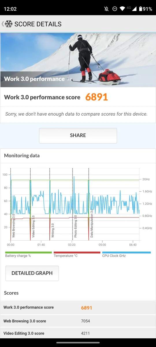
In mixed mode of use with automatic refresh rate, the smartphone lasted me an average of 30 total hours of work with 9-10 hours of active screen, which is a really good result. The Qualcomm Snapdragon 680 4G chipset once again demonstrates great energy efficiency here. In the PCMark Work 3.0 test with the maximum display brightness and forced 90 Hz, the Moto G32 lasted 9 hours 36 minutes – an excellent result.
The smartphone supports 30W TurboPower 30 wired fast charging with the bundled 33W power adapter.
Software
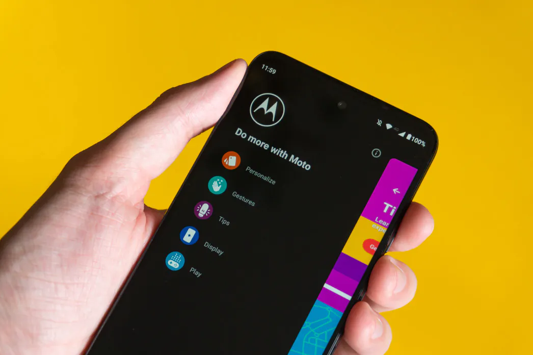
The software component of the Moto G32 is represented by the Android 12 OS in a “pure” form, that is, close to the Android on Pixel smartphones, complemented by various Moto additions. Most of them are concentrated in Moto Features, but in one form or another come across in other nooks and crannies of the system. On the one hand, there are few improvements from Motorola, but the usual functionality of a smartphone can be expanded thanks to them.
Read also:
Verdict
The Motorola Moto G32 has quite a few strengths and not too many weaknesses for a smartphone of this price. It has a modern design, a great IPS display with a refresh rate of 90 Hz, and it is fast and offers decent amounts of memory. Also, nice battery life, fast 30W charging, and excellent stereo sound for the class. True, it struggles with heavy games and the cameras are not particularly impressive, but otherwise, it is a nice inexpensive smartphone that definitely deserves your attention.

Read also: Motorola Edge 30 Review: Balance At Maximum








Good job!
Good Explanation