© ROOT-NATION.com - Use of content is permitted with a backlink.
“Nothing isn’t better or worse than anything. Nothing is just nothing.”
Arya Stark
A girl is No One and she reviews Nothing… Nothing Phone (1). But seriously, calling a smartphone Nothing Phone (1) is a bold move. The brand “without a brand” is a different kind of kitsch! Here we have a crazy original design, a powerful heart, and various exciting features. Also, this smartphone is developed by a UK-based company, which is very unusual for the smartphone market. Frankly, I can’t wait but move on to a detailed review, so let’s get to know Nothing Phone (1) better!
Nothing Phone (1) Specs & Pricing
- Screen: 6.55″, OLED, 1080×2400, 20:9 aspect ratio, 120 Hz refresh rate, HDR10+, Corning Gorilla Glass 5 (front and back);
- SoC: Qualcomm Snapdragon 778G+ 5G (6nm), 8 cores (1×2.5 GHz Cortex-A78 & 3×2.4 GHz Cortex-A78 & 4×1.8 GHz Cortex-A55);
- GPU: Adreno 642L
- Memory: 8/12 GB RAM, 128/256 GB ROM (UFS 3.1)
- Battery: 5000 mAh, 120W Quick Charging
- Rear camera: Wide: 50 Mp, f/1.9, 24 mm, 1/1.56″, 1.0µm, PDAF, OIS; Ultra wide: 50 Mp, f/2.2, 114˚, 1/2.76″, 0.64µm, PDAF.
- Front camera: 16 Mp, f/2.5, (wide), 1/3.1″, 1.0µm
- Connectivity: LTE, 5G (n1/3/5/7/8/20/28/38/40/41/66/77/78), NFC, Wi-Fi 6 (802.11 a/b/g/n/ac/ax), Bluetooth 5.3, GPS (A-GPS), GLONASS, BDS, GALILEO, QZSS, NavIC
- OS: Android 12
- Dimensions and weight: 159.2×75.8×8.3 mm, 193 g
- Price: about $670
What’s in the Box
In the Nothing Phone (1) box, in addition to the phone, you will find a USB-C cable and a quick start guide. Well, what else did you expect? Nothing comes with nothing.
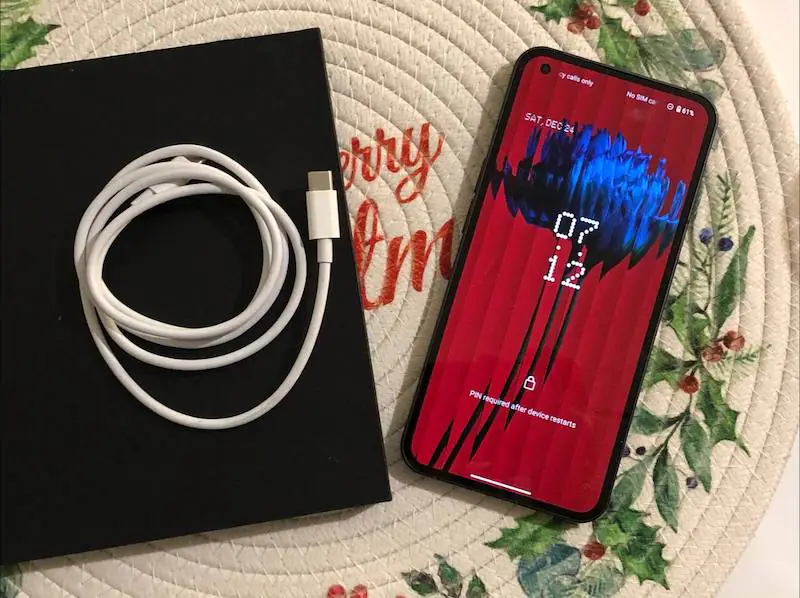
Although the smartphone is positioned as a top-notch model for geeks. And it costs accordingly $670 is “nothing” for fans of various exclusives and original tech.
Nothing Phone (1) Design
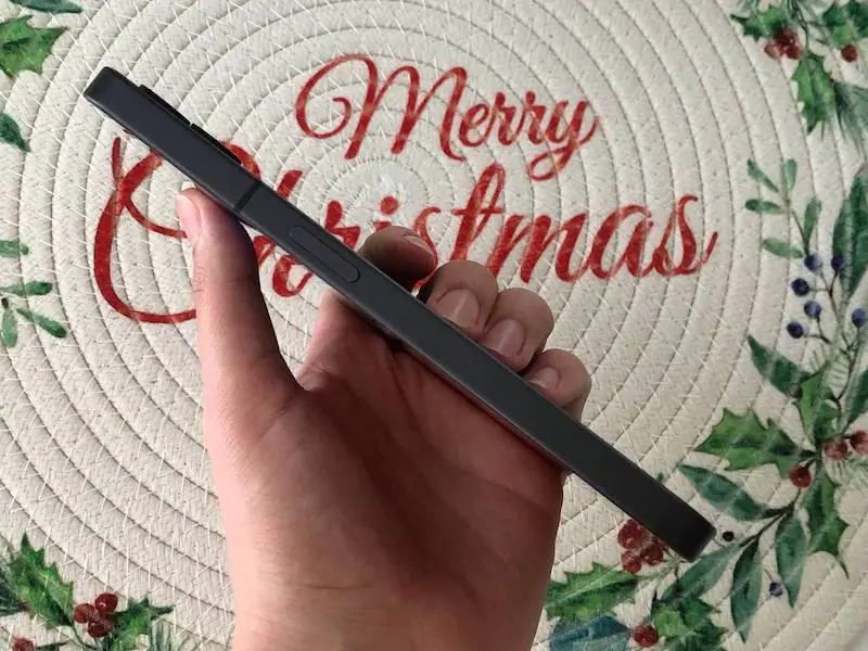
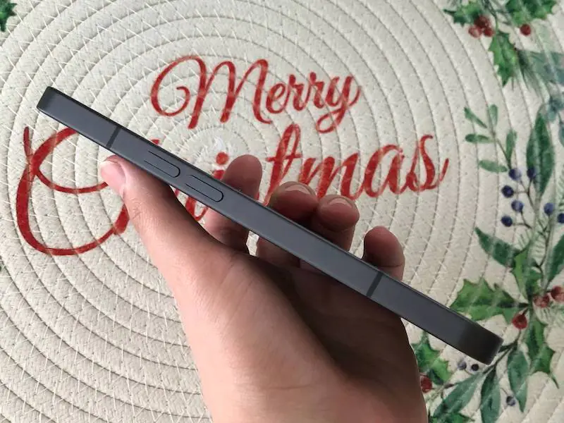
The phone’s appearance with an aluminum frame, clear edges, and smooth corners for some reason immediately reminded me of Apple’s best models of yesteryear – the iPhone 5s and others. Only here, of course, everything meets modern requirements – the smartphone has a large display and sports a battery of a significant capacity, as well as powerful hardware.
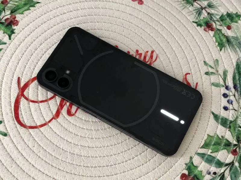
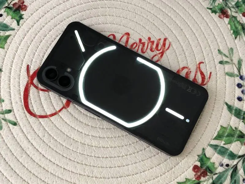
The back of the phone is what makes the Nothing Phone (1) so special. It is transparent and has several lighting zones under it – Nothing named this system with incomprehensible word Glyph. It is not a “design over function” type of gimmick – but we will talk about this in more detail in the Software section of this review. For now, just know that the backlight is here and it looks bombastic.
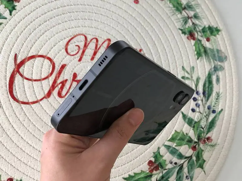
Also on the back, we see two camera lenses that protrude a little above the body and a flash that is placed under the glass of the back surface.
The front and back panels of the smartphone are protected with Gorilla Glass 5, plus the frame around the edges of the case is made of metal, so you can easily carry the gadget with you anywhere and noprotectsntegrity. By the way, the phone also provides protection against dust and moisture, altho IP53, not the maximum possible. However, it is clearly better than nothing.
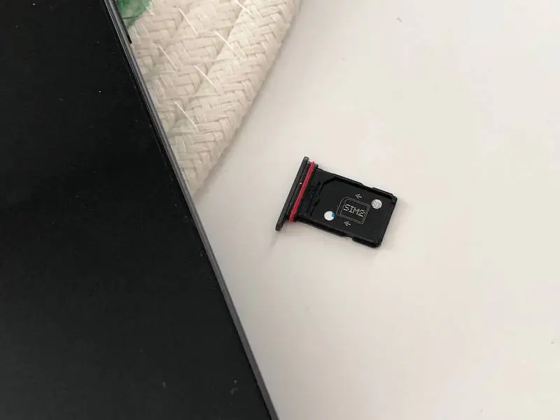
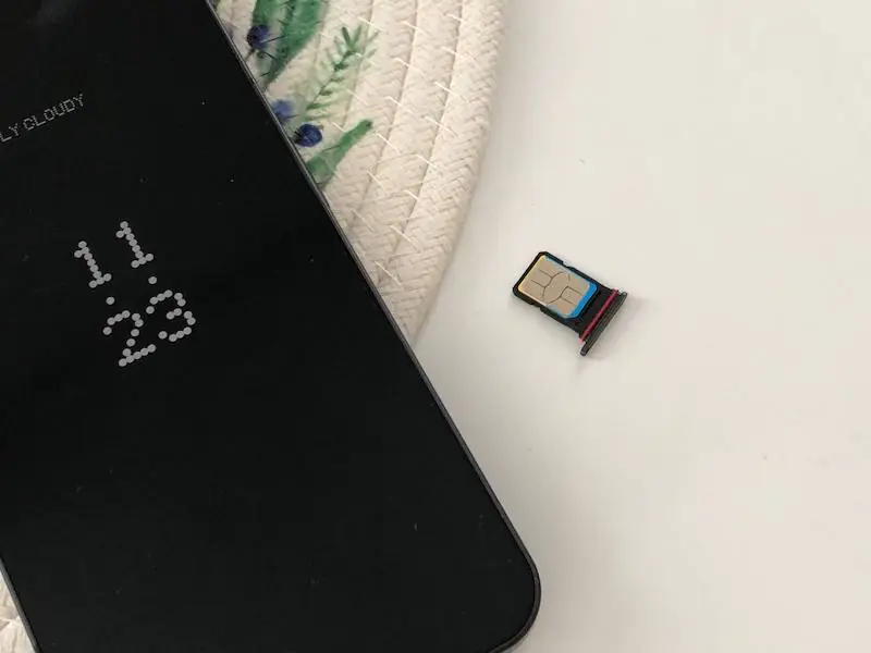
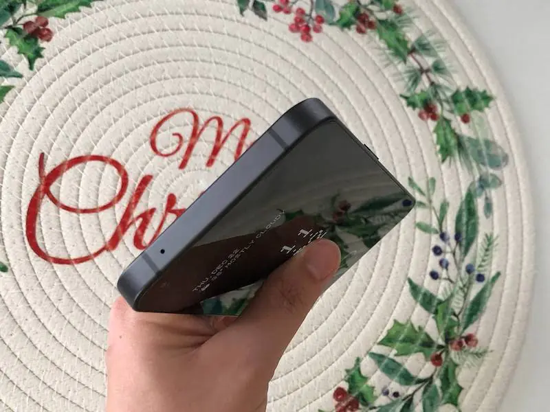
The bottom edge has a slot for SIM cards, a microphone, a USB Type-C slot, and a speaker. To create stereo sound the phone uses the earpiece as a second speaker. The upper edge is occupied solely by the microphone.
The volume control button is placed almost in the middle of the left edge, and the power button is symmetrically placed on the right. I must say that despite the large dimensions of the smartphone, thanks to the competent placement of the buttons, even with my small palm, the controls were exactly where they should be.
The only question I had about the smartphone’s ergonomics is its weight. It really feels like a “brick”. A huge one, I must admit. At the same time, the battery here is just 4500 mAh – not the largest of all that I have encountered recently. Therefore, why the smartphone turned out to be so heavy is a mystery to me. In general, this heaviness, on the one hand, creates the impression of a reliable status device, but on the other hand, it affects comfort during long-term use. So, if you have rather small hands – look for something thinner, lighter, and more compact.
As in many modern flagship phones, the fingerprint scanner in the Nothing Phone (1) is mounted directly under the screen. Such a solution allows for an all-screen front panel design while retaining fingerprint authentication for those who prefer this method. Although, of course, another popular option of face-unlocking was also added here.
I liked that the “eye” of the Nothing Phone (1) front camera is not only small and inconspicuous but also moved to the upper left corner. Thus, it becomes completely invisible and leaves the screen almost completely at your disposal. The display, as I mentioned before, is also covered with Gorilla Glass 5, which protects against small scratches and unwanted fingerprints.
Recommended reading: Motorola Edge 30 Ultra Review: Can Moto Make Flagships?
Nothing Phone (1) Display
It’s hard to say that the display of Nothing Phone (1) is unique or somehow incredible. “Modern” and “efficient” are the best terms to describe it. It is large and clear enough, responsive enough, and harmoniously balanced in terms of specs to be easy on hardware. But let’s take a closer look at the display’s specs.
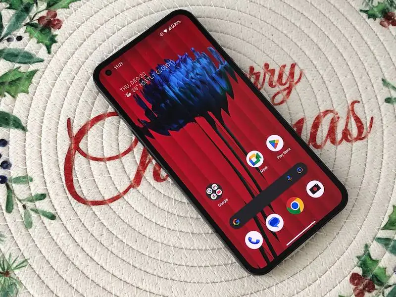
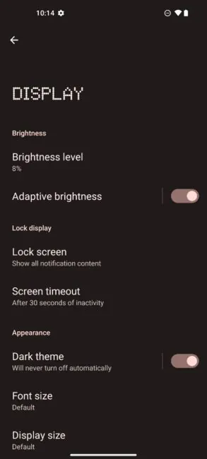
With a diagonal of 6.55 inches, you get a very clear picture thanks to the resolution of 1080×2400 pixels. The display is very bright – the standard brightness here is 500 nits, and the peak can reach 1200 nits. Even on a sunny day outside, the picture remains pleasant enough, and the text is readable.
By the way, in use, I noticed that the lower limit of brightness, which is usually paid less attention to, is extremely low here, so if you like to read in bed and do not want to disturb your partner or child with bright light – you will like it. The screen of Nothing Phone (1) also supports HDR10+, which means that the picture will delight you with its contrast and color depth.
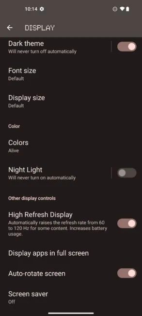
The refresh rate here is 120 Hz, so both the UI and the gaming experience with this smartphone will be of high quality.
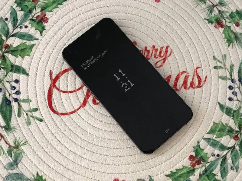
The familiar Always On Display feature (displaying the clock, date, and messages when the screen is off) is also here, although it is not that obvious. It was hidden in the settings of the lock screen in the inconspicuous switch “Show information on the locked screen”. In my opinion, this is a very cool feature that is worth paying attention to, so I recommend that you turn it on right away – it will save your smartphone’s charge and help you avoid activating your phone and sticking to the screen too often.
Hardware & Performance
As I have already noted, the smartphone manufacturers followed the path of reasonable compromises, so they did not chase after a top-of-the-line chip. Yes, it gives more power, but it is worse in terms of energy efficiency, heating, and the final price of the product. Therefore, Nothing stuck with almost the flagship Qualcomm Snapdragon 778G+ 5G SoC.
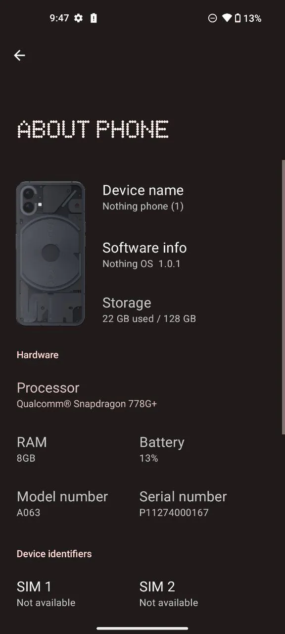
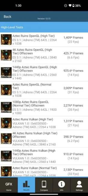
Built on a 6nm process, it has 8 cores, 1 most powerful Kryo 670 Prime core with up to a 2.5 GHz clock speed, 3 powerful Kryo 670 Gold cores with up to a 2.4 GHz clock speed, 4 energy-efficient Kryo 670 Silver cores with up to a 1.8 GHz clock speed. The Adreno 642L graphics adapter is well suited for obtainithe results of the synthetic benchmarks mobile games.
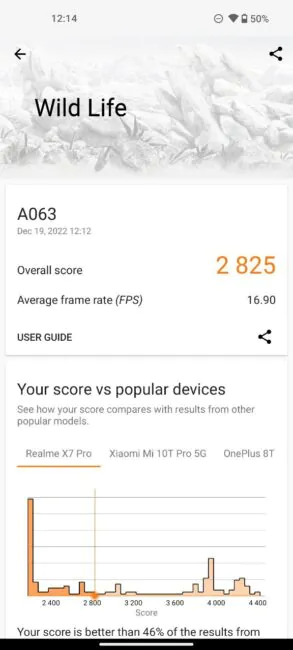
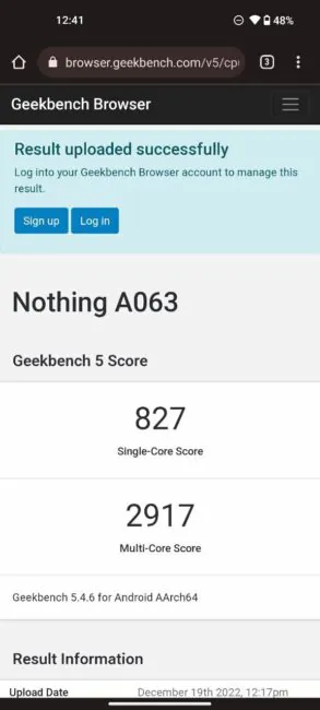
Here are the synthetic benchmarks results:
- GeekBench 5 (multi-core) – 2917, GeekBench 5 (single-core) – 827
- 3D Mark – 2825
When buying, you can choose either a bse model with 128 GB of built-in memory and 8 GB of RAM, or a higher-capacity model with 256 GB of memory, accompanied by 8 or 12 GB of RAM.
Recommended reading: Choosing a Foldable Smartphone: Samsung Galaxy Fold vs. Flip – Which Type Is Better?
Nothing Phone (1) Cameras
I was pleased that Nothing Phone (1) has neither too many nor too few cameras – and functionally they cover all the needs of users:
- wide: 50 MP, f/1.9, 24 mm, 1/1.56″, 1.0 µm, PDAF, OIS;
- ultra-wide: 50 MP, f/2.2, 114˚, 1/2.76″, 0.64µm, PDAF.
- front 20 MP, f/2.45, 1/2.8″, AF.
Photos from the Nothing Phone (1) rear camera look good both during the day and at night. Color rendering is correct and as close as possible to reality, without oversharpening and redundant software “improvements”. You can see the originals of all pictures here.
Nothing decided to go without extra cameras, so finally there’s no separate macro lens, as well as a telephoto lens, just 2x digital zoom. And it copes with its functions perfectly – zooming in or cropping the frame to the desired result without leaving the place comes out almost without loss in quality. For example, the photo on the left was taken without zooming in on the main camera, and on the right – with 2x zoom:
But it’s impossible to perform such a trick on ultra-wide shots. So a separate wide-angle lens was added, especially for spectacular panoramas and landscapes. Photos from the wide-angle camera are also of good quality, compared to the main camera, the difference can be noticed only by carefully looking at the close-up images.
The camera interface is quite ascetic – there is a photo, portrait, video, slow-motion, timelapse, panorama, macro, and “expert” (aka pro-mode) tabs. In the settings of the latter, all important shooting parameters are available – shutter speed, ISO, white balance, exposure, and focus. In general, for most tasks, such modes are enough, but for some miracle shooting such as the trajectory of lights at night, the capabilities of the camera will most likely not be enough. Therefore, I consider such restraint quite appropriate.
The portrait mode deserves a special mention – the shots taken with it can be further processed after shooting by adjusting the depth of field and the degree of blurring of the background. If you learn to manage it a little, you can significantly improve the quality of your feed on Instagram.

The Nothing Phone (1) can shoot video at a maximum resolution of 4K at 30fps, as well as 1080p at 30 and 60fps. These parameters apply equally to both the main and ultra-wide-angle modules.

The front camera also performs good. The pictures turned out to be clear and bright, in portrait mode the face is well separated from the software-blurred background.
Nothing Phone (1) Software
The Nothing Phone (1) operating system is Android 12 with the Nothing UI skin. Personally, I’m a fan of the pure Android experience, similar to Motorola phones. However, in this case, despite significant differences from the basic Android, I got a lot of pleasure from using the smartphone.
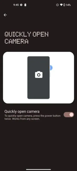
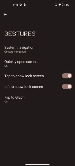
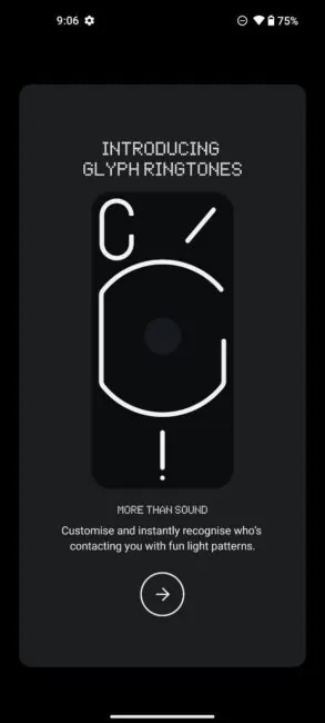
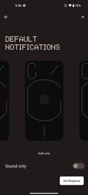
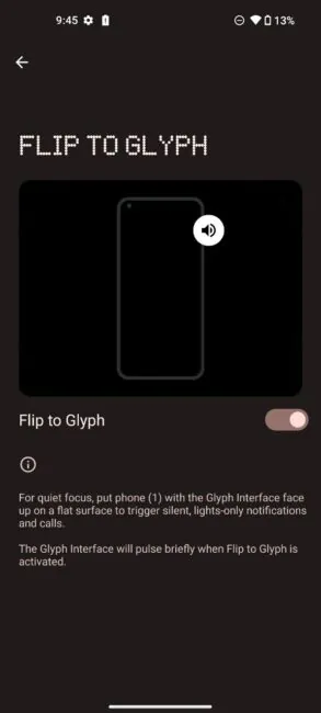
Of course, the first setting I jumped into when I picked up this smartphone was the Glyph – the lighting on the back panel. There are several different schemes for how the LEDs can flash for a certain notification. From a simple blinking dot to a complex pattern involving all the elements on the back panel. In addition, different schemes can be used for calls and messages from different contacts.
At first, this Glyph seems like a very cool feature – you can immediately see who is calling or texting you, without even picking up the phone. But after using my smartphone a little, I changed my mind.
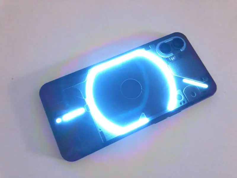
First, on the second day you forget which pattern you assigned to which subscriber. Well, to be honest, we keep a crazy amount of information in our memory in order to remember that little morse-code. Secondly, the warning about epilepsy is legit. Even if you reduce the brightness of the effects, the constant flickering can be annoying, especially in the evening. And thirdly, finding out who is calling you without picking up a smartphone is now easier than ever if you have a smart watch or even the simplest smart band. Or you can use the Always on display feature and still see important messages without having to unlock your smartphone. And at the end, this unique wow-factor turned out to be completely unattractive in practice.
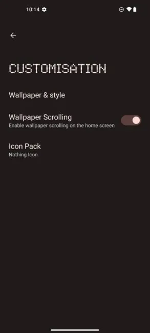
I loved the geek chic of the dot design (some call it dot matrix, it reminded me of the old digital clock we had at home when I was a kid). This font is present here in clock widgets, in menu titles, when connecting charging, etc.
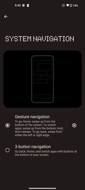
You can see all applications by swiping from the bottom of the screen – and here I had a complete fiasco, because I nailed this trick from the third or fourth try. Maybe I swiped something wrong, but as a matter of fact – me and this feature did not have a match.
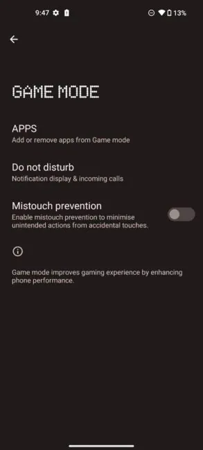
I liked the small but nice feature of the game mode – to turn off notifications about calls and messages. Really, it sucks when, in the middle of a match, telegram pop-ups start spamming you with messages from the work chat, where someone decided to discuss a project or a new TV series.
I didn’t really understand the trick of creating different accounts for using a smartphone. Okay, with a laptop or a tablet, this is quite a realistic option, because there you can watch a movie, play games, or play cartoons for your child. But a smartphone is still such a personalized thing, and in reality, there is probably no person who does not have his own smartphone. Therefore, such smart sharing seems to me to be too far fetched.
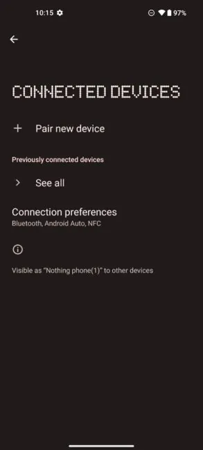
The Nothing Phone (1) supports a standard array for connectivity: 5G, Wi-Fi 6 (802.11 a/b/g/n/ac/ax), Bluetooth 5.3, GPS, NFC.
I was very pleased with the volume of the Nothing Phone (1) speakers, despite the fact that there is only one dedicated multimedia speaker, and the second speaker is basically an earpiece. Although the difference between them is still noticeable – the main speaker is more bassy and “rich” in sound.
Nothing Phone (1) Battery & Charging
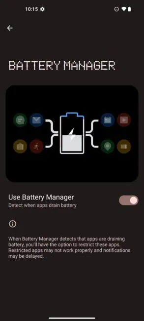
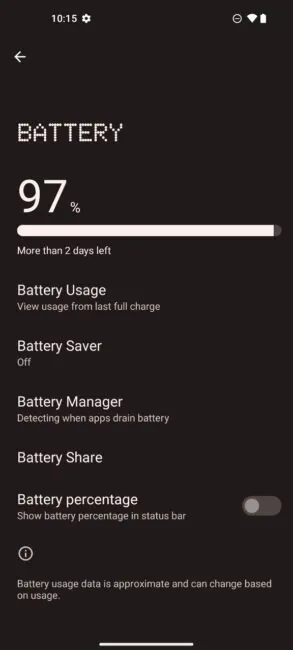
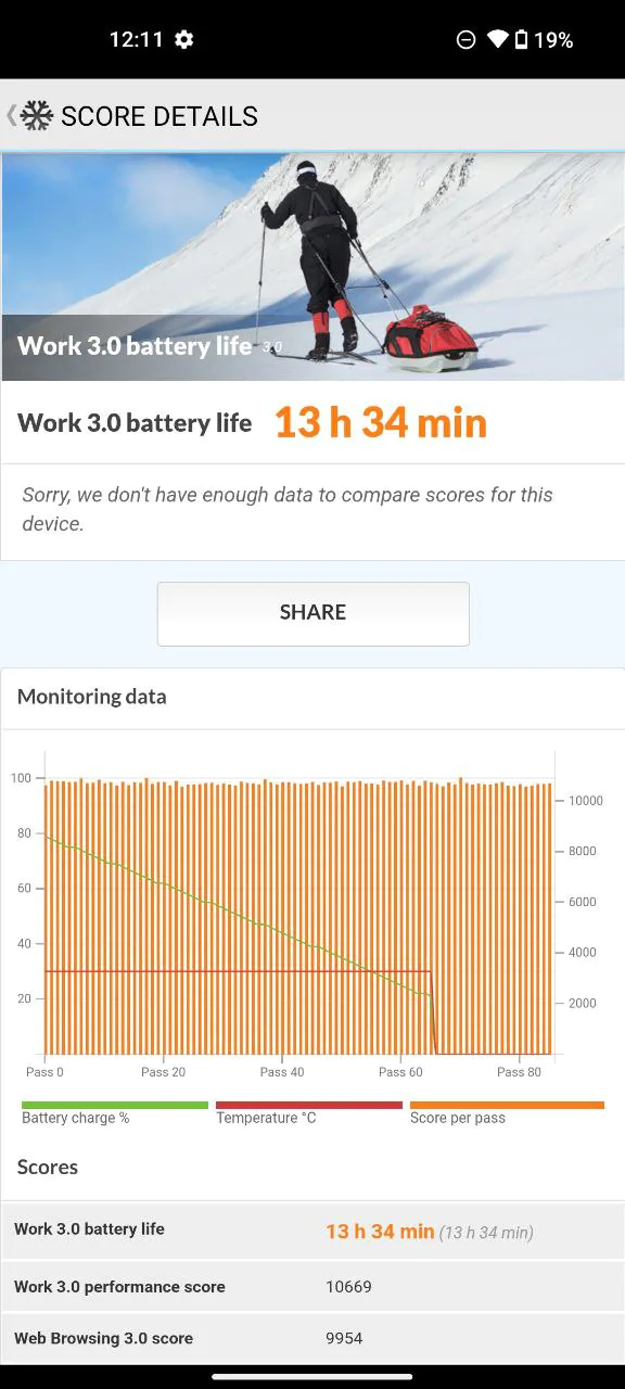
Despite the fact that the battery capacity in the Nothing Phone (1) is not the largest on the market, it shows respectable battery life. With the Nothing Phone (1), you can count on an average of almost 10 hours for various screen tasks. According to professional tests, it is capable of 15 hours of web browsing and about 20 hours of video playback at medium brightness.
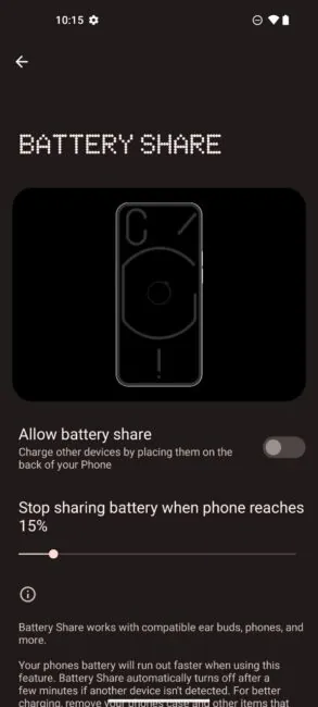
A cool option is the ability to charge devices from your smartphone wirelessly. Designed mainly for headphones, but still – for me, charging a smartphone is more important even than the ability to listen to music, so I haven’t seen many real cases for using this feature.
Despite the fact that the charger is not included in the box, the smartphone is fast charging ready, so you can connect it to a 33W power brick. But when compared with the Xiaomi 12 Lite, the smartphone does not charge as quickly as possible. It took me 1 hour 40 minutes to charge it from 5 to 100%.
Verdict
Nothing Phone (1) is not a smartphone for everyone. It is unique, and can stun you with wow effect in the first hours of use. But in the end, first impressions pass, so the value of the smartphone is manifested in other aspects.
If we take into account the price of the smartphone, Nothing Phone (1) mostly competes with the flagships of Xiaomi, Oppo, realme or mid-rangers from more well-known brands. It wins with an original design and a convenient Android skin, i.e. the factors that matter the most when the phones have almost the same specs.
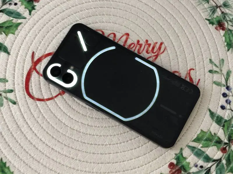
In addition to this, Nothing Phone (1) can offer its users a bright and responsive display, a good set of cameras, high performance in productivity tasks and pleasant stability in games.
The weakness of this smartphone is that it comes from a less-known brand, so it mostly caters to geeks and hi-tech fans who have at least heard something about it or, for example, read our review. Therefore, do not forget to subscribe to our social accounts to see more similar devices – the dark horses.
Recommended reading:
- ZTE Blade V40 Vita & V40 Pro Smartphones Review: Perfect Anti-crisis Options
- Vivo X70 Pro+ review: Powerful beast with fantastic cameras
- Huawei Mate 50 Pro Review: There Are Never Too Many Cameras
You can also help Ukraine fight with Russian occupants via Savelife or via an official page of the National Bank of Ukraine.


