© ROOT-NATION.com - Use of content is permitted with a backlink.
Last December, I was pleasantly surprised by ZTE’s new Blade V40 series smartphones. Both the V40 Vita and V40 Pro turned out to be excellent power efficient devices and even helped me survive a couple of blackouts thanks to the powerful battery on the V40 Vita and very fast charging on the V40 Pro. It’s now the beginning of autumn 2023, Ukraine is about to be in another period of blackouts and Russian attacks on our energy infrastructure. And ZTE is right there with its updated Blade V lineup: the ZTE Blade V40 Design and the ZTE Blade V40S. Whether these smartphones will become a worthy replacement for their really great predecessors – we’ll find out from this review.
Read also:
- ZTE Blade A72s review: ultra-budget with a big screen and 90 Hz
- ZTE Blade V40 Vita & V40 Pro Smartphones Review: Perfect Anti-crisis Options
Specifications of ZTE Blade V40 Design/ V40S
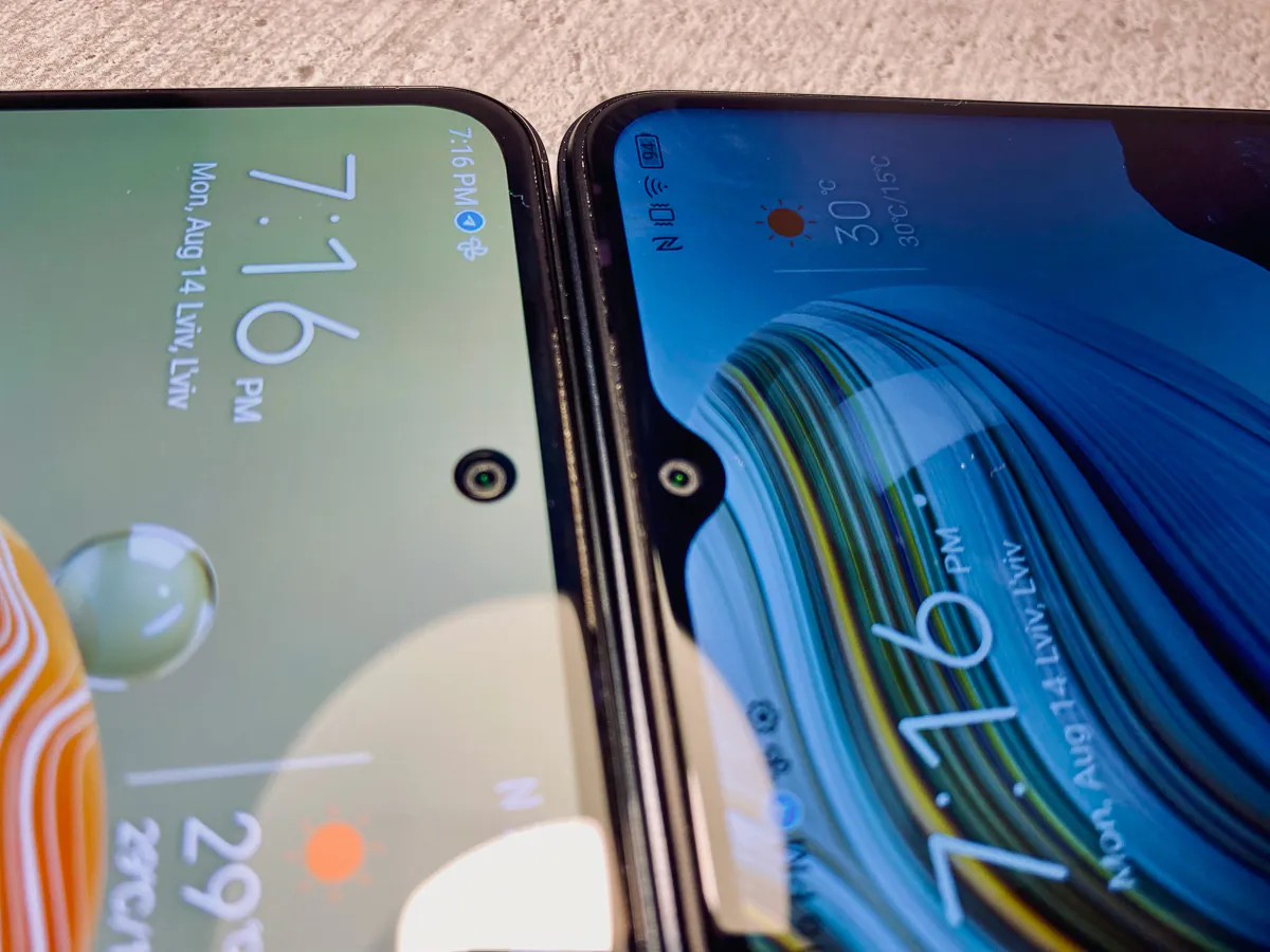
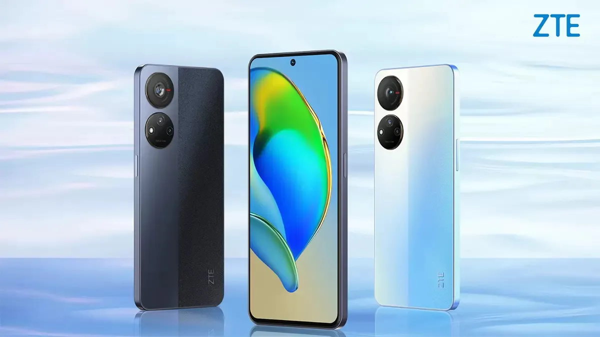
First of all, let’s talk about what’s under the bonnet of the new devices. ZTE decided not to change what worked in the previous V40 devices and settled on Unisoc chipsets, namely the T618 (in the V40S) and its “little” brother with reduced frequency T616 (in the V40 Design). Other notable differences include the displays: the V40 Design has a Full HD IPS screen with a drop-down notch, while the V40S has an AMOLED screen of similar resolution, with a notch-dot for the camera.
The rest of the specs are similar across the board: up to 6GB of RAM (the V40 Design has a 4GB option), 128GB of permanent storage (which is expandable via MicroSD), 4,500mAh batteries with 22.5W chargers, an Android 12-based OS, and 50-megapixel main cameras with two additional modules. I got the 4/128GB version of the Blade V40 Design and the 6/128GB version of the Blade V40S, both in black colour, for my test.
Specifications of the tested version of ZTE Blade V40 Design
- Chipset: Unisoc T616 (2×2.0 GHz Cortex-A75 + 6×1.8 GHz Cortex-A55)
- RAM and ROM: 4 + 128 GB (UFS 2.2)
- OS: MyOS (based on Android 12)
- Battery: 4500 mAh
- Charging: fast, 22.5W
- Screen: 6.6″, IPS, Full HD+ (1080×2040), 60Hz
- SIM: 2 × Nano-SIM + MicroSD card
- Main camera module: 50MP wide-angle camera + 2MP macro camera + 2MP depth sensor
- Front camera: 8MP
- Connectivity: Wi-Fi 802.11 a/b/g/n/ac (2.4 and 5 GHz); Bluetooth 5.0, USB Type-C + OTG, GPS, NFC, 3.5mm headphone jack
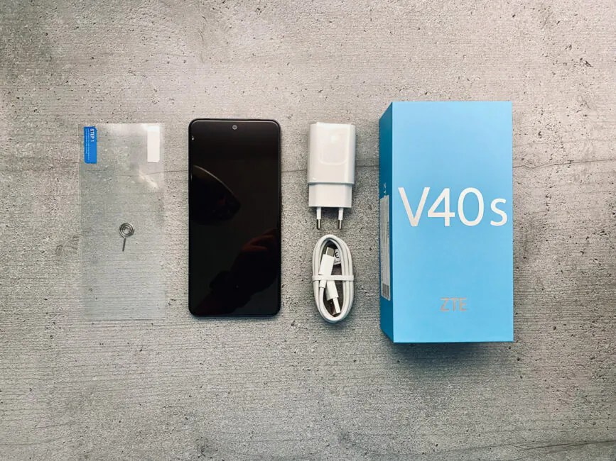
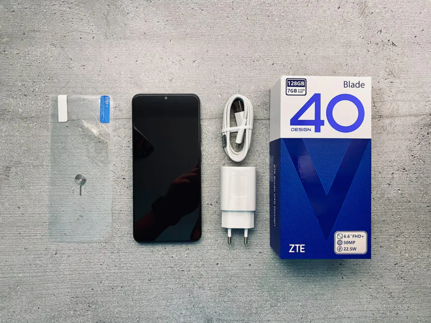
- In the box: smartphone, USB Type-C to Type-A charging cable, 22.5W charging unit, SIM card removal tool, protective film (needs to be applied) and quick start guide
- Other features: LED alert indicator at the top of the display (white), side-mounted fingerprint sensor
- Dimensions: 163×74×8 mm
- Weight: 183.4 g
- Case material: plastic
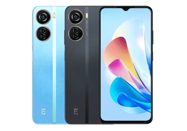
As mentioned, the phone has 2 RAM variants: 4GB and 6GB respectively. It is also available in two colours: black and blue.
https://youtube.com/shorts/XQu_7umHGmE?si=M9S-GKfun0Mhwwa7
Specifications of the tested version of ZTE Blade V40S
- Chipset: Unisoc T618 (2×2.0 GHz Cortex-A75 + 6×2.0 GHz Cortex-A55)
- RAM and ROM: 6 + 128 GB (UFS 2.2)
- OS: MyOS (based on Android 12)
- Battery: 4500 mAh
- Charging: fast, 22.5W
- Screen: 6.67″, AMOLED, Full HD+ (1080×2040), 60Hz
- SIM: 2×Nano-SIM or Nano-SIM+MicroSD card
- Main camera module: 50MP wide-angle camera + 5MP macro camera + 2MP depth sensor
- Front camera: 8MP
- Connectivity: Wi-Fi 802.11 a/b/g/n/ac (2.4 and 5 GHz); Bluetooth 5.0, USB Type-C + OTG, GPS, NFC
- In the box: smartphone, USB Type-C to Type-A charging cable, 22.5W charging unit, SIM card removal tool, protective film (needs to be glued on) and quick guide
- Other features: LED notification indicator around the camera (RGB), fingerprint sensor on the side
- Dimensions: 163.5×75.8×7.6 mm
- Weight: 183.4g
- Case material: plastic
Unlike the V40 Design, the V40S has a single memory option: 6/128GB. However, it has retained both colour options: if you want something brighter than the traditional black, a blue variant is also available.
https://youtube.com/shorts/qPz1DX41UYg?si=ms_tltYnp1IgIGWo
But whichever configuration/colour you choose, you’ll get the same contents in the box: the phone, screen protector (must be applied), SIM card ejection clip, USB-A to USB-C charging cable and a 22.5W charging pad.
From the bundle, let’s move on to the updated smartphone design language – that’s what I’m going to talk about next.
Design
Although the Blade V40 Vita and V40 Pro looked pretty good, it is noticeable that they did not have a common design concept. Therefore, ZTE decided to update the appearance and bring the smartphones to a unified style.
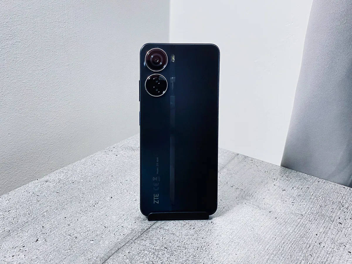
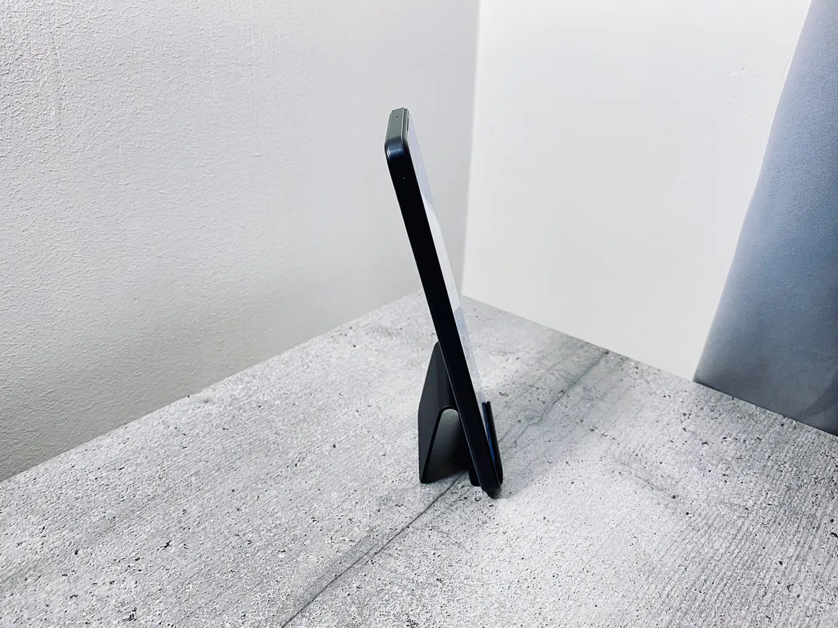
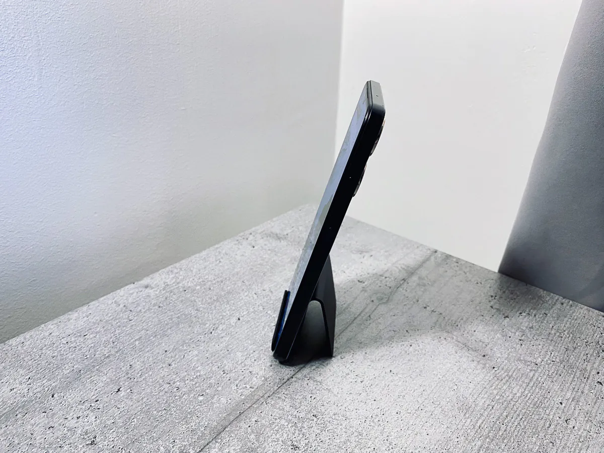
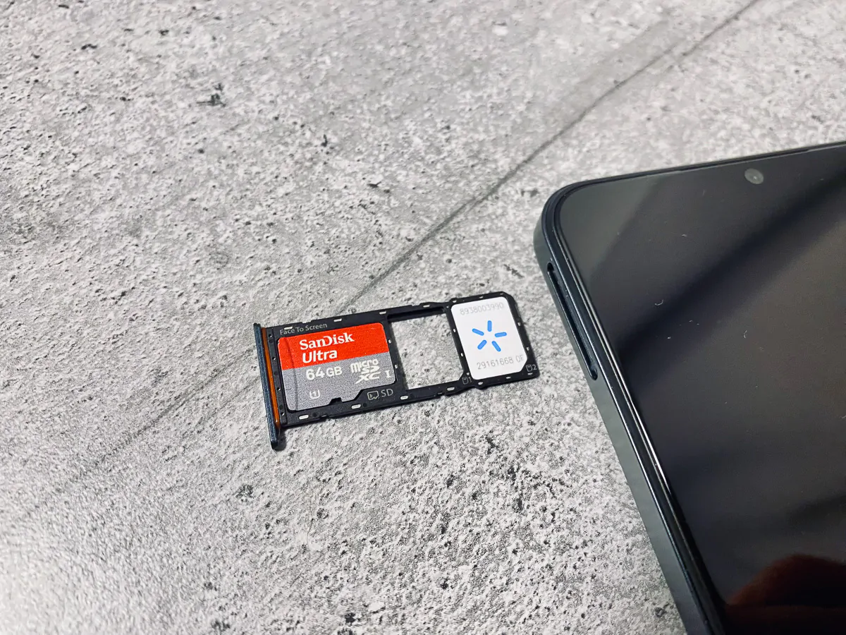
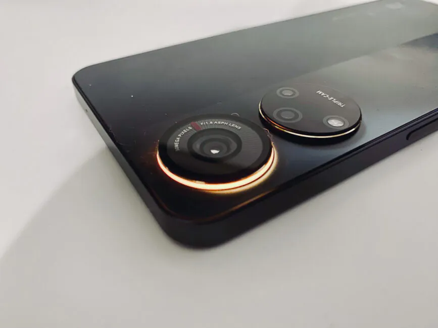
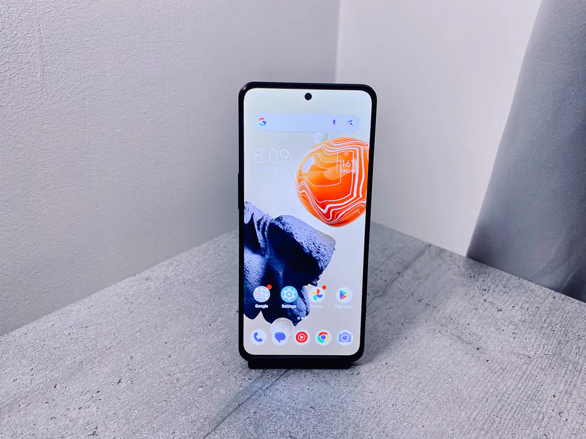
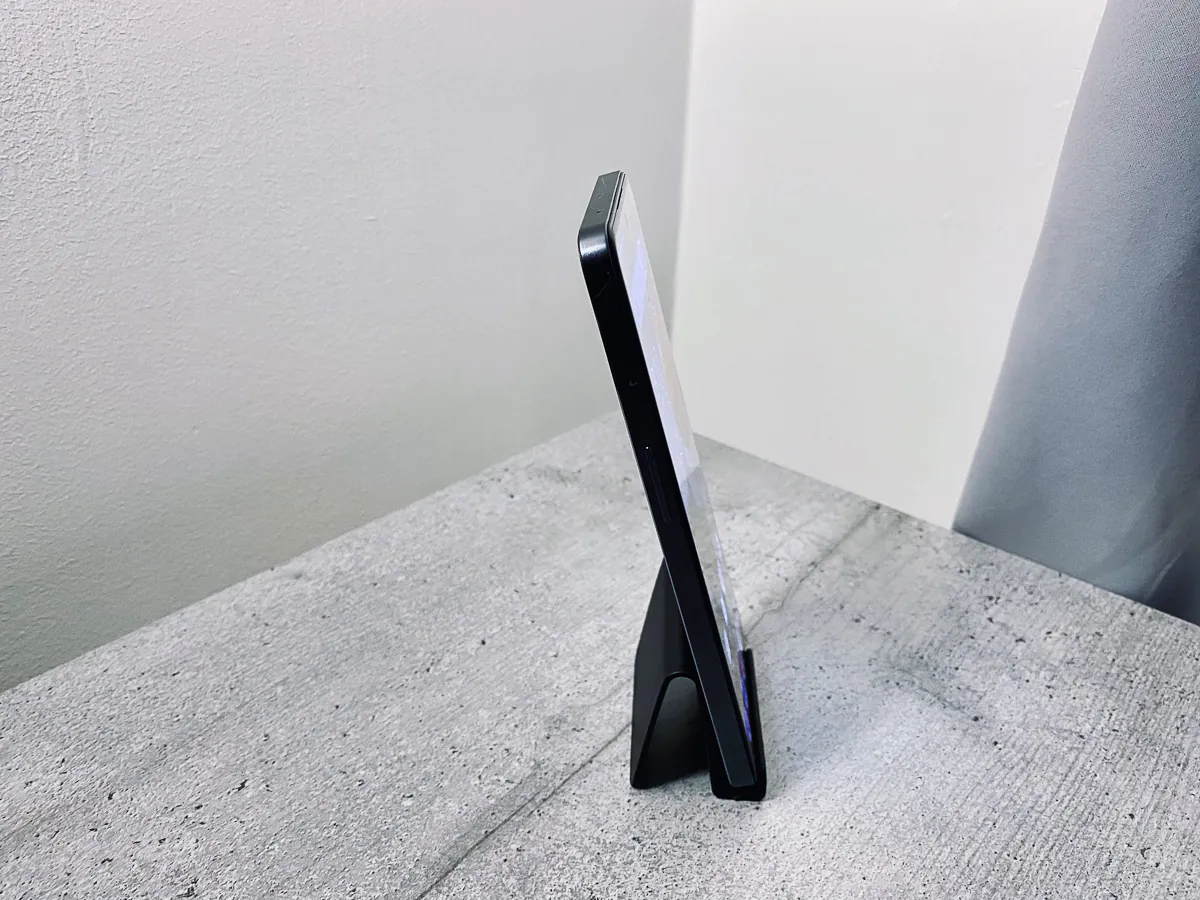
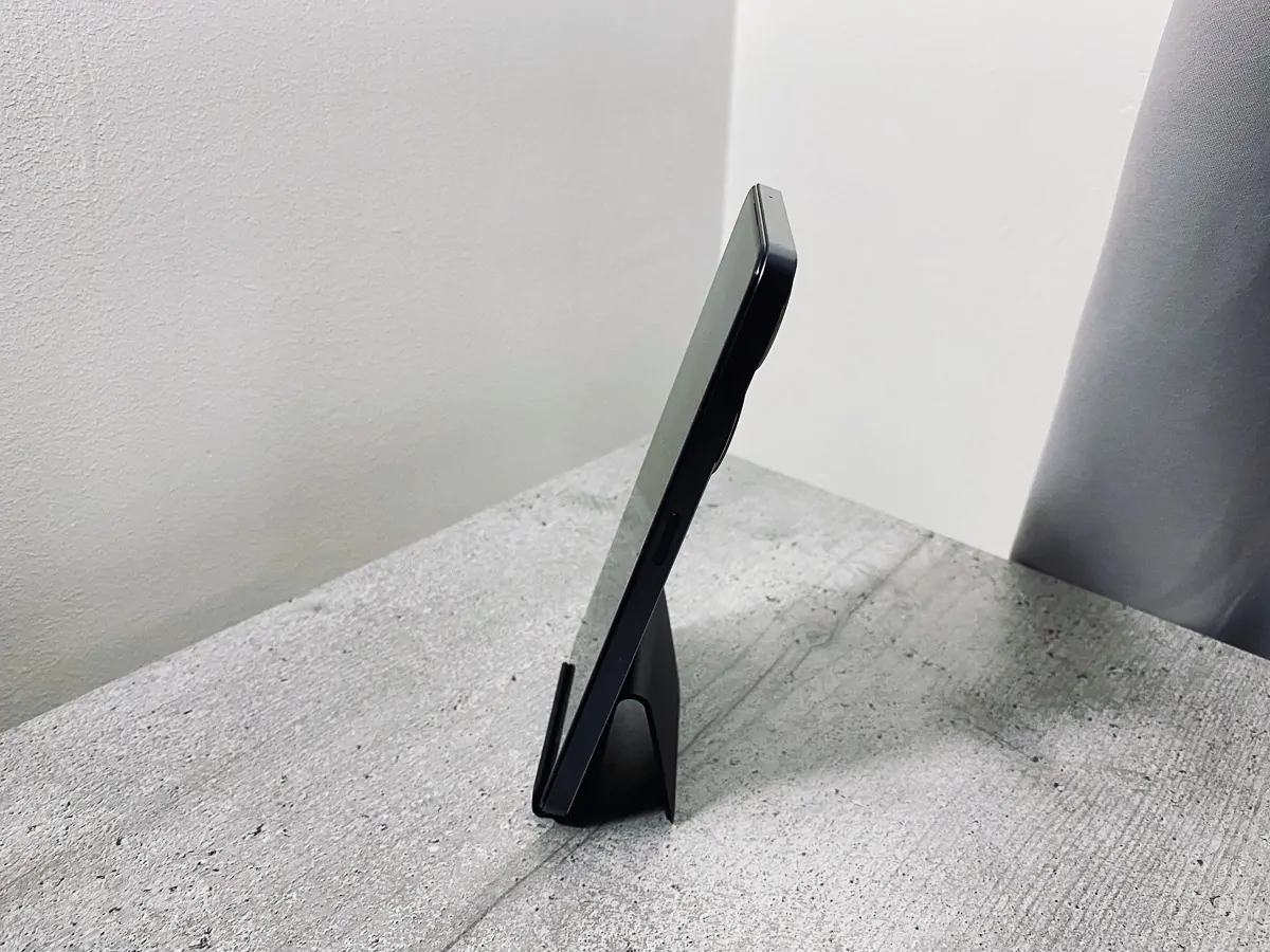
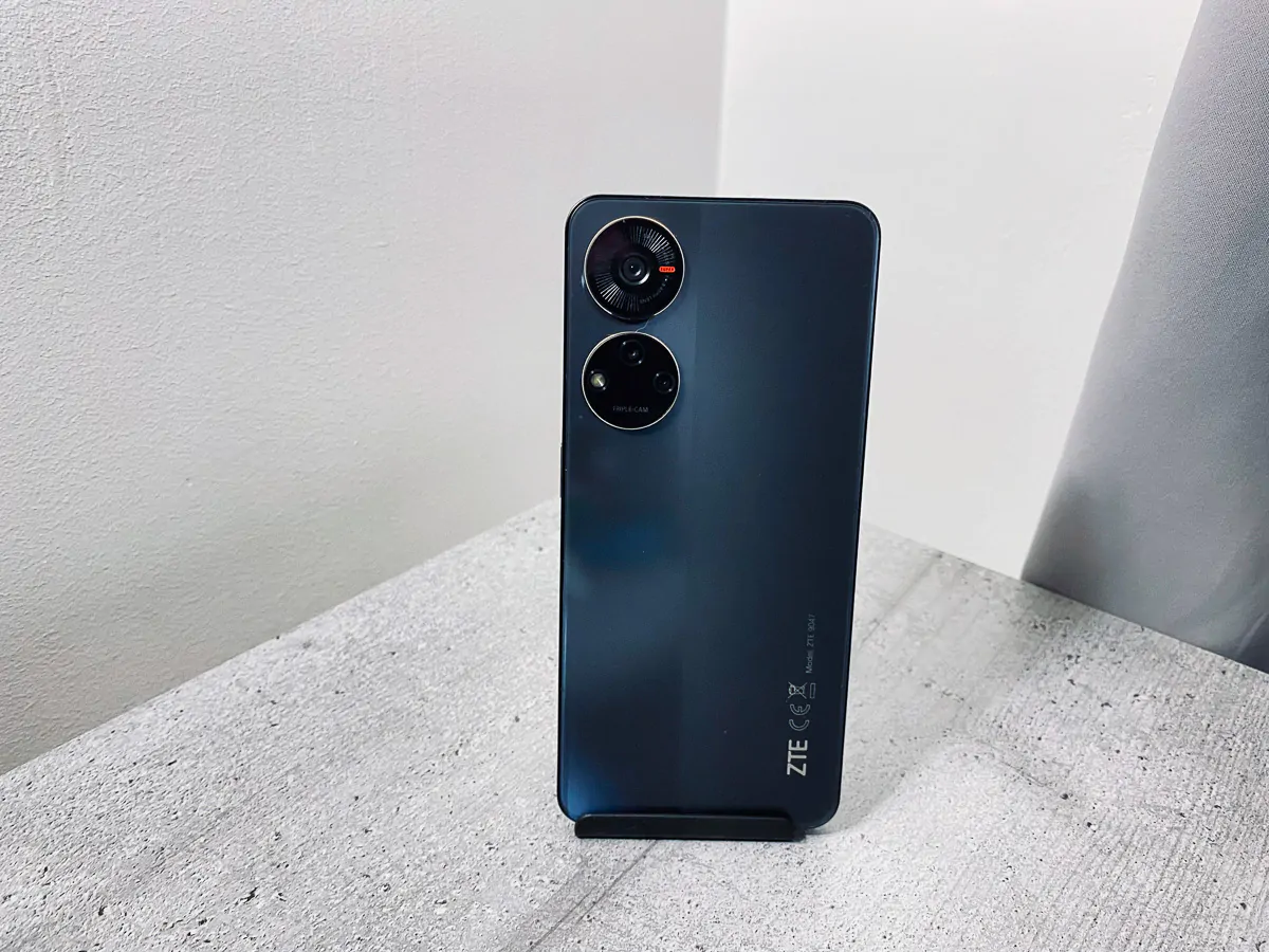
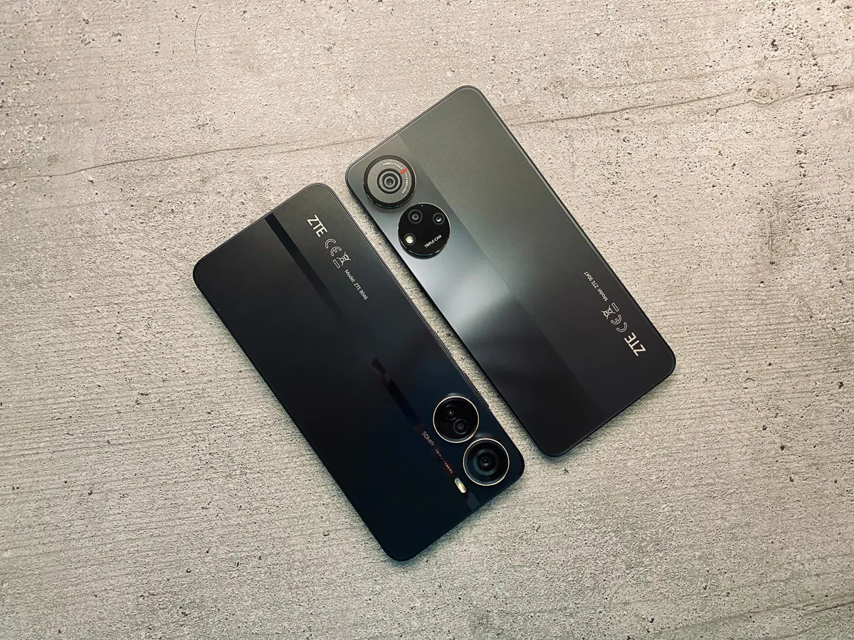
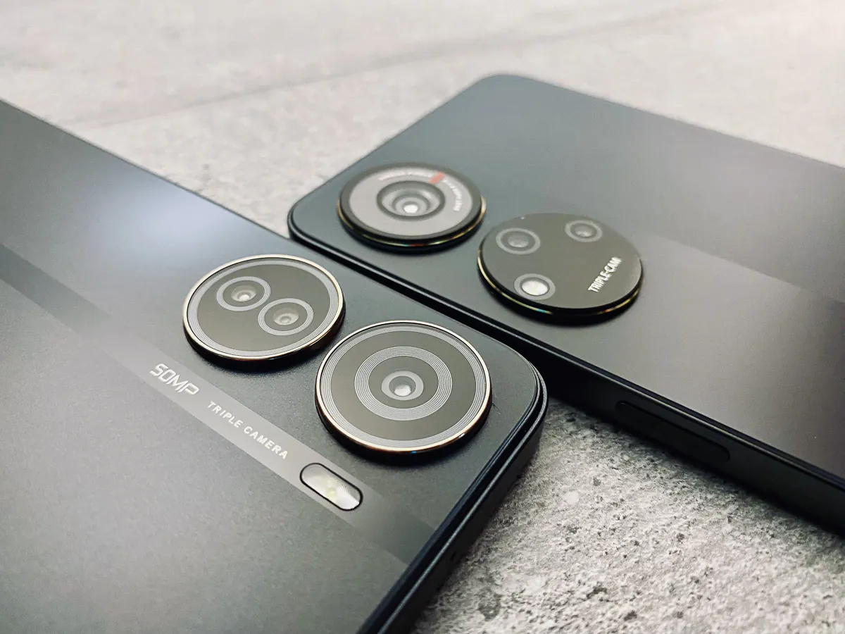
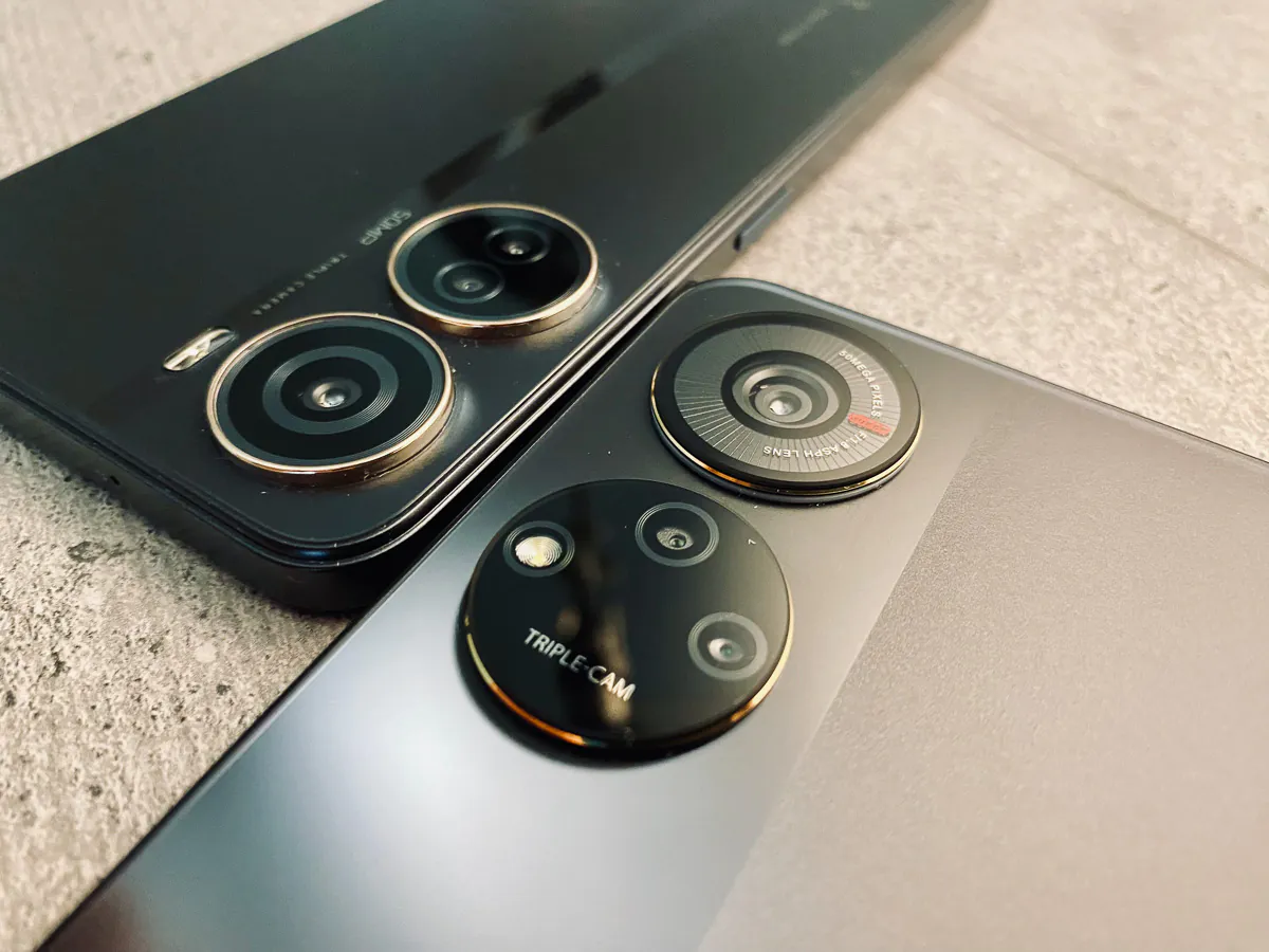
And that’s where the flat edges, thin profiles and overall square look came in. The ZTE Blade V40 Design and the ZTE Blade V40S look very similar, with some minor differences between them.Thus, the V40 Design, the cheaper model, has slightly smaller camera rings with gold accents and a matte stripe on the glossy black back of the smartphone. The traditional Android smartphone placement of the power button and volume buttons on the right edge of the phone has also been retained. Whereas, the left edge only houses the dual SIM + microSD slot. It has also retained the 3.5mm audio jack at the bottom and USB-C next to it.
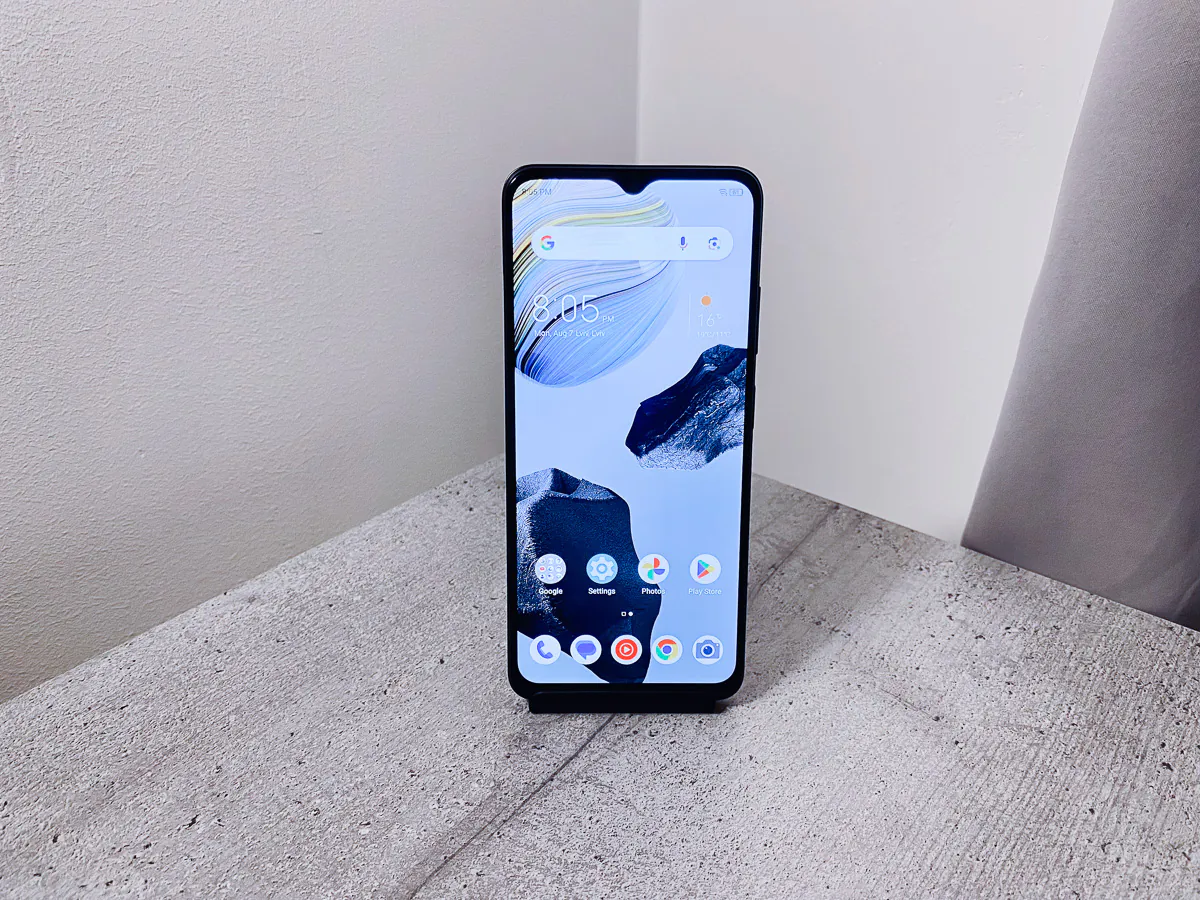
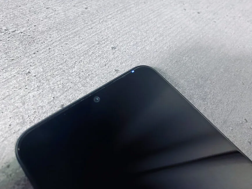
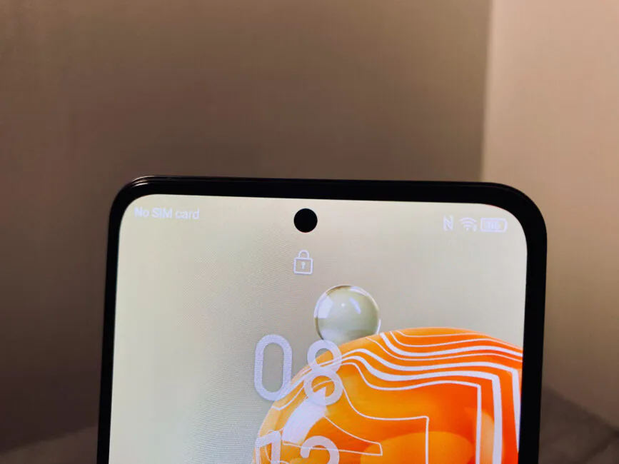
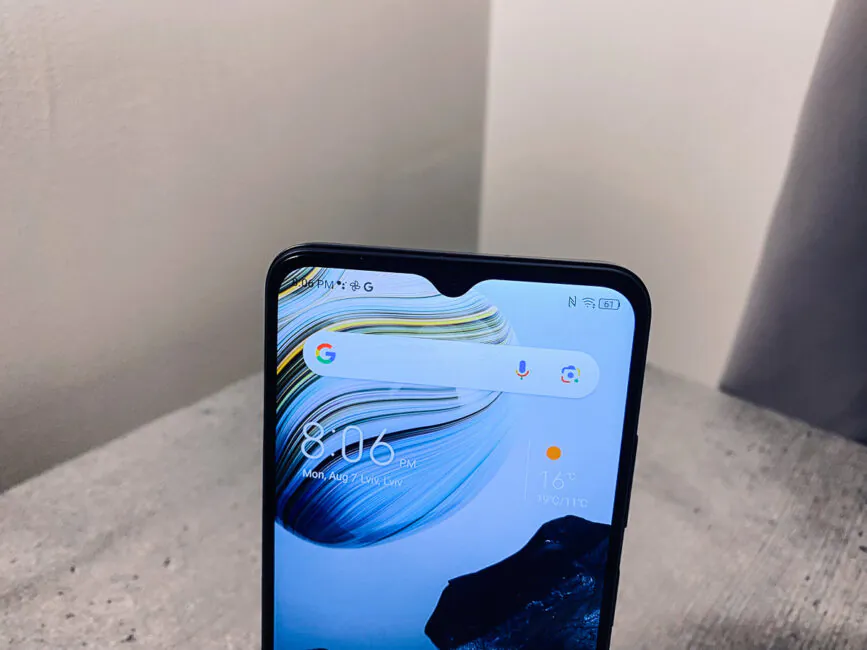
On the front, the V40 Design features a slightly larger “chin” and a drop-shaped cutout that houses the 8-megapixel camera and a small white LED light. In comparison, the V40S gets a notch for the front camera and thinner bezels for a more premium look.
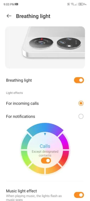
The V40S definitely looks like a more expensive device: its back panel is dual-textured, which includes matte and glossy black plastic. The camera rings are significantly larger, especially the main camera, which also houses what ZTE calls “breathable light” on the unit – a multi-coloured LED strip around the camera frame. The volume rocker has been moved to the left and the power button is on the right. The bottom of the phone now only has a USB-C port and a dual-SIM/MicroSD slot. There is no audio jack.
Overall, both phones are a significant upgrade in terms of design: there’s finally an overall style with more attention to cameras and displays. Speaking of displays…
Displays ZTE Blade V40 Design/V40S
The two smartphones differ not only in the design of the notch, but also in the display technology underneath it. Both have Full HD+ panels, which is good for clarity, but the V40 Design has an IPS panel with a slightly smaller diagonal, while the V40S boasts an AMOLED matrix with all the typical advantages such as extra brightness and contrast.
It’s not just the screen type that differs. The colour profile of the V40 Design is noticeably cooler, while the V40s is warmer. However, the V40S still has Always on Display. There are a variety of clocks, images and animations to choose from, which you can display for as long as you like.
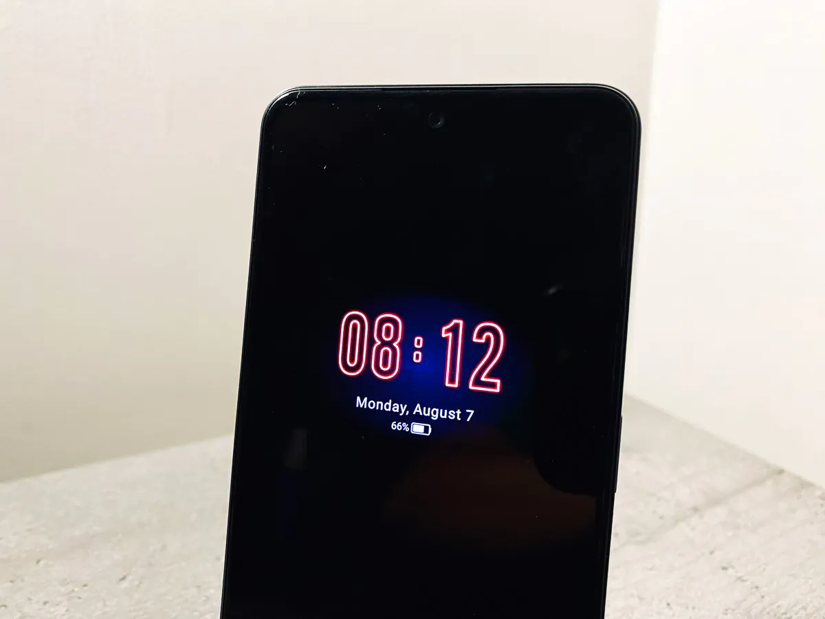
The new Blade V40 series smartphones have pretty decent screens considering both are priced under $175, but can you say the same about their software and performance?
Read also: Infinix GT 10 Pro smartphone review: for gaming and beyond
Software and performance
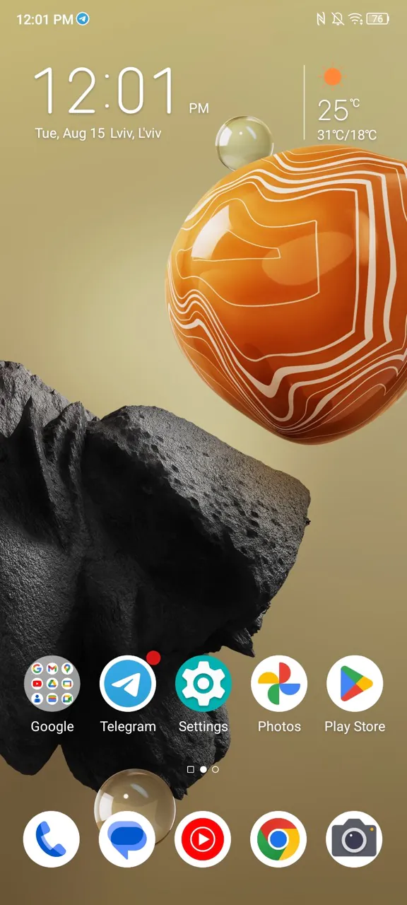
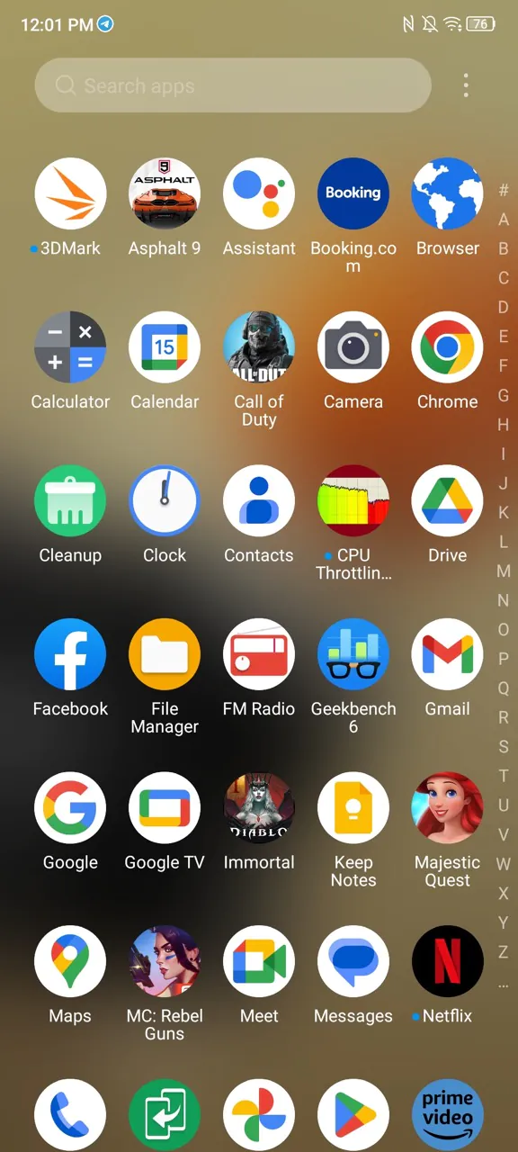
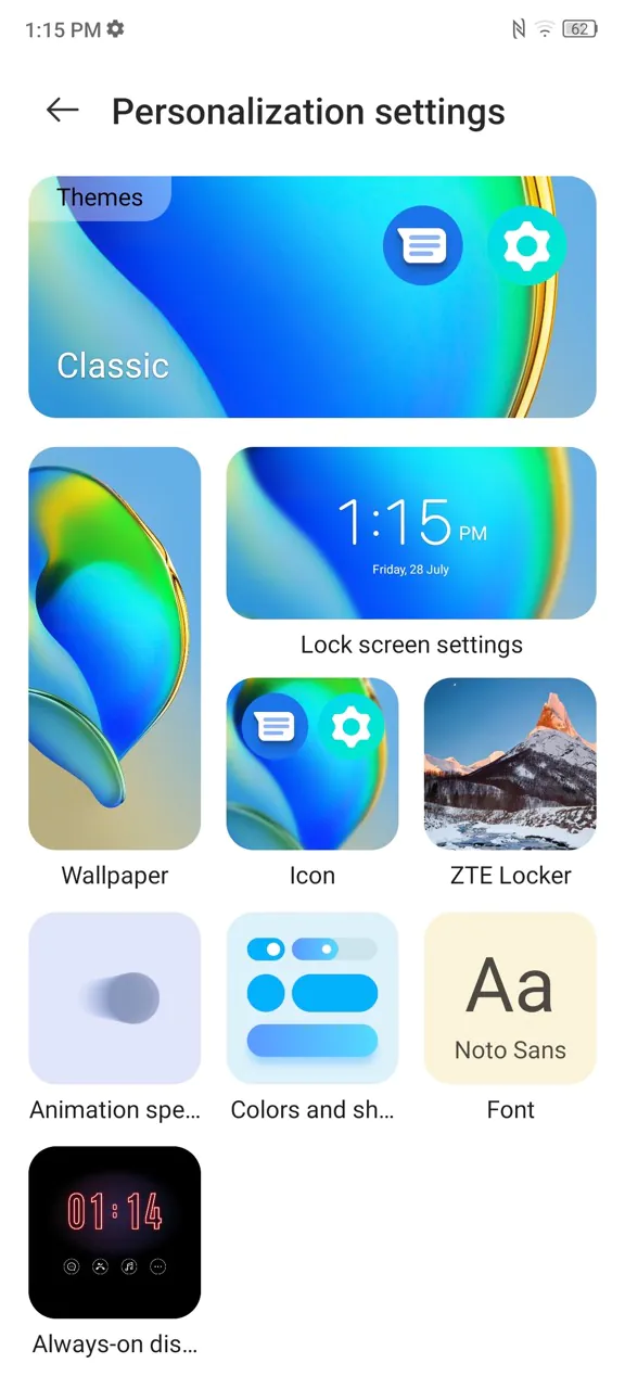
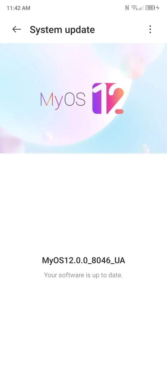
The Blade V40 Design and Blade V40s run on ZTE’s MyOS 12 based on Android 12. Unlike some other handset makers, ZTE has decided not to change much from pure Android in terms of OS design and customisation. It even has an Android 12 customisation screen that allows you to adjust the colours to match your content.
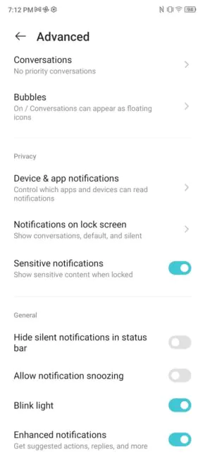
The OS is also, practically, devoid of pre-installed software and apps from ZTE: there are only three games that can be easily uninstalled, the ZTE lock screen, the theme manager and the Breathing Light settings for the Blade V40S. The latter, however, doesn’t offer much in the way of settings: you can turn it on for notifications or incoming calls, but not both at the same time, choose the colour of notifications, and that’s it. This seems like a place for further improvement in future OS updates.
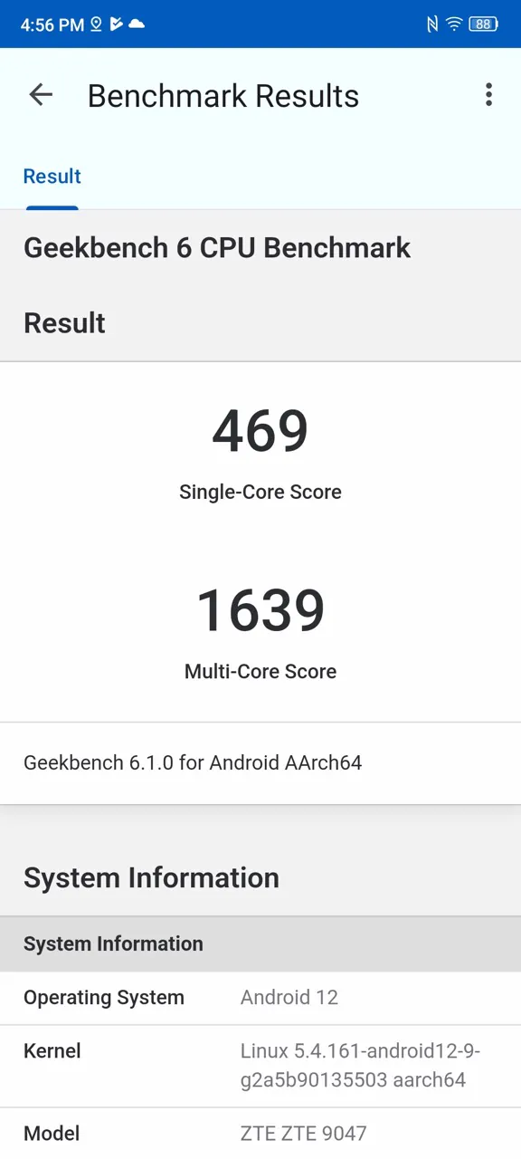
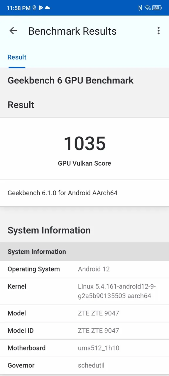
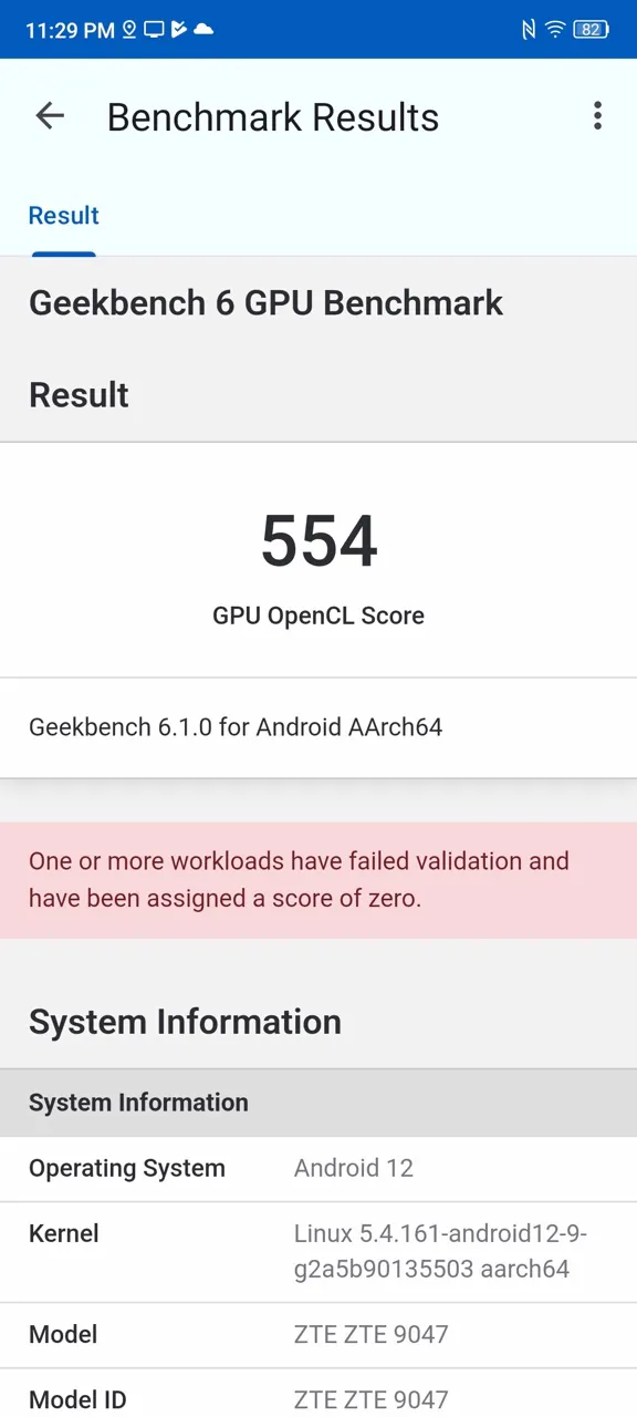
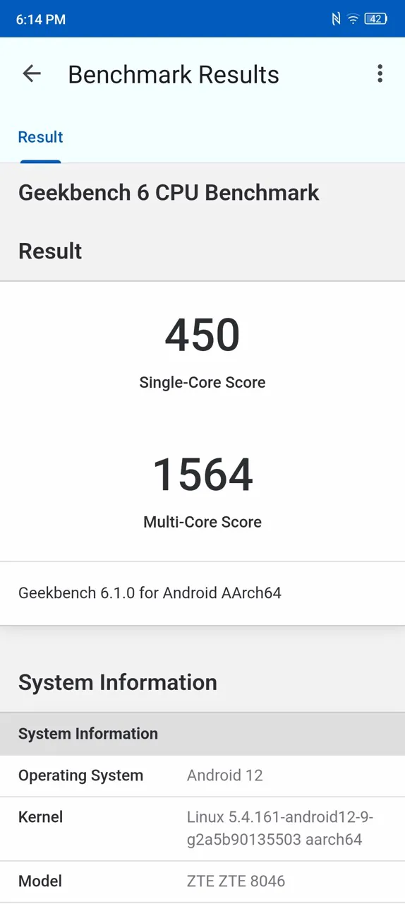
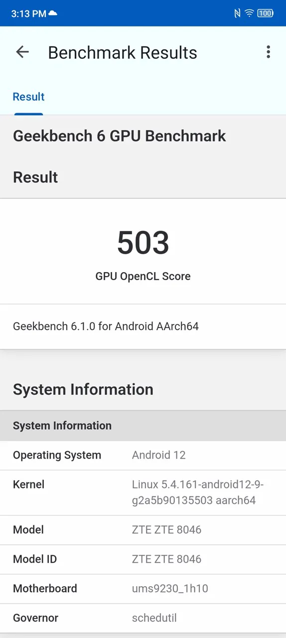
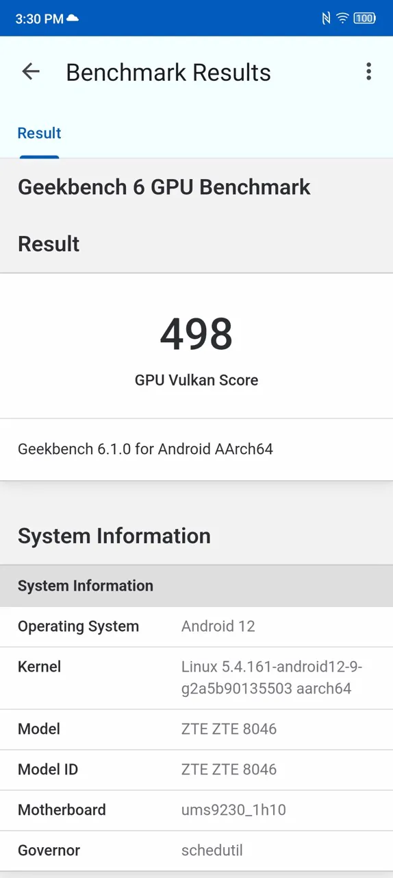
Well, the lightweight OS should obviously contribute to performance. The UNISOC T616 and T618 are hardly the most powerful SoCs on the market. GeekBench results in the screenshots below:
So, the new look is a win-win, the performance is quite sane, what about the other changes? Let’s talk about the cameras, for example.
Cameras
Let’s start with the good news. Technically, we have brand new main camera modules on the V40 Design and V40S. I wasn’t able to confirm that they are identical for both models, but at least the specs look pretty similar: 50 MP, f/1.8, 26 mm.
View V40 Design/V40S photos and videos in their original quality
And the pics also look pretty similar. They look normal on both the V40S and the V40 Design. There’s nothing flagship-like about these photos, but after all, no one expects that from them. So if you need to shoot something in bright daylight or under clouds, the ZTE Blade V40 Design and ZTE Blade V40s will help you out without question.
There is no telephoto lens, but 2x shots look sharp, as for budget smartphones. The only problem is the zoom button: it is on the right side when you hold the phone vertically, and stays there even if you hold the phone horizontally.
Full 50-megapixel shots are also good.
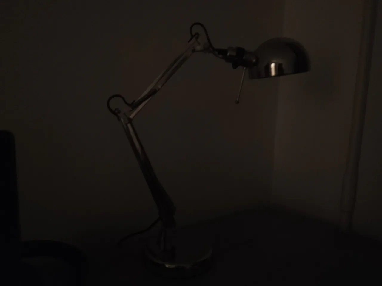
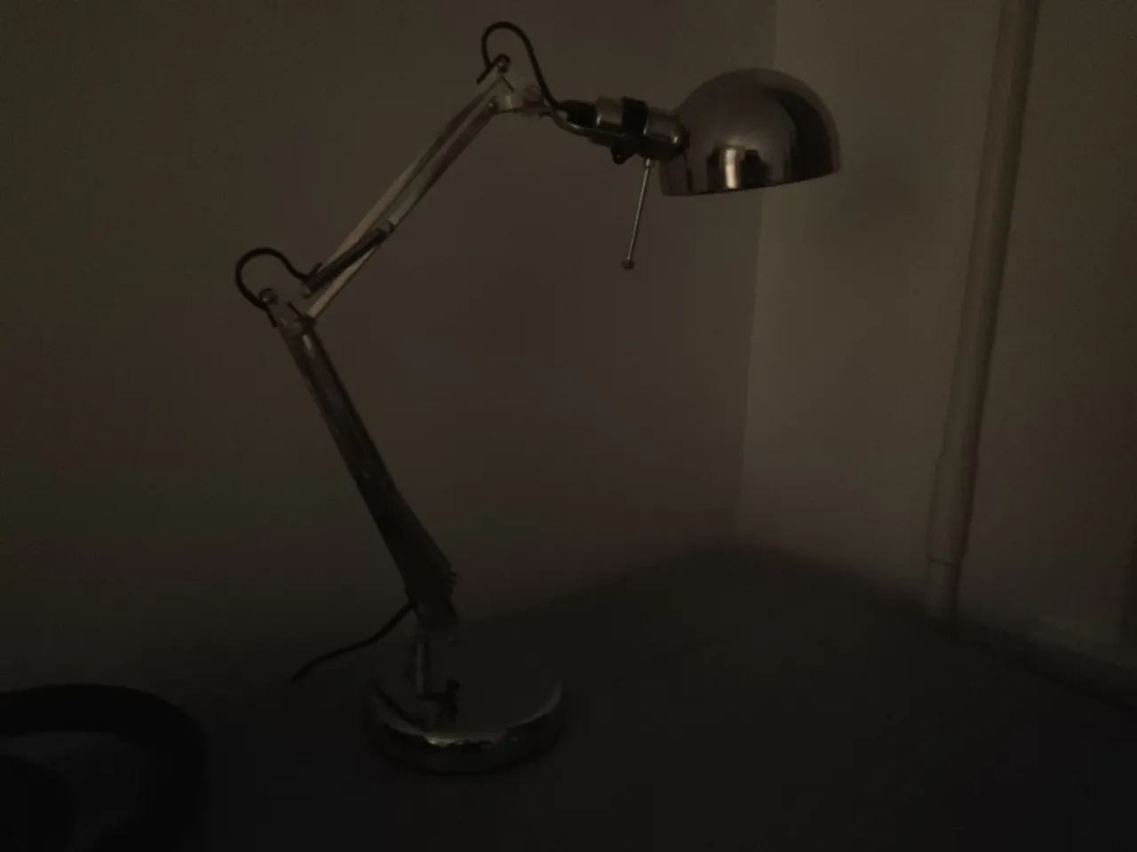
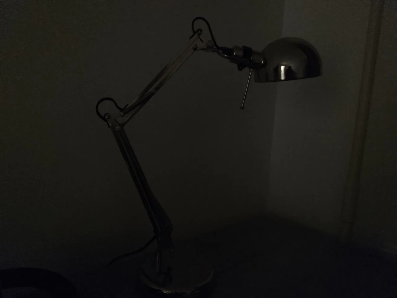
However, the night mode, despite a separate item in the settings, helps practically nothing. But there is a nuance – this is an absolutely typical situation for this budget. That is, you will definitely not take a smartphone for this money for night shooting.
Portrait mode works fine. You can rely on these phones for portrait photography almost 80-90% of the time.
Macro cameras perform surprisingly well in a controlled environment. The only thing missing is an ultra-wide-angle module, for a complete picture.
The front cameras did their job very well, capturing me in both normal and portrait mode – a win-win for selfies lovers.
Unfortunately, smartphones can’t boast of high video quality. It’s only 1080P, with a maximum of 30 frames per second. The V40 Design doesn’t offer any stabilisation, so a quick walk in the park looks like a Jason Bourne movie. The V40S, meanwhile, offers electronic stabilisation.


Overall, the camera quality has improved compared to the V40 Vita and V40 Pro, but not by much.
Battery life, charging and overall impressions
Last year I praised the V40 Vita and V40 Pro for their approach to battery and charging. The former had a 6000mAh battery and the latter had a 65W GaN charger in the box.
With the V40 Design and V40S, ZTE has decided to do away with that. Now both smartphones have identical 4500mAh batteries and 22.5W charging units.
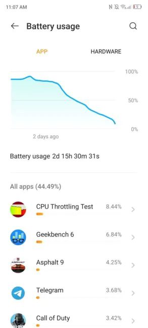
In practice, this means about a day and a half of use on a single charge. And charging from 10% to 100% takes up to 2 hours with the charger out of the box.
Other aspects of the device were quite satisfactory. I had no problem watching YouTube videos and listening to music on both phones: the sound is good, even though the phones have a single multimedia speaker. Bluetooth headphones also worked without problems.
NFC worked flawlessly on all devices, so I could leave my main phone behind when going shopping.
And yes, there were no problems using these phones as, in fact, phones: I could hear people well, and they could also hear me well. There were also no false screen taps during a call. So yes, the ZTE Blade V40 Design and V40S are decent communication devices.
Read also:
- Realme C53 review: cheap and cheerful
- Huawei nova 11 Pro review: expressive design and interesting software solutions
Prices and verdict
The advantages of the V40 Design and V40S are only emphasised by the price of the devices. For instance, the ZTE Blade V40 Design costs ∼$147, while the ZTE Blade V40S sells for ∼$174. Even considering all the shortcomings of the latter devices, the price is just fine.
As for the V40 Design, most competitors in the same price category offer a much worse screen, the same cameras and similar processors.
However, the V40S has some interesting competition. For example, the Redmi 12 offers a better chip in the form of MediaTek Helio G88, but 2GB less RAM.
But at the end of the day, it’s about the key features the phones offer. And the V40 Design/V40S predominantly wins with its style and price. That’s not a bad thing, as an extension of the existing line-up. And creating a brand identity is also a good decision.
If you imagine someone from the company reading the review, I’d like to see ZTE focus on key features like bigger batteries and fast charging, as well as software optimisation. With that in mind, the next update to the Blade V series could be a sensation in the market that everyone will instantly love.
For now, we have some good entry-level options that are sure to attract attention.
Read also:
- HONOR Magic5 Pro review: Like Huawei, but with Google services
- ASUS Zenfone 10 review: a compact flagship is relevant
- Motorola Moto G13 review: classic budget phone up to $135


