





© ROOT-NATION.com - Use of content is permitted with a backlink.
Equal Earth: Nearlyall the countries represented in the United Nations General Assembly recently voted in favor of geographic maps that more accurately reflect the actual areas of the various continents. Nevertheless, the UN resolution is unlikely to change the way millions of people view variations of 16th-century Mercator maps – with their distorted continental sizes – in mobile apps every day.
On September 4, the initiative by African countries received 164 votes in favor, while 6 states abstained. The only exception was the United States, which opposed the adoption of this document, describing it as a “radical ideological project,” according to UN News.

This non-binding UN document does not impose any mandatory obligations to change cartographic representations. Instead, it “calls on governments, educational institutions, international organizations, and technology companies to use the Equal Earth projection and similar equal-area maps in cases where actual size matters,” as noted in the UN News report. In addition, the resolution encourages the study of the trade-offs that inevitably arise when attempting to map a spherical planet onto a flat sheet of paper.
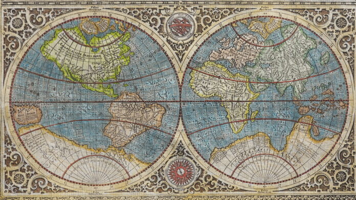
A significant portion of commonly used world maps are modern interpretations of the classic work by the Flemish cartographer Gerardus Mercator, dating from 1569. His primary goal was to create a projection that would represent straight lines, consistent with the movement of ships while maintaining a constant compass bearing, which made it an extremely useful tool for maritime navigation, enabling precise course-setting on the open ocean.
The practicality of the Mercator projection for navigational purposes has contributed to its status as one of the most popular maps today, and digital maps are no exception. The most popular navigation apps, including Google Maps and Apple Maps, continue to use various modifications of this projection, with Google Maps alone boasting over 2 billion active users each month.
However, the Mercator map has a downside: it distorts the actual proportions of the continents. Land areas are artificially enlarged as they move farther from the Earth’s equator, leading to such anomalies as Africa appearing to be exactly the same size as Greenland, even though it is actually 14 times larger.
The visually exaggerated dimensions of certain territories, such as Greenland, on the Mercator map can even have geopolitical consequences. A scientific study published in *Communication Reports* demonstrated that national security arguments, when combined with this map, can influence how citizens perceive the Trump administration’s initiatives regarding the potential acquisition of Greenland.
By comparison, the Equal Earth projection – which represents land areas equally – was developed in 2018 to accurately convey land areas at the cost of some distortion of their outlines. Bojan Šavrić, Bernhard Jenny, and Tom Patterson created this cartographic product in response to the debate surrounding the 2017 decision by the Boston Public Schools to use the Halls-Peters projection, which, while preserving the proportionality of landmasses, severely distorts their geometry near the polar regions.

There is immense value in educating people about exactly how each map distorts objective reality. A large-scale survey of 130,000 people showed that respondents who were more familiar with the Robinson projection – a compromise between equal area and the preservation of angles and shapes of small areas – were, on average, much more accurate in estimating the areas of countries, regions, and continents compared to those who more frequently used the Mercator projection.
The results convincingly demonstrate the urgent need to use map projections with reduced area distortion in fields such as social media and educational materials, as the authors emphasized in a paper published in the scientific journal ISPRS International Journal of Geo-Information.
The most famous illustration of how the Mercator projection distorts the true scale of Africa is considered to be an infographic by German software developer Kay Krause. In 2010, he presented a visualization titled “The True Size of Africa, ” which clearly demonstrated that the United States, China, India, Japan, and almost all of Europe could easily fit within the territory of the African continent.
Inspired by Kay Krause’s visualization, James Talmadge and Damon Mainis created an interactive website “The True Size Of…,” which allows users to see how the Mercator projection distorts the sizes of different countries as they move across the screen. They also drew on ideas from an episode of the TV series *The West Wing*, which discussed the shortcomings of the Mercator projection with the participation of the fictional Organization of Cartographers for Social Equality.
Certain governments and educational institutions may use the recommendations of the UN resolution to more actively incorporate the Equal Earth map into the educational process. Nevertheless, this in no way changes the fact that millions of people will continue to regularly use navigation apps such as Google Maps, which are based on the Mercator projection. Even the very initiators and supporters of the UN resolution have acknowledged its practical value.
Of course, the best way to view the Earth’s continents and landmasses while maintaining their correct shapes and scales remains the use of a physical three-dimensional model of our planet – or interacting with the Google Earth digital service, which offers detailed satellite imagery alongside three-dimensional models of urban structures and terrain.
Read also:Comet 3I/ATLAS arrived from another star system, and this is changing the scientific picture